Have you ever wondered whether having fewer choices might actually make you MORE creative? I’ve just returned from teaching my three-day Limited Palette, Maximum Impact! workshop at Dakota Art Pastels, where we explored exactly that idea. Once again, I was reminded of how creative constraints in painting can lead us somewhere we might never have gone otherwise.
Let me show you what happened during one of my demonstrations.
What caught my attention?
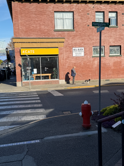
Out one day on an errand, I happened to notice this man with his dog against a brick wall. I snapped a quick photo. The scene included a shopfront, windows, street signs, a pedestrian crossing, and all sorts of other information.
But what had made me take the photograph in the first place?
The man, his dog and that FABULOUS cast shadow!
So my first decision was to get rid of almost everything else.
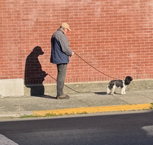
I cropped the photograph considerably, concentrating on those three elements. The brick wall was still there, of course, but it was really just a backdrop for the story I wanted to tell.

Or so I thought!
Making decisions before picking up a pastel
I chose this photo to work on in the workshop. Before diving into colour, I made three quick value thumbnails, to show how I explore different arrangements of light, middle, and dark values.
I asked the workshop participants to vote on which one I should take forward.
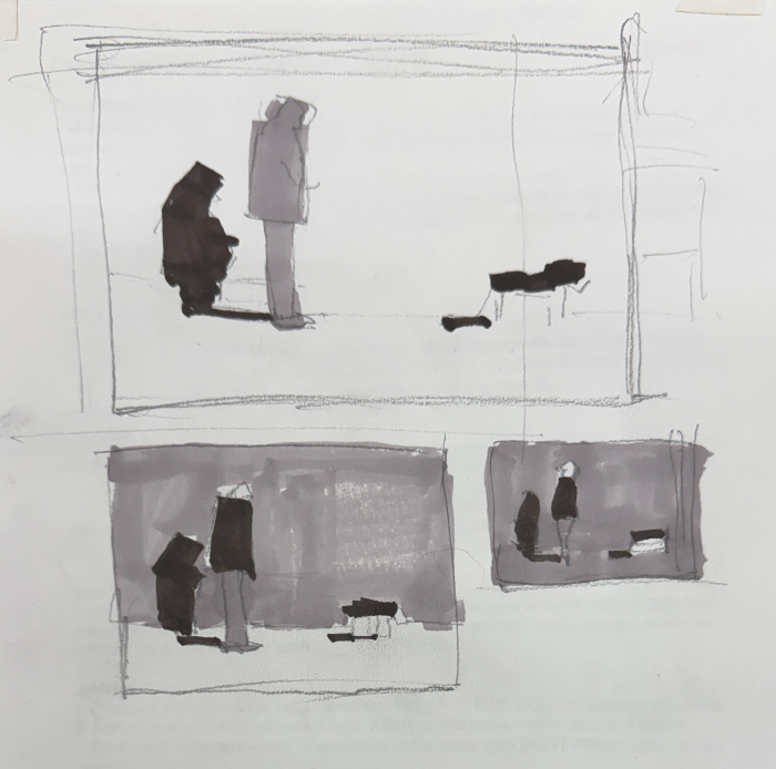
Already, we’d narrowed our options. We had our subject, our composition, and our value arrangement.
Now for the colour!
Four possibilities. One unexpected decision.
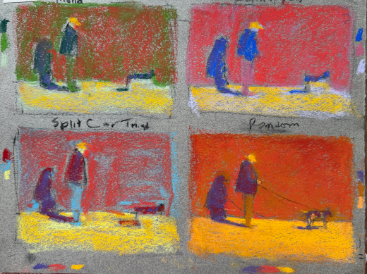
As part of a workshop exercise, I created four quick colour studies using a limited palette, each with two layers of colour. Each explored a different colour combination.
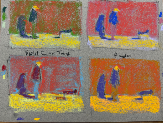
Then it was time to choose one to develop further, demonstrating how I build up a painting while sticking to my limited palette and resisting the temptation to add a whole lot more colours!
Looking at the four studies, my first instinct was to choose the upper-left version.
Why?
Because I could imagine developing it with a lovely greyed reddish brick wall. The upper-right version also had possibilities, although I’d probably need another colour to create more variation in the reds.
And the lower-left version? Well, it was rather odd, but I was intrigued by it, even if I wasn’t quite sure where it might lead.
But the lower-right version, with that blazing orange wall and violet figures?
THAT was the one I was immediately drawn to.
And yet…I was about to choose the upper-left version because it would give me something closer to the actual colour of the brick wall.
WAIT A MINUTE!
Why was I trying to reproduce the colour of a wall that wasn’t even the reason I’d wanted to paint this scene?
I’d already cropped away almost everything else to concentrate on the man, his dog, and that wonderful shadow. So why was I suddenly worrying about getting the wall colour right??
I changed the question.
Instead of asking which colour combination was closest to the photograph, I asked: Which colour combo excites me most?
And that made the decision easy.
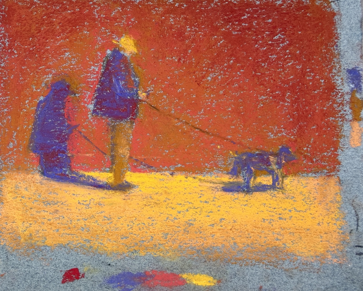
The orange one! And so, I went on to develop that as a further demonstration of how I build up a piece.
The limited palette had given me possibilities I might never have considered. Now I had to give myself permission to choose the one I actually wanted!
When fewer choices open up more possibilities
We often think creativity requires unlimited possibilities. All the colours! All the materials! All the options!
But sometimes having fewer choices is exactly what pushes us somewhere new.
A creative constraint can interrupt habit. But there’s another part to this: we have to pay attention to what happens when we experiment. Otherwise, we may discover something exciting and then dismiss it because it doesn’t look the way we think it SHOULD.
Working with a limited palette means you can’t automatically reach for the colour you think you need. You have to explore other possibilities.
Cropping a photograph means deciding what really matters to you.
Working quickly means you can’t fuss over every detail.
And, by the way, making several small studies means you can explore different directions without feeling that every attempt has to become a finished painting.
That’s the wonderful thing about creative constraints in painting. They don’t necessarily tell you what to do. They encourage you to discover what YOU want to do. As long as you pay attention!
In my case, I had four possibilities. I just had to pay attention to which one sang to me rather than which one most closely matched the photograph.
What happens if…?
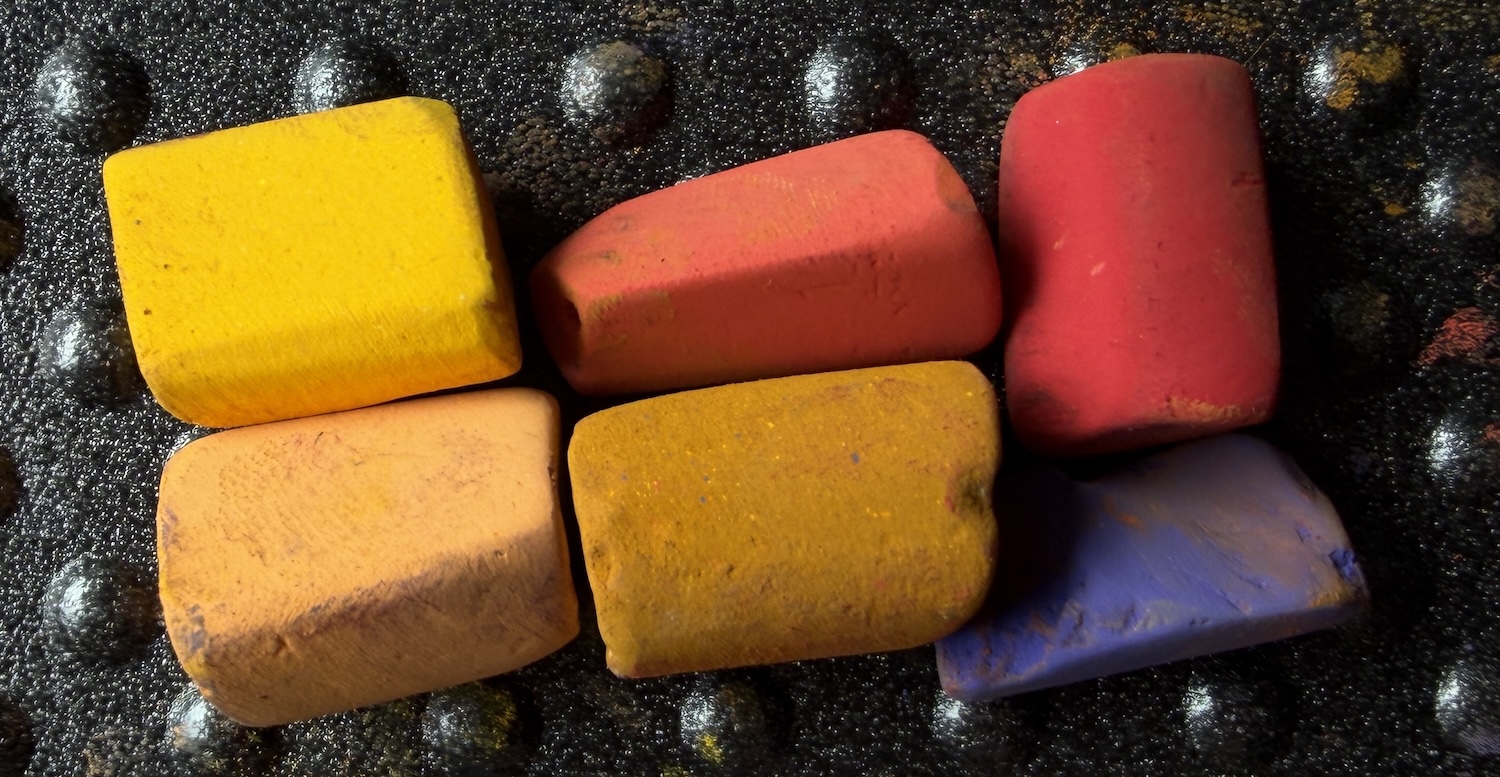
There are countless ways to introduce creative constraints in painting, whether that’s limiting your palette, cropping your reference, or simply giving yourself less time.
- What happens if you limit your colours to just a handful of pastels?
- What happens if you dramatically crop your reference?
- What happens if you give yourself only 15 minutes?
- What happens if you paint the same subject several times, changing just one thing each time?
- What happens if you deliberately choose colours that bear little resemblance to your reference?
You don’t need to adopt any of these as permanent rules. They’re simply opportunities to explore.
And sometimes, by taking away a few choices, you discover possibilities you hadn’t even considered.
A little workshop surprise!
One of the things I love about teaching workshops is seeing how differently artists respond to the same exercise. We all bring our own experiences, preferences and ways of seeing to the easel.
Give a roomful of artists a constraint and watch how many different solutions emerge. And look at some of the different directions they took!
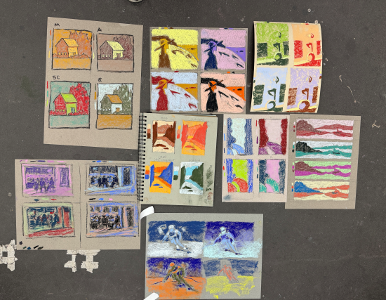
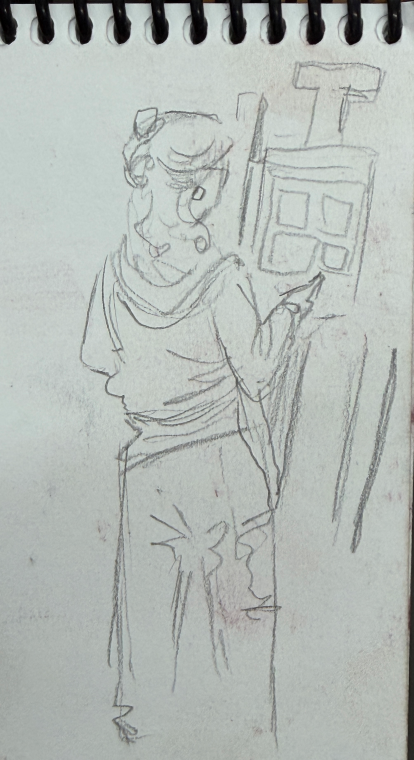
And while I was busy demonstrating, one of the participants, Levi, was busy sketching ME!
A huge thank you to everyone who joined me for the workshop and for all the staff at Dakota Art Pastels (thank you April!). What a pleasure it was to spend three days exploring, experimenting, and making limited palette discoveries together!
Over to you!
Next time you’re feeling overwhelmed by possibilities, try giving yourself a limitation.
Take something away. Change one thing. See what happens.
You might surprise yourself!
Have you ever deliberately limited your choices when painting? What happened? Or is there a creative constraint that you’re now tempted to try?
I’d LOVE to hear about it. Leave a comment below and let’s get the conversation going!
Until next time,
~ Gail
P.S. A little surprise at Dakota!
While I was there, I got to see the NEW cover of my Unison Colour pastel set for the very first time! Naturally, I had to take a photo. 😁It’s a bit skewy because I took hurriedly. 🤷♀️
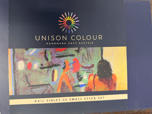
The pastels I used at the workshop were from this set. If you’re curious about the set, why I chose these particular colours, and how it all came about, you can read the original blog.











![Pastels on black aper: Gail Sibley, "Untitled [at this point], Mount Vision pastels on Sansfix pastel card, 5 1/2 x 7 3/4 in](https://www.howtopastel.com/wp-content/uploads/2016/04/IMG_9649-2-150x150.jpeg)