Sometimes a small study has already told you a great deal about the painting you want to make. The question is whether you’ll trust it.
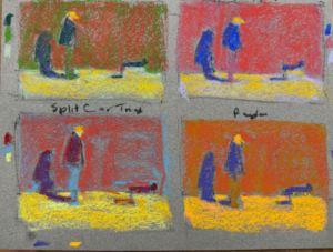
In my previous post, Creative Constraints in Painting: Is Less More?, I shared how, in my recent workshop with Dakota Art Pastels, I used one reference photo to create four small pastel studies. One of those studies immediately appealed to me more than the others.
So I chose it and demonstrated how I build a piece.
Once home, I started wondering: what would happen if I took that pastel colour study beyond the demo experiment and developed it into a finished painting?
Could I make the painting larger and richer without losing what had attracted me to the study in the first place?
If you haven’t seen that post, have a look first. You’ll see all four colour experiments, the constraints I was working with, and why this particular study was the one I wanted to pursue.
The idea I wanted to keep
This was the pastel colour study before and after I built it up.
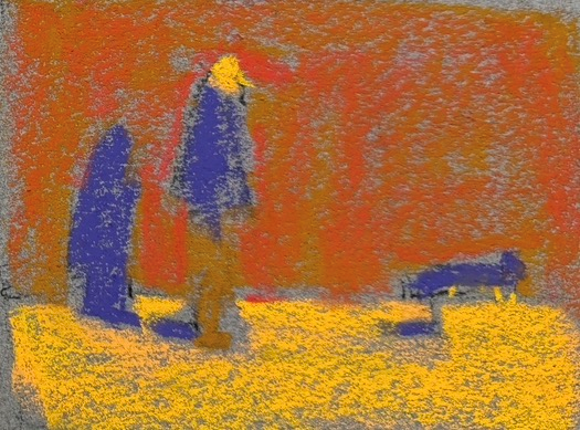
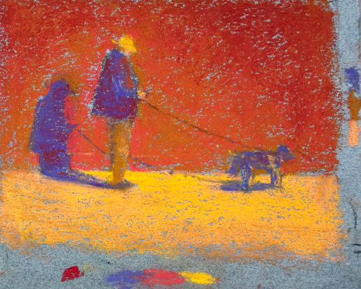
What interested me wasn’t simply the colour. It was the design: that large warm wall, the dark figure and dog, the exaggerated cast shadow, and those small but important notes of yellow echoing the yellow in the pavement.
Before beginning the larger painting, I didn’t ask, ‘How can I improve this?’ Instead, I wanted to ask something quite different:
What is it about this study that I don’t want to lose?
That became my guide.
Back to the source
Here’s the reference photo.
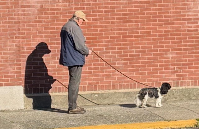
There’s plenty of information in the photograph, as there always is. Bricks. Clothing. Pavement. A dog. Architectural details. A man who, to me, seems to have stopped for a moment to look at his phone.
But I wasn’t particularly interested in copying all that information.
The reference gave me the subject. The study had already begun telling me what the painting was about.
Start with design
Underneath all that colour was the original design.
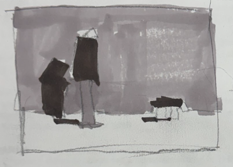
This is the thumbnail the class chose from the options I’d created for the painting. The thumbnail helped me return to the big shapes of value rather than getting distracted by the subject matter.
The wall.
The figure.
The dog.
That wonderful cast shadow.
I wanted those relationships to remain strong as the painting developed.
Vine charcoal first
I transferred the design to my larger surface using vine charcoal.
At this point I’m not trying to draw every detail correctly. I’m establishing placement and, most importantly, the main shapes. The thumbnail has already done much of the thinking for me.
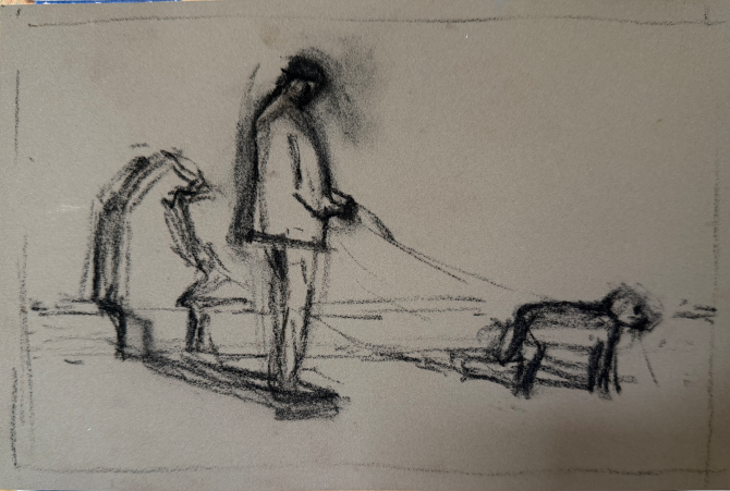
And then came the part I was particularly curious about.
Rather than reaching into my pastel boxes and starting again, I went directly back to the colours from the original study.
Trusting that first layer
The first layer follows the colour decisions I’d already made in the study.
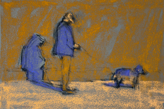
That sounds almost obvious, but it can be surprisingly tempting when we begin the ‘real painting’ to abandon what we learnt in the study. Suddenly there are more colours available. There’s more room. We can see more detail. And before we know it, the simple little idea that excited us has become much more complicated.
I wanted to resist that.
And then the second
The second layer brought me essentially to the same place as the original two-layer study.
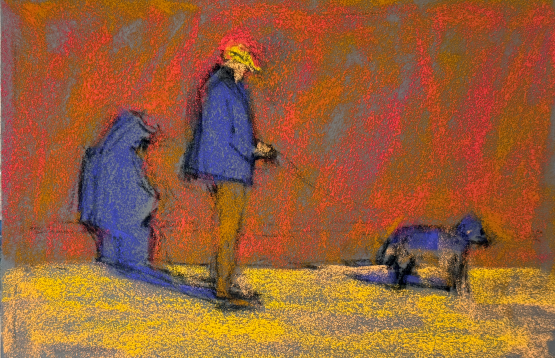
Up until this point I knew what I was doing because I was following the decisions already made in the study.
From study to painting
From here, I was asking: How much can I develop this painting without losing the original idea? And without adding many more colours? (I did end up adding two more colours.)
As I worked, I clarified shapes, built the colour, suggested more of the wall (without feeling the need to describe every – or any – brick!) and gave the figure and dog just enough information to make them readable. But I kept returning to those original relationships…
The warm wall needed to remain dominant. The dark, cool figure and cast shadow needed to hold their own against it. The yellow needed to stay potent.
And I certainly didn’t want detail to take over from the bigger design.
A limited palette…with a little flexibility
And here’s the rather small cast of characters responsible for the finished painting! The pastels are arranged from light at the top to dark at the bottom. You’ll also notice the stick of vine charcoal I used.
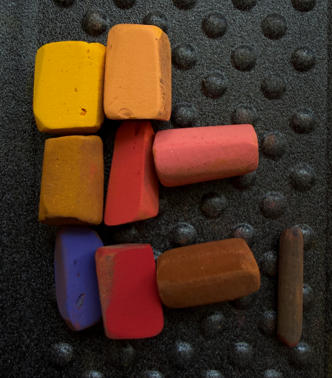
The pastels standing vertically are the colours I began with, the same palette used for the study. The two horizontal pastels are the only colours I added as the painting developed.
Remember, when we talk about creative constraints, that a constraint doesn’t have to become a rule you’re afraid to break.
The original limited palette had already done its job. It had created cohesion, forced decisions, and established the colour world of the painting. Adding two more colours later didn’t undo that. I added them because the painting needed them.
Did I keep the spark?
When I look back at the little study and then at the finished painting, the question I care about most is not: Did I make it look more like the photograph?
Rather, it’s: Did I keep what made me choose that study in the first place?
I think I did. And here it is alongside the original built up colour study: “A Brief Pause.”
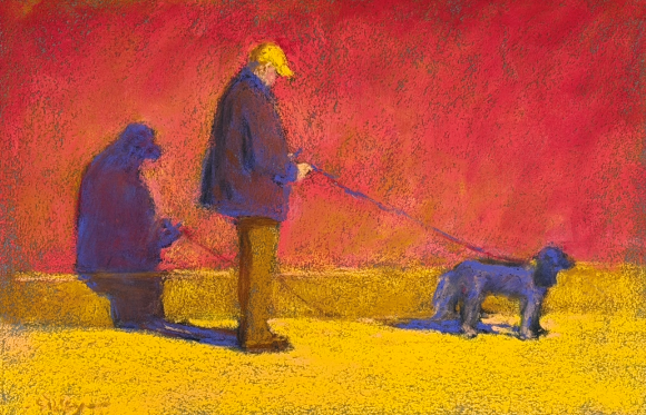
The painting has more information now, certainly. But the large shapes, the strange and limited colour world, the relationship of the figure and dog to that great expanse of wall and each other, and the dramatic shadow are still strongly there.
And perhaps that’s the real value of a pastel colour study. It isn’t simply a preliminary exercise you finish and put aside. Sometimes it contains the very thing you need to protect.
So here’s my challenge to you: pull out a colour study that still makes you sit up and take notice. What was it that excited you about it? And what would happen if you took it further while deliberately protecting that first spark?
And I’d love to know:
Do you make a pastel colour study (or two!) before beginning a larger painting? Have you ever loved the study more than the finished piece?
Tell me in the comments!
Until next time,
~ Gail
PS. I filmed the painting process from the second layer onwards. Once the video is ready, I’ll add it here and let you know!