
I’m a huge fan of the pastel paintings by Bill Cone! Truth be told, I was slightly anxious about reaching out to ask him if he would consider contributing a guest post to HowToPastel. But I did and, oh my, he said Yes!! I can’t wait to share his words of wisdom with you!
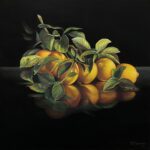
Before we get going, a teaser image and a wee bit about Bill Cone. (He took my request for a really short bio literally!)

Bill Cone Bio
Bill Cone has been creating landscapes in pastel for over 25 years. He lives in the San Francisco Bay Area. He teaches a few workshops a year and exhibits periodically.
You can see more of his work on Instagram.
Now here’s Bill! (Note his I-had-no-idea-he-did-this! career.)
~~~~~
Notes on returning to the scene of a crime…
My early art career for almost 10 years was as a commercial illustrator. I then worked in computer animation as a designer for almost 30. I fell into using pastels and painting on location in the late 90s. This was when I was working at Pixar Animation Studios on the film A Bug’s Life. I’d started a few years earlier as a set and prop designer on Toy Story under the art direction of Ralph Eggleston.
I was greatly inspired by Ralph’s lighting studies for Toy Story. They were created with the luminous medium of pastels and I was determined to carry on with that medium and do something similar for A Bug’s Life.
An initial stumbling block for me was that I hadn’t used pastels at all since a figure class in art school, some 15 years earlier. In order to get up to speed with this dry, crumbly medium, I started practising outside of work hours – at lunch, on the way to work, on the way home, on the weekends, and on vacation. I was driven by a mixture of fear of failure, along with the desire and excitement to understand and get better control of the process.
After about 6-8 months of working out of doors in my spare time, solely with pastels, I had much more confidence and control. I also experienced a slow epiphany, that painting outside in nature was like being in an eternal classroom of sorts, with an ever-changing display of light and colour to inspire, challenge, and teach me as an artist.
Painting outside was far more inspiring than working from photos off of the internet. Ironically, my use of pastels and the inspiration of painting in nature was really triggered by this need to do lighting studies for an animated film around 1996.

Working outside, I began to notice how the colour and value structures of what I was studying would vary throughout the day, due to the angle and colour temperature of the sun, as well as the weather. By sitting still and observing nature, one could literally see the shadows move, and the colour of the light evolves from warmer to cooler, or vice-versa, depending on the situation.
I recognised that Claude Monet’s studies of haystacks and the Rouen Cathedral were documenting the same effects of light and colour over a hundred years earlier. I not only felt this connection deeply but realised that every artist who paints in nature could discover for themselves the same timeless qualities and principles through their own efforts. It doesn’t come from a book – it comes from practice and immersion.
Depending on what’s happening in our lives and what we have as obligations and priorities, it’s a real issue to find when and how we can ‘immerse’ ourselves so to speak.
I tend to see the practice of art, unless one is already a full-time professional, as a form of exercise, like working out every day. It’s something that takes time and effort but can be readily integrated into one’s day and one’s life. And towards that end, the idea of re-visiting a convenient and inspiring spot to work begins to take hold.


Not only is there a long-established tradition of such a practice but there are also practical reasons for painting in the same spot. You may paint close to home, perhaps even your backyard or a local park. At any rate, those decisions and choices are up to each individual. Practising art requires some effort and is less of a leisurely pursuit than some might imagine.
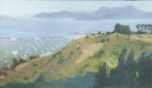
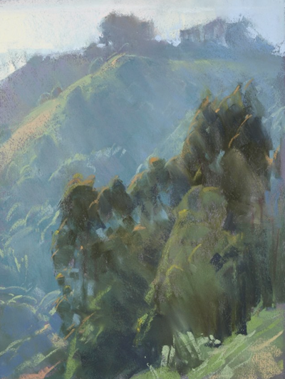
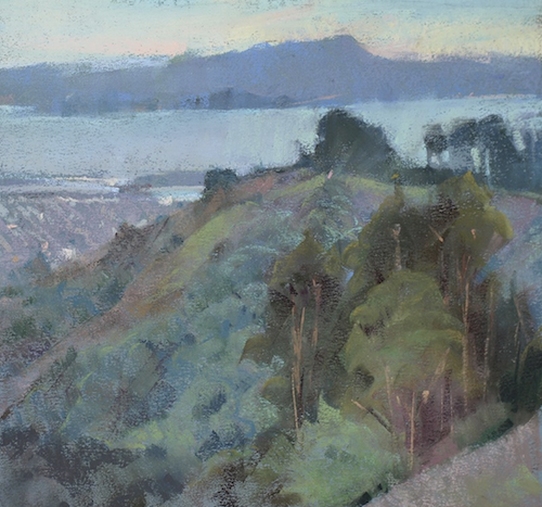
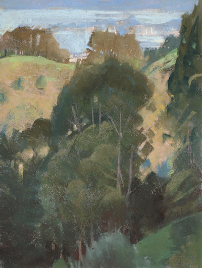
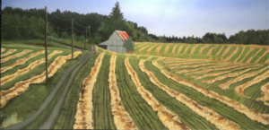
In this post, I’ve included a selection of pastels that I’ve painted in roughly the same location over the past 25 years.
It’s a wide turnout along a road in the Berkeley Hills, big enough to pull over and set up your gear. In fact, it’s big enough to host a group of students which I’ve done numerous times. It looks to the west, down into Emeryville and North Oakland and across the bay to San Francisco and Marin County.
There is a multitude of reasons, from the practical to the artistic, to return to a source of inspiration. Each visit is never exactly the same and the more one returns to a spot, the more you begin to catalogue the reasons why that is.
Here are a few:
1. Time of day: The Earth is rotating with us hapless artists upon it for the ride. Therefore, the angle of the sun, with respect to our view, changes constantly throughout the day. This makes a huge difference in the value structure of your image as well as to the colour.
2. Weather: Is it sunny or overcast? Foggy or crisp and clear?
3. Seasons: Are the grasses green or dry? The trees barren or full of leaves? Has the foliage altered? Has it grown significantly, is it in bloom, or fallen or cut? Is it wet or covered with snow?
4. Atmosphere: The character and colour of the air, literally the space between us and other objects, plays a powerful role as it contains dust, gases, and moisture. These all contribute to the way light and local colour is filtered on their way to our eyes. For several years, I primarily focused on painting atmosphere, specifically the colour jump between objects near and far. I was fascinated that local colour could change so much just by being further away in space.

5. The Artist: Yes, YOU! Our moods, focus, interests, health, age, and experience change over time. We are not the same from day to day let alone year to year.
These qualities and others will be reflected in your work every time you go out.
Touching back on the concept of art as a form of study and exercise, I’m reminded of the song title: When I Paint My Masterpiece. When I go out to paint, I don’t have such a lofty idea in my head. I’m generally excited to focus and get down to work but I can’t predict the result. I’ve come to realize that if I paint 10 paintings, I will usually find about half to be better than the others. It doesn’t mean the rest are horrible, but that I can (subjectively, of course) pick out the hierarchy I’ve described. The top 5 usually are sold over time and the rest sit in folders. Some may make their way to the trash bin after a few years.

However, just because I judge a piece not worthy of selling, doesn’t mean it lacks emotional or educational value for me. There’s a variety of reasons to hang on to work as well as sell it. Sometimes my batting average is worse and sometimes better, but it has been fairly consistent for quite some time. Oddly enough, some paintings that I did not like at all when I did them, slowly redeem themselves years later, so one has to accept that our judgement is not only subjective but also based on what/who we were when we made those decisions… If we change our minds later, and the artwork hasn’t changed at all, then we must have changed!

I urge folks to find spots they can return to regularly that provide something of interest to paint. Study those locations at different seasons, weather, and times of day, and then periodically take a look at the differences between the work you do to help you understand what is going on and why. You may come away with a renewed appreciation of what nature has to offer, as well as a deeper understanding of the ephemeral, infinite character of light and colour.

A note on paper: All the pieces are on Canson Mi-Teintes paper using the smooth side. The early ones were done on the colour “Twilight,” but they stopped making that colour at a certain point, so I had to adapt to other, more varied, colours.
~~~~~
I don’t know about you but I’ve been completely inspired by Bill Cone and his art and words!!
I have returned to specific locations but I often get the feeling I’m just repeating myself. Seeing Bill’s work and hearing his reminders makes me want to get out there and paint a familiar scene again. I think having a scene that inspires you is super important! You need to be curious to see and paint the changes Bill talks about.
Now it’s your turn. Do you have questions or comments for Bill Cone? Let us know your thoughts!
Until next time,
Gail
PS. Here’s a link to Bob Dylan’s song When I Paint My Masterpiece


12 thoughts on “Bill Cone – On Returning To The Same Location”
Thanks for sharing your beautiful art, and the history of your passion.
Thanks for this and all of your blog posts, Gail! These paintings are SO lovely! I keep zooming in on the wonderful hazy radiant light, trying to determine if Bill layered “grayed” light colors, or if he layered more saturated light value colors. I’d love to know what some of his favorite brands of pastels are for depicting this hazy and beautiful light. Thanks, Lori
Thanks Lori! And I know what you mean about that gorgeous hazy light that Bill achieves in his work!
I’ll let Bill answer your question about pastel brands 😁
Hi Lori, Bill Cone here. Thanks for your kind words. Layering the colors is key to getting more complex colors. In this medium, my general assumption is that I never have the ‘right’ color out of the box, so am often in a state of ‘improving’ the color relationships by adding another color to an existing area. One generalizes value structure, and color temperature, then refines those behaviors with more work.
I currently primarily use Terry Ludwig and Blue Earth, both are unwrapped, rectangular sticks with the Blue Earth about 2/3 the size of a Ludwig stick. Terry Ludwig Pastels use a lot of atmospheric color blends that make it easier in landscape to push elements back in space without excessive mark making. Blue Earths have a useful mix of lights and darks to grays within a box of any hue. In the past I’ve used Unison, Schminke, the glassine wrapped Sennelier, Mt. Vision, and Great American. I am not fond of the unwrapped, half-stick Senneliers, because they are usually slightly curved, so out of the box, you can’t use them on their sides very well.
I have always loved his work, for the quality of light, atmosphere, shapes and colors.
Yes, yes, yes and yes Marsha!!
Thank you Bill (and Gail). I placed Bill high on my list of inspiring pastelists years ago so was excited to see this interview. Your subjects are in my neighborhood so the views, your catching the light, and color are wonderfully familiar. Thanks again for sharing.
How lucky you are Kathy to see the views Bill has painted and so see them through Bill’s eyes. Wonderful!!
Hi Bill! I’m thrilled that Gail has highlighted your exquisite works here. I’ve been a fan for years [and even asked you to come teach a workshop for the Pastel Society of North Carolina a ways back!]. At that time you said you were waiting to retire and then COVID got in the way. So I can only assume that you have indeed retired by now. Would love to hear what your teaching schedule looks like now. And how much you still get out to Plein Air paint.
A true fan of your works,
Laura Pollak
Ohhhh great questions! Thanks Laura!
Maybe the most useful post for me. Thank you…it might loosen me up!
So good to hear Teri!