

Sometimes, if you’re working with a small set of pastels, you won’t have a large assortment of almost whites i.e. very light colours – light blues, greens, pinks, yellows, mauves, or oranges. So if you’re painting a white object, what should you do when you have such a limited palette? One good thing is you probably have a white stick of pastel in your set. But how can you make one white pastel stand-in for all the white areas? In this video, you’ll see just that. I want to show you the possibilities of painting a white object with colour!
Have a look:
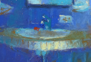
Now, as you saw, I only used eight pastel colours including Grey 27 (which is actually not even pure white as you can see in the image of the pastel below. Just look at the colour of the paper wrapper compared to the pastel colour!

Think of white – what colour is it? Well it’s the colour of all light together. Use a prism and white light separates into a multitude of colours. But in paint media, white is the absence of all colour. Confusing huh? Think of it this way, painting a white object with colour pastels means reuniting all those colours of white light into the resemblance of an object on your paper which will be perceived as white.
The thing about a white object is that most of it won’t actually appear white. White will reflect any colour around it – be it the sky or an orange close by – and thus white can be colourful. The thing is, you need to look carefully. At first glance, you may think you see just variations of grey in the shadows, but look deeply and beyond that superficial glance you’ll see the colour that’s really there.
Much of the colour you see will also be dependent on the light source – an indoor light will produce different colour light than the sun. Outside, sometimes the shadows in a still life (or landscape) may be more blue/purple. Indoors, shadows may look more green. And are the highlights really pure white? They too will reflect surrounding colours.
Look closely at the white object and see the colours within – think red and see if there are any parts of the white leaning towards red. What about blue? Any blue leanings? And what about yellow?
See those colours and apply them to your paper. The idea here is to create a colourful underpainting. As you saw in the video, this doesn’t always mean you can stick with the right values at the start because of course, all the light areas will be a light value and the only light you may have is that white stick of pastel!


After applying colour, you will then use that white stick to lighten everything that is light and bring those areas closer to white. But you saw in the video that the addition of white removed all the vibrancy and saturation of the colours and made it all a bit chalky-looking. So it will probably be necessary to go back into the painting with colour. And then use the white again, and build up the look of colour within the white object. Remember to reconnect with your three values and work the painting within your value map when you start adding layers.
Pick a white subject. Then experiment using small pieces of paper and a variety of different colours, then cover all the areas that should be light with white. Then work up the layers. Play around with moving from subtle shifts of neutrals (you can add a complementary layer to grey the purity of a colour) to exaggerated colour.
In case you need reminding, you are the artist seeing with artist’s eyes. Bring what you see to the world, in this case, painting a white object with colour!

Did you find this post about painting a white object with colour helpful? What are your struggles painting white subject matter? I’d love to know so please leave a comment.
Until next time (and I can hardly wait as it’s a guest blogger who I can hardly wait to introduce!),
Gail
PS. In an earlier post, I showed this painting step-by-step. My theme there was that a lack of colour choices can open your creativity!


![Gail Sibley, [Not yet titled], Unison Colour pastels and a Sennelier pink on UART 400 mounted on board, 15 1/4 x 11 1/2 in -close up of face](https://www.howtopastel.com/wp-content/uploads/2025/07/11.-Gail-Sibley-Not-yet-titled-Unison-Colour-pastels-and-a-SEnnelier-pink-on-UART-400-mounted-on-board-15-14-x-11-15-in-close-up-of-face-Feature-image-150x150.jpg)

![Pastels on black aper: Gail Sibley, "Untitled [at this point], Mount Vision pastels on Sansfix pastel card, 5 1/2 x 7 3/4 in](https://www.howtopastel.com/wp-content/uploads/2016/04/IMG_9649-2-150x150.jpeg)


20 thoughts on “Painting A White Object With Colour”
Hi Gail…
Just loved this video…
Brightened the beginning of my day!!!
Bless you.
Mustafa.
Mombasa, Kenya.
Mustafa, and you brightened mine with your so kind comment!! 😀
I Love how this came out for you. I’m not sure I would see all those colors on that box… I know it was subtle and you exaggerated… but still!! Guess I will have to learn to see more colors in things!
Thanks Gisela!! With seeing colour, try like I say, putting on your red filter lens – just say it and you’ll start to see the things that are more red in your subject. Then do the same for the other primary colours. Then start to compare parts of the painting: is that darker or lighter than that part? Does it lean more towards yellow or blue? Stare at an area with eyes open wide and you will start to see the colour emerge!
merci c’est vraiment intéressant et gai et cela donne envie d’essayer !
Merci Nicole! Je suis impatient de voir ce que vous faites 🙂
What a wonderful and eloquent explanation and guide for understanding and using white, the color of light together.
Awww Gailen, thank you for your soooo kind words!!
Enjoyed that wee tutorial Gail, thankyou I will look forward to future lessons
Glad you liked it Pat. Have you seen the other videos on my YouTube Channel? I sure hope to make more mini-lessons in 2018!
Thank you for posting the demo. It’s very timely for me since I’m studying values. I will watch the video again and again.
Tena that’s wonderful to hear. I hope to have an online course on Values ready sometime in 2018!
Very well expressed and demonstrated . I think you could have lightened the shadow areas of the tissue. To me they are too bold . Possible by lightening the edge areas going into the more bold darker would solve this. A sort of molding – sculpting light into dark so that the shadows have a gentile depth.and fading into the darkest depth of the fold.
Love your effervescent personality. It really gives the viewer a welcoming & friendly outreach in your overall presentation. Good painting & good job!
Alan
Thanks Alan for your perceptions about the piece. Your ideas are good. I do remember that the shadows were quite a clean transition from light to dark but certainly with more time (this was about 30 mins), some transitions may have been more fine-tuned.
Glad you enjoy my presentation – trying to be more ‘me’ on camera 😀
Fantastic! Your video is extremely helpful and so inspiring. I love your animated expression of describing your process; you are so enjoyable and delightful to watch. I like your “bloopers”/out-takes at the end as well, very funny. Not to mention, your tissue box painting is really, really impressive! Thank you Gail for sharing your talent and expertise!
Berdine THANK YOU for your compliments!! It makes me joyful to know that what I do is helping and inspiring you and others. Thank you!!
Thanks for another great video, Gail! It’s somewhat similar to what I’m doing with the sea foam – exaggerating the underpainting and block-in colors, being more concerned about value and temperature first, then refining them and adding highlights later.
Glad you enjoyed it Lana! And yes, you do work in a similar way. Pastels are so wonderful in the way you can be bold and then add another layer to temper that boldness if necessary. Thanks for commenting 🙂
Hi Gail,
First time commenter here.
I’m an oil painter who hasn’t yet taken the pastel plunge but I’m nearing the edge of the pool. Great demonstration. It reminds me of Henry Hensche’s color block studies. Thank you for sharing.
Onwards and Sideways,
Jay
Hi Jay, so glad you commented. Please do dip your toe into the soft pastel pool – it’s mighty fine in here 🙂
I like the thought of Henry Hensche! Here’s a link for anyone interested.