When it comes to small details with pastels, one of the questions I’m asked most often is, “How do you get those tiny marks?” Students usually assume I’ve switched to a pastel pencil – something sharp, neat, and precise. But even at the final-details stage, I’m still holding a big, chunky pastel stick. I’ve just found the particular edge or corner that will give me the mark I need.
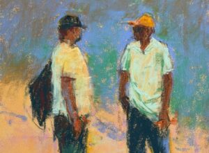
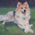
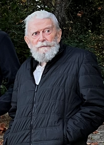
For this small pastel portrait of my friend Sandy, I began with a reference photo that looks almost black and white. What caught me wasn’t colour at all (obviously!), but the gesture: the tilt of Sandy’s head, the solidity of his body with hands in pockets, and that slightly surprised, alert expression on his face as he looks at something beyond me. That was what I wanted to hold on to as the painting developed – not every wrinkle or hair, but the feeling of that moment.
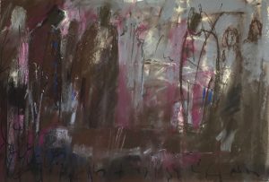
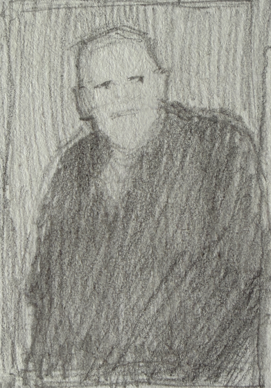
I started, as I usually do, with a small thumbnail. Before thinking about colour or detail, I wanted to understand the large shapes: the pale head and beard, the dark mass of the jacket, and the surrounding background. As you can see, I chose to lighten the background into a middle value.
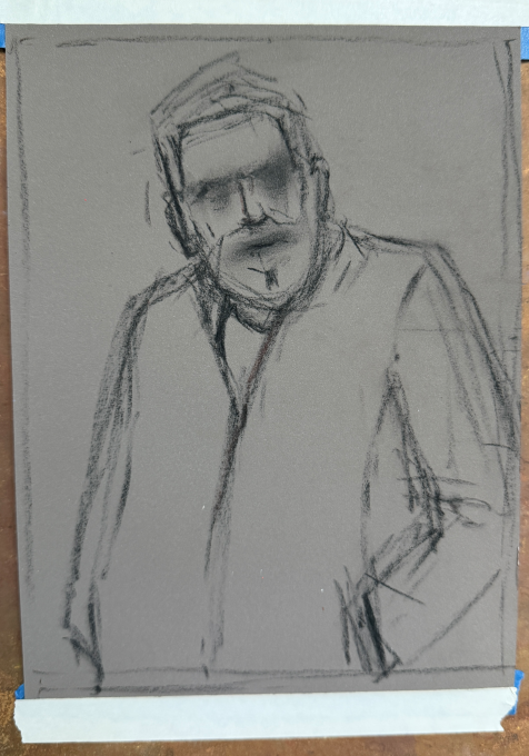
From there, I moved to a loose vine charcoal drawing on Pastelmat, keeping the marks open and searching rather than careful and final. The details could come later. First, I needed the structure, the gesture, and the big relationships in place.
With the first layer of colour, I was still thinking in large shapes. The jacket became a big mass of blue, the background a field of green, and the head and beard a pale warm shape sitting inside all that cool colour. Even though the face is where our attention naturally goes, I try not to rush into “features” too soon.
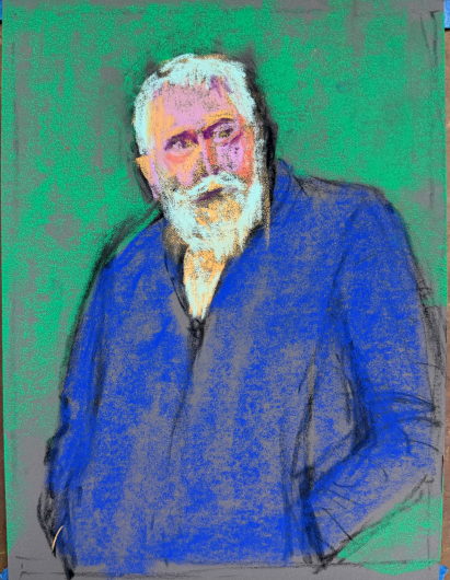
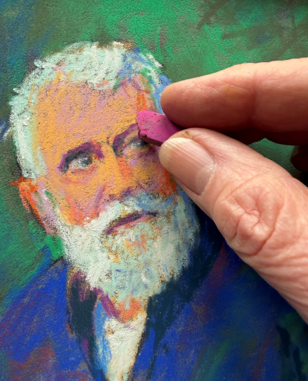
As I began working into Sandy’s face, I was looking for the expression. The eyes, brows, nose, beard, and mouth all matter, of course, but they need to serve the gesture and that slightly surprised and intense look that caught me in the first place. This is where small details with pastels begin to appear but they’re still really just carefully placed shapes and marks.
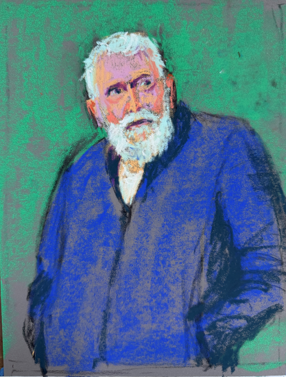
Next, I turned my attention to the background. A flat wall of one green would have felt a bit dead, so I started breaking it up with related greens and darker marks including a touch of the blue used in the jacket. I didn’t want the background to become busy, but I did want it to have enough life and movement to support the figure. I also brought some of the background green into the blue jacket.
As the painting developed, I added blue into the upper left corner. This helped contain the image and keep the viewer’s eye from drifting out of the painting. The blue also visually connected the jacket and the background. I added small flashes of orange, especially lower down, to give the eye a reason to travel beyond the face and move around the whole piece. These colour echoes help connect the painting from top to bottom.
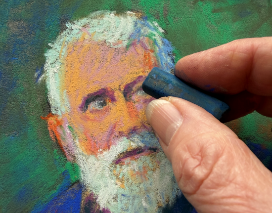
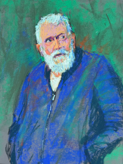
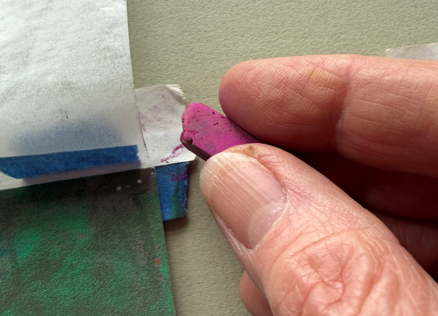
At this point, I thought the painting was finished. But when I came back to it later, something about the eye on the right bothered me. It wasn’t wildly wrong, but it wasn’t quite right So I went back in — not with a pastel pencil, but with the same big, chunky pastels I’d been using all along.
Before touching the painting, I tested the edge of the pastel off to the side so I knew exactly where the point was. That’s the trick: I’m not using the whole stick. I’m using one tiny edge, corner, or broken point. The correction wasn’t perfect, but it felt better. And sometimes “better” is good enough.
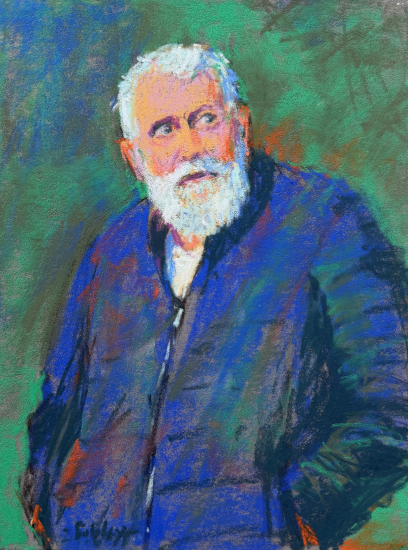
After the tweak, the painting felt more settled to me. Not necessarily perfect but closer to the feeling I was after. The eye seemed to sit more believably in the face, and Sandy’s expression still had that alert, slightly surprised quality that had caught me in the first place. That’s often what I’m looking for at the end of a painting: not a flawless rendering, but a clearer version of the original spark. And since I wasn’t trying to make a precise portrait of Sandy, but rather capture a man with an interesting expression and pose, I could let go of the need for exact duplication of features.
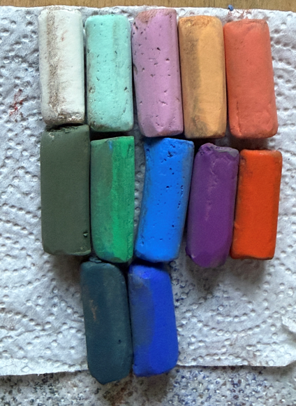
Here are the Sennelier pastels I used for the painting. They’re soft, chunky, and definitely not what most people think of as detail tools. But by turning the stick, testing an edge, and placing the mark with care, even these generous blocks of colour can create surprisingly small marks.
So yes, you can create small details with pastels even when the sticks in your hand are large, soft, and chunky. You don’t always need a smaller tool to make a smaller mark. The key is to look for the usable edge or point, test it before you commit, and be brave enough to place it.
Have you ever surprised yourself by making a tiny mark with a not-so-tiny pastel stick? Or do you instinctively reach for a pastel pencil or a harder pastel with a point? I’d love to hear your thoughts in the comments!
Until next time,
~ Gail