I love love LOVE looking at other people’s pastel work! And because this is such a pleasure, it’s also a treat to share some of these awe-inspiring pastels with you each month. I collect so many wonderful pieces through the month and then it comes time to select 10 of them to analyze and share with you. Hope you are both awed and inspired by them!
By the way, make sure you check the size of all of the pieces. They all look the same scale here onscreen, but in reality, they are not!
Here we go with this month’s awe-inspiring pastels!!

When I first saw this piece, I thought of oceans and oil rigs. It was about the vastness of sky and sea and man’s influence on it. And then I realized I wasn’t looking at that at all. I could see a house-like structure on the far right and then what else? Scaffolding? I wasn’t sure. It wasn’t until I read the title that I understood what I was looking at – hay wagons. And then I was instantly taken to paintings of the past by say Millet, Constable, and even Van Gogh. Why do I tell you this? For two reasons. The first is that I was drawn to this painting because of its painterly qualities of composition, of value, of colour, and particularly of mark-making. It didn’t really matter what the subject was – I was already hooked by the form of the piece itself. And second, once I did know what the subject was, it was instantly connected to the vast history of art that has gone before, paintings that include hay wagons and those working around them.
The painting is primarily a monochromatic study in blues. Without the confusion of colour, this gives the values a chance to be easily read – the darks, the middle values, and the lights sit securely. The place of greatest contrast is the nattering of the hay wagons in the distance against the light sky. Our eyes are taken there but they continue to examine the rest of the piece with its restless and agitated marks that sit in the simple composition of three horizontal bands. I find my heart surges when I look at this piece – so much expression of feeling created out of a simple colour scheme, values, and marks rather than a detailed subject and a dependence on colour. And still, I see the vastness of land and sky and humanity’s small place in it. Consider the actual size of the piece – it may surprise you.
It appears that Amy Szwaya does not have a website but you can see more of her work on her FaceBook profile.

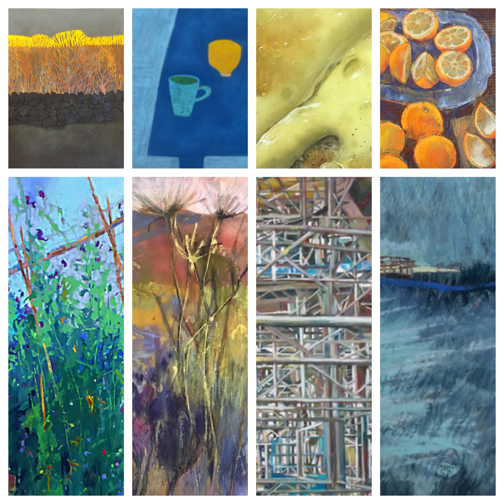
Still in blue mode, I rather swooned when I saw this painting. Two blue tables sit with items on them. Simple yes? But not so simple with a closer look. The tables are slightly skewed perspective-wise. A few objects sit atop these blue fields. What do these objects represent? Why have they been chosen? Certainly, they are everyday objects, ones we might take for granted during our daily activities. Little overlap brings our focus to the shapes, colour, and the evocative nature of the objects themselves rather than placing us in the illusion of space and a specific place. It’s clear that these items haven’t been distributed randomly but instead have been considered carefully in their placement.
There’s that surprise of yellow against a sea of deep blue but our eyes move to the texture of flowers and the whiteness of the pitcher against the dark. Spaces beneath the table bring us forward and in contact with the painting’s border. Our eyes shift left to the other lighter table with its bunch of hyacinths tied with a thin band of red. This thick bunch contrasts with the openness of the other arrangement. It gives weight where there is less weight in the colour of the table. The second white object echoes the shape of containers on the right table and also connects with the colour of the pitcher. And so we explore all parts of the work. The shape of space becomes a major player here – the spacing and space between objects and the space around the larger tables as they intersect with the perimeter of the painting.
The colour is rich, dense, and luscious. The flat pattern, a design of hard edges, manages somehow, in its deliberation, to move beyond decorative. I am reminded of the often colourful and simple setups of Milton Avery and the still life paintings by Joe Plaskett.
See more of Angela A’Court’s work on her website.

From the flat panorama of A’Court’s piece, we come to the agitated chaos of this painting by Sheila Goodman. Taking up a good portion of the painting are a mass of plants arranged in a kind of randomness (think Gertrude Jekyll and her gardens designed by colour and texture and her contemporary William Robinson with his focus on wilder more natural-looking gardens). They sing with blues and greens punctuated with high notes of yellows, pinks, and purples. Further in, the green of the lawn and the borrowed landscape of trees, and also the blue of the sky, echo the primary palette of the painting. And beyond, barely visible, we discover with delight and a clap of our hands, two small figures apparently conversing. Our curiosity is piqued! Who are they – gardener and owner? Two friends? And what kind of conversation are they having? World affairs? Garden design? Secrets? They stand in the sunlight, bright against the deeply shadowed and rigidly pruned hedge. The hedge’s hard line and solid shape provide a grounding to the piece.
A similar structural element comes from the stakes that hold up the clambering plants. The poles are delightfully off the plumb lines of a strict grid and so add movement to what might otherwise be a rather upright framework. Instead, their imprecise stance reiterates the chaotic planting that together gives a loose tapestry effect to the garden. And once we establish our relationship with the garden, we begin to investigate the plants themselves, trying to make out what’s what. Ahhh sunflowers not initially noticed are clearly visible to us on a second look. As is the hidden netting that in part holds the plants up.
A delight of rambunctious and rich greens and blues spiked with splashes of warm colour, this painting can’t help but engender a feeling of joy!
See more of Sheila Goodman’s work here.

From the intricacies and intimacy of the garden and accompanying conversation, we come to the broad strokes of this painting by Norma Stephenson. This abstracted vision of the landscape – the dales – is all about composition and capturing the essence and feeling of a scene. Initially, we see a field of colour and marks. A sharp line appears rising from the bottom, then assuming a greyed brown cloak, it divides the canvas almost diagonally. It’s not a straight line though. With slight curves and interruptions, it makes its uneven way across the composition and disappears as it approaches the top. Looking more deeply and with more observation, all of a sudden the line becomes a road, journeying across a desolate landscape. The interruptions of the line are now understood as the road meanders its way over the roll of a hill and then another, and soon it vanishes in the distance.
And all of a sudden what was once a flat abstract painting has become a landscape with the illusion of depth. The saturated downward moving colours that inhabit much of the painting now resolve into a foreground that presses towards us. The imagination of this viewer is stirred! Are those yellow specks in the distance originally thought to be dots echoing the yellow mass in the foreground and harmonizing for a better composition, now seen as indications of human habitation? This is a lonely vast place. Stephenson has delivered its pattern and mood rather than representing it more naturally with form of light and shade. She has divined its essential nature.
Check here to see more of Norma Stephenson’s work.

In a similar square format as the painting above – though much smaller – and with a similar essential palette of blue and yellow, here our view is intimate rather than expansive, taken as it is from within the wild tangle of plants along the roadside rather than as an overview from above. Blackberries, teasel, and Queen Anne’s lace all make an appearance. But the type of plant is only important to those who might wish to identify them. More important is the design and pattern they bring to the piece.
I find myself oscillating between the depiction of the road winding away from us to distant hills framed by the various roadside plants, and the surface of the painting itself – the textures of marks, the pattern of shapes and use of negative space to create them, the jerkiness of line, the scrumptious colour, the use of lights against darks and vice versa.
There’s something here that brings up a remembrance of childhood – the hedgerow illustrations by Molly Brett in books I read when oh so young. Funny what a painting can remind you of, what memories it can evoke. There’s just something warm and joyful about this piece!
See Judy Tate’s website for more of her work.

From the expressionistic scene above, let’s savour this more graphic depiction of a slice of landscape in the path of the setting sun. We come upon that moment on a grey overcast day when the sun slices through clouds and casts its warmth along whatever it finds, and a viewer’s breathe is stopped at the beauty of it. Here we find a landscape more tamed, more under the influence of human hand. The pattern and pictorial nature of the work with its neat compartments underlines this message.
At an abstract design level, the piece comprises of five horizontal strips – the ground, the wall, the trees in shadow, the trees in light, and the sky. Each plays a role, showing us a certain aspect and idea. The ground, hazy with pastel and little definition; the wall carefully constructed without mortar by a skilled stone mason; the trees in shadow, growing in the random and yet predictable patterns of that species of tree; the sunlit portion showing the difference a flood of sunlight makes; the grey sky, unadorned and acting as a neutral foil to the intensity of the yellow colour. Together they reveal the essence of the scene.
Humans and their activity, and nature are both celebrated and accepted in this piece. The wall creates a dark boundary between a person’s property and the great stand and glory of nature. And yet somehow, here, a balance is maintained or at least, proported to exist. This piece feels bright and colourful yet in reality, it’s mostly muted and subdued. Dark and mid-values dominate, with the only light value being the sunlit strip. That slice of saturated glorious yellow illuminates the entire painting and we are lifted in spirit, given hope.
See more of Rachael Kidd’s work here.

From the pattern created by rock and tree, we arrive at the detailed and complex pattern of metal scaffolding. I’m fascinated by the incredible observation, patience, and commitment to creating this accounting of massive construction. This painting is HUGE (actually a diptych). Take a look! Although it’s a realistic rendering of a scene of commercial scaffolding, it becomes more than that. The painting comprises shapes within shapes and lines overlapping lines. It’s a fairground of metal pipes strapped together to construct an arena. The first layer of scaffolding acts as a wall abruptly stopping us from entering but relax and surrender to the painting and it allows us access. You begin to see through this wall and can then move into the depths of the painting. We travel far into the scene, down passages of metal scaffolding, stepping around a sheet of plywood that leans into the walkway.
So we have realism. Yet see with different eyes and it feels like a non-objective pattern of shapes and lines that may dissolve into a surface of Mark Tobey-like marks. The unbelievable and marvellous complexity brings to mind the work of some of the Futurist painters but without the curved and diagonal movement of their work.
A grey overcast day means the whole thing sits in a middle-value range except for the two dark metal sheets that travel diagonally across the piece. Squint and you’ll see these diagonal bands clearly. Among all the neutral colour we find spices of primary colours – red, blue, yellow. I like the idea that it is these three colours mixed together in varying amounts plus white that create the different darknesses and temperatures of the overall grey colouring of the piece.
The painting is a study in illusion – illusion of volume in the pipes themselves, illusion of space, illusion of looking at scaffolding. The reality is that we are looking at pastel on paper representing those things. I love this back and forth between form and content.
Check Patricia Cain’s website to see more of her work.

From the cold rigidity of architectural construction, we come to this figure by Marianne van der Veer. Although the colouring of the piece is similar to the last one, that’s where the commonality ends. We see how the artist feels her way around the figure in the underdrawing, where lines show what might have been but we see how they have been readjusted and corrected. And then with gestural marks, she applies the pastel, just enough to describe the form of the figure. Light pastel is added to show areas where light lands while a heavier dark line indicates a deep shadow area. Much of the warm-grey paper is left untouched and stands in as a middle value. Blues and reds are added and perform the duty of warm and cool areas and the indications of flesh tones. There’s no need to add more colour. Except perhaps in the scramble of hair where some neutrals of purples, greens, and yellows describe the casual hairstyle.
The artist’s keen observation has successfully been transferred to paper: you can, for instance, feel the weight and softness of flesh – the roll tummy, the give of thigh, the languid fall of the breast. You can also sense the boniness of elbow, the threading and tension of clasped fingers, the firm seating of the chin against the hands, the fixity of the model’s gaze upward. I love the scribble of line to the left of the model where we understand from it that fabric tumbles over the support beneath the model’s elbows.
There’s a combination of dreaminess seen in the reverie of the pose and the probing quality of the line, and of determination seen in the strong confidence of the pastel application and the purposeful gaze of the model.
I couldn’t find a website for Marianne van der Veer but you can see more work on her Facebook profile.

From the delicate tenderness of a figure drawing we come face to face with cheese on toast! Ian Rawling offers us the tangibility of an everyday object. With this painting, he tells us that even the mundane is worthy of capturing in art. Would you consider painting this subject? I think I’d be more interested in downing its yummy textures and oozing tastes! Everything the artist has done manages to convince us that we are actually looking at cheese on toast, ready to be eaten. Except that the painting is huge (check the size!) and this dissolves any illusion of reality! He wants us to see and observe close up, even this unlikeliest of painting subjects.
This is as naturalistic as we can go – oil-soaked bread glistens with fat, crumbs splinter off the slightly burnt edges, the cheese that begins to harden as it cools, the bubbles that have deflated, the oozing cheese as it slips into the crack after the knife has slid through to cut the toast in half. It’s all here in detail for us to inspect. You may never look at your cheese on toast in the same way again!
Curiously, I find there is also a repellent quality to the piece. As we are drawn in to examine the details (and exclaim about how this feat was accomplished in pastel), we are also in a way repulsed by the coagulating cheese on mangy white bread which has been over toasted and now grows cold. It’s actually a bit disgusting. Yet I love this tension between my attraction and aversion to this piece!
You can see more of Ian Rawling’s work on his website (and you may be surprised at what you find there!).

From a painting that seems to be small but is, in fact, large, we come to the opposite where a painting appears so bursting and full of life that we assume it must fill a large sheet of paper yet we are shocked to find out how small it is. Felicity House shows us the coziness of home and the ideal of the handmade. The painting shows the care, time, and effort it takes to make homemade preserves but conjures up the reward of something that tastes so unlike store-bought as to be another species. The activity of preparing and making marmalade also brings back memories of my own childhood (there’s a lot of that going on here!). It also makes me think of my parents who continue the tradition using, with luck, Seville oranges that are only available for a short season in January.
In the painting, we see all stages at once – the story unfolds in one tapestry. We have the plump oranges themselves (with a couple of lemons to add extra zing), the plate of halved oranges waiting for their insides to be scooped out, the chopping board where the painstaking work of slicing the rind takes place, the pot of the bubbling mixture, and finally, the glisten and glow of the jars of freshly made marmalade. A bag of sugar reminds us of the other main ingredient and also gives respite from all the orange colour surrounding it. We circle the piece discovering each new treasure and see too the leaf-patterned fabric on which everything sits.
A simple complementary palette of blue and orange shows how much can be accomplished with a limited colour scheme. The quality of line gives a vibration of movement, where nothing is static, as if the job of making marmalade continues. This is an image that treads the line between realism, where everything is certainly recognisable, and a focus on the physical painting itself – textural mark-making, colours chosen and placed with orange dominant, pattern, edges sharp and blurred. I relish this painting on both levels!
Check Felicity House’s website for more of her work.
*****
And that’s it for this round-up of awe-inspiring pastels!! Soooo you know what I’m going to ask don’t you?! Do tell me which of these pastels is your favourite and why? Or perhaps share any surprises you may have had.
You know I love to hear from you so please do leave a comment about these awe-inspiring pastels. (And did they inspire you??)
Until next time,
~ Gail











38 thoughts on “Awe-Inspiring Pastels From February”
Hi Gail – well that’s the sort of news I LOVE to wake up to – thank you for including my piece alongside such fabulous artwork . As my Canadian nephews would say – I am super stoked !
Yay Judy! And that’s the kind of news I LOVE to hear 😀 I do so like your pastel painting!! (Now you know why I was laughing when I saw the piece on the Meet and Greet thread in the HTP Facebook group!)
I am in awe of your ability to look at and describe what is going on in these beautiful images. Thank you
Karren thank you for your very kind words! They keep me going 🙂
A wonderful collection of pastels!!
Glad you think so Judy. I thought they were pretty awe-inspiring pastels!
awesome selection !!!!!!!
Fantastic to hear Jill!
This collection of works caused me to reminisce about how I’ve lived my life. Those days that went on forever when I was young running in open fields. Being taken by mid 20th century art works that caused me to look at my world in a different way. Life drawing as a student, knowing that I’d be a student for the rest of my life. Eating Welsh Rarebit in a small cafe in the north of England (Cheese on Toast stopped me cold). Finally, picking and making muscadine grape jam with my sister. What a lovely trip down memory lane this month. Thanks for your February selections Gail.
Gailen thanks for sharing your wonderful memories with us. Art really has the power to evoke past events and experiences, doesn’t it? As you can see, many of these pieces did just that for me too!
There are few greater pleasures in life than viewing one of your monthly collections over my first cup of coffee, Gail. I’ve been working on a painting that has a very simple structure, with lots of weeds blowing in the wind and an overgrown road running diagonally into the distance. And voila, in your collection this month are ways to solve some of the issues of such a simple framework. And now for my second cup of coffee while I look at all of them again….
Thanks
Cathryn
Cathryn, I got goosebumps reading your words. Thank you!! And part of that feeling came from the timing of this blog and its images to help you with your own work. Doesn’t get better than that!
The cheese on toast is really quite something. Amazing technique, but do agree on all your comments.
Hah hah Carol. It’s pretty incredible isn’t it, especially when you consider it’s many times life size!
So hard to choose. Guess I’ll go with “Autumn” as my favorite painting in this group. I love the organic quality of it the most. But, I must say, what really kept me smiling throughout reading the descriptions and insights you add to the works, were your words, your vision, your humor and your talent for seeing and pointing out beauty and intricacies we may never have picked up on without your voice. I love pastels, but I also love words and you have a talent for both.
Thank you so much, Gail, for this wonderful blog. No wonder it won top honors. I certainly voted for it.
Yes I was being rather unkind asking you to pick a favourite Dana. Thanks for rising to the challenge and naming yours 🙂
Thank you soooo much for your words of delight. The appreciation you show is what keeps me working at these roundups which yes, take me days to complete!
Thanks for your support Dana!
Wow’d again by all these wonderful artists. The ones that struck me the most were the one by Patricia Cain for her amazing puzzle! Had to look up “Diptych.” A new word for me today. And the one by Ian Rawling. Fantastic, so real, so delicious!!! I had to go to his site to see more. Phenomenal talent. And lastly, I liked the one by Felicity House. Beautiful loose rendition of a time honored tradition. I also just finished a “citrus” painting, and I did another one recently called “Grandma’s Steel Pot.” Both of those items are also in Felicity’s painting, so I felt a type of kinship. Thanks again for posting these Gail!!! Always enjoy them.
Ruth thanks for sharing your favs and for telling us why you picked them. And yes, I saw your citrus work while I was putting together this post and I did think you might appreciate Felicity’s piece!
Love that you shared with us too that ‘diptych’ was a new word for you 😀 Maybe you’ll now go and create one?!
WOW, you were on a blue roll this month!
So many interesting works! Thank you for sharing the pictures and your comments as well.
Hah hah yes Wendy! Just seemed to happen. But maybe also it’s a winter thing. Not that our winters are unpleasant – just grey and NOT filled with the warmth of Mexico!!
I always admire each piece that you choose. I love Autumn, but Conversations in a Garden really speaks to me. I think the vibrant flowers are enjoying their chats as much as the 2 people.
Thanks Marsha! Love your added interpretation of the flowers in The Conversation!
There is something about Felicity’s painting that reminds me of my favourite impressionist painter, Paul Cezanne. Is it the colour scheme? the interesting perspective of the foreground oranges? the overall composition? What ever; just love it. You did it again Gail. Thanks.
How interesting Cliff! I think perhaps it’s the shape and placement of the fruit as well as the overhead perspective. Love the comparison!
And thanks for your kind words Cliff 😀
My favorite (if I have to pick one!) is Hay Wagons on a Hill. The first thing that attracted me to it was the color. Blue in all forms just somehow speaks to me ☺ The mark making is equally as compelling, and really makes me want to sit and explore it more and more. Thank you for pointing out the size of this…you’re right, I was thinking it was MUCH larger! This was such an interesting blog, Gail! Thank you for all of the time and effort you put forth to share amazing art with us…greatly appreciated.
Well you have a lot of blue in this round-up Jackie! Glad you enjoyed this post. And thank you for sharing your fav and why. And YES, looking to see what size a piece is is hugely important. We see everything the same size on our screens. For example, imagine scrolling and seeing the da Vinci’s Mona Lisa and then Rembrandt’s Night Watch one after the other. Yet they are soooooooooo different in size!
Stunning and powerful things. Each one.
I’m glad you agree Casey. I sure think so!!
Tate and Goodman have both achieved what I aspire to. Thanks for finding their work to make me think about how to go about trying to emulate their looseness and use of color.
Fantastic! Glad I could offer you two role models to emulate 🙂
Gail, did I catch something in a painting that you didn’t see!?! Only a fluke, if it happened. Anyway, in “Over the Dales” there’s a person entering in the bottom right side of the page! I loved all of your picks, as I always do, but if you’re going to twist my arm to choose one, then I’ll choose “Over the Dales”, only because the more I looked at it, the more it seemed to expand! I know I’ve told you before how much I love surprises. Well, this painting kept surprising me.
I see the figure, kind of like a cast shadow. Thanks for pointing it out and for sharing your favourite of these ten and why you chose it (very important!) Elaine!!
I am astounded by what Marianne van der Veer was able to accomplish in 20 minutes. Absolutely beautiful!
I’m with you on that Betsy!!!
Wonderful. I’ve been saving this for time when I could read your wonderful descriptive words and also look at each artists site to explore more of their work. At first glance I would have skipped over Norma Stephenson’s work, however your words along with her site really changed my mind! Thank you for once again bringing these great artists to me! I’m always so glad I take the time to enjoy!
Helen I too am glad you take the time to enjoy! I do love hearing how my words may help sway you to reconsider an artist’s work. Wonderful!!
Hi Gail-
You out did yourself, what a FABULOUS selection of pieces this month!!! I would be hard pressed to pick my fav,,,they are all too good!
Thanks as always for sharing with us.
Thanks Randall!! I feel I kinda lucked out this month and didn’t have to have a huge collection to choose from! I loved too that they covered so many styles and subjects.