
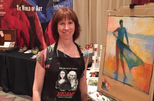
I’m back from four amazing days at IAPS!! This pastel conference connects and reconnects you with wonderful people who are all passionate about pastels. It also inspires you through demos, workshops, and the exhibition of amazing work from around the world. It’s also a place to stock up on pastel supplies at the ‘candy store’ where you can converse directly with the vendors – offering feedback, finding out about new products, getting the best deals you’ll probably find. While there, I had the opportunity to demo with Sennelier pastels at the Savoir Faire booth. I thought I’d share the progression and results of this demo with you.
I had two possibilities to paint – a lovely mostly-grey landscape and a figure. Since many others were demoing landscapes around and about the trade show, and since I’m drawn to figure work, that’s the one I chose.
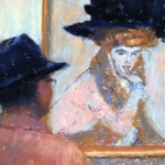
Here’s the reference photo I used. My good friend Andrea was with me a few years ago in Mexico. She’s a fab model and offered to pose as I snapped off a ton of photos. I’ve always loved this one and here was the opportunity to use it.

Savoir Faire’s account manager Andrew gave me a choice of two boxes – the regular 40-half-stick set (which I have at home) or the portrait half-stick set. I chose the portrait set since I was keen to do a review of it eventually. What I didn’t immediately realize though was that I would be constricted by the colour choices. But as I always say, restriction can be a good thing!!
So I plunged in on a full sheet of ‘Sand’ La Carte paper.


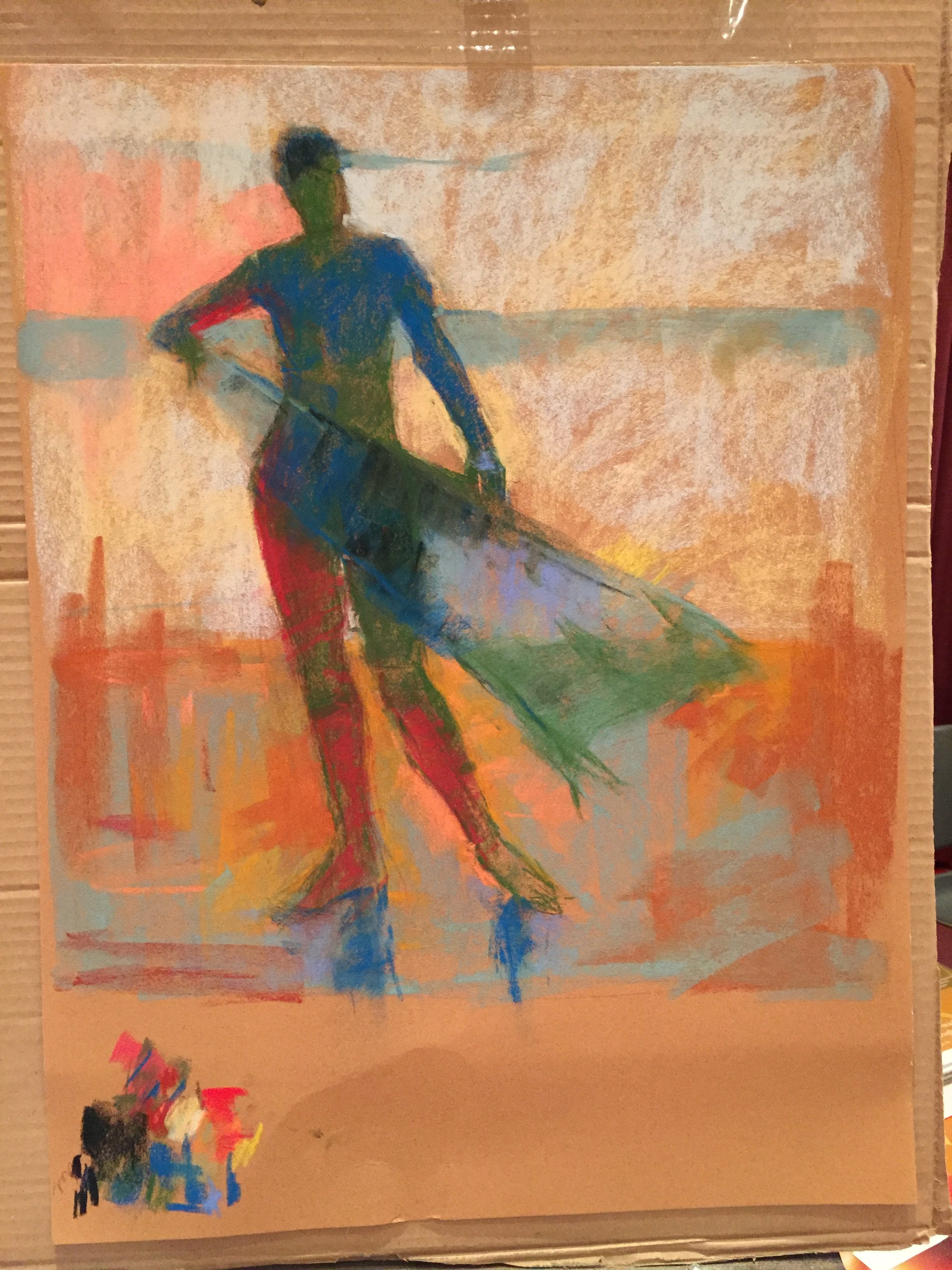

This is as far as I got in the demo what with setting up (finding a backing board large enough – thanks Roberta for the creative idea of using a sheet of cardboard and for the loan of the easel!), choosing a colour palette, drawing up the image, and then feeling my way forward without a clear idea of what I was doing other than I wanted to abstract the image, pushing colour. I plan on working on it further in the studio and will update this blog with a final image when I do.
I was tickled pink when at about the halfway mark in this demo with Sennelier pastels, Casey Klahn came by and said no matter what happened next, I could relax because I’d already succeeded or words to that effect. They gave me confidence because I was seriously wondering why I had made it more difficult on myself by a) choosing to a figure and b) working in an abstracted way where I was moving forward intuitively beyond the reference. Thanks Casey!


And a few other photos….


If you haven’t been to IAPS (International Association of Pastel Societies) I encourage you to put it on your schedule for June 2019! It’s hard to describe how amazing it is and I hope others who have been will add comments below. It’s an experience you will not forget!
Workshops to come!
One of the treats for me (among the oh-so-many) was meeting Mario who has set up the pastel workshops in Croatia. I was honoured to have been invited to teach this September. There are still spaces available so if you are at all interested, I hope you’ll take a look by clicking here. I’m SUPER excited!!

If you can’t make Croatia, I am also teaching in Spain on the Costa Brava end of April 2018. Click here to learn more.
While at IAPS, I spoke to Margaret Evans about organizing a workshop in Scotland in 2019. There are also possibilities for France and Tasmania. If you are at all interested, please let me know!!
~~~
Okay, I think that’s it! I’d LOVE to hear from you. Were you at IAPS? Did we meet? I met so many people who thanked me for my blog – felt like a celebrity!! Thank you soooooo much for your warmth and appreciation.
And what do you think of my demo with Sennelier pastels? Dare I ask?
Until next time,
~ Gail
PS. Excited about next week’s guest blogger!!!


38 thoughts on “Demo With Sennelier Pastels At Their IAPS Booth”
First, your trip sounds like it was a lot of fun! I love the piece you did and how you capture the light through the towel. And the color choices, WOW! Very eye popping! I look forward to seeing this finished.
I am very tied down to caring for my mother in her late life, so not much time for travel or playing with pastels, but I love the medium, and love your blog, which keeps me fed in my time of famine with my art work.
Thank You!
Lela
Dear Lela, I so appreciate your comment about my work and am warmed and gratified that my blog feeds your artistic soul. Soon your time will come. In the meantime your Mum must be so happy to have you close.
I love your demo piece, but sorry I missed seeing you work on it. I was at IAPS and met you briefly to say how much I enjoy your blog. You are a pastel celebrity!!
Thanks Julie!! It would have been fun to have chatted more over my demo. Next time?
REALLY nice Gail! Altho I agree with Casey, you already have a succeeded, I am anxious to see how you take it further…if you do. I am also intrigued by the color choices you made for the various parts…especially the “magenta” in the shadow areas. I would have never THOUGHT to do that and thus this is why YOU were selected to do the demo and not me.:-)))
Also, Thanks for the highlights of IAPS…hoping to attend in 2019!
Many thanks Randall! I have no idea at the moment how I’ll take it further. Will have to set it up in the studio and ponder it. The more I look at it, the happier I am with it as is but I will give it some examination and see what happens! The red areas were really about flattening and abstracting, trying to pull away from reality.
Hope to see you at IAPS in 2019!
Hi Gail
Thanks for welcoming me to read your blogs. I enjoyed two that I have received. The IAPS demo was very interesting. I love the different colors on the figure especially the reds on the figure lower legs and the greens. Very inspirational and different as I have only painted figures in skin tone colors so far.
Great to hear from you Khing! I’m happy you have enjoyed the blogs so far. The colours were ones I chose based on value and available choices of colour rather than anything in reality. It’s fun to try something a bit crazy!!
Love the demo, good lesson.
Marsha so good to hear!
Your demo is AWESOME! Congratulations!
Thanks for sharing so much from IAPS; it was all much appreciated by those of us who weren’t able to be there. And thanks for all you share anyway!
Wendy wow thanks!!
I really had planned to share so much more about the IAPS experience but I realized the hotel wouldn’t allow streaming unless I paid them their $20 a day. Next time I’ll be more prepared and do just that!
Hi Gail,
First, let me thank you for the interviews you did at IAPS, very interesting and all good!
Your demo is exciting and I can’t wait for the finish. The colors and style remind me of the painter Jylian Gustlin’s work whose paintings I love, so your start is amazing to me and I hope you will present it back to us in a step by step pictorial demo. Thanks for all you do, your energy is infectious! 💓 Gailen
Thanks Gailen – there are more interview videos to come! Keep checking http://www.youtube.com/gailsibley
Glad you like the demo and so interesting that you relate it to the work of Jylian Gustlin. I was actually inspired by the Bay Area figurative artists. I even wrote a blog on Nathan Oliviera a few years back: http://www.gailsibley.com/2012/11/28/nathan-oliveira-figurative-painter-extraordinaire/
And thank you Gailen for your lovely words of encouragement 😀
As always the demo piece is gorgeous.
I would love to attend an IAPS convention. All you wonderful pastel artists with blogs make it sound like so much fun.
I hope that you have a wonderful time in Croatia with wonderful friends and food and painting.
Thank you for posting on your blog.
Many thanks Patricia! IAPS is a one-of-a-kind experience..I do hope you can make it there one day. Thanks for your good wishes for Croatia. I’ll be sure to share our times there 🙂
Gail, I’m always inspires by your work! I love the step by step progressions. I’m fascinated by your bold underpainting and blocking in. Although tempted to try it in my work, I always fall back on to my standard ‘following of the colour ‘ patterns. I’ve always been taught to follow similar colours as I would want in the end piece – not that that is always a bad thing. I’m just not brave enough to dip in to what I consider brave new colours (and I have watched and been intrigued by all your videos!). Next piece, I might just break loose! It does make sense to follow the values, even if I’m hesitant about the colour choices. And, about Tasmania, COUNT ME IN!!!!!! Thanks, as always, for your generosity of knowledge.
Jacquie THANKS!! What I want you to do next time is indeed break out those colours!! Follow the value pattern and go bold. Go lightly and build from there. You can always subdue the boldness but move slowly and judge slowly. Let us know what happens!
And yay for Tasmania!! If you know of anyone else who might be interested, please let me know!!
What do I think of your IAPS demo piece? I think it is absolutely marvelous! The color layering is radiant, and I frankly hope you don’t do much more to “finish” it. The spontaneity you’ve captured is beautiful! Great job, Gail!
Wow Kim, I appreciate your positive comment. I will take time with the piece and as you say, resist the move towards a more ‘finished’ look. I’ll see what happens and how it speaks to me.
Hey Gail Kudos to you! I have always found starting a demo the most intimidating time. One wants to put the best foot forward and for some unknown reason it seems one has bitten off more than one can chew. The important thing is to push past the intial mark making and go with the flow of what has started to happen on the paper which is exactly what you did. Infront of a ton of pastellists no less! Do more figures!
Ah Diane, you so perfectly describe the experience of starting a demo. You just have to gulp and jump in with a feeling that something will come of it. So thank you for that understanding and explaining it to others. And THANK YOU for your command to do more figures 😀
I love your painting Gail. WOW
Awesome!!
Your use of color gives me courage to be more daring. Love seeing what you do with it.
I encourage you to jump into the colour JeanLee. You can ALWAYS tone it down if needed!!
Love the transparency of the fabric (scarf?) over her body. Colors look like Casey Klahn’s, but the figure is more Gail Sibley’s. Beautiful.
Ahhhh many thanks Amy!!
I’m very sorry I missed you at IAPS. So much to see and do! IAPS is an amazing event!
The demo is really lovely – the colors give it so much life and excitement. I’d be inclined to leave it as it is 🙂
I really enjoy your blog. I hope our paths cross in the near future.
You are so right about IAPS! But also, it is frustrating not to be able to meet or have time to chat with the many people you’ve connected with over say Facebook and blogs. Thanks for your vote of confidence about the demo piece…and who knows… it may stay as is!
Glad you are enjoying the blog and yes, our paths will cross!
Great share, thanks! Lovely palette. I found I was using up my white sticks too much because my basic set of Sennelier didn’t contain as many pale tones as I wanted, so I ordered a few yummy light sticks from Sennelier a la carte selection. (blues, lavender-greys, pinks). Now I just have to actually get started on a new painting….
Glad you liked it Genie! Great idea to order the sticks you really need, and yes, they do sound yummy! Now crack them open and use them 🙂
Gail, thank you SO much for all you do!!
Chris thank you for your enthusiastic and kind words!!
Love what you did with the photo. I’m only viewing it here – didn’t see your demo. Did you consciously put opposite temperatures down for contrast, i.e. green in the face under the later warms, pale blue on the sand under the later warms, and warm in the water under a bit of cooler blues? Really effective!
Thanks Randy! I do tend to put opposite temperatures on as my first layer – so yes to answer your question. Well spotted!
I love what you have done so far and would like to see the final piece. Your color selections intrigue me. I have trouble there and appreciate seeing what you do.
Thanks so much Debbie! I’ll have to dig it out as I haven’t looked at it in some time….