
Ahhhhhh it’s that time of month to share my pick of 10 sensational pastels from the oh so many I saw last month. Because the Pastel Society of America’s annual show, Enduring Brilliance, took place this month, there were even more to choose from. (I didn’t go to the actual page but rather selected pieces as they were posted on various Facebook groups. It’s worth taking a look at all the pieces in the show though! Click here to do so.)
I started with 83 pastels and arrived at 10 after long, looooooong deliberation. So many incredibly beautiful pastels. But before we get to September’s sensational pastels, I’d like to share some pretty cool news.
Pratique Des Arts
Caroline Duchesnes, assistant editor of the french art magazine, Pratique des Arts, contacted me back in July to ask if I would agree to the blog being featured in their special pastel supplement to the magazine. They would focus on the monthly round-up.
Naturally I was delighted to say, Yes! They chose the artists to be featured so a big congratulations to Janet Cook, Jeri Greenberg, Nancy Marshburn, Damilola Opendun, and Aline Ordman.
Here’s the spread. I’ve linked each of the artists above to the blog post in which their piece was originally featured so you can see what was said. (I actually had to write something for Janet Cook’s piece as when I started, I wasn’t doing the writing about each piece like I do now.) I’ve added a translation (thanks Caroline Duchesnes!) of the rest of the coverage below the image.

Translation:
” New Section: Blog to Discover.
Every month, Gail Sibley gives her blog readers a selection of recent pastel paintings that have touched and made a deep impression on her. They are strong and successful artworks and here are our favourite ones, accompanied with the discerning analysis of this blogger who is also a member of Pastel Society of America.
Techniques and Discoveries: The blog howtopastel.com was created by Gail Sibley, pastellist originally from Jamaica and now living in Canada. She divides her time between painting, being a pastel workshop instructor, and blogging. She created How To Pastel in 2013, simply because she realized that people were interested in the technical aspect of her work. You can thus find on her blog technical articles (how to, steps by steps, tips & tricks…), readers’ opinions and comments, and now also interviews and featurings of pastellists to be discovered. The blog keeps evolving and Gail encourages readers to let her know what they want to see on the site.”
Now let’s get on with this month’s show!!
September’s Sensational Pastels!

Dolores Saul has captured the look and behaviour of cats, as well as the various textures found on these animals. I can reach out and touch this cat, interrupting its intense focus. Its hair is roughly soft, its whiskers wiry that twitch as I brush past them, the inside of the ears have that strange cat-like waxy skin with hairs screening the entrance that are sensitive to the slightest touch, the eyes glassy with reflected light as they stare. I can feel the cool dampness of the nose and the slightly wet skin of the inner eye area. Saul could have cropped the piece but chose not to, instead including a touch of light on the cat’s back giving us the feeling of the whole cat. What’scaught this cat’s attention? Something to pounce on? To see more of Saul’s work, click here.
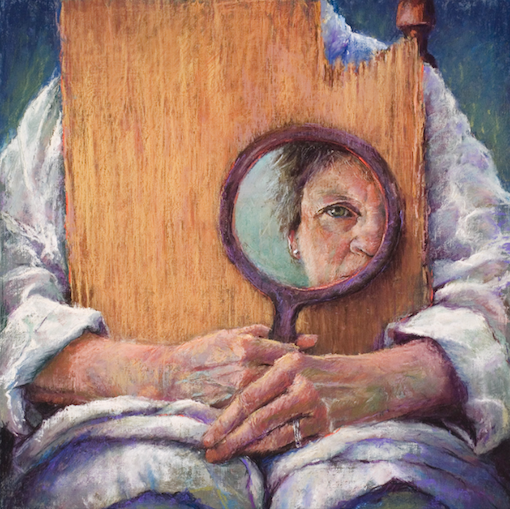
Speaking of an intense gaze, here we see the partial face of a woman, the artist, as she examines herself for a self-portrait. Yes? But wait. Look again. Is this the artist’s face as she portrays an anonymous sitter, her face reflected in the mirror the sitter holds, or is this instead the face of the artist, detached from her own body which itself holds the mirror in which her face is revealed? Tricky! The title gives nothing away – it’s not called Self-Portrait but rather Portrait of an Artist. So we could read the image either way. I was caught by this dichotomy, this search for the way to read the painting and what meaning that brings with it.
I also enjoy the mark-making in this piece especially on the exquisitely portrayed hands. I am drawn to the partial face again and again. We see the intense scrutiny that comes with self-portraiture when we delve into ourselves, looking so closely to find the essence of who we are and also how we appear to the world. There’s also the barrier (or is it a protective shield?) of the board that is still mostly whole but worn around the edges and broken on one side. Is this a metaphor for the imperfection and aging of the artist herself? Check out Maines’s website for more work .
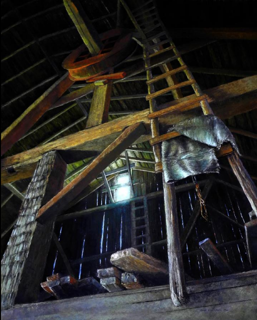
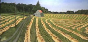
Another portrait, both of a barn and perhaps of Keith. This ladder that we first notice, disappears upward into the darkness where we cannot follow. It also has no lower rungs and so is unclimbable. When we look more closely at the painting, we see another ladder, one that appears ethereal as it rises to the light that pierces through the one window.
The painting itself lovingly describes this part of a barn with its high ceiling and heavy warm-coloured beams; its rough-hewn posts; the random pile of boards that are unused or waiting to be reused, left where they were laid, unsorted and untidied; the exterior boards so worn by weather, time, and environment that they now let in the outside air and light; the discarded grain bag, the strange red mechanism that circles the roof beam. Kleczynski’s rendering of the perspective seems flawless. It’s notable that she has made the upper part of the building (the part that’s more in the darkness) warm while the lower part (with access to more light) remains cool. Conspicuous too is that the one area of blazing light is almost in the centre of the picture where in the end, our eyes come to rest.
What story is this painting telling us? Which one is Keith’s Ladder? Why does the rope seem like a noose for hanging? To see more of Kleczynski’s work, check out her website.

First off, a difficult subject with crazy perspective which Ashby has managed to create on paper convincingly. She’s carefully and lovingly rendered a single spiral staircase and then, beside it, depicted its cast shadow which together form a kind of double helix. The intricate spaces and patterns created by the substantial yet open structure as well as the light-effects it constructs are part of what makes this piece so captivating. I love the contrast between the solidity of metal reality and its ethereal echo which seems to cavort and twist. It’s a dance of two whorls, one more grounded, the other childlike and playful.
I delight that this basically monochromatic work fools us into thinking it’s black and white – we have to look closer to see the subtle changes of colour in the cast shadow, colours that run the gamut of yellows, pinks, blues and greens. Look closer too to see beneath the helix to the wall against which this dance plays out: we see the textures and incidences of the world we live in recorded here – wires, pipes, doorbell mechanism, rust, and door frame. And then there’s the 32A at the bottom of the spiral staircase. Who lives there? Is their only entrance to their apartment this staircase? And so the story unfolds. See more of Ashby’s work here.
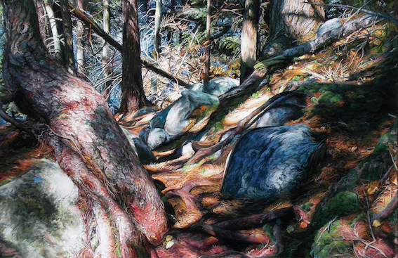
Such an intricate and intimate depiction of a small section of a wood where everything feels alive. There is such detail here but the overarching composition keeps it whole – we look at each leaf, each scab of bark, each craggy or smooth part of a rock, each tree needle, each piece of moss, each fallen twig, each spot of dappled light, and yet all fit together as one large piece. There’s a cohesiveness to the painting that astonishes me amongst the threads of singular details. An ostensibly muted painting illuminated by sunlight that finds its way through the trees to the forest floor, on a closer look, is filled with colour – reds, blues, greens, oranges.
Hanson shows us deeply into nature. This isn’t just scenery. She goes beyond, revealing the spirit nature of each item in the environment. Writhing roots bound up among the solid rocks: each seems to breathe and move. I feel if I spend time looking, I will see the hidden forces of the land. There’s a trail (reference the title of the piece) where humans may tread but nature is dominant here while we are small and must watch our step through the chaos and glory. At this point I haven’t been able to find a website for Hanson. I hope that will change.
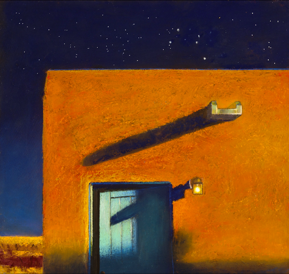
We move from the intricacies of the above pieces to this simple yet alluring painting. I am more familiar with Murray’s broad vistas that describe the southwest landscape colourfully and with profound knowledge. And so this close view of an adobe building caught my attention. At first glance it seems just that, a painting that records a house of the southwest at night. The uncomplicated abstract design of rectangles and complementary colour scheme of blue and orange draw us in like moths to a flame. Yet there is much more being said here.
It’s night – we can see a dark star filled sky – yet the whole painting is illuminated by a strong light. Where is it coming from? Its intensity belies the depth of the night. A light is on above the door which is cracked open. Do we enter or has someone else just gone through? Is the door about to be opened or closed? And is that a corn field beyond the building? (It brings up visions of Vincent Van Gogh’s many paintings of the subject.) There’s mystery and story around this painting. And the title, what hints does it give us about the narrative? Does it literally mean looking south with the stars revealing a southern sky or is it more metaphorical? Is there something spiritual about it or is this a painting of beauty veiled with a kind of eeriness. I seemed to arrive at a website that didn’t belong to this Paul Murray. As soon as I know where to send you, I’ll update this blog post.
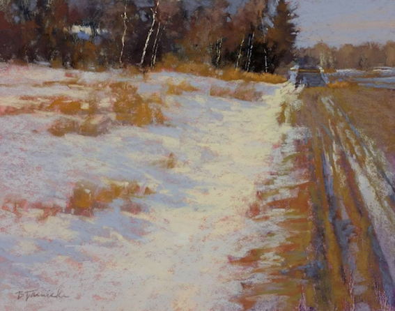
A snow scene bathed in the low light of a winter sun, it exudes warmth from the ochre yellows of scrub and road, the pink peeking through the blues and whites of the snow, the browns of bare tree branches. I enjoy the abstract foundation of four uneven rectangles – a large light one made up of snow that’s surrounded on two sides by a rectangle of trees and the rectangle of the road and fields to the right. A fourth rectangle balances the others in a diminutive way by the light shape of the sky. The painting is stable yet certainly not boring with movement introduced by the converging lines of ruts in the road and the slight sway of the tree trunks in the distance. The composition keeps my eye flowing around yet there’s much for it to dwell on.
The title suggests activity, perhaps the whoosh of cars, yet all is quiet and the only sign of human presence is what might be a snow-covered rooftop hidden among the trees. This road has indeed been travelled as exhibited by the ruts in the road. Anyone who has experienced living in a cold climate can relate to these grooves, made when the temperatures are warm enough to create a muck of mud (easily plowed by car tyres) which then freeze in falling temperatures to become solid and unyielding. Yet here, in the gentle quality of the painting, it feels as if a thaw is in process and that everything is unresisting. The straight road suggests clear travel yet up ahead our view is blocked by the trees, the direction of the road hidden from us – like portions of life. Where will this road take us literally and figuratively? See more of Barbara Courtney Jaenicke’s on her website.

Have you ever looked out a window as the rain clatters against it? I’m always memorized by the rivulets, betting on which raindrop will collapse next and run down the pane. In this painting, I have the same feeling – the raindrops and their pattern hold me but then I’m drawn to look beyond, to what’s outside. But our view is frustratingly obscured by the raindrops on the glass. There are trees, and a grassy verge, also a field and a road – that much we can tell. But we cannot see where the road leads. We cannot tell where we are. We cannot know why we are looking out through this rain-spattered pane. Are we in a house, or perhaps a car? Have we parked to wait out a storm, to make a call, to rendezvous with someone? Or are we in a house awaiting someone’s arrival or anticipating going somewhere, delayed for now by the downpour? This mystery adds to my enjoyment of the piece. So many narrative possibilities.
Ute Farr has so convincingly rendered the raindrops – I want to raise my hand and wipe them to open up the view. Her simple colour scheme of mostly green is brave (greens in landscapes are notoriously difficult to deal with!) yet she has made it interesting by the many textures, scratchings and marks. She’s also introduced a few other colours in an understated way. That and the light value in the sky and road counteract the dominance of green so it’s neither boring nor overwhelming. See more of Farr’s work here.

When I first saw this piece by Susana Correa Llobet, I was struck by how much it reminded me of the work of František Kupka. (Don’t know his work? Have a look at a few pieces here.) I think it has something to do with the colouring of the painting as well as the way the figure is depicted – there’s a sort of art nouveau quality to it. It also felt vaguely familiar but I couldn’t put my finger on why. At least not until I looked up “Spinario” when I discovered the reference for this painting (and was reminded of art history classes from way back when.) It’s based on the bronze Hellenistic sculpture (of which there were many copies made through the centuries) of a boy pulling a thorn from his foot. So that solved the puzzle of what this Spinario (or Thorn puller) was.
But the mystery as to why the artist decided to use the figure in her work is still unanswered as is her interesting choice of colour pattern. The boy, with youthful limbs, sits concentrating on the task at hand. In Llobet’s version however, she has included another part of the story, some sort of roller. It’s not obvious on first viewing of the painting but then there it is. Is this a worker with the tools of his young trade portrayed in soupy green? Does this youth represent the children of the world who are put to work at an early age? Does the distortion and colouration of the figure mean anything – solid yet fading out, black and white for the past, colours of hope for the future? See more of Llobet’s work here.
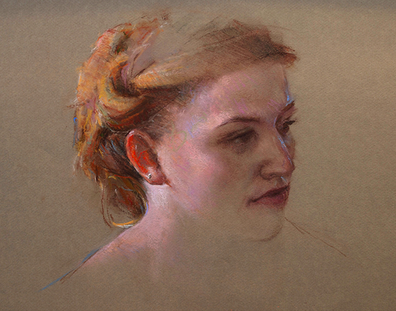
I was spellbound by this exquisite portrait when I first saw it, and then, again and again. Ken Pledger, with delicate and precise line, colour, and texture, has perfectly captured this woman’s face. There’s an extraordinary and tender rendering of the features – it reminds me of portraits from a time gone past.
In this portrait intriguingly there are two focuses for the artist. There’s his focus on the hair and head wrap, wound together in such a way that it’s difficult to discern where one starts and another ends. His tiny strokes of pastel, the variety of colours, the darks and lights, the translucency of the ear revealed in the red of the skin backlit as it is by the primary light source, the small sparkle of an stud earring.
The other focus is the model’s face, more simply coloured with a balance between warm pink, the warm neutral colour of the paper, and the cool blue light from a secondary light source. There’s an incredible feeling of volume with so little delineated. And even though there’s less attention to the colours in the face, hidden as it is in a soft shadow, and turned away from the main light, our eyes are continually drawn back to the features of this woman. Pledger’s deft touch has successfully captured this 3/4 view from an upper vantage point – not the simplest thing to accomplish! Check out more of Pledger’s work here.
~~~~
Soooooo what did you think of this month’s sensational pastels? Did they move you? Is your imagination sparked? Are you going to paint today?? I’d love to hear from you so please leave your response to this week’s blog.
Until next time,
~ Gail
PS. We’ve started the 31 pastels in 31 days challenge. It’s not too late to join. Come on over to the How To Pastel Facebook page and join in!!


20 thoughts on “September’s Sensational Pastels (and being in Pratique Des Arts)”
Big Congrats on the Practique de Arts Gail!! Well done and well deserved.
Many thanks Heather – I was pretty chuffed 🙂
Some fabulous pastels there ( actually, they’re all great)…thanks for collating this fine selection
Glad you enjoyed them Marty!
Just when I’m feeling uninspired, having finished one painting and am just thinking about the next, your monthly blog arrives in my in-box and I get all excited again and whip out my pastels! Dolores Saul’s cat portrait really caught my eye, it could be my cat Ellie Mae. Thank you Gail.
Mary-Anne that’s just the best thing you could say. I LOVE when artists are inspired to go create!!
Hi Gail,
I really enjoyed your intelligent reading of the paintings, which gave me an incentive to look more closely at them. Excellent selections and beautiful work.
Peggy I’m delighted my work means you’ll look more closely. When I’m making my selections from so many wonderful pieces, it’s the ones that make me pause and look beyond what first catches my eye that make the shortlist!
Wonderful selection this month, there is something to learn from each one. Thank you as always for your careful search and selection.
Congratulations on having Pratique des Arts recognize and do a feature on your blog👏 Makes it all worthwhile doesn’t it.
It’s a pleasure to do these monthly blogs when there is such appreciation for them so thank you Gailen! And yes, doing the work involved is also worthwhile with the reward of being featured 🙂
What a wonderful selection of sensational pastels! Thank you so much, Gail, for choosen my “Watching”. your comment make me proud, happy and change the grey weather in golden September! All the others are really interesting and I like many of them!
Dolores, I’m tickled pink that my selection of your piece changed the weather outlook for you!!
Congratulations Gail, you have every right to brag. That is sensational news. I absolutely love “Keiths Ladder”. The tones and detail certainly take you on a search for Keith. “Raindrops”, my fav, certainly what I see today looking out the window, it’s spring time here and the greens through the raindrops on the window are just how I saw it in that beautiful work. Thank you Gail.
Thanks Wendi!! 🙂
I love your sharing your own experience with “Keith’s Ladder” and “Raindrops” – adds to the bigger conversation.
Wow – thanks for including me…such an honor! And you got it!…the searching, the hiding, the aging, the intentional ambiguity of the title of what is actually a self-portrait – and for mentioning the drawing of the hands – I’m especially proud of that. Thanks again for liking this piece.
You are welcome Marie! This piece is sooooo intriguing!!
I really enjoy your monthly selections…plus I’m having a ball working with my pastels every day for your challenge…it really is a challenge to take enough time out of a busy day to paint. Have you ever heard that when you retire you have less free time than when you were working? Well, it’s true! But I’m learning as I go and it is truly inspiring to see the work of the others who are being challenged. So, many thanks for your monthly choices AND for the October 31/31 challenge.
Wend, I’m so happy to hear you like the monthly selections AND that you’re enjoying the effects of the 31 pastels in 31 days challenge. It seems creating this opportunity and commitment to paint every day was a good decision for many. I know I myself am benefiting from it (even though it’s dang hard some days to get to it!). And yes, I’ve heard that about retiring lol! I love seeing everyone’s work being posted in the facebook group(https://www.facebook.com/groups/howtopastel/) and like you, I’m inspired both by the work itself and by the determination to succeed!
Hi Gail, I was wondering as a new subscriber when your blog would arrive, when as I was searching, I heard a “ping” and up popped your news. So delighted, soooo much to read and digest . Thankyou 😊 Shirley.
Shirley, I always feel happy when I read a comment like yours! Thank you for letting me know you’re there and enjoying my blog. I look forward to hearing more from you along the way 🙂