
Wow, February is already a week over so here I am with my ten choices of fabulous pastels from that ones seen that month. As always, soooo many pastel paintings to choose from, sooooo difficult to make the final choices, soooo hope you enjoy them. Nothing changes 🙂 In any case, I hope you will be inspired, surprised, and delighted by them!
I also want to point out that today is International Women’s Day and it just so happens that all ten of the fabulous pastels this month are created by women!! Cool huh?
So let’s get on with the viewing!

How can you not love this piece? First off, the colour is glorious. (I admit, I am a sucker for those pinks and purples!) And although the painting is painted loosely, we can completely understand what’s going on. Then there’s the balance between narrative and the form of the painting itself – there’s a story with the bartender looking at his phone between serving drinks, and there’s also the physicality and design of the painting that keeps us engaged too. I want to look at every inch of this painting, wandering through the various marks, blocks of luscious colour, big and small shapes, hard and soft edges, light and dark nooks and crannies. See more of Aline Ordman’s work here.
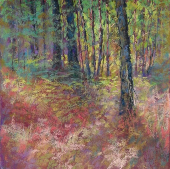
We go from the extreme value shifts in Ordman’s painting to the subtle middle values punctuated with a few darks and lights of Nancy Knapp’s work. Every time I look at this, I sigh inwardly. I’m taken with the way Knapp manages to combine the sense of realism – we are looking at a forest of trees – with the abstraction of colour marks. As with Ordman’s work, I want to explore all parts of this softly coloured piece, from the gentle warm chaos of the foreground to the cool daubs of colour on the left to the striking verticals alternating dark with light as we move to the right. The foreground tree then brings us back down to the forest’s undergrowth. Interestingly, this pastel is done on primed BFK Rives, a printmaking paper. Click here to see more of Knapp’s work.

From the hush and stillness of the forest we come to the energy and crashing sounds of a wave on a beach. Can’t you just smell the salt in the air, feel the wind rousing your hair, sense the dampness of water droplets on your cheek, hear the screech of the one gull that soars above the rolling sea? I feel joyous laughter erupting as I look at this picture. It seems to be about the vitality of life. And of freedom represented by the gull manoeuvring its way over the choppy waters. I also appreciate the difference between a distant viewing – there’s the wave – and a close-up view where all we can see are the delightfully vigorous marks of pastels. I couldn’t locate a website for Jackie Blue so for now, I’ll direct you to her on Facebook. [March 2018 – see Jackie’s comment below]
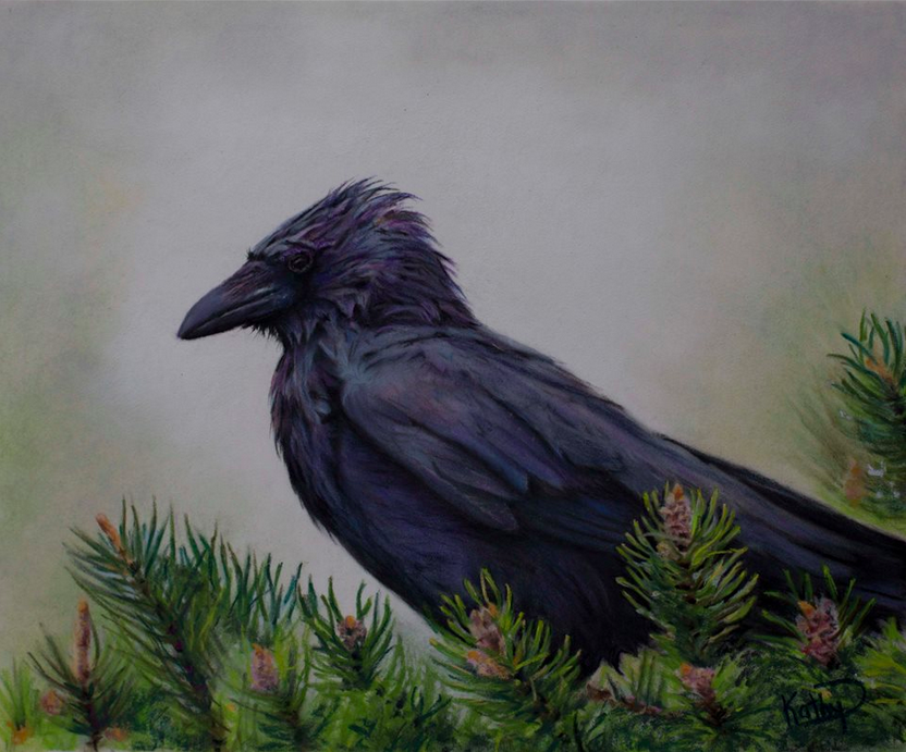
From the energy of Blue’s work we come to the quiet of Kathy Dolan’s piece. With its sombreness you may be tempted to pass this pastel by but you’ll be rewarded if you stop and spend time with it. This Corvus looks bedraggled, feathers wet with rain, yet to be groomed back to their shiny existence. The evergreen leaves and the bird’s feathers are rendered beautifully with both specificity and suggestion. Look into the mist and you begin to make out forms of trees and, you also begin to sense the fog rising, I mean actually moving! Any minute now, you’ll be able to see what’s now hidden. We just have to wait. In the meantime, we are being watched. See more of Dolan’s work here.

I feel like I know this place. It’s a joy to be in this sunlit patch of fairly arid landscape in the late afternoon.. Such a simple scene with nothing really spectacular to recommend it, made into a painting of satisfying design and emotional resonance. I can feel the warmth of the sun but as it slides towards the horizon, there’s also a hint of coolness. Are the clouds clearing or arriving with the approaching evening? I can feel the scrubbiness of the dry grasses against my legs as I step off the path for a better view. I love the way our eye is lead by the cloud forms across the painting to the trees which bring our eyes down and then swoosh, we are sweep across the scene with shadows and rolling earth and the path. We reach the other side and the lightness of the dune takes us back up and we begin the circle again. Check out more of Fuscaldo’s work on her website.
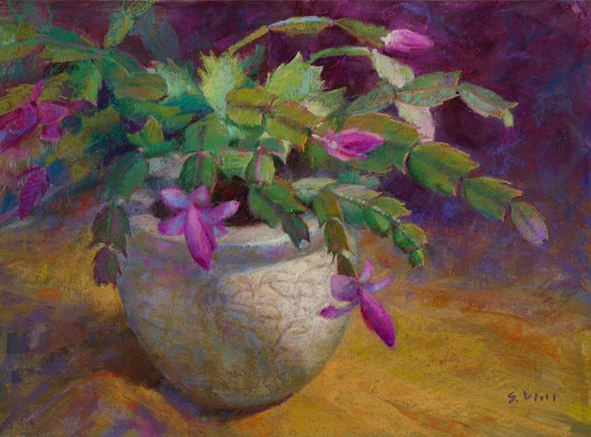
From the warmth of outside we come to the cool interior still life by Sharon Will. When I saw this piece I was arrested by its beauty. I know the word ‘beauty’ is so vague so let’s have a closer look at what makes it beautiful. Sumptuous colour that sits comfortably in a mid-range of value – no extreme darks or lights. Each leaf is considered, observed, and painted. There’s no formulaic work here. The artist’s eye, then her hand, gives us the intricacy of the design, light, shape, and colour of each segment. The flowers serve as luscious colour accents in amongst all the variations of green. And the pot – you can reach out and touch its incised surface. This painting, its subject and mood, reminds me of the idea of home, of an old-fashioned way of life, and the cozy way that makes me feel. See more of Will’s work here.
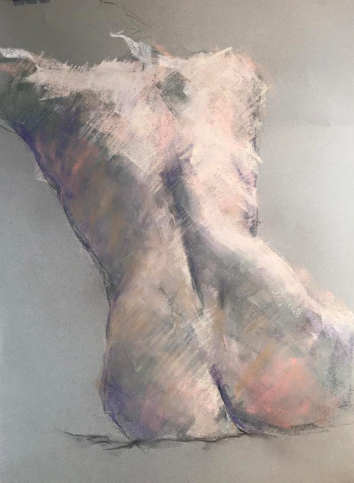
The female back – so classical, so feminine, so beautiful, and so difficult to render in an interesting yet accurate way. Morgan has done this in spades! (Curious about the origin of this phrase? Check here.) There’s pliable flesh, there’s weight, there’s bone, muscle and fat beneath the skin. Yet the anatomically correct painting is described in such a loose way. Morgan has kept her colour palette limited, mainly in greys and whites with hints of pink, ochre, purple, and a grey olive green. The marks are confident on this large life drawing. Unfortunately, I was unable to locate a website or Facebook Page for Morgan so I have no where to direct you to see more of her work. Hopefully that will change soon!

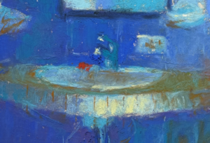
I was charmed by this painting of a woman gazing from her bathtub into an aquarium. The piece is titled, Envy, and one can only guess at what this refers to. I take it to mean that the woman envies the fish their full immersion in water while she, merely human, is only half submerged, forever bound by her inability to breathe underwater. She can only watch and wish. The fish on the other hand swim happily unaware of this envy. I love the contrast of the rather flat, cool, interior lighting of the figure with the colourful richness of the fish and their habit. I also enjoy the various textures from bath water, to skin, to strands of hair, to the scales of the fish. Check out more of Tousey’s work here.
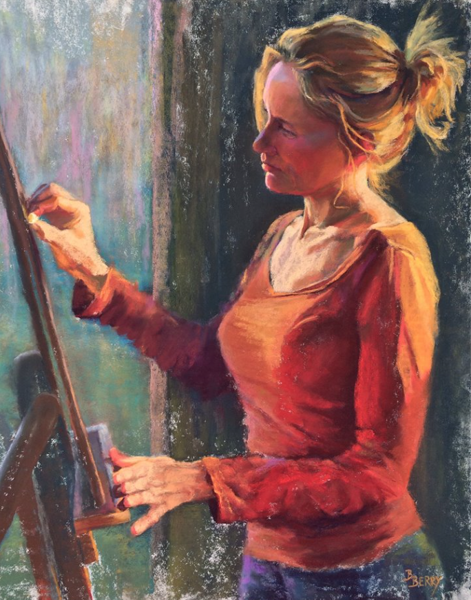
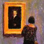
I was entranced by this self-portrait by Barbara Berry. It’s the story of an artist at work, totally focused and in ‘the zone’ while pastelling. What’s ironic is although the artist is shown focused on the work on the easel, this is fiction as the artist is rather, focused on capturing herself in this experience! The artist herself is the subject, not the work she is shown working on. But wait, is the work she is is fully engaged in actually this self-portrait?! Okay, enough with the mindgames, what about the painting itself? First off, hands are difficult at the best of times, and I’m rather in awe of the hands here, especially the brilliant foreshortening of the lower hand. I love the way the light is reflecting colour from whatever’s on the easel onto the upper hand. Speaking of reflected light, look at that gorgeous colour on her cheek thrown up from her blouse. There are two light sources – one cool from the window and one warm from off-camera – and both are interpreted superbly. The tilt of the head and the light and shadow on the neck and upper chest are also captured beautifully. Go to Berry’s website to see more.

We come to the 10th choice in this month’s collection of fabulous pastels. How can you not smile at the whimsy here? I was enchanted when I first saw it and that delight remains on each viewing. Who is this woman standing on a clothesline? She’s accompanied by a number of crows that not only make use of the lines but also the roof tops. Looking beyond the narrative, I love the various greys Sloat has incorporated to counterbalance the warm reds and yellows. I also love the way Sloat creates a fantasy world where not only does a woman stand on a clothesline but the world is warmly lit at the same time the sky is dark and glittering with stars. It won’t surprise you to hear that Sloat is also a children’s book illustrator. See more of Sloat’s paintings here.
I hope this month’s selection gets your juices flowing and has you thinking about pastels in a new way. What will you try out after seeing these ten fabulous pastels? Tell me your favourites and why. Please feel to add to the conversation about each and every one.
I look forward to hearing from you!
Until next time,
~ Gail


![Gail Sibley, [Not yet titled], Unison Colour pastels and a Sennelier pink on UART 400 mounted on board, 15 1/4 x 11 1/2 in -close up of face](https://www.howtopastel.com/wp-content/uploads/2025/07/11.-Gail-Sibley-Not-yet-titled-Unison-Colour-pastels-and-a-SEnnelier-pink-on-UART-400-mounted-on-board-15-14-x-11-15-in-close-up-of-face-Feature-image-150x150.jpg)


22 thoughts on “February’s Fabulous Pastels!”
I am new following your blog. I want to thank you so much for the time you take to share your knowledge. These February choices are amazing and I love your explanation of why you chose them. Very helpful.
Thanks so much.
Gisela
Gisela, welcome to the howtopastel blog and thank you so much for commenting. I am delighted that you have found this blog helpful and that you’ve enjoyed it. Like I’ve said before, yes, it is a lot of work, but when I receive comments like yours, it’s oh so worth it!
Love seeing the pastel figure work by Shelagh Morgan but sad that she doesn’t have a website to see more! Also greatly enjoyed the recent blog on Therese Schwartze!
I know what you mean about Shelagh. I am hoping to find she does have a website and will add it as soon as I know!
Glad you also liked the blog on Thérèse Schwartze!
These are all amazing works and inspirational to my continuing work in pastel. Thank you for sharing them!
Matthew, it’s heartening to hear these works are inspiring to you. So happy to share them!!
Speaking of narrative, the title “gypsy Forest” set my mind to work and kept me in the painting. I’ve followed Aline Ordman’s work and the above piece is a stunning example of her style. For me, Shelagh Morgan’s drawing is what I aspire to in mark making – wonderful!
As always Gail, thank you for taking the time to find instructive pieces each month.
Yes yes Gailen! The title “Gypsy Forest” does conjure up stories and I’m glad it did that for you. Sometimes I see there is so much to talk about but trying to keep my observations about each painting to one paragraph! Hopefully that leaves something for viewers to add, just as you have done. Thank you!
And thank you for your other remarks. I know what you mean about Shelagh’s mark-making!
What wonderful pastels! I especially like Barbara Berry’s self portrait! Thank you for sharing!
Betty
Glad you enjoyed his month’s selection Betty. I’d love to know what it is about Berry’s self-portrait that draws you in.
Gail, thank you so much for including my portrait in your blog! As always, I was scrolling down, reading and thoroughly enjoying each painting, each review, one by one, when suddenly something looked extremely familiar -it was me! my painting! What a gift you’ve given to me. Thank you, Thank you!
Barbara, your painting is just gorgeous! I’m delighted I gave you a surprise 🙂
And thank you for being such a fervent reader of my blog!
Hello Gail,
I must say I almost fell out of my chair when I scrolled down and saw my “Gypsy Forest” included this month! I always look forward to your blog and the thoughtful comments you make on your choices. The pieces you choose are always so inspiring. This came at a time of struggle in my art and what direction I am going, I needed a little shot in the arm, so to speak! Thank you again.
Nancy Knapp
I am delighted to have given you a wee boost Nancy! Your painting is mysterious and gorgeous. Love it!
Extraordinary works and wonderful write up! Thanks for sharing these!
Many thanks James!! I’m glad you enjoyed it so much.
Wow, thanks Gail! I always find something in your picks that point the way.
Cathryn
That’s wonderful to hear Cathryn! I’d love to know more details 🙂
Hi Gail
I’ve gone back into my studio after a successful career in the public service. I trained as an artist in the way-back-when; it is harder than I thought it would be to settle on a direction for my art. I love pastels and colour, but stumble over doubt. As we all do, I suppose!
Cathryn
Cathryn, welcome back to the world of art-making 🙂
Doubt is an emotion I think all creative people deal with. The thing is to keep going, pushing through the fear and doubt. I know that’s a lot easier to say than do!
Hi Gail,
Thanks for including my seascape in your blog….love your description! I could not have said it better!
My web site is http://www.jacquelynblue.com for those who might be interested. Keep up the great work,
Gail.
Jackie
You are welcome Jackie. I’m so glad that you liked what I wrote! And thank you for adding your website.