It all started at a recent demo I did at my local Opus art supply store. The presentation was called “Use Colour Studies To Unleash New Possibilities in Your Paintings.” I took one subject and created four different colour studies. Each piece had two layers of pastel. The only thing that was different between the four studies was the colours I used in the first layer. The second layer in each piece had exactly the same five colours. These variations on a theme amazed even me! Although I knew what was going to happen, it still surprised me how different they looked!
I decided I’d complete each of the variations as part of the 31-pastels-in-31-days Challenge in October, one per day. I enjoyed the process so much that I created two more paintings with different colour underpaintings for a total of six.
I’d like to share these variations on a theme. Unfortunately, except for one instance, I didn’t remember to take a photo showing only the first layer. I do, however, have photos of all the pieces with two layers. I’ll show you all six final variations on a theme to show you how different they look from each other even though they are of the same subject and despite the second layer colours being almost identical in all six images.


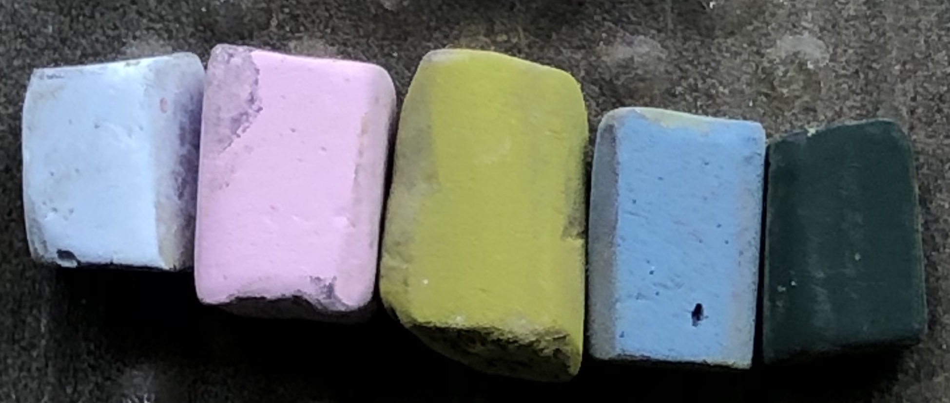
I’ve included photos of the pastels I used for each painting. The three colours on the far left are the first layer colours. I used them to block-in the light, middle, and dark value shapes. The next line shows the five pastels I used on the second layer of all six paintings. When it came time to proceed beyond the second layer, I mostly used the same eight pastels over and over. On occasion, I added one or two other colours. If I did, you’ll see them on the right of the photo.
The second layer colours were chosen by thinking about the “realistic” colours, for example, blue for the sky and greens for the trees and bushes.
Let’s get going!
At Opus, I listed the various colour scheme possibilities for the first layer. I had a member of the audience choose the colours for me in each scheme so they would see that the colours weren’t pre-chosen to create a certain and expected (by me) effect.
The first underpainting colour scheme was colour temperature. This meant choosing one that looked different from the overall temperature of the scene. The group decided on a warm underpainting.


The next colour scheme was monochromatic. I suggested they choose from green, blue, purple, or red. Purple was chosen!


The next colour study had a split complementary colour scheme as its base. I held up the colour wheel and the audience chose the colours – blue with red/orange and yellow/orange.


Next is what I call ‘the second colour.’ This is looking at a subject and looking for another colour beyond the obvious one. Again I had my audience at Opus help me choose the colours for this. Unfortunately, I forgot to take a photo of the painting with only the first two layers of the colour study! Still, you can see the pastel colours I used below.


Then came the final two. For the first one, I used random colours. This meant choosing three colours from each of the value areas randomly, without thought. In this case, I did do a bit of thinking but not related to the painting. What I did do was look at the colours chosen for the first layers of the previous paintings and tried to choose something different.


And finally we come to the sixth variation. For the first layer I used what I call ‘ugly’ colours. These are colours I rarely reach for. For me, that’s greys and browns. They just don’t excite me! For this one, I remembered to take a photo of the first layer so have a look.
The thing about this painting was how much I liked the final piece despite the unappealing (to me!) colours in the first layer!


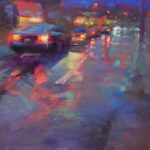
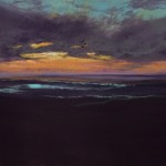
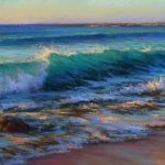
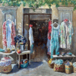
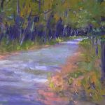
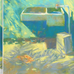
Now let’s have a look at all six pieces together.


There are a few visual similarities between the six but basically, they are all individual. Each conveys a different mood, feeling, and story. I’d love to hear what you read into any of these variations on a theme. Feel free to tell me which one’s your favourite!!
All of these small paintings are available.
Until next time!
~ Gail
PS. I love doing colour studies and have written about this subject before. Click here to read an earlier post.









30 thoughts on “Variations On A Theme: One Subject, Six Looks”
Fascinating post Gail. I learn so much from your posts and am always amazed by the small number of pastels you use in any individual painting. I think this is a great way to teach (and paint) as you stop being mesmerized by “all the pretty colours” and focus on what is important. So much to think about.
Thanks so much Amanda! I love hearing that you are learning from these posts. And don’t I know about being mesmerized by all the pretty colours. You can see why I’m having a dickens of a time choosing which pastels to include in my set!
Gail, this is terrific!!! Can’t say how wonderfully you have chosen colors. This is a real lesson which I intend to apply. Thank you for opening this window.
Nancy Malard
I LOVE to think that I’ve opened a window Nancy!! I’m soooo glad to hear it was helpful. Do come back and let us know how you applied it when you do. (Sooner than later right?!)
un bonjour de France
j’apprécie beaucoup votre travail et surtout la progression dans l’étude des couleurs
je vous suis régulièrement
en ce qui concerne le dernier sujet , mon choix se porte sur le premier tableau ; il y a beaucoup de vibrations
A tres bientôt
Salutations Jacqueline!
Je suis heureux d’entendre que vous appréciez mon travail et ces études de couleurs. Merci d’avoir choisi votre tableau préféré et de nous avoir expliqué pourquoi vous l’avez choisi.
Je vous remercie!
So interesting to see this study. Each so unique even though they are so similar. You are a color master!!
Thanks Ruth!!
And isn’t it interesting that with so little difference in the colours that they can look uniquely individual? I find it fascinating!!
That is a very interesting and illustrative exercise. I will have to give it a go.
Thanks Brad! I hope you do try it. And when you do, let us know here how it went!
Gail, these are stunning. I would be hard pressed to pick a favorite, but if you forced me it would be the first with all the warm colors — that warmth is so inviting and somehow unexpected for that scene. One of the things that really strikes me is how ordinary the photo is (although great composition), and how each and every painting in the series is so extraordinary, completely elevating the scene!
This is inspiring to me because I’m the world’s worst photographer, and frequently I see something I’d like to paint but when I see the photo I think, “Wow, that’s really boring. Why did I take that photo?” This exercise shows how to take those photos and create art, as opposed to simply copying a photo reference.
Wish I had been at this amazing presentation… were the participants completely floored?
Leslie thank you for your enthusiastic response!! I do think the audience was amazed. So much so that I’ve been invited by one of the audience members to present at their art society 🙂
I know EXACTLY what you mean about looking at a photo and thinking, “Why did I think that was worth photographing for a painting?”
Three thoughts on that:
1) Always try to paint from photos you take to paint from as soon as you can. That way you still have the feeling of what it was like to be there. This was true for me of this image.
2) Know that you took the photo for a reason. Try to recall what it was that caught your attention – the shapes, the shadow pattern, the textures, the chaos of people etc and focus on bringing that out in your thumbnails. Make a strong value pattern and then go for it.
3) Whenever possible, always try to jot down a sketch no matter how quick or vague. That will give you something to refer to as you pull up the photo. it will bring you back to the sensation of being their and what caught your attention.
Hope that helps! 🙂
Gail, this is so helpful! I’ve been struggling with my tendency to carry around boxes and boxes of pastels, trying to get just the right color directly from the stick. I’m going to try to go on a crash diet, and doing color studies seems like a great way to get started. Thank you for your continued inspiration!
Ralph I’m sooooo glad to hear this!!
The thing about colour studies is they don’t have to be big (keep them small!). They don’t have to be detailed. And they don’t need to take a long time. Colour studies give you the opportunity to be bolder with colour choices – you can afford to take a risk on a small scale! Work fast and fearlessly and see what comes of it!
Then come back and let us know how it goes 🙂
Wow! Thanks so much for this. It is great to actually see and be able to compare the different results.
You are welcome Diane!
I think having them all together to compare really shows the endless possibilities of different coloured underpaintings.
I am about to start a wet underpainting for a dog portrait. I happened to see your posting and studied it for a good long while. Your timing couldn’t have been better.
As for preferences when just glancing at the six together, the first and last of the demos appealed to me most. The blue/green was irresistible in the little shed in the last one. The warm colors in the first one drew me right in. As for the “ugly colors”, they sit unused for years in my box. Perhaps it is time to experiment, as I’m sure that they are feeling abandoned. Many thanks for all your work compiling this blog. It is so helpful.
I do LOVE good timing Andrea and glad it was helpful!
Thanks for your preferences and sharing why you made your choices. I too love that splash of intense blue in the shed!
There are always pastels in a set that go unloved (certainly in mine) and I do want to love each for their individual character. It was a delight to find that even the ‘uglies’ have a purpose 🙂 So go ahead and experiment!
1 late fall afternoon
2 late summer toward dusk
3 sunny day after first snow
4 early fall, fog bank in the distance
5 spring early morning
6 rainy May morning
Oh Dave, I LOVE that you have taken the time to review and interpret each painting, describing the time of year, time of day, and weather conditions for each. Very COOL!!!
These are amazing. If you use coloured paper the variations are probably endless.
Thanks Eddie!
And yes, choose different coloured paper for each piece and then use the same first and second layer colours and you are bound to have different feels for them all (as long as some of the paper comes peeking through). I hope you’ll try it and report back here!!
This is a really interesting post, Gail! The first painting speaks to me, it has that beautiful glow of late afternoon light – I love that time of day.
My favourite under-painting technique is using watercolour (I learnt from the master, Richard McKinley) and although your technique is different, these studies demonstrate beautifully how to vary the mood with the different base colours.
I nearly always use pink and/or yellow for the sky so the blue “sings”on top and, in most cases, it looks like you have done that too. Usually I use variations of the local colours for the under-painting but it’s time to be more brave and see what happens! Let the Aussie school year finish, and studio here I come!
Thanks Cathy for sharing your fav of the six.
I did try Richard’s underpainting technique in his workshop in September (you can read my post here) and as fun as it was, I’ve gone back to my dry underpainting – my comfort place!
I’ll be looking for a report here on what happens when you get back to your studio!!
This is so interesting Gail. They are all so different and each appealing in their own way. I really like #2! How did you pick the common 2nd layer of colours? I’m also noting that the reference picture is quite simple, and yet your studies show just what is possible when thinking ‘outside the box’. Thanks again!
Thanks Helen! Yes I really was surprised how different they were considering they are of the same subject and very little of the colour is changed.
Good question about the second layer choice of colours. I totally forgot to mention that and will go and edit the post. I chose colours that I thought were close to the ‘real’ colours, the colours I would say were more like nature’s colours in the reference photo.
Dear Gail, another wonderful painting lesson! Thank you, thank you. When you did the three color studies of the Gerber daisies I was so excited that I had to go get some mums and give it a try for myself. Like this wonderful display of the amazing use of colors, your painting inspires me to think I too can do this (not to your standard, but I can learn). My flowers came out soooooo much better after watching your lesson and I know it will be just as valuable to try the color studies you have just illustrated. I am amazed at the very limited palette you use and how small the sticks are that you use. You show us that “less is more”- – and you do it soooo well!! Thank you.
Oh Renee I LOVE hearing a response like yours!! Thank you!! That you saw the gerbera colour variations and took action with your own flowers. And then that you felt they came out better after seeing my lesson!! Whoo hoo!!!! And now I can’t wait to see what happens when you try these colour studies.
I certainly do now push the limitations of colour – how far can I go without reaching for another colour?? It’s amazing, if you push yourself, what can happen!
Hi Gail, Do you have any post for field of depth using values?
Hi Karen, can you expand your question a bit more? I think I know what you mean but hearing it from you would be best!