
Spring has sprung and it’s certainly evident in my neck of the woods! It’s April which means it’s time to look at the pastel pleasures I’ve chosen for March. As always, a highly personal and subjective collection of 10 pastels selected from 79 gathered throughout the month. Let’s go!
The Pastel Pleasures

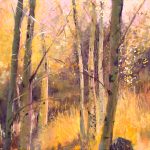
Alain Voinot’s work has been just short of the top ten so I’m delighted to include his work this month. Here we see a distinct division of space – two rectangles separated by the band of light streaking across the water near the top of the painting. The top rectangle reveals the warmth of late day as the sunlight skims the trees. The lower larger rectangle, by comparison, is cool and in the shade. Muted colours give us pause and respite and yet there is lots to see here. Particularly appealing are the water and rocks. The water is opaque at times reflecting the sky, transparent at other times, revealing the warm colour of the creek bottom. Rocks can be such a difficult subject and Voinot has successfully indicated enough form for us to read ‘rocks’ without detailing each one. And after our investigation of the subtle details of the foreground (there’s much to explore!), our eye is once again drawn upward by the zigzag of the stream to the warmth beyond. And the cycle begins again. Check out Voinot’s website to see more of his work.
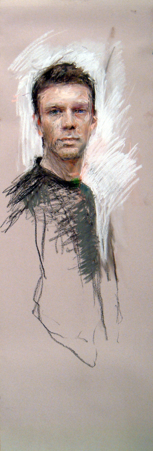
When I saw this image I had to stop and pay attention. Such confident mark-making required a closer look. I love the vigorous strokes going every which way both on the face, clothing and background and all coalescing into a readable whole. The energetic marks belie the calm face that looks us in the eye as if to say, Here I am. Artist. The strokes are built up on the face with the final light layer applied with a bold directness. I love the long format which allows more than a face to emerge. Look at the size of the paper – it allows for pretty much a life-size head. I would love to have seen this self-portrait being created. Look at the way Henriques has used the white pastel to cut in and create the final shape of the subject, both body and head. Can you see where the original view of the subject may have been more turned towards the viewer, the left arm hanging almost in sight but the white now negates that possibility, throwing the body into a full profile. Pastel has been applied with zeal and one can’t help but react to the vital nature of this piece. See more work here.
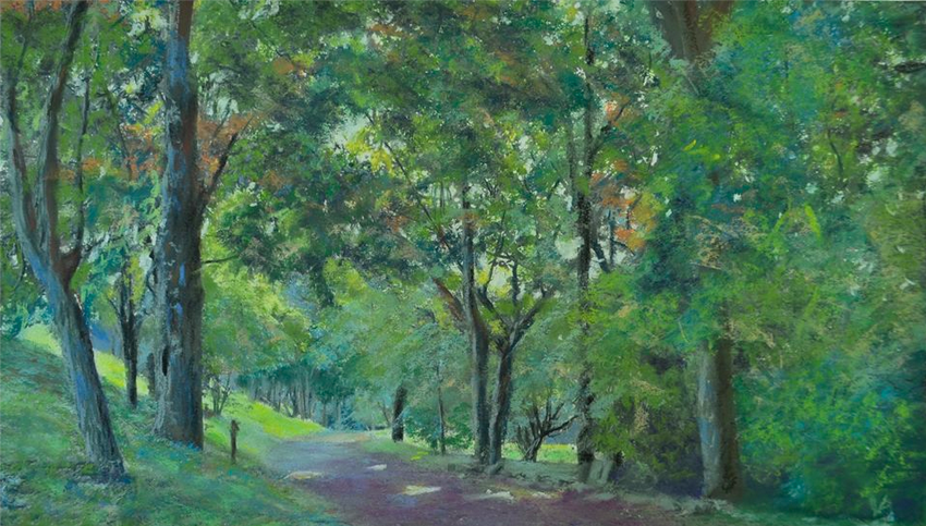
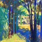
In this painting by Dalmo Antonio, we see greens everywhere yet we’re not overwhelmed by a feeling of ‘greenness’. Instead we find ourselves on a cool and calming stroll through nature, away from the frazzle of an urban life. The painting sits mostly in a middle value range punctuated by the few darks of tree trunks. There is little hint to tell us what time of day it is. The weather too is ambiguous but suggests a bright overcast day with enough light to warm the painting and create a few spots of light piercing the canopy, leaving its evidence on the path. The path leads us into the picture and curious as to where it leads, we follow. When we cannot see further, our eye drifts upward and circles through the tree tops, exploring colour and leaf. No other soul interrupts our reverie as we enjoy our shaded surroundings. Check out more of Antonio’s work on his Facebook Page.

Speaking of reverie, this painting can also soothe our soul with its calming colours of greens and blues and its guardians of trees, some of which are reflected in the still, mysterious waters. From a more realistic representation of trees in the previous painting, we enter into what feels beyond reality or more than reality. The blueness of the tree trunks suggests sentinels perhaps. From the dark foreground, we move into the lighter middle ground and since our vision of what is in the distance is obscured, we pull move along and finally circle back to the darker places. The subtle variations of the blues and green colours, the combination of side strokes and more linear hatched ones, and the contrast between soft and more sharply defined areas create a visual treat in which to linger. Something about the quiet dreaminess of this place recalls the work of Puvis de Chavannes. See more of Piana’s work on Facebook.
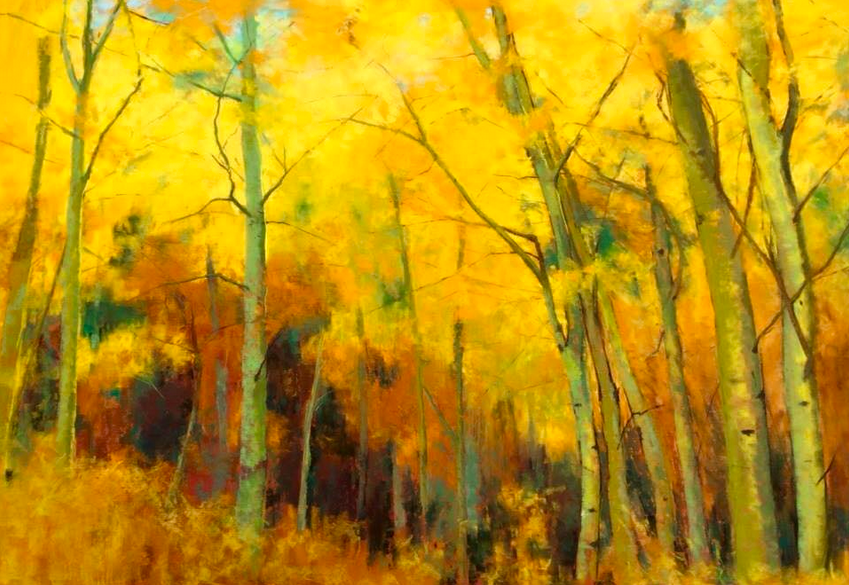
This painting isn’t about each beautiful Fall leaf, it’s about the majesty and awe that a forest of deciduous trees inspires at that time of year. Maureen Spinale has captured the essence of autumn in this somewhat abstracted painting. We are soaked in warmth and bathed in the glory of nature. What I can’t get over is the way Spinale has made an almost monochromatic painting in various shades of yellow punctuated by some analogous greens mainly in the tree trunks, and made a luminous and, what I feel as ‘colourful’, painting. She also moves our eye successfully around the painting – we swoosh down the collection of leaning-in tree trunks on the right and then move at a slow pace through the tangle of dark undergrowth only to be taken on a ride upward as we follow the trunks on the left. We see the hints of a September sunlit sky and then a thin branch beckons us over to once again take a trip around the painting. This time we can linger and enjoy the uniqueness of each tree trunk as we already know the way. You can see more of Spinale’s work here.

From the glow of light and yellow, we come to this moody painting of a girl. It’s unusual in that we more often see youth portrayed in a lighter way, without the shadows of age and wisdom and introspection. Dark as it is, this painting, like the one above, is almost monochromatic, using the full value range of a warm ochre colour. Even with so much concealed, we can make out enough in the features – the eye, the nose, the mouth, the fall and pullback of the hair – to understand a bit about this young woman. The shadowy forms of the piece hint at her character, introverted perhaps and quiet. The direct gaze, however, hints at confidence while the darkness of the piece suggests it takes time to get to know who she is and that she has an old soul. One can’t help but be reminded of Rembrandt’s work when considering this painting. To see more of this artist’s work, go to her Facebook profile by clicking here.

And now I smile 🙂 Does this portrait not engender a lightness of being? I feel that this person, Percy Ramirez, as portrayed by Bienvenido Sibug has a joie de vivre within him, a total optimism in the world. When I first saw this piece, I wasn’t sure about the almost solid pinkish purple colour of the cap, being as it was, so different from all the other colours of the painting. And yet I realized it is this colour that amplifies the feeling of joy here. Looking more closely, we can see the pinkish colour echoed at the base of the nose and rounded parts of the cheeks. I love the surprising inclusion of the blue behind this man. It suggests perhaps a cool light coming in from a window on the left. Take out the blue and the whole piece loses something. Note too the way the flick of the white lines on the shirt, the curved tips of the moustache and the rounded lines of the glasses all reinforce the smiling face. Have a look at more of Sibug’s work here.

I’ve only recently come across the work of Richard Suckling. I had a number of pieces selected over the last month and it was difficult to choose just one. But in the end, I chose this piece for its utter simplicity and focus on design, light, and colour (primarily two only – blue and peachy pink). I feel as if I am standing at the cliff edge looking out to sea. The water is so bright as the sunlight glints off the water that I literally feel my eyes beginning to squint and I move my hand to shade them. I can see the movement of those many dazzling reflections as they change under the moving sea. The painting is divided into uneven thirds with each division having a unique quality. The sky has more colour and the strokes move vertically while the sea is full of light and there is a horizontal movement. This is balanced out by the vertical feel of the lower third where teazels stand and sharply pierce the backdrop of the sea. Check out more of Richard Suckling’s work on his guest blog.

We go from the intense light of the previous painting to a mostly dark painting of a stormy scene. I love the predominance of turquoise-y blues that Bethany Carter Fields uses and I’m especially drawn to the luminosity of colour above the clouds. I enjoy the way the whole sky area appears almost abstract. It’s not until we notice the tiny line of trees, telephone poles and a red rooftop that we are located in a representational world. We appear to be looking at a farm house surrounded by acreage. The barely indicated lines in the fields give interest to the foreground and direct us back into the painting without distracting us. The diagonal rainfall does the same thing, keeping us from leaving the scene and indeed, points us to the farm. We are shown the insignificance of humanity contrasted with the grandeur of nature. See more of Bethany Carter Field’s work on her Facebook profile.

When I came across this piece, it stopped scrolling. I hadn’t seen anything quite like it before. Since then I have seen a few more pieces posted by Emily Christoff Flowers, but in the end, I decided on this one. I think I was charmed by the braces and the obvious delight this teenager finds in the music of Maynard Ferguson. It’s such a joyful piece! The listener is off in his own world and that dreamy feeling is enhanced by the whimsy of designs that lift off the background fabric and float across the surface, reminding us that a painting in itself is all make-believe. Even so, we feel both the passion and the innocence of youth here. One more thing, those beautifully rendered hands just get me! (And you probably know by now that I have a thing for well painted hands.) Go see more like this here.
A Note About The Difference Between These Selections and Jurying A Show
Although it’s a couple of months past the event, I was honoured to have been asked to jury the winter online competition for the Pastel Guild of Europe. It was a tough decision and took me many viewings to choose the winners. You can see them by going here. And you can read my comments about the pieces in the PGE’s newsletter, The Scribbler (starts at page 8).
Jurying a show is completely different from what I do in this monthly post. For this, I gather paintings that appeal to me and then cut down the selection to 10. No one knows who was part of the original collection so no one is disappointed.
It’s a completely different when you’re jurying a show. You’re presented with the entered pieces from which you make your selection. You must have a strict list of criteria by which you judge each entry and then go over and over to choose the winners, until you know deeply why you have made your choices. It’s hard on the juror and it’s really tough on the entrants, each hopeful that theirs will be a winning painting.
~~
I hope you enjoyed this month’s pastel pleasures and if you did, please don’t be shy about saying so! Leave me a comment and see what others have to say.
As always, it’s been a pleasure sharing my choices with you.
Until next time,
~ Gail


22 thoughts on “Pastel Pleasures For March And A Note On Jurying”
I love Voinot’s paintings of water. His reflections and sparkling sunlight give a wonderful calmness that appeal to all the senses. They are places where I would love to sit and relax.
Mary-Anne, I know just what you mean!!
I enjoy your choices and your comments. It is a pleasure as well as an entertaining lesson each month to see and read what you offer. Thank you so much!
Thanks so much Wendy. It takes me awhile to chose the final ten but then the real work comes when I write about each. I’m always happy (and relieved!) to hear that it’s a pleasure to see and read 🙂
Wow! Great selections. Was very pleased to see the first one was on Canson M-T so beautifully as it has become so common to hear it put down by sanded paper enthusiasts. The selection of portraits is amazing. I love reading your comments as they give me lots of insight into composition and design elements which I’ve only just started appreciating as the underpinning to great artwork!
Thanks Susan! There are some artists out there who do amazing things on Canson Mi-Teintes and Alain Voinot is one of them. Pretty incredible what he achieves. Glad you enjoyed the portrait selections! I am partial to the figure and portraits so always hope to squeeze some in.
I’m so glad that my comments are helpful 🙂
Glorious trees and fabulous portraits! Thank you for your explanation of the jurying process. That mystifying process that leaves you wondering why…
Gailen, when I began jurying, I really began to understand the whole process from the other side. Now when I get a rejection, although I’m hurt, I try to take it in stride knowing that I may have been one away from being accepted and also that, although there are criteria of value, colour, design, technique etc, there’s also the bias of the juror which really can’t be helped. So my advice, which you’ve heard I’m sure from many others, is keep painting and keep entering!!
Wonderful! Always a joy to browse your pastel picks! I’m especially happy to see Emily Christoff Flowers on this list (Way to go Em!) She and I go WAY back… I learned the 5-minuted amusement park portrait sketch from her in 1986 at Cedar Point, then worked again with her at Busch Gardens VA in the early 90’s. It’s so awesome to see her getting recognition for her amazing work as she branches out from commissioned portraits into the wonderful world of freelance fine art!!
How cool that you have such a history with Emily (or should I say Em?!). I just LOVE what she is doing and, like I said, it was difficult to choose which one to include here from the fabulous pieces I’ve seen.
Rita, thank you so much! You have taught me so much. It is wonderful to go from the traditional commissions to doing what ever the heck I want.
There’s nothing like going from commissions (doing what others want!!) to doing everything you want. Congratulations Emily on taking off!!
Thank you Gail for honoring me with your post. It is delightful to hear how you describe my work, and you write beautifully.
It was a delight to include your work Emily. And thank you for the writing compliment 🙂
Dear Gail,
You have such a nice gift of seeing beyond the obvious and into a painting. I always enjoy viewing your top ten and reading your comments. Well done!
Michele thanks for your lovely comment. I’m delighted you enjoy my Top Ten (I may need to use that name now!).
Dear Gail,
I was very surprised this morning when I learned that one of my paintings was selected for your Top ten for March.
I love how you are so thoughtful in your wording in describing each piece and how a painting makes you feel.
Thank you for including “Autumn Symphony ” it was a joy to paint. It was inspired by our trip to Yosemite . The Aspens took my breath away.
So, thank you again, it was wonderful reading your thoughts on this painting.
Maureen
I’m glad to have given you a nice surprise this morning Maureen 🙂
Thank you Gail for selecting and for the comments about my painting. It’s an honor for me to be part of this incredible list.
You are so welcome Dalmo!!
So happy to discover monthly all these wonderful pastel paintings, so different ! Many thanks for all this work you do, and which allow us to learn so much with all the explanations. Sorry for my bad English😕 !
I’m delighted that you enjoy these monthly picks Fabre!! And I also thank you for your appreciation:-D
And your english is just fine, plus mieux que ma francaise!!