
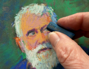
Yay, I just released a new pastel demo on YouTube. A lot of people have asked me about how I see colour? Well this video tells you a little bit about just that.
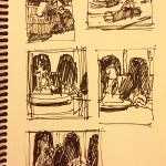
Here’s the thumbnail I did before the pastel. You can see it’s divided up into three values. As long as you understand values, you really can go crazy with colour. Just make sure your colour corresponds to the value that you want to reproduce.
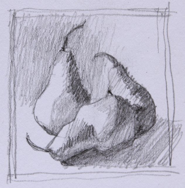
Here’s the set up of pears in life (well in a photograph of the pears in life – gets complicated!).

And here’s the same set up in black and white so you can see the values:

Here’s the initial drawing in charcoal on Wallis paper:

I didn’t show the full range of pastels in the video, just the outside of the box and later, the 11 pastels used. So here’s the whole collection of pastels:

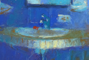
I don’t usually use Holbein pastels for a whole piece but I’m rather pleased with the way this one turned out! And here it is:

It’s amazing, as children we use colour intuitively and we are completely happy with the results. As we get older and ‘wiser’ we may be influenced by those who surround us (parents, teachers, friends) who with good intentions, direct us to a different choice of colours, one that more ‘realistically’ matches the outside world. They are safe colours, predictable and bearing a recognizable resemblance to the subject being painted. But there comes a time when we want more, we want to give expression to some inner calling of colour. We are bored and we want to break out of the rut we are in. And this is where learning to see colour comes in.
With practice, you can see colour. I find that some days I can ‘see’ colour better than others so beware of days like that and don’t be too hard on yourself.
Keep an eye out for that unexpected colour that just punches out at you when you least expect it. You know, when you turn to look at something and before your brain kicks in to recognize what you’ve just seen, you see that pure violet patch on the street. (When your mind figures it out, you’ll find the colour simmers down into a grey sort of asphalt colour.)
Rather than think of the rules and colour theory as you paint, just look. Sit and look until some colour emerges and put it down on the paper. It’s exciting stuff!!!
Let me know how you make out seeing colour in your next piece okay? I do want to hear from you! Thanks to everyone who commented on my last post – I attached them all to the blog. You can see them, and my responses, by clicking here to go to the post.
Until next time,
~ Gail
PS. Speaking of seeing colour, do you know Harry Chapin’s song “Flowers Are Red”? It’s such a sad one….and it’s all about seeing colour!!! Click on the image to hear it.


![Pastels on black aper: Gail Sibley, "Untitled [at this point], Mount Vision pastels on Sansfix pastel card, 5 1/2 x 7 3/4 in](https://www.howtopastel.com/wp-content/uploads/2016/04/IMG_9649-2-150x150.jpeg)


8 thoughts on “Eyes Wide Open – All About Seeing Colour!”
hi Gail , I enjoy your videos , I don’t have that problem , I see paintings and colours everywhere i go . but keep up the good work!
Cheers
Rae Smith
Thanks Rae 🙂 There’s just not enough time to paint all those paintings we see is there???
Thanks Gail. I’ll never see color in the same way!
Mary Jo
That’s wonderful Mary Jo!
This is a wonderful piece Gail! Thank you for including the song Flowers are Red, I had never heard it.
Debbie Kay
Thanks Debbie. And glad you liked the song. What a story it tells. Painful isn’t it?
Hi, thank you for this. Your videos are so helpful. I’m a complete beginner but love color and struggle to be brave with it. Practicing! I love pastel.
Hi CJ, many thanks for your words.
Practice and get those paintings done. That’s the way to make your way and be brave with colour! Yay!!