

We are well into August but still not too late for my roundup of ten uncommon pastel paintings selected from all the work collected over the month of July.
Each choice brings with it some thoughts as I examine and ponder the paintings. As always, you’ll find a range of styles and subjects. And remember, these are truly personal and subjective picks, paintings that move me or capture my attention in some way. I select many paintings through the month. In the days leading up to this post, I slowly whittle the choice down to ten. This time I got to about 16 picks and was stuck. A couple of pieces were by artists I had recently featured so I let go of those and then thirteen were left. After writing notes and seeing which I could really speak about, I determined the final ten uncommon pastel paintings.
July’s Uncommon Pastel Paintings

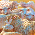
Unflinching, that eye stares out at us. We’re grabbed by it then led down the muzzle to the curving hair that swishes over the others on the chest. Following the curve, we come to the left edge where chest meets background and are plunged into a daring and yummy red-violet. We travel up until we encounter the cocked ear. It’s then that we discover the other eye, deeply hidden beneath the flop of hair blown to the left by an unseen force. Despite this gust, the dog stands resolute. This steadfast stance is reinforced by the erect ear on the right. Unlike the other ear, it holds us firmly in place within the picture despite the diagonal direction of pastel strokes and the dog’s hair.
Between the eye and the colour, I was stopped in my tracks by this painting. The rendering of the dog itself is pretty wonderful but with the addition of the surprising colour, it’s a winner. Normally I wouldn’t think a painting with a background of an entirely different colour from the subject would work. In this case, however, the main subject is mostly neutral greys, blacks, and whites which are a great foil for the bright saturated colour. Tiny smudges of colour within the monochromatic painting are warm (the deep brown eye, the skin colour within the ear, the subtle change of hair colour close to the mouth) echoing back the background warmth.
This painting calls out for a caption or a human voiceover don’t you think?
I couldn’t find a place to send you to see more of Michelle Bonneville’s work at this time (but hope that will change).

This pastel was Maria Marfia’s entry into the 10-minute Friday challenge (in the HowToPastel Facebook group) a couple weeks ago. I was taken with so much about it, so much observed and recorded in just 10 minutes. There were many extraordinary entries in the Challenge which all went to prove that much can be noted in just 10 minutes! This piece kept pulling me back to it. The first thing is it made me smile – the facial expression, the colour, the line. With just a few strokes, Marfia has described character, features, and feeling. We can sense her affection for this animal and dogs in general.
The values run the full scale from very dark to very light. And within these values is a fearless use of colour – not a grey or brown to be seen anywhere! Instead, Marfia’s mostly cool palette of blues is spiked with surprising flashes of red-violet and pink, all set against the warmth of blue’s complement orange. I love that we can see signs of the initial placement of the dog, adjusted and readjusted, all under the constraint of a ticking timer. Dark blues give us the shadow areas, the collar, the eye and nose. Mid-value blue stands in for parts of the body – ear, jowl, chest. Light blue notes illumination – eyelid, ear, the edge of the dog’s muzzle.
The dog pants and is easygoing; his ear hangs relaxed. There’s no tension in this creature alert to a walk or food or some other specific activity. It’s just dog and human delighting in the company of the other.
You can see more of Marfia’s work on her website.

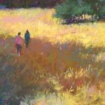
Let’s assume we don’t know the title of this piece and just look at the image. The energetic pastel application – strokes laid down with emphasis and passion – reveal a figure in movement, slightly silhouetted against the light. Head tilted, eyes downcast, we could read the impression of a young man with a sense of despair, of hopelessness in the world, representative of much of the angst of youth. And yet, there’s also a feeling that the inclination of the body will, all of a sudden, move vertical or even angle the other way, lifting the face, hair flicking outward with the motion. The diagonal line of the body and the intensity of light on the left suggest the need to rebalance with any tension being released. And at the same time, the warmth of the background and the skin, as well as the intensity of light, speak of optimism. I want to know who this young man is.
Susan’s boldly drawn facial features, all placed perfectly without fussing with details, speaks of a confidence with portraiture.
Of course once we know the title, much becomes clear. Now I can read this as a musician, perhaps leaning into the fingering of his guitar, deep in the flow of music. Still, I like to look at a painting without the associations a title can give us. One thing is, I’m happy to hear this is part of a series! I couldn’t find a website but you can see more of Typert’s work on her Facebook Page.

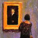
There’s something about this tightly cropped painting of a woman’s face that reminds me of the early portraits by Lucian Freud. The attention to the eyes in particular gives me this impression but also the carved feeling of the face, the linear quality of the hair, and the combination of flatness and roundness in the form. Laszlo Orban closely scrutinizes his subject who looks away from him. The model is vulnerable yet reveals a strength of character and a determination seen in the slightly pursed lips. What is perceived by the artist is not merely copied yet at the same time, a sense of faithfulness to the subject comes through. The woman’s status is given further significance by the size of the painting – Orban has painted her larger than life – and this gives us greater opportunity to inspect her intently, as the artist did while painting.
This woman is of today, sunglasses raised to the top of her head as if caught in a moment – ‘okay I’ll sit but only for awhile’ – and yet in the tangibility and truth of her form, we have the sense of a face that represents all strong women faced with the daily issues of living.
The portrait has been lovingly painted: look at the artist’s attention to the intensity of the model’s gaze, the detail given to the shape of the eyes, the observation of how her hair behaves and moves in areas – behind the glasses, emerging from the head, tangled in threads shown against a glowing background. The carved out three-dimensional form makes one forget that it was created by strokes of dry pigment on a two-dimensional surface.
I have found nowhere to send you to see more of Orban’s work. Darn.

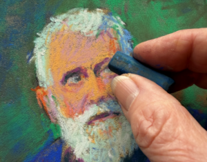
Bam bam! the strokes of pastel are applied with passion and energy. This piece commands our attention. Whereas Orban’s portrait is a linear one, here we have one that is full-on painterly. Essentially we have applications of a complementary palette of cool blues and warm oranges slashed down onto paper, all resolving into the features of this face. A powerful portrait indeed!
With dark skin, there’s often a strong reflective quality and Jz Xu has made the most of this – painting what he sees but also pushing that perception to the nth degree. It’s those dabs of blue that push the form to reveal its veracity. There’s no fiddling with detail – ears are mere shapes and lines of dark, the edge of the head collides in places with the red background, the neck is suggested with a chaos of pigment. Yet as slapdash as this may seem, the hand of an artist conversant with anatomy is at work here; averted eyes, broad striking nose, full lips barely parted, carved cheekbones, pronounced chin, are painted with knowledgeable yet impressionistic perfection.
The fiery background vibrates against the dark head and blue stripes of the shirt. Movement is indicated in the carving out of negative space behind the head and suggests a man alive with the passion of living. Despite the gestural strokes of pastel, a feeling of gentleness and an empathetic soul is conjured up by the artist in this portrait of his friend.
See more of JzXu’s work here.

Ahhhh a still life. But there’s nothing ordinary about this one! All the parts are beautifully executed – the reflective metal of the jug, the leathery skin of pomegranates, the nubbly buds and smooth leaf of the eucayptus, the silkiness of cloth. A strong off-centre vertical rests on a dark horizontal plane. And then there’s the moth. Caught mid-flight. Lightening and balancing out the heaviness of the composition. So tiny yet such an important and integral part of the piece! I enjoy the play here on the idea of still life – all the other pieces in the arrangement are to be expected but the flying moth doesn’t belong. Unless of course it’s brought to a standstill by the painter.
Two other parts that hold me to this painting are the edge of a frame on the upper right, barely seen, and the shape (handle of another jug?) on the far left. Both didn’t need to be there (they are hardly worth mentioning) but remove them by placing your hands over them and see the change!
The soft yet dramatic lighting that shafts diagonally across the dark picture both brings our attention to the moth and creates a quiet movement. In that band of light also sits the jug. And we can’t help but be mesmerized by the reflection in the pitcher – what is being reflected? I can’t make it out but what I see reminds me of a cocoon which in turn makes me think of the moth and the metamorphosis it’s been through. The moth flies toward to the reflection and to the light. And what meaning can we take from this?
You can see more of Otto Stürke’s work on his website.

Is this really done in pastels? Such precision and crispness of edge with no remnant of a pastel stroke belies both the softness of pastels and it’s mark-making capacity. Although the painting shows a young girl swimming underwater, the subject of the painting seems more to be about the affect water has on our visual perception of objects beneath it – the twists and turns of light and the distortions of the figure. Each area of the painting is an abstraction; it’s only when we see the whole that we discern the swimmer. The shapes of blue in varying values are like crystalline forms, shifting under the motion of water and reflections and refractions of light.
Michelle Lucking revels in the distortion of the girl below the surface, reverently recreating every bizarre shape, every sliver and calligraphic swirl of light, every subtle shift in colour. I find myself memorized by the patterns. And waiting for the rising air bubbles to break the water’s surface. And anticipating the swimmer moving beyond the painting’s edge. But she’s caught in that moment between exhale and inhale, suspended in time and space forever. And so we go back to savouring the dichotomy of soft flesh and hard unyielding pool floor. And the tension between a figure caught between the painting’s boundaries and the force of movement. And the way the circular patterns of the bikini are repeated in the shapes and shadows made by the air bubbles.
Check Lucking’s website for more of her work.

I’m both drawn to and repelled by this painting. I’m attracted to the linear and warm-coloured pastel marks describing this young girl’s body without contour demarkation. Unlike the lightness of being and the sense of freedom we feel in the pastel painting above, here the young girl sits surrounded by the blackness of the paper. And this is where I am repulsed. The darkness gives us no clue as to the location of this young girl and for some reason, along with other reasons, I feel disquiet.
The containment of the body within the four edges of the paper with only the tip of one foot breaking it, along with the darkness, suggests confinement in an unpleasant place. The resigned slump and facial expression, the undressed state of the girl, the gaze away from us (is she looking at something or someone, or in her own thoughts?), all these things together give me pause, remind me of stories I’ve heard, of horrors done to young people particularly girls. Is she at the mercy of someone? All of this comes to me when I look at this picture. And I’m filled with a deep sadness that these things actually take place in our world.
And then I look at the physicality of the painting itself and I’m excited by colour, line, shape, edge. An interesting push pull for sure!
The title, ‘Heat,’ may fit with my reading, or the artist may have had a completely different idea – high temperatures can certainly bring about a state of listlessness that can also be read into the girl’s posture. The blackness of the paper perhaps represents the feeling of endless time. When will we be cool again?
You can see more of Elena Degenhardt’s work here.

Here we have your average street in an average neighbourhood where a perfect blue sky is scattered with a few puffs of white clouds that brighten the day after a perfect rain shower. All the houses look perfect in their size, in their paint jobs, in their placement. Long shadows reveal the start of a new day. Soon we notice the back end of a car. Look more closely and the reverse lights appear to be on; someone is about to head out – to work, to play, to disappear? In this perfect world, are there undercurrents of hidden not-so-perfect actions, thoughts, words, behaviours? We never know what happens behind closed doors or what goes on behind the mask of people’s smiles. One side of the street is lit while the other remains in shadow. And so doesn’t this painting stand in for the continually shifting balance between dark and light, between joy and sorrow, between life and death, between vitality and ennui? Look at the painting and fill in your own opposites.
The perspective of variously shaped homes as they recede into the distance and are lit by the rising sun read beautifully. The overwhelming blue of the painting is balanced by the warmth of sunshine in the glow of yellows streaking over the street and striking the houses. Much of the rest of the painting is done in muted colours. They balance out the intensity of saturated blue in the sky and its reflection in the pool of water left after the rainfall.
Is this simply a recording of a flawless moment in time or does it beg the question, what’s really going on?
I couldn’t find a website for Curtis Eley to point you to more of his artwork.

The unmissable texture of the paper shows through in this 12 x 9 in landscape. I feel that it’s a picture about the process of painting – about colour and pigment, shape and marks – as much as it’s about trees and sky and land and sunset. The whole thing seems to be exploding out beyond the confines of the paper.
The painting reminds me of the work of romantic painters (think Eugène Delacroix, Théodore Géricault, and Casper David Friederich) in the dramatic diagonal lighting, the rich colouring, the awe inspired by the sublimity of nature. Dense darks fill the piece yet you can still spy the green of grass and vegetation. The shapes of trees are unmistakeable yet at the same time made indistinct by soft edges. Although dark silhouettes, colours of blues and purples are evident in the trees.
The downward diagonal slash of piercing light takes us earthward where we are cooled and stilled by the darkness and earth but soon our eyes rise up through the trees to the light, looking for its source. There’s much opaque pigment on the paper yet there’s such luminosity. This painting is indeed an ode to nature.
At this time, I couldn’t find a website for Sharon Orlando-Evans.
*****
So that’s it for this month’s uncommon pastels paintings! Tell me what you think by leaving a comment.
I’m getting excited as I prepare for my workshop in Croatia. Can’t wait to meet all the students and enjoy the experience with them. Imagine – painting, learning, food, wine, laughter, swimming, exploring, the joy that comes from being in another country. It doesn’t get much better than that!
The workshop is 2-9 September but Cam and I leave for Croatia on 22nd August (that’s in two weeks!) for some time to explore Zagreb and then journey to Istria stopping along the way. A warning: while away, my blog postings may be a bit spotty…
Until next time,
~ Gail


30 thoughts on “July’s 10 Uncommon Pastel Paintings”
Thank you so much Gail for including me in your blog! I was happily surprised when a fellow artists posted on my Facebook account. I really appreciate your critique and kind words.
You are so welcome Sharon! I’m glad you were surprised 🙂
They are all so creative and wonderful but “Beautiful Boy”really speaks to me.
Thanks Janette for letting us know your fav. And yes – ‘Beautiful Boy’ is wonderful!
Thank you for featuring me in your July picks, Gail! I’m truly honored. I love reading and looking at your selections every month. You are so good at writing about art. I always learn so much from you.
You are welcome Marie! I would have included you in the 10-minute blog but wanted to hold it back in case I used it in the monthly selections (in case you were wondering why I didn’t use it). So happy to know there’s value in what I write!
Hi Gail and thanks once again for all your devotion and work.
I don’t know how your find your artists of the month, or guest bloggers, but I wonder if you have ever heard of the French pastel artist THIERRY CITRON? Self-taught, he revolutionized the pastel world when he first exhibited. A totally new approach, new technique, far removed from the usual almost photographic renderings of the accepted schools. He has a web site you might want to check out.
Warmly
Nancy Malard
Thanks Nancy. And thanks for the intro to Thierry Citron!
Gail, I’m never sure whether it is the paintings themselves or your superb analysis that strikes me most. All good and looked forward to every month.
Thanks so much for your lovely comment Carolyn. It takes me huge amounts of time to ponder what I am going to write and then actually write something coherent to express a deep look and my feelings and thoughts. So thank you!
I love reading your Blog. Your critiques of the paintings really help me to see just what is good and not so good about each paintings. This helps me to make my paintings better. Thank You.
Thanks Eileen. I am so glad these help you to learn.
I want to say that hope not to say anything negative in a judgemental way as these are not critiques but rather personal interpretations about why specific pieces caught my eye.
What a wonderful idea. Well, it is new to me. I love seeing your personal picks and the comments you must spend a great deal of time on are terrific. I’m hoping I can go look at past months also. Thank you for sharing this. It’s almost an overload of stimulus since Albuquerque but I’m loving the push.
So glad you like it Anne. Yes, do have a look back. I laughed though when you talked about overland after IAPS – I know what you mean! These posts will be here whenever you want them so don’t feel you have to grab them immediately!
Wow! Thanks, Gail…..imagine my surprise this morning when I looked at your blog and discovered “After the Rain – Oceanfront” was among your “July’s 10 Uncommon Pastel Paintings”!! Always enjoy your blogs….and I always get something from them! Thanks for including me! By the way, I don’t have a website, yet….hopefully that will change soon…but anyone interested can view much of my work under my ‘photos’ section on facebook. There’s an album marked, “Artwork by Curtis Eley’…..thanks again!
Glad you were happily surprised Curtis! And hope you were okay with what I wrote. Yes, do work on a website as soon as you can. Doesn’t have to be fancy. I know easier said than done when there’s painting and life to attend to! Thanks for letting us know where we can see your work.
To read about and look at some of T.Citron’s work (in French) http://www.art-culture-france.com/fiche_artiste.php?id_artiste=22537#ad-image-0
Thanks Dominique for adding to the resource!
I just clicked on the link you provided to T. Citron’s work. I absolutely fell in love with this artist’s paintings. I could not only see the beauty in his paintings but I immediately felt connected through music. I could actually hear the symphony playing in my mind as I looked through his work. Thank you so much for sharing. It was an emotional experience for me on many levels.
Fantastic Glenda!!Thanks for sharing your powerful response to Citron’s work 😀
Love your choices! I saw some earlier on FB and so glad they made it to your selection 🙂
Yay! It sure is difficult to make the final ten selections!
Thank you so much for including me in!! Your article is an inspiring and thoughtful read. It made me take a different look at other artists’ fabulous paintings.
You are so welcome Elena! I am delighted to hear how the article affected your take on paintings by others 😀
My first impression of the first image, the dog portrait “Ghemma”, was “Gunslinger”! Doesn’t she have the exact look and posture of the classic resolute western hero daring the bad guy to draw their weapon? There’s always that breeze blowing the tumbleweeds past, and I could even hear the whistling notes that would invariably proceed the gunfight scene…
YES!!! Thanks for your elaboration on the kernel of the idea I had (but didn’t speak of). Now we can see Ghemma in the part completely! I can hear the musical notes and whistling…..
I’m looking forward to learning more about Pastels and the creative process. Each painting shows the different techniques that can be achieved. Such beauty!
Wonderful Patricia! My hope is you’ll learn LOTS about pastels here!!
Dear Gail,
Thanks for your videos. I just started recently…soft pastels…on sandpaper from hardware shop. Very cheap. I’m using grit p1200-1500 . It’s very nice.
However, I bought pastel mat and meteintes touch online. I didn’t like them. I love painting animals, birds . Could you show how to paint animals please. Am I right in using hardware sandpaper?
Please suggest. Your energy in videos is very infectious. Thank you.
Drsujanith
Hello Drsujanith,
Thanks for your comment. Although hardware sandpaper feels good to use, it won’t stand up over the years. So I would suggest moving to a sanded paper like UART or Pastel Premier or Art Spectrum OR preparing your own. I do find Canson Mi-Teintes Touch a bit rough. I haven’t used Pastelmat yet but many love the paper. They do say the magic is in the layering so maybe you could try using it again.
As to your question about painting animals, as I rarely paint animals I can’t answer that specifically. What I can say is to look at shapes, simplify everything into three (or four) values i.e. do thumbnail sketches, and really take time to look and SEE the subject. Doing these three things will be very helpful. Also look carefully at how other artists tackle animals in pastels.
I’m glad you enjoy my videos. It’s high time I made more!!