

I’ve been circling around my work, trying to get back into it after a few months away—life and family will do that. But this week I finally said, That’s it! Enough tiptoeing— do something! I always say that action is what makes “it” happen, so I took my own advice and put pastel to paper, letting go of any expectations. By the end, I was happy enough with the piece. But when I came back to the studio the next day, I realised something was amiss. I pinpointed the problem and, using charcoal, I think I fixed it!
Yes—charcoal! Vine charcoal, to be precise.
I love using charcoal – it plays so well with soft pastels. I often begin a piece with it, drawing up the image and then enjoying how easily I can smudge and soften it. It’s also fantastic for redefining areas mid-painting, and also for pushing areas back in a subtle, gentle way.
Let’s take a look at how I used it in my painting.
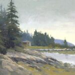
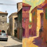
Here’s my thumbnail of one of the worker bees in the kitchen of JJs, my favourite local Chinese restaurant.

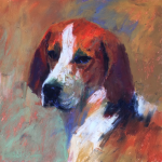
And here it is drawn up in vine charcoal on UART 600 paper

Then, the first layer. Since I knew I’d be adding a lot of cool colours, I chose warm hues for the middle and dark values. For the light areas, I jumped straight to using a cool green to capture that fluorescent lighting look.

Then I started in. Soon enough, I hit the ugly phase—where the inner critic does what it does best: This is a mess. Maybe it’s time to quit. But I ignored the voice and carried on. I’ve been here before and I know the trick is to just keep going.

So I kept at it. Even though this piece is quite small—just 9 x 6 inches—I wanted to suggest a face. I dove in with my big pastel sticks. Bit of an eeek moment, but again, I reminded myself it’s not the end.

More pastel, more layers… until I was pleased enough to call it a day.

And for fun, here’s the black-and-white version to compare to my thumbnail.

The next day, I came back with fresh eyes. That’s often when any lingering problems make themselves known.
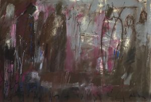
I realised there were some hard edges in the background distracting from the figure. (Also, some light spots!) There’s also one particularly dark shape that kept pulling my eye. Have a look.

I also decided that slightly darkening the shape on the left would help the composition. Plus, a few strategic dabs of the warm red I’d already used in the piece would help move the viewer’s eye around the painting.
I made those adjustments.

Better. And yet…
After a break, I returned and saw the real issue: the figure was fighting the whole background for attention. I needed to dull it down.
Enter using charcoal!
At first, I thought of adding more colour to dull things. But I wasn’t using complementary colours, so that wasn’t the solution. Instead, I pulled out my trusty charcoal and, with a light pressure, I covered the entire background with it.

Using charcoal like this gives you a quick and effective way to see if indeed a passage needs dulling. If you go too far, no problem—you can always layer pastel over it. But in this case, when I stepped back, I saw it was just right. The figure was now clearly the star.

And in black and white, you can see that although using charcoal slightly darkened the middle values, each shape still holds its intended value.

Is it finished? I think so. It’s all too easy to fiddle faddle a piece to death. Time to move on!
And here are the Unison Colour pastels I used:

Can you see how using charcoal made that subtle yet effective change? Can you see how using charcoal can benefit your pastel work? Is this something new you might try? Or are you already a fan of vine charcoal?
I’d love to hear from you so please leave a comment below!
Until next time,
~ Gail
PS. Here’s the reference with the man’s face removed for privacy.


12 thoughts on “Using Charcoal with Soft Pastels – A Surprising Solution”
This is such a clear, and strikingly effective, lesson! It is amazing to see how well this works — I would never have guessed!
Hey John, that’s marvellous to hear!!! And yes, vine charcoal is pretty magical stuff!! 🤫
What a great article! Thank you so much! It would be difficult to make that transition using color.
Yay! And yes, charcoal just makes the quietest yet most effective changes!!
Great trick Gail!! I will definitely put this in my toolbox!! Lovely painting too!
That’s great to hear Ruth. I wouldn’t be without it!
And thanks 😊
Hi. Im sort of new to the medium but I absolutely love it.
Am I supposed to start all of my pastel paintings with a pencil thumbnail ? then another one in charcoal and add color to the charcoal sketch or a 3rd one with full colors?
Hi Vanessa! So happy you’ve discovered soft pastel 😁
Thanks for your question. Thumbnails? Well, I’m going to say, yes, absolutely do them! It took me some years to accept their benefit but now I wouldn’t be without them. You can search “Thumbnail” on the HowToPastel blog and you’ll have a whole heap of posts come up! But here’s one to get you started.
What comes after the thumbnail is totally up to you! I jump straight into colour!
I like the use of the charcoal on the background, and it seems that you used mid value Unison’s. I think the top deep orange one was probably the darkest light that you used to shade like under the hat and under his sleeve? In order to make the values darker did you use more charcoal?
Hi Deb, thanks for your questions!
If you look at my photo of the pastels I used, you’ll see my two darks are at the top – warm brown and the blue green. The next row are my middle values and the two at the bottom are my lights. The two darks I used are not “absolute” darks but, relative to my mid-value colours, they read as dark. I rarely use extreme darks as the darker you get, the less colour shows and, well, I love colour!
And to answer your second question, I didn’t use the charcoal to darken, just to dull.
Excellent job using the vine charcoal to dull the background. I would have never thought of using that technique.
I LOVE vine charcoal for so many reasons, this being one of them! I hope you give it a try.