

Meet Susan Kuznitsky!
Over the years, I’ve seen paintings by Susan pop up on social media and I’d think, Ooooo how lovely is that?! And over the years, we’ve briefly chatted in an IAPS hallway or more likely a booth when we were demoing. And I’ve often thought, why don’t I invite Susan Kuznitsky (pronounced: kooz-nit-ski) to pop up as a guest in HowToPastel?
And now, here she is!
Don’t know Susan’s work? Check it out!

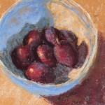
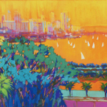
Pastel on Lux Archival , 14 x 18 in.
This was like painting a large floral quilt!
Before I hand the blog over to Susan Kuznitsky to share her thoughts and tips on how to simplify complex subjects, here’s a wee bit about her!
Susan Kuznitsky Bio
Susan Kuznitsky is a product of her rich background and art experiences. Growing up in Chicago she was surrounded by culture and art. Susan left Chicago after art school to become Albert Handell’s Studio Assistant and absorbed much from his years of knowledge. She also studied with the late Richard Schmid, further broadening her skillset. Susan teaches classes both locally, online, and abroad and is a popular workshop instructor as well as a sought-after Juror and Judge for shows both nationally and internationally. Check out her website here.
And now, here’s Susan Kuznitsky!
~~~~~
The first artist that captured my attention was Norman Rockwell. My mom bought the ‘Norman Rockwell Illustrator’ book, when I was about 14 years old, and I spent many hours poring over it. I loved his ability to tell a story.
Another early influence was Andrew Wyeth. His ability to find the romance in the ordinary really stuck with me. During my time at the American Academy of Art in Chicago in my late teens, I became obsessed with the Pre-Raphaelite painters. Clearly the pattern here is my attraction to detail and how to use it to tell a story.
I spent many years with the internal message that I shouldn’t paint so much detail. I finally realised I was fighting something that brought me joy. So, I gave myself ‘permission’ to continue pursuing my love of detail but with a goal of painting the illusion of detail. Sounds crazy, huh?

Pastel on Lux Archival, 8 x 10 in.
As I continued this journey, I began to learn the concept of seeing everything as shapes like a jigsaw puzzle where all the pieces fit together. Once I understood this (and I am still learning!), it seemed to not matter how detailed or complex the subject is.
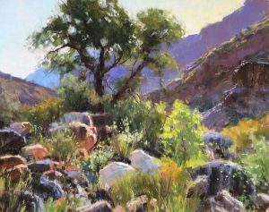
The first challenge I set up for myself was to learn how to paint the magical feeling of dappled light. I have studied how others have painted this subject. It is where I really learned about simplifying shapes. Once I felt like I could handle this subject matter, it led into other complex subjects.

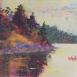
Pastel on Lux Archival, 20 x 16 in
While teaching a workshop in Provence, around every corner there was something exciting to paint. For the painting Sunlit Moment, I cropped the photo and gridded it and then used the same grid pattern on Lux Archival paper (9 x 12in) and drew it with pastel pencil.


The next step was a watercolour underpainting to establish the large shapes of my composition. At this point, I ignored the smaller dapples of light with the intention of adding them later. Because of the nature of watercolours, I do two or three washes to get the darks I want. Next, I begin to apply light layers of hard and soft pastel focusing on varying the colours in these large shapes while staying in the same value range (how light or dark a colour is).


Pastel on Lux Archival, 12 x 9 in.
My pastel pencils are a wonderful tool to softly blend the colours. Adding more dappled light now becomes a design and composition decision. It is like choreographing a dance. I decided to simplify the space in between the two buildings. An example of taking away what doesn’t work for the painting.
Painting complex subjects is challenging and rewarding. It can also feel intimidating.
Whether I’m painting figures in a landscape, a cafe interior filled with objects, or a layered room full of textures and perspectives, I find the key lies in managing complexity without losing the essence and clarity of the painting. It has taken me years of observational strategies to simplify visual information, build confidence, and create compelling works without becoming overwhelmed by details.

Pastel on UART 400, 12 x 16 in.
Complex subjects are characterized by their many visual elements working together—the interplay of figures, shapes, colours, and textures creates richness, but it can also make the subject feel like a visual puzzle. Trying to paint everything at once is a common pitfall. If you approach a scene by attempting to duplicate every detail exactly, you risk losing focus and may end up with a cluttered or confused image.

Pastel on UART 400, 14 x 7 in.
I fell in love with this charming boutique in Provence.
The first step is to understand the nature of the complexity involved and have a strategy to break things down. I start with analyzing my photo reference to see what to leave in and what to leave out. It is not a one-and-done step. I will delete or put back elements as the painting evolves. Remember YOU are the boss of your painting not the reference be it from a photo or from life. I like to do this step in photoshop, but it can also be done in a thumbnail or small study.
Baristas is a recent painting done from a photo taken in Northern Italy. This painting required some real drawing skill. I started with a grid and had to do some redrawing in between watercolour washes. The geometric square shapes of the shelves and the pastry case created an interesting contrast to the round domes on the cake plates.

In the first watercolour wash, I really simplified the painting into large shapes. Think of making a jigsaw puzzle with big pieces for a toddler. In the second wash I began working smaller shapes into the large ones. I had to redraw after the third wash. I treated the pastries and the label cards as one shape and then broke them up into smaller shapes. The last layer was done with soft pastels to create the highlights on the tiles and the reflections on the glass domes.

Baristas Progression

Pastel on Lux Archival , 11 x 14 in.
It’s taken years to train my eye to identify the largest shapes within the composition. I always seem to return to the analogy of a puzzle composed of big pieces like for a young child. These large shapes often define the main areas of light and shadow, the general positions of figures, and the arrangement of major objects. By concentrating on these larger forms, you lay a foundation that guides where details belong later. This step also helps to prevent overworking the painting early on, which can lead to muddiness or loss of focus.
For example, in the painting The Moon and the Stars, I needed to analyze and look at how the figure fits as a simplified shape against the background. What is the overall shape of the figure’s clothing or posture? How does the figure relate to the shapes around it? By isolating these large shapes, you can start to compose a harmonious picture before adding complexity.

The underpainting for this painting was done with an isopropyl alcohol wash over a light layer of pastels. I identified the largest shapes by blocking them in with loose strokes. This can be done with hard or soft pastels. After establishing these major zones, gradually work toward smaller and more nuanced shapes. You might think of this as building a structure layer by layer—foundation, walls, finishing touches.

The Moon and the Stars – Progression

Pastel on Lux Archival , 19 x 26 in
This progression is about value and colour relationships as well. Establish the darkest darks and the lightest lights within these big shapes. This helps maintain contrast and visual interest. Then, move into adding mid-tones and accents. By following this sequence, you retain control over the composition and avoid getting lost in details that don’t support the overall design.
A common misconception when working with complex subjects is the belief that every element must be fully rendered for the painting to be successful. This is rarely true. It’s helpful to think about how our eyes and brains perceive a scene. When you look at a face full of freckles, for example, you don’t see every single freckle with the same clarity; your perception fills in many details automatically.
For instance, when painting hair, I treat it as one shape and one value. The silhouette of the model’s hair in the painting The Moon and the Stars is very important to the overall composition. The careful modulation of pressure and layering of pastel marks can make this area rich and suggestive without being fussy. This means that in a painting, you only need to suggest details rather than painstakingly reproduce every dot, line, or texture. Selective emphasis on some details asks for the viewer’s imagination to participate in completing the image. It works as an invitation rather than a literal blueprint.
Remember, it’s not about leaving areas incomplete but instead, choosing the areas to invest your attention and deciding where you allow shapes and colours to imply detail. This balanced approach makes your work more engaging and dynamic.
In The Moon and the Stars, I saved my attention to detail the crystals and the reflection. I really had to make decisions about the design element here. I had to re-gird and re-draw after I started adding pastels to the underplanting to maintain the composition. It was so joyful painting all the sparkles. I even added specks of fluorescent colours to enhance the feeling.
Next is a busy store scene. Do you need to draw every single product on the shelves or every label? No. Instead, indicate areas of interest and let shapes, light, and shadow suggest the rest. This approach reduces visual noise and highlights the key elements of the story you want to tell. As I was painting this painting the title came to me – Purses with Personality.


I cropped the original photo so it would feel like the viewer was standing in the store.
Again, in the first watercolour wash I broke it down to geometric shapes. Throughout the next steps of layering with hard and soft pastels, I kept making decisions as to what to leave in and what to delete from the scene. I used the colours to ‘dance’ your eye around. If you look at the original photo you can see that I added the yellow purse from the front row of purses to play around with this idea. I also emphasised the arch of the wall to keep your eye focused on the ‘happy purses.’

Purses with Personality – Progression

Pastel on Lux Archival , 12 x 16 in.
My painting,The Gerber Clan, was a huge challenge! It was a commission from a student of mine from a photo she had of her 10 grandchildren dressed in various shades of green for a St. Patrick’s Day dinner at grandma’s. Talk about a complex subject!

This was done on UART 400 15 x 30in. There was a lot of gridding and drawing with pastel pencils. To maintain the details of the children, I lightly sprayed the painting with fixative before beginning the watercolour underpainting. I so enjoyed the details of the clothing and the challenge of capturing the individuality of each child.


Like any skill, simplifying complex subjects is developed through intentional practise and observation. Develop a habit of stepping back during your drawing or painting sessions to check how your shapes and values relate to each other from a distance. This “big picture” view is critical to managing complexity. And constructive feedback from other artists is invaluable. We all need another set of eyes to give us an objective look.
Use references actively. Look closely, but then ask yourself: what are the largest areas of light and dark? Where do details get lost or gain prominence? This mental filtering is a valuable habit, especially when revisiting complex subjects.

Pastel on UART 400, 14 x 14 in.
It’s important to respect your own journey and knowledge rather than forcing a rigid approach. Take time to observe with curiosity rather than frustration. Pastel as a medium responds well to intuitive, hands-on exploration, so don’t hesitate to experiment with mark-making and colour while keeping the large shapes in mind. Your lived experience and personal perspective contribute to how you see complexity. Use that to your advantage. Maybe you have a heightened sensitivity to mood, personality, or atmosphere that lets you convey the scene’s essence without getting tangled in every detail.

Pastel on UART 400, 14 x 18 in.
I loved the resort towels and the reflections they made. And the obvious fun the girlfriends were having.
After completing a painting, spend time reviewing which parts you detailed and which you left simplified. Consider how those decisions contribute to the painting’s overall visual impact and message. Do the large shapes hold together? Do the suggested details add interest without being overwhelming? What might you do differently next time?

Pastel on Lux Archival, 12 x 12 in.
Reflection deepens your understanding of your process and helps develop your personal artistic language. Over time, you will find yourself more comfortable addressing complex subjects and making judgments about where detail is necessary and where suggestion better serves the painting.
One misconception is that complexity requires complexity in technique— that you need to layer thousands of pastel strokes to achieve believable detail. Instead, mastering complexity often involves restraint and simplification.

Pastel on Lux Archival , 11 x 14 in.
Another misconception is feeling that respecting every detail is the same as being realistic. Realism in painting is a matter of a convincing impression and accurate relationships, not photographic replication. Remind yourself that you’re painting a scene, not a photograph. A good painting comes from choices made, not from perfect description.

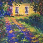
Pastel on Lux Archival, 11 x 7 in. A local shop.
In conclusion, painting complex subjects with pastels requires a thoughtful approach that balances simplification with the richness of detail. By learning to see and block in large shapes first, progressing thoughtfully toward smaller shapes, and confidently suggesting rather than painting every single detail, you create work that is both clear and expressive. Remember that your goal is not to overwhelm the viewer but to invite their imagination into the scene.

Pastel on UART 400, 16 x 20 in
Over time, through practise, reflection, and respect for your own artistic journey, you will develop the skills and confidence to handle even the most complex pastel subjects with ease and creativity. Do not be scared off by detail; instead, approach it as an opportunity to engage deeply with your subject and to communicate with clarity and impact.
*****
I soooo love seeing those pieces move from reference to start and then to finish. I’m always amazed to see a painting’s progression, how it develops from something so barely formed to something that sparkles and fills us with delight.
Susan Kuznitsky has shown us how she simplifies complex subjects and we hope this helps you to take on scenes that may have frightened you away in the past! Be sure to come back and let us know when you do.
And be sure to share your thoughts and questions for Susan as a comment below!!
Until next time,
~ Gail


14 thoughts on “Susan Kuznitsky On Simplifying Complex Subjects”
I Love Love LOVE Susan’s work! Thank you for having her on as a guest! ❤️
And I Love Love LOVE that you left such an enthusiastic comment Rita!!! Thank you!
What an excellent article with great advice! I will be saving this to read over and over. Thank you!
Rebecca, that’s just the best!!!
Oh….my……gosh!!!! What a splendid group of works! I am always trying to loosen up, but never quite achieve it. Susan does an amazing job of combining shapes and detail to incredible finishes!! I’m inspired!!!
Yayyy!! That’s so great to hear you’ve been inspired Ruth!
Big fan of Susan’s work. Its truly amazing. I took an online course with her and she’s very generous with her advice and I love her laid back attitude. Helps to not get stressed about the work. Thanks for inviting her to share her process.
It was my pleasure to have Susan as a guest MaryAnn! Thanks for sharing your own experience learning from her 😁
What beautiful work. These are so ambitious, and they turn out so well. At each reference, I would say, “Who is crazy enough to attempt to paint that?”
And her advice is right on. Focusing on the shapes and values, and save the details for last. But she is a bit deceptive, in that she has incredible drawing skills, and when she gets to the details she doesn’t hold back.
Hah hah, I hear you about the references Kyle! And agreed, Susan’s drawing skills stand her in good stead. It’s amazing when you get those big shapes in how you can go all out on the details!
What an amazing artist! I loved seeing her paintings and hearing her take on how to simplify without losing the added richness of detail.
Thanks, Susan!
Thanks, Gail!
You are so welcome Wendy! Delighted you enjoyed Susan’s post so much!
I’m a Huge fan of Susan’s artwork.. This was a great interview..her view points are always so simplified! Thank for this Gail!
Love hearing this Arabella!!