Login

And here's me at work on the first demo using Schminke pastels

Demos At IAPS In The Schmincke Pastels Booth

At the beginning of June, as you know, I was at the wonderful bi-annual International Association of Pastel Societies (IAPS) Convention. I was fortunate to be asked to demo twice using Schmincke pastels at their booth.

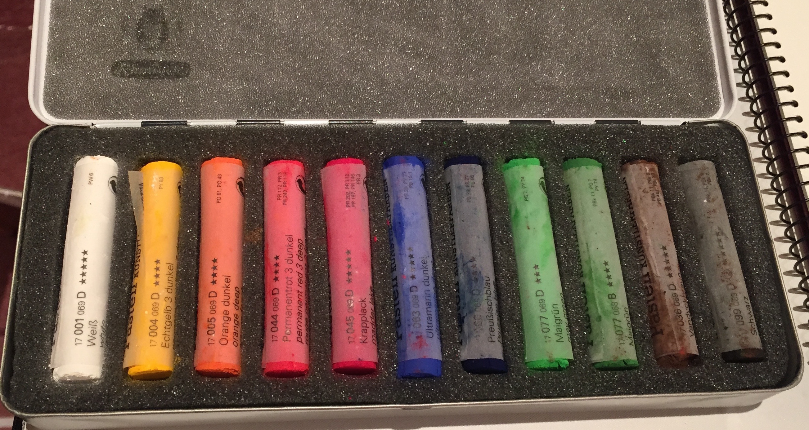
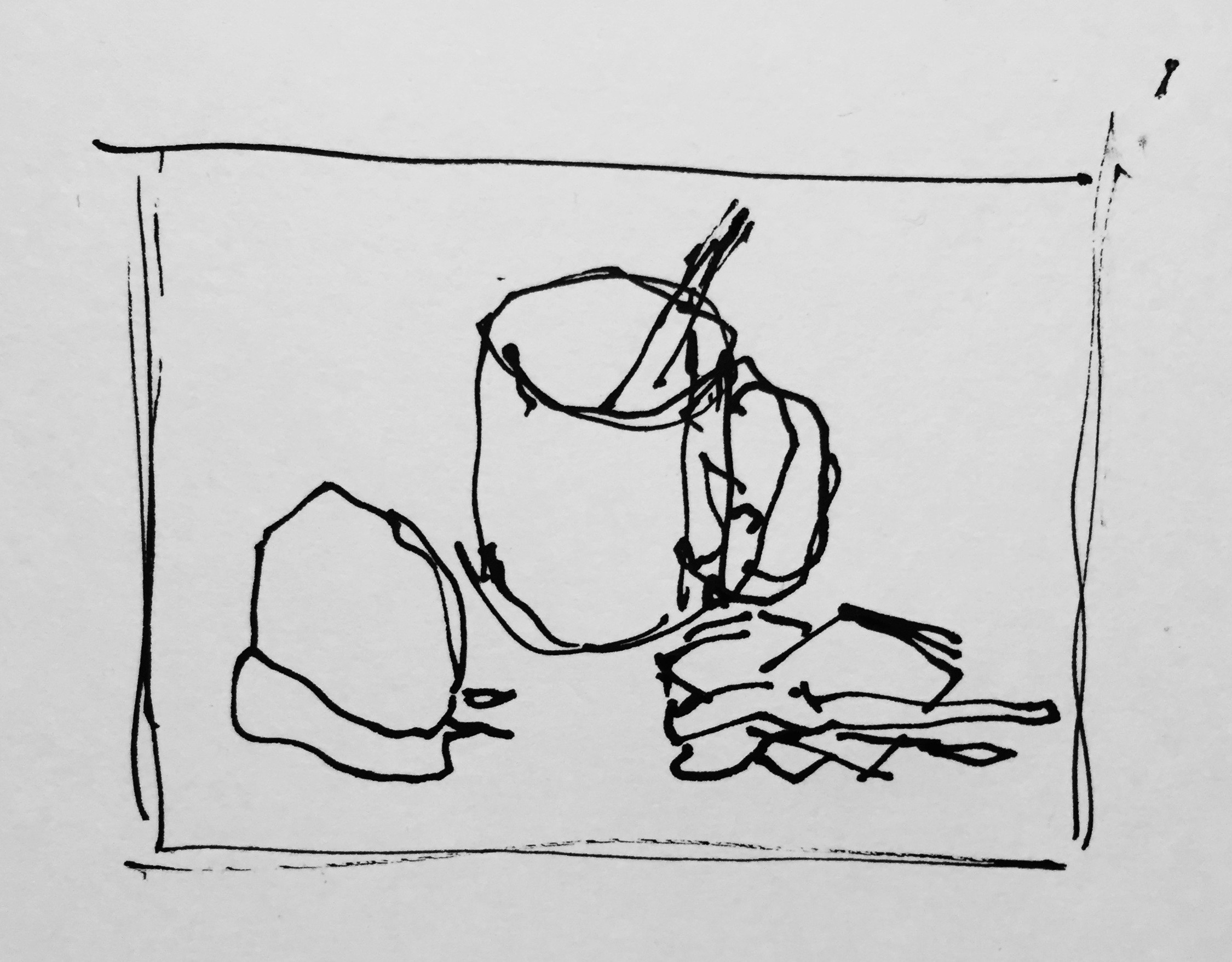
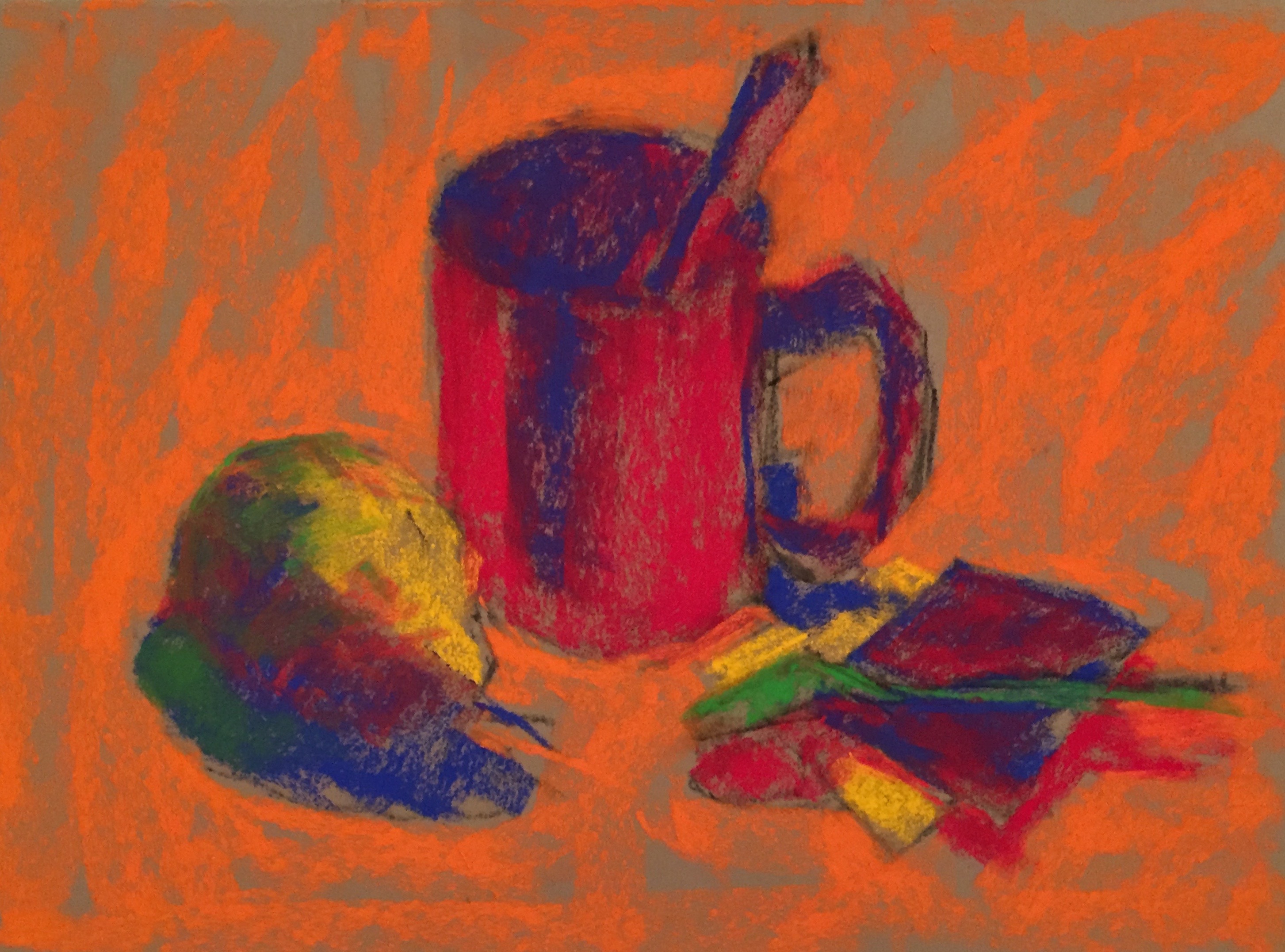
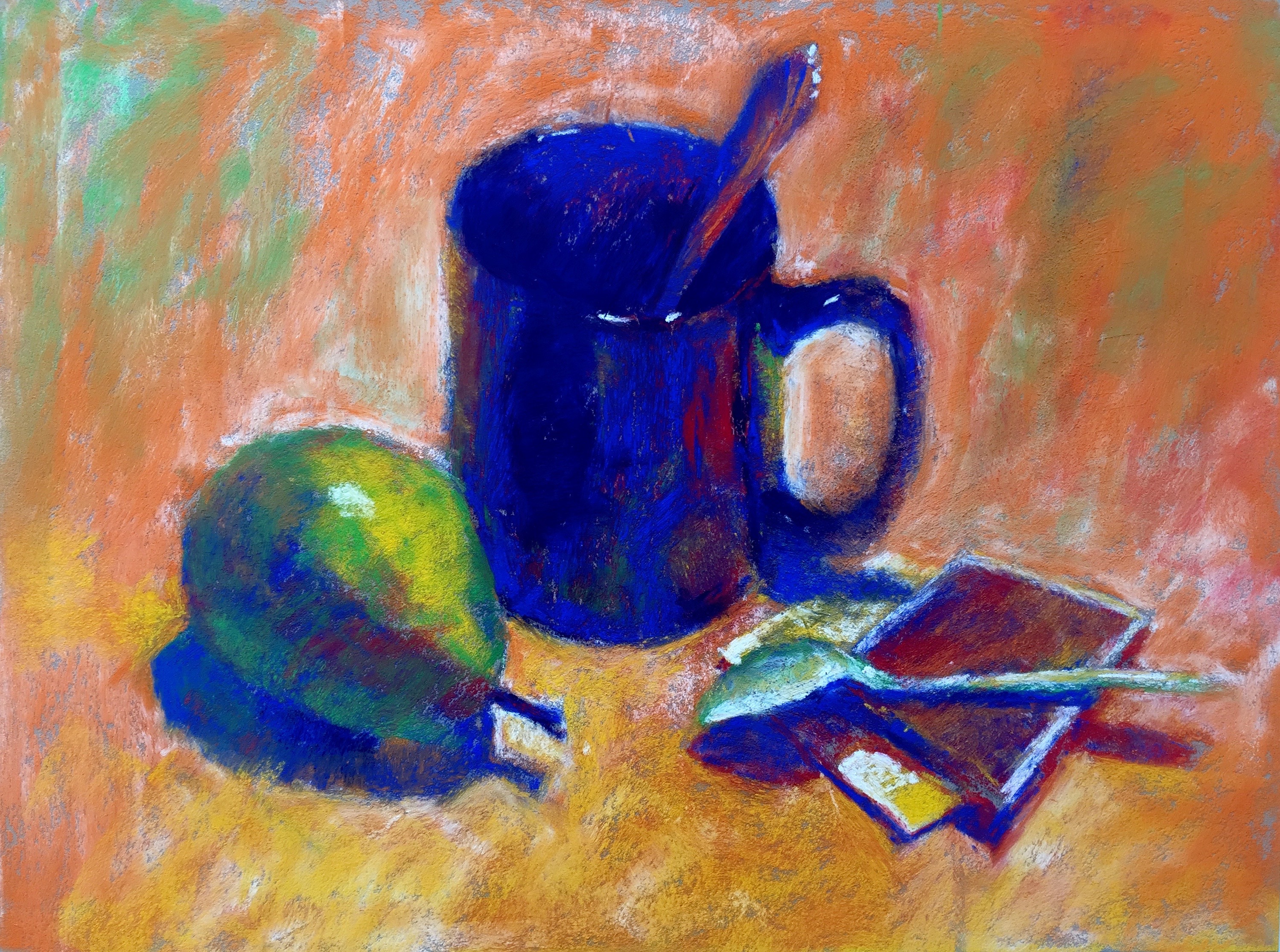
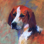
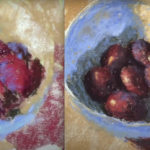
What to paint? Well, if you know me, you know I prefer working from life, so the first demo was a no-brainer – I’d do a still life set up. And if you’ve been following my YouTube videos you know I’m a big promoter of using quality pastels in a limited palette. (This is to help show beginners that they only need to start with a small selection of pastels which means they can afford to purchase good quality rather than mediocre pastels!)

And what did I decide to do for my demo the following day? Well, wait and see!

Let’s have a look at the first demo.

Set up for Schminke pastels demo
The set-up. I wanted to include a full value range from dark to light as well as different types of items. My viewpoint changed slightly from this photo as I stepped to the easel.
Gary, the Schminke rep, asked me to use the small set of Schminke pastels that I'd used in my earlier videos. Well that put a wrench in the works! So few pastels to choose from!
Gary, the Schmincke rep, asked me to use the small set of Schmincke pastels that I’d used in my earlier videos. Well that put a wrench in the works! So few pastels to choose from – only 11!
Schminke pastels in black and white photo. This easily shows you the value range available!
Schmincke pastels in black and white photo. This easily shows you the value range available. Two lights, one very dark, one fairly dark, and the rest midtones (the brown and one of the reds are missing.)
Thumbnail for demo using Schminke pastels
Hmmmm…my thumbnail except as you can see, I forgot (how??) to add values! Nevertheless, it helped me see how the items were placed and made it easier for me to sketch the set up on paper.
Drawing in vine charcoal and first layer of Schminke pastels on
Drawing in vine charcoal and first layer of pastels on. Usually, I block in the three main values – light, middle and dark. Here I worked differently in that I only had two lights to work with. So instead, I began by putting in shapes of colour over which I would layer my lights (and darks and mid-values). The red and the blue are the darks and will eventually become darks and mid-values, the orange mid-tone will eventually become a light value, and the yellow will remain a light value.
Beginning to build the layers with Schminke pastels
Beginning to build the layers. It’s tough going working in colours that aren’t the correct values. (They will eventually be layered over to create the appropriate value.) All this is made even more tricky with the broken focus that comes with demoing. Good practice!
Beginning to shift values to correct range using Schminke pastels
Beginning to shift values to correct range. Bit bizarre isn’t it?!
The image above in black and white. This really shows you where the values stand. I wanted to point out a small value lesson. Looking at this image, you really can't tell the difference between the orange and the colour of the paper! Cool huh?
The image above in black and white. This really shows you where the values stand. I wanted to point out a small value lesson. Looking at this image, you really can’t tell the difference between the orange and the colour of the paper! Cool huh? I can see I need to darken the mug a whole lot more.
More Schminke pastels applied
More pastel applied
The final piece. Schminke pastels on Pastel Premier paper med fine 320 grit Italian Clay
Photographed on my return home in daylight on a cloudy day, the colours look a bit bluer than they actually are. Schmincke pastels on Pastel Premier paper med fine 320 grit, Italian Clay
With the black and white version, you can see how things have changed!

One down, one more to go.

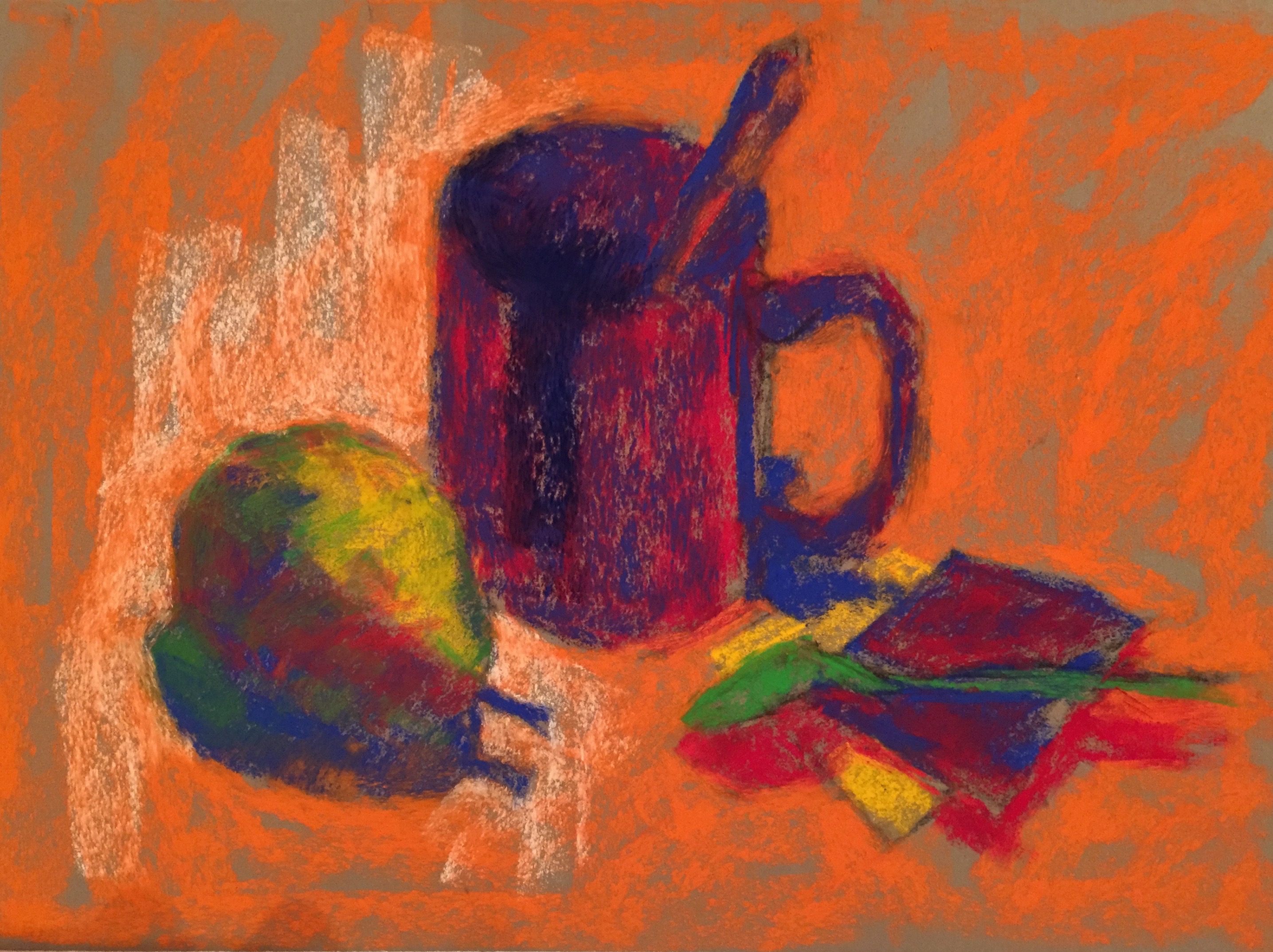
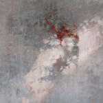
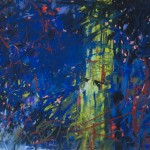
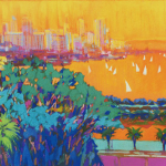
I decided that since I had recently begun offering a workshop called “Reality to Abstract,” I’d have my second piece use the first demo as a base from which to go abstract. And even though Gary was kind enough to offer me the use of a larger set, I decided to stick with the smaller set to see what would happen.

Here goes!

First Schminke pastels down with little care. Can you see the main items of pear, mug, and tea bags?
First colours down with little care. I just went for it! Can you see the main items of pear, mug, and tea bags?
Now what? I just trusted my intuition, believing the process would take me somewhere. I just let go and applied Schminke pastels, watching where my hand and heart took me.
Now what? I just trusted my intuition, believing the process would take me somewhere. I just let go and watched where my hand and heart took me.
This is it so far. (The demo was a bit shorter as it was soon time to pack the booth away.) Crazy huh? Gail Sibley, "Untitled as yet," Schminke pastels on UArt ? grit, ?
I began to think about the formal qualities of composition, value, line, shapes, edge etc. I added colours according to what I felt the painting needed.
For interest sake, here it is in black and white so you can see how the values are arranged. (Sorry about the shadow top right.)
For interest’s sake, here it is in black and white so you can see how the values are arranged. (Sorry about the shadow top right.)
This is how the piece finished up. Crazy huh? (The demo was a bit shorter as it was soon time to pack the booth away.) I need to decide how much more work to do on it if any. Schminke pastels on UArt 320, 12 x 18 in
This is how the piece finished up. Crazy huh?  (The demo was a bit shorter as it was soon time to pack the booth away.) I need to decide how much more work to do on it if any. Schmincke pastels on UArt 320 paper, 12 x 18 in
And here's me at work on the first demo using Schminke pastels
And here I am at work on the first demo. You can see part of the set up I was working from. I’m using an easel borrowed from Dakota Pastels. Kicking myself for not buying it. It would have been perfect for my upcoming trip to Budapest! Argh.

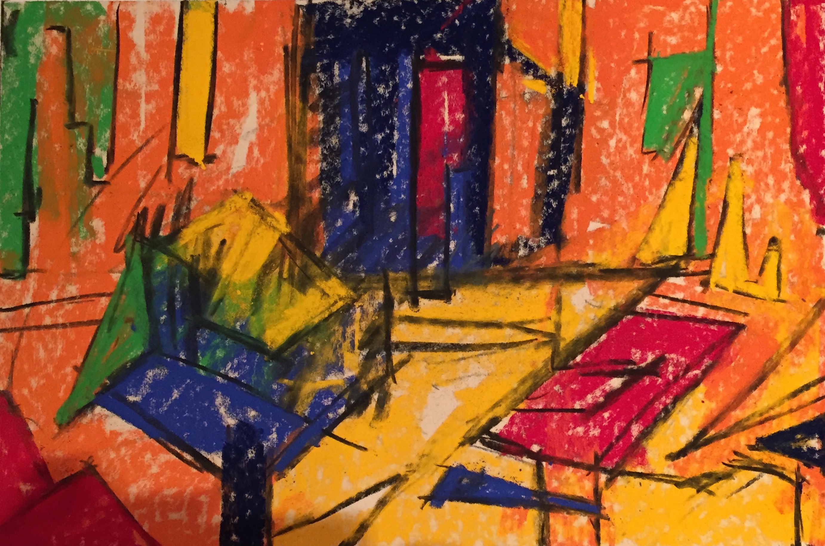
I enjoyed trying out new papers and can certainly recommend them both – UART 320 and Pastel Premier 320 Italian Clay. They both took the layering of soft pastel very well. And of course I loved using the Schmincke pastels!

Look forward to hearing what you think about these pieces! So please leave a comment 🙂

Until next week,

~ Gail

Related Posts

Subscribe to the HowtoPastel Blog today!

Take a course

Like my Blogs?

Do you like the blog?

Support HowToPastel and help me to keep creating content to instruct, inspire, and motivate you with your pastel painting. Although I’ve been asked, “How much does it cost to subscribe?” HowToPastel will always be free. Your financial support is completely optional but does go a long way in helping with the cost of running this blog. Thank you!

Comments

6 thoughts on “Demos At IAPS In The Schmincke Pastels Booth”

  1. I’m not usually into abstracts but the one you did is beautiful! The small saturated palette worked well in it. There are times when despite owning well over a thousand pastels, I’ll turn to a small starter palette for its particular character. I sometimes pick them up on clearance or to try a brand in a little more depth than one sample stick, every time it makes me get more creative on color and value treatments.

    If a set has few lights, be prepared to buy extra white sticks to create lights. This may also slow the painting process, my favorite plein air sets are between 24-60 colors in half sticks in a relatively small box. I often pack without many neutrals, preferring to overlay colors within the same value range to mute them.

    1. Thanks for the compliment Robert 🙂

      I like the way you describe a starter kit has having a particular character. You are so right about that as each brand curates a different collection of colours and values. Using a limited palette is such a good exercise – to focus on shape, line, composition and value. It can be difficult to create what you think you want but the limitation can lead you down some wonderfully satisfying paths if you let it.

      And yes too to the need to add to a starter kit usually with a few different light selections. Best is to create one’s own limited palette. It just requires time and attention!

      Thanks for adding to the conversation.

  2. I do like Schminkes. I have to be careful, though, because they’re so soft that I can fill up the paper’s tooth with the first layer. Light and easy does it.

  3. Well done. You do set yourself a good number of challenges and are surprisingly astute in overcoming them plus the teaching value of what you produce. Congratulations! Somehow you must receive a reward ??????? S.

    1. Thanks Sandy! Challenge is good. It leads to growth whether through success or failure. That’s a reward in itself. Of course a wee dram might be nice too.

Leave a Comment

Your email address will not be published. Required fields are marked *

This site uses Akismet to reduce spam. Learn how your comment data is processed.

Other Related Posts

Headshot of Gail Sibley

Gail Sibley

Artist. Blogger. Teacher.

My love of pastel and the enjoyment I receive from teaching about pastel inspired the creation of this blog. It has tips, reviews, some opinions:), and all manner of information regarding their use through the years – old and new. Please enjoy!

Join the mailing list today to receive exclusive tips, resources and inspiration directly from Gail:

Scroll to Top

Welcome Artists!

Online Courses

Pastels 101

Use this link if you bought the course AFTER Sept 2022

Use this link if you bought the course BEFORE Sept 2022

Pastel Painting En Plein Air

Art Membership

IGNITE! Art Making Members

Love soft pastels?? Then join 7000+ other subscribers and get my tips, reviews, and resources all about pastels... it's FREE! Just enter your name and email address below.

Your information will never be shared or sold to a 3rd party. Privacy Policy