
I first met Vianna Szabo at the 2013 International Association of Pastel Societies (IAPS) Convention. I was doing short interviews and I asked her what got her into her studio everyday. (You can see her answer at the end of this post!) Since then I have been an admirer of her work and featured “Pause” in last May’s monthly round-up. I realized it was high time I asked Vianna if she’d consider guest blogging and when I did, Yay!! she said Yes.
First, a wee introduction.
Vianna Szabo Bio
“Whether she is painting portraits, landscapes, or still life, Vianna Szabo PSA, IAPS EP, PSWC DP is known for her expressive use of color that captures a moment in time. She works in pastel, oil, and watercolor but pastel is her first love. Vianna is a popular and passionate instructor and teaches workshops nationally and abroad.”
Click here for her website.
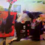
In case you don’t know Vianna’s work, here’s a teaser:

Vianna, it’s all yours!!
~~~~~
First of all I would like to thank Gail for inviting me as a guest blogger. The pastel community is indebted to her continued passion and contribution to all things pastel.
There is a lot of confusion among pastel painters about what colors to choose for their palettes. Unlike the other mediums, our pigments are already mixed for us in a variety of juicy colors that just beg to be purchased. It is so easy to be taken in by a beautiful color without considering how it will work for you. Beginning artists tend to grab colors that they feel will paint “things,” like bright greens for grass or brilliant blues for skies. Then they are frustrated when the paintings fall short and the beautiful colors look harsh and unreal on the paper. Another problem is when artists buy sets of pastels that are for painting a subject but do not understand how to use them. In this post I want to talk about creating a palette that works for you. A palette is nothing more than the selection of pastels you have chosen to create your painting. Choosing your pastels for a purpose will help you get the painting you want.
Here are three things you should consider when you are creating a palette for pastel painting: value, hue, and saturation.
Value
Value is the range of light and dark pastels regardless of color. If you photograph your pastels in black and white you will see that all those beautiful colors have a specific value compared to the other colors around them.
I think of values like musical notes with the lightest color being the highest note and the darkest color as the lowest bass note. Just as a musician knows the range of notes they can play on a specific instrument so a painter must know how light and how dark their palette will go. They must also know how many steps of values you have in-between your value extremes.
A successful palette will have a minimum of three distinct values: light, dark, and mid-tone. A five value range will have a value in-between the light and mid-tone and a value in-between the dark and mid-tone. Five values are all you need to create any painting.
My frustration with many pastel sets is the lack of value range. Many of the sets have a lot of bright colors which are in the middle value range and very little in the lights and darks. This limits what an artist can paint. Certain brands of pastels are also limited in their value range because of the binders used to make them. Rembrandts and Holbein are good pastels but have a limited range of light and dark. My favorites are Terry Ludwigs. He has a large selection of colors in extreme light and dark values. His pastels extend the value range far beyond that of other manufacturers.

Hue
To give a pastel purpose on your palette you have to identify it by its hue. Hue is another word for color and the most important aspect of using a color is identifying it correctly. It is easy to get confused if the same color of pastel is given a different name by the manufactures. Names like Spruce, Paris, and Twilight are fun but they do not tell us about the properties of the hue. To overcome this problem, I identify all colors as a primary, secondary, or “ish.” The primary colors are red, yellow, and blue. The secondary colors are created when two primary colors are mixed together – purple, green, and orange. “Ish” is made when all three primary colors are in the mixture. An “ish” color is never as vivid as a primary or secondary and can be very useful in describing colors that fall in the brown or gray range. Rather than saying “gray” which is vague and can be represented by many muted colors, you can be specific and say blueish/greenish, or greenish/yellowish.
By identifying a color by the pigments that make it up you can avoid confusion over names like “Warm Gray” and “Leaf Green.” You can be specific and describe subtle differences by using a primary and a secondary together to identify the color. The first color you name is the one with the most influence. Imagine the difference between a reddish /purplish verses a bluish/purplish.
Primary and secondary colors can also be identified with two colors. Cadmium red is a red/yellow. Ultramarine blue is a blue/red.

Saturation
Another secret to a good palette is knowing the saturation range of your palette. Saturation describes how intense or vivid a color is. The easiest way to judge saturation is this: If you look at a pastel stick and you immediately think RED, then that is a saturated color. If you look at a pastel stick and think hmmmm, that is a reddish color and it is not saturated. Saturated colors are usually defined as primary and secondary colors. People will exclaim, “Wow, that is a bright green!” You never hear anyone remark, “Wow, what an intense beige!”
Knowing how saturated the colors are on your palette is crucial because that will determine how intense you can go with your palette. You can always dull down a bright color but you cannot make a dull color brighter. If you have a muted range of primary and secondary colors you are limited by how intense your colors will be. The best palettes are those with a selection of saturated and “ishy” colors in a full value range.
Terry Ludwig was generous to create two pastel sets for me a couple of years ago that I sell at my workshops and website. What a thrill to have the opportunity to design sets that I could use to make entire paintings!


My sets, a portrait set and a still life set, have thirty pastels each. Both sets have the great value range of Ludwig pastels and a selection of primary and secondary colors within the mid-ranges. The biggest difference is the saturation. The portrait set is “ishy” which is easier for flesh tones. The still life set has primary and secondary colors that are fully saturated. I have used the sets exclusively to paint much of my work.


“As Compared To”
So how does choosing a palette help you create the painting you want. First I decide what will be my composition. What is the value range; what is the most saturated color? Then I decide if I have pastels that will represent the composition. Even if I do not have pastels that match the exact value or color, I choose a palette where the relationships are similar to my painting.
The extremes of value and saturation set the parameter of your palette. Once I have determined what they are, every decision I make after that is “as compared to.” I never pick up a pastel without comparing it to the one I just used. To compare pastels I hold them next to each other and judge the differences in value, hue, and saturation. Pastels of the same value will appear to blend together when I squint at them, even if they are different colors. Differences in value and hue are easy to see when the pastels are next to each other.
I begin a painting the same way I choose my palette. I start with one decision, paint that area and then build the painting outward from there. Every time I pick up a new pastel to place a stroke, I ask these questions:
- Is the value lighter or darker than what I just painted?
- Is it the same color or a different color than what I just painted?
- Is it brighter or duller than what I just painted?
Often the answer is a combination; a color could be slightly duller and darker than the previous stroke or lighter and a completely different hue. I use this approach for all subject matter and find it useful for other mediums as well.
Below is a demo of my painting “Two Hearts” showing the decision making process.


Make your palette work for you by giving each stick of pigment a purpose. Identifying your colors by hue, value, and saturation and comparing them to each other will help you gain confidence in your pastel painting.
~~~~~
Thanks so much Vianna! We all need a reminder about what these terms mean and how we can apply that knowledge in a practical way. (And thank you for your kind words about this blog.)
Naturally we are suuuure looking forward to your comments! Is all this Value, Hue, Saturation stuff sinking in? It’s ongoing understanding that’s for sure.
Thanks for being here on this pastel journey. Please let me know what else would add to your experience here on the blog.
Until next time,
~ Gail
PS. Vianna heads off soon to teach a workshop in Florence!
PPS. Here’s Vianna answering my question at IAPS 2013.


6 thoughts on “Vianna Szabo On Making Your Pastel Palette Work for You”
I wasn’t at all familiar with Ms. Szabos’ art, but I certainly enjoyed this post! Her artwork is just phenomenal and I especially enjoyed her suggestions! Thanks, Gail, for finding such a wonderful artist to comment on your blog.
Betty I’m always delighted to hear when someone discovers a new artist to admire!! I’m happy to make the introduction.
This guest-post is yet another reason that How to Pastel should be regarded as an important a read to the pastelist as the Pastel Journal. Szabo’s eloquent explanation of value, hue, and saturation–and how they work together–is the most concise I have ever read. Her work, which appears so loose and effortless, belies the careful consideration that she puts into her mark-making. A timeless lesson for us all, regardless of medium.
David, that is the sweetest thing to say. THANK YOU!!
I agree with you. When I read Vianna’s draft, I thought, Wow! I think How To Pastel readers are gonna get something huge out of this post!
Thanks again for your support.
I am thrilled Vianna Szabo agreed to write this blog. Looking at her work is beyond inspiring. I’m particularly stirred by the lost edges, the deliberate block-in strokes which she seems to strategically soften by the gentle “ish” palette in her portraiture and landscapes. I’m now motivated to paint with more forethought, “giving each stick of pigment a purpose”. Thank you!
Barbara, I am delighted you were so inspired by this blog post by Vianna. After your comment, I had to go back and have another look!