
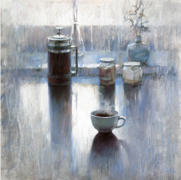
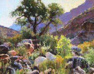
I remember the moment I encountered the work of Olga Abramova. It was at the 2019 IAPS exhibition in Albuquerque. I walked in and saw this large painting of a bodhum with a steaming cup of coffee in front of it. A couple of jars completed the scene with the whole thing set contre-jour. This painting with its limited palette and visible mark-making was a perfect example of the power of a well-designed value pattern. I was blown away! And not surprisingly, it won the Gold Award. From then on, I kept an eye out for this artist’s work.
And today I’m delighted and excited to introduce you to Olga Abramova who happily accepted my invitation to be a guest blogger on How To Pastel.
Curious to see the winning piece? Have a look.
Before I hand over the blog here’s a little bit about Olga Abramova.
Olga Abramova Biography
Olga Abramova, IAPS/MC, PSA, NPS, IFA (Russia), Pastel society of France (SPF), is a professional artist, a teacher of drawing, and co-founder and President of National Pastel Society of Russia. She has been exploring pastel technique for more than 20 years. The artist’s paintings have won many international awards. She has been published in the Pastel Journal, the Pratique des Arts magazine, and she is the author of the book Pastel, published in Russia by EKSMO. To see more about Olga, check out her website.
And now, here’s Olga!
~~~~~
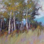
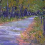
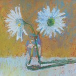
The main idea of my paintings is the retention of human sensory experience in these accelerating times. I’m immersed in meditation-like scenes where time is present. I’m looking for moments of quiet contemplativeness. That’s why most of my paintings are made in a soft colour range that catches the viewer, leaving them alone with their mood.
In my search, I leaned on the Impressionists, Tonalists and Symbolists – those who put inside their artwork something more than a realistic plot, weaving their feelings into colour shapes.
Learning from Vilhelm Hammershøi, Andrew Wyeth, Wolf Kahn, Michael Vrubel, and others, I seek out means for my own artistic language and I’m still in this journey.
My way to pastel
My first touch of this material was in a flash.
It was at university when I laid my hands on an old box of my father’s pastels. At that moment I realized that with pastel I could easily do everything I needed. My first serious work with pastel was my thesis at university, which consisted of several psychological still-lifes. I chose that theme because, for me, still-life is much more than a group of pretty objects. I wanted the viewer to see someone’s personal history behind the objects portrayed.
Subjects
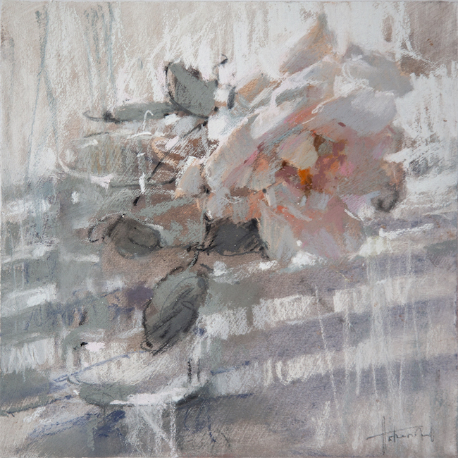
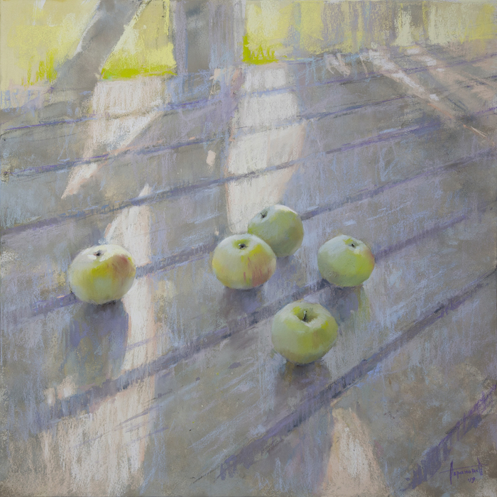
I have been painting still-lifes for a long time.
I also like other themes such as flowers and landscapes for variety of colour palette and unexpected colour combinations. For a more emotional expression, it is vital not to enclose the colour in the framework of the form.
Johannes Itten had a very good idea, that borders are in the way of colour. I always paint my works by moving from colour spots to the details, without trying to fit the colour into a prepared drawing. This way I can portray feelings that have no boundaries.
I sometimes paint portraits or plot scenes. I am interested in showing a thoughtful and a little drawn character in an environment featuring a state of light, fragments of a landscape or interior.

Pastel and mixed media
I worked only with pastels, without mixing them with other materials, for a very long time. The style of work varies depending on the paper you use.
In the beginning, I drew on Canson Mi-Teintes paper for pastel, then I got carried away with abrasive paper. With a new paper, you might lose your customary way of working. For example, it was an eye-opening experience for me to draw on Pastelmat, which does not allow you to mix colours while blending. I really like this paper for quick plein air works though.

I now often mix pastel with other materials. I fell in love with mixed media at my academic painting lessons while studying at university. I mixed pastel with gouache then. I still do that now. Sometimes I add acrylic, charcoal, sauce (sticks made of pressed powder of soot, clay and glue), and combine them with pastel in different proportions. Additional media help me to be more spontaneous in my work and to shift away a bit from my usual use of pastels and discovered know-how. This technique mix enriches my pictures with new properties and textures.
For mixed techniques, I prefer white or black rolled paper for graphics. I pull large-sized paper onto sketch boards and then work with charcoal, gouache, acrylic, alternating layers with pastel primer.

Аbstract design of shapes
I usually start my painting with an abstract design of shapes. Sometimes I wish I wouldn’t go further.
This step is the core of the painting – the emotional base which creates a mood. I love beginning a new artwork. I can follow my intuition, apply big spots of colour, and set the atmosphere of my piece.

In order not to lose the freshness of those initial abstract findings, I take pictures of the process and go on working, keeping in mind that very first stage, and doing my best to keep those already-found tone combinations, mood, and generality.
It is also important for me to keep all the layers visible, including those first ones, so that they shine with their different states through each other. This allows me to sharpen the viewers’ feelings and give them space for imagination.

Later, in the stage of hammering out details, my analysis switches on and a certain feeling of struggle appears. It is essential not to spoil the primary cohesiveness of the main masses.

On the final stage I keep an eye on the balance of main elements, make sure nothing is in excess, and try to keep the state found in the first layers.

Format
I prefer working large. It gives me the freedom to move and a chance to work more with space in my paintings. A large-format picture has a special effect on the viewer. It fills them with colour and feeling.
For example, it is impossible to admire Mark Rothko’s paintings in an album of 20×30 cm. I wish I created monumental art, just like him, but then I’d have to give up pastels which I’m not ready for yet.
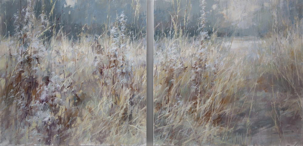
The maximum size I work with is 100x150cm because it is the maximum possible size of the glass needed to frame pastel works. When I feel like creating a piece bigger than that, I break the story into two parts and make a diptych, with the composition flowing from one picture to the other.
I like small-sized paintings as well, but every time I draw them I need to get in the right mindset, whereas working on large-sized pictures is always effort-free.
In a small painting, you can also open up a whole world. Giorgio Morandi is one example of an artist who did this. Once in noisy Moscow, there was his exhibition, quiet and light. I stood for a long time in front of his tiny artworks. He painted dried flowers and sometimes even artificial ones; there was so much life in them.
Light
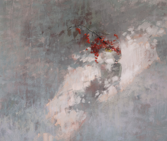
One of my favourite topics to explore is shade and light. I really like contrasting light, when objects almost lose their colours in the backlighting. You can see this in my painting “Winter Breakfast” at the top of this post.
Here all the attention is on the tonal contrast, which, in my opinion, is the most important contrast in painting. It might be OK to make mistakes with the colour, but mistakes with the tone turn your work into a bland piece. Deep contrast, from white to black, makes the picture powerful and eye-catching. You can’t give such a picture a miss. It excites, energizes, or disturbs.
If you intend to create a mood of tenderness or sadness, then most likely the tone of the painting will be softer. For the last two years, I’ve been exploring a high-key palette and creating pieces, where the black colour is present only in the form of small spots. When I keep colours close in value, they blend and float together, and I can create a mysterious, emotional feeling.
In my work, I move towards simplification – composition, colour, shape. I want to bring everything as close to simplicity of rendering as possible, and this is the hardest thing. Complete mastery is to make it simple.
*****
I don’t know about you but I’m soooooo inspired by Olga Abramova’s extraordinary work. Please do let us know your thoughts by leaving a comment. All questions are welcome!!
Until next time,
Gail
PS. Please note, along with writing her guest post, Olga Abramova translated it from Russian (her mother tongue) to English!!
PPS. Want to see a beautifully produced film of Olga Abramova at work? Here it is!


25 thoughts on “Olga Abramova – Moments of Quiet Contemplation”
Beautiful, inspiring pieces. I’m wondering how she frames her larger pieces. Especially what type of glass she uses.
Such a great question Kathy! I shall leave it for Olga to answer.
HI GAIL
THANKYOU SO MUCH I really love Olga’s work and have been following her for some time. I find her work speaks to my soul.
Thank you for publishing all these very special and interesting artists and their blogs.
Gwendolin Lewis
Newcastle NSW Australia.
You are so welcome Gwendolin! And yes, I absolutely agree about Olga’s work speaking to our souls!
Brilliant. “…without trying to fit the colour into a prepared drawing. This way I can portray feelings that have no boundaries.”
Brilliant indeed! Thanks for pulling our attention to these words Marsha!
masterful. i wanted so much to see Olga’s work at IAPS. Her mastery of neutrals floors me
I know, right Jeri?!! Her neutrals!! I think Olga’s work opened my eyes to the incredible possibilities of neutrals.
Wow, I mean wow Watching the video was pure joy A blast of inspiration You know something moves you because every thing tingles and you feel kicked into another dimension
Ohhhh Mark, thank you for sharing the effect of the video on you! I know what you mean when things tingle or you get goosebumps. That means pay attention right?!!
I love her beautiful work, and how she manages to balance the very evident two dimensional surface of the painting while simultaneously inviting us into the atmospheric spaces she creates in her work. Extraordinary! Thank you Olga, and thank you Gail
Ohhhh yes Aidan! I love how you describe the balance between picture plane and illusion of space. Extraordinary indeed!!
I’ve been a big fan of Olga’s work for some time and just wish she’d have that book translated into English. It would be so enlightening for many more pastel artists around the world. I’ve often wished I could sit on her shoulder and watch her work through her painting process. Maybe an instruction video in the future?
John, yes!! Wouldn’t that be faaaantastic?! The book translation, the sitting on Olga’s shoulder, and an instruction video… Olga??
I agree about getting Olga’s book translated into English
Wow! So inspiring!
I wonder what Olga means by this:
“For a more emotional expression, it is vital not to enclose the colour in the framework of the form. “
Yay Lynette!
Great question. I have my thoughts but I’ll let Olga answer you 😁
Gail, you’re doing such good work on these posts.
I just love them & thank you for your efforts.
Thank you so much Maggie!! Comments like yours keep me going 😁
I’m floored by the simplicity and power of her work. I love her process and layering. Thanks for presenting her in this blog.
Yes and yes Gisela!!
Gail, I thoroughly enjoy reading your posts, from sharing your own work & process to the wonderful artists you feature! I always come away inspired! Thank you for what you are doing!
Beth K
Beth, that is just so marvellous to hear!! Thank you!
Wow. I’m speechless after watching the video. Her color choices are soothing, and the mood is calm. Thank you for providing this information. Quite inspiring.
Sonya, Olga’s video is speechless-making for sure lol! Glad you found it inspiring!