

Ohhhh today we have Alain Picard as a guest on the HowToPastel blog!
It feels almost strange to be writing that sentence, considering how long I’ve known Alain — and the fact that he’s already taught inside my IGNITE! Membership. But somehow, this is his first official appearance here. Better late than never, right?
So yes, I’m absolutely delighted to introduce you to Alain Picard.
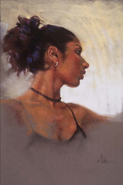
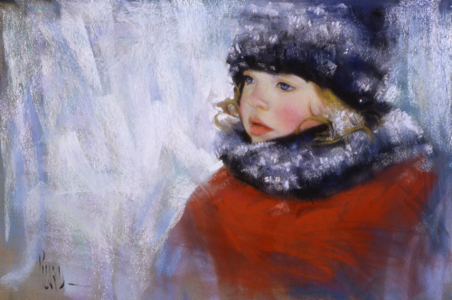
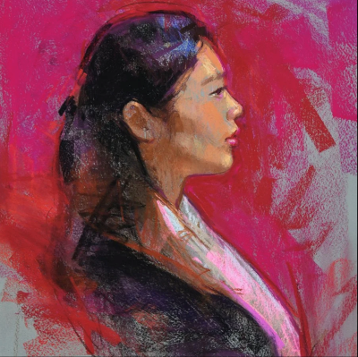
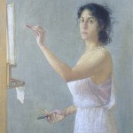
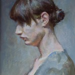
If you don’t know his work yet, here’s a little teaser… (I soooo love this piece!)
A wee bit about Alain…
Alain Picard Bio
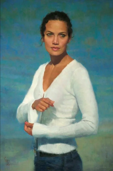
Alain Picard is a professional and award-winning pastel artist whose work has been exhibited in the USA, Europe, China, and the UK. He travels internationally as an instructor, demonstrator, and speaker. Alain is the creator of the Painterly Portrait Online Course as well as a course on landscape and other mini courses. He is known for his structured, painterly approach with an emphasis on strong drawing, thoughtful design, colour relationships, and expressive mark-making.
His work and writing has appeared in art publications such as The Pastel Journal and The Artists Magazine. He has also written three instructional books. Click here to read more.
And now, over to Alain Picard!
~~~~~
As a portrait artist and instructor, more than any other topic I’ve received, I get countless questions from students about painting backgrounds.
Crazy, right? I understand the struggle, though.
Backgrounds play a crucial role in the portrait. They set off the head, and either enhance or seriously detract from the final artwork.
Master backgrounds, and you elevate the entire portrait. Get them wrong, and even a beautifully painted face falls flat.
Here are four key principles I use to achieve backgrounds that not only support, but beautifully enhance my portrait paintings. I’m giving you these keys to unlock the full potential of your backgrounds so you can create beautiful expressive portraits in pastel.
Whether you’re working on your first portrait or your hundredth, these principles will transform how you approach backgrounds.
1. Use Complementary Colours
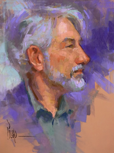
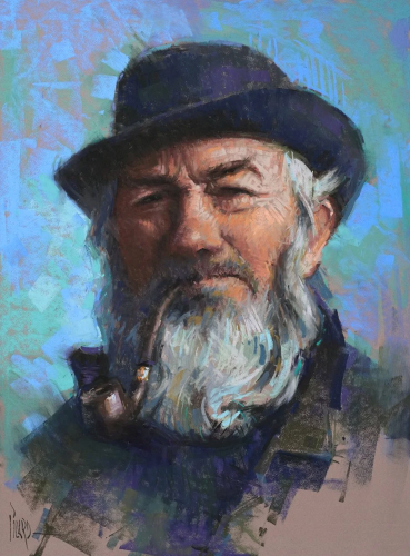
When you’re not sure what to do, choose cool or subtle complementary colours in your background. This creates depth and separation, allowing the background to recede behind the subject’s head.
Pale blues, greenish neutrals, blue-greens, and darker greens work well. This is due to skin tones often being warmer with orange and reddish tones in them. I have gone back to this colour approach time and again for its pure effectiveness.
Try it and see for yourself!
2. Vary Your Edges
Edges don’t get enough credit for their powerful influence in a painting.
When you look at the perimeter of your subject’s head and shoulders, create a variety of soft and broken edges. This will allow the atmosphere to pass through between the subject and the background. Soft edges recede, while sharp edges come forward.
Use this technique to create a magical feeling of air in your portrait.
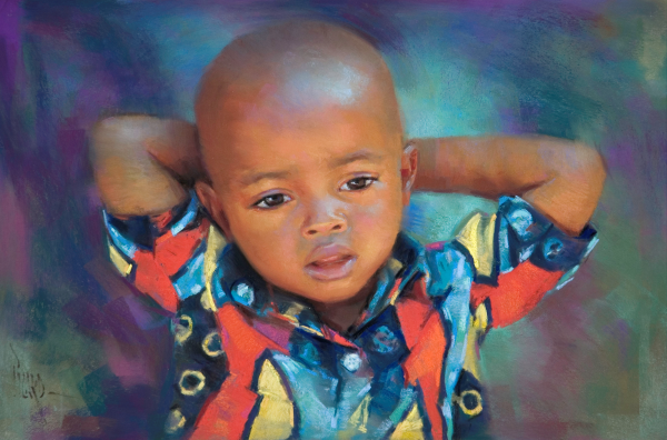
3. Leave Out More Than You Put In
It’s in the photo, I get it. But that doesn’t mean you should put it in your painting!
When it comes to a head and shoulders portrait, leave out the specifics in favour of a softer haze. This creates the illusion of depth and allows the viewer to focus on the subject.
For instance, for the Rwandan portrait, “A Good Morning,” I left out all sorts of distracting details, from other people’s clothing to elements of the landscape. A colourful haze of cool tones was all this beautiful boy needed to hold the viewer’s attention.

4. Lead The Eye with Colour Accents
There are times when using strong colour accents can be a powerful tool. Try creating a leading line of stronger colour that draws the eye toward the subject’s head. If you have a transition of value in your background, this is a great place to use colour accents.
A little goes a long way, so try selecting one or two colourful hues of pink, turquoise, red, violet, or orange – those exciting hues that grab the viewer’s attention. This is your chance to cut loose and have fun!


Let’s Recap
- Use cool complements
- Vary your edges
- Leave out more than you put in
- Lead the eye with colour accents.
These four keys will help you unlock the full potential of your portrait backgrounds and make your paintings shine!
*****
I love how clearly Alain Picard lays this out. Backgrounds are one of those sneaky areas that can quietly undermine a portrait — or, when handled well, lift the whole painting into something far more resolved and expressive. Alain’s emphasis on restraint, edge variation, and colour relationships is such a powerful reminder that backgrounds don’t need to shout to do their job brilliantly. But they do need your attention and intention.
If this post has you nodding along (or itching to revisit a portrait that’s been bugging you), then you’ll definitely want to explore Alain’s teaching more deeply.
👉 Make sure to check out Alain’s Painterly Portrait Online Course (an affiliate link). Alain guides you through his complete step-by-step system for creating stunning, expressive portraits in pastel.
If you’re inspired to try any of these background ideas, we’d love to hear how they change things for you. Leave a comment below and let’s talk backgrounds!
Until next time,
~ Gail
PS. Have a look at this short interview I did with Alain at the 2017 IAPS Convention. (You’ll need to scroll past a lot of other fabulous interviews to find Alain’s so try not to get distracted!)
PPS. I spoke about this luscious portrait in a monthly roundup post. You can read what I said here. (Again, you’ll need to do a bit of scrolling!)


2 thoughts on “Alain Picard – Four Keys to Creating Beautiful Portrait Backgrounds”
Thanks for sharing this, Gail. Alain is an excellent teacher / instructor, as well as an amazing artist. He points out some very valid points in this article.
Good to hear from you John! And thanks for your confirming thoughts about Alain’s teaching and the usefulness of his article.