

Recently in IGNITE!, we’ve been diving into the magic and mystery of painting the night. With guest Clarence Porter’s brilliant masterclass, demo (the painting has gone on to win third prize in a recent Pastel Artists Canada juried show), and Q&A leading the way, IGNITErs have really embraced the challenge of working with limited light, compressed values, and those delicious moments when colour shows up. In short — we were painting the night!
During a recent Co-Create session following our month with Clarence Porter, I began a small nocturne and later carried it through to a finished piece. In today’s post, I thought I’d share its progression with you — what I was thinking and the decisions I made along the way.
If you’ve ever wanted to try painting the night but felt unsure where to begin, this glimpse into my process might just nudge you into the dark… in the best possible way.
Starting with Structure: The Thumbnail!
Before any colour touched the paper, I needed to decide what to include from my reference photo. So I asked questions:
- What attracted me to this scene?
- What would support what I was interested in painting? How much did I need to include?
- What wouldn’t support the subject? What do I leave out? What do I change?
For nocturnes, simplifying early is crucial — too many shapes can quickly dilute the sense of mystery.
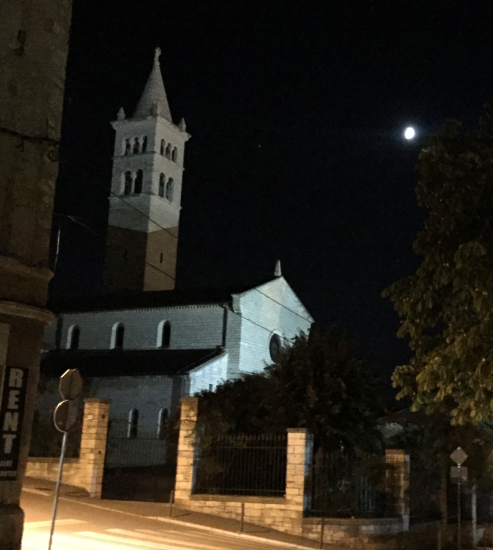
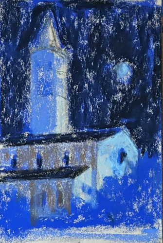
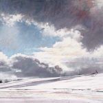
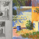
This is a crop of a much larger photograph. I was interested in the architecture – the flat sides punctuated with rounded decorative openings – and how it was lit by the moonlight (and also a hidden light source at the front of the building). And so I cropped out the rest of the picture (which you don’t see here). I decided I didn’t need the warmly lit stone fence/gate posts in the foreground. In another painting, the contrast between cool and warm light would be something to play with but not this time.
Because I felt a vertical piece would serve the subject best, I moved the moon over to the left, closer to the building. The darker brick work on the tower distracted from the simplicity I sought so I changed that too and decided that all the walls would be white.
This is a wonderful reminder that the reference is not the painting. It’s only a starting point, an inspiration.
Have a look at my thumbnail.
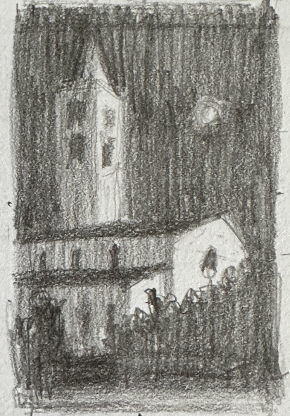
I purposefully melded the darks of the sky, the roofs, the foreground bush. The light shapes emerge from the darkness. The areas of most obvious value contrast are the dark windows against the light wall, the light wall and the moon against the dark sky.
The Charcoal Block-in
Next was to create a simple outline on paper. I chose a piece of UART 240 from the UART Trial package, curious to see how that paper would work. I made sure the ratio of the paper matched that of my thumbnail i.e. 3:2. The paper was marked off to 9 x 6 in.
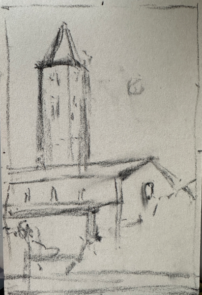
Using vine charcoal, I put down a simple line drawing. Nothing fancy. Just the essential shapes: the tower, the roofline, the main building, the rhythmic windows. This stage is about placing everything as I had it in the thumbnail.
I avoided a detailed drawing because I knew it would be covered by the first layer of pastel — and the detail would emerge naturally as I worked. My process is always to start with big shapes and move slowly towards the smaller ones.
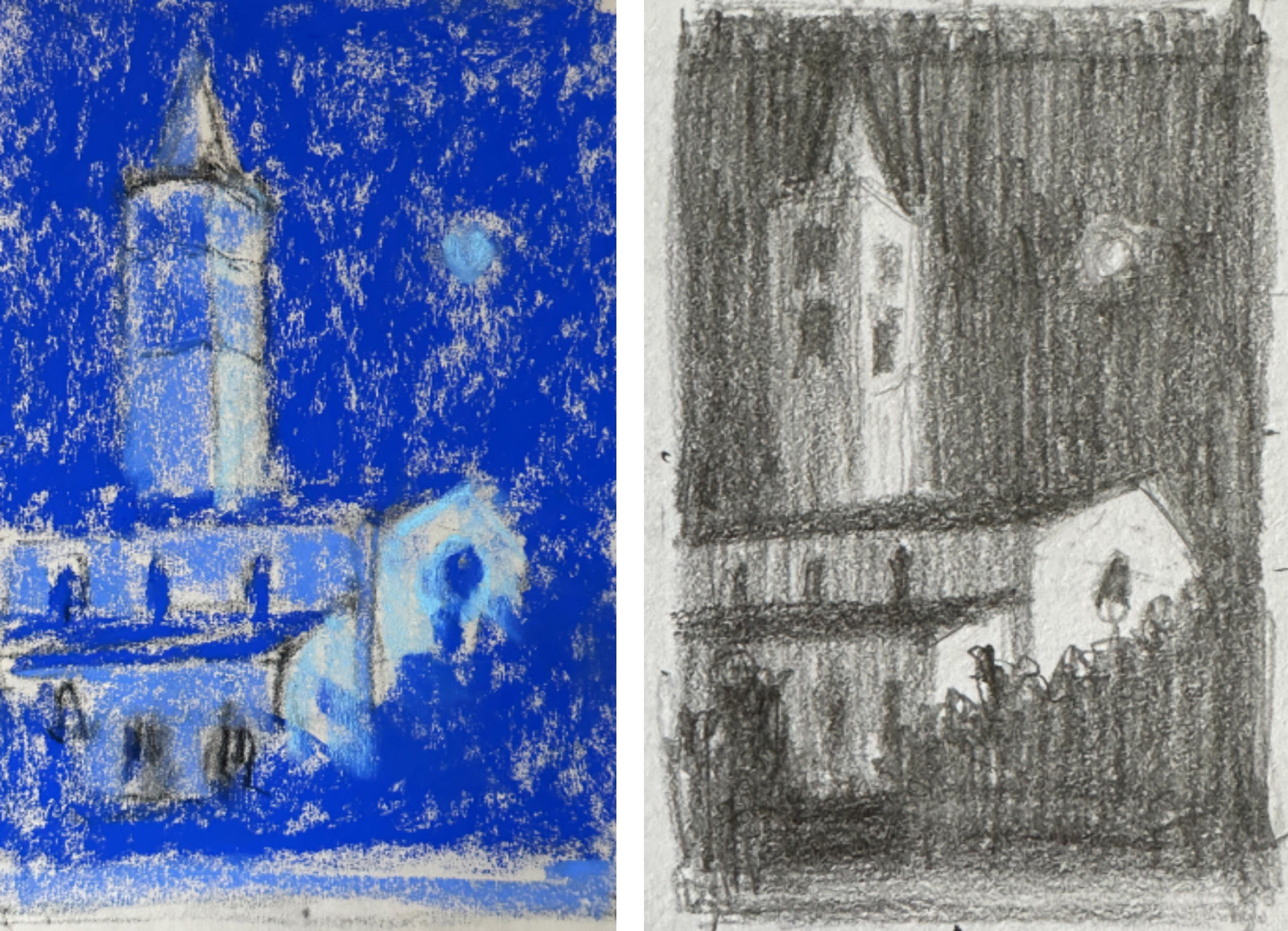
Diving into Darkness: A Bold Blue Underlayer
Rather than reaching for a black pastel first, I laid in a rich blue foundation for the dark areas. This approach keeps the painting alive — night doesn’t have to be just black! In fact, most of the time, black can kill vibrancy and narrows your options too quickly.
I decided to flood the entire surface with blues:
- Dark blue for sky, building roofs, and bush
- Mid blues for the walls in the shadow
- Light blue-green for where illumination falls
This stage is wonderfully freeing. It’s not about getting anything “right.” It’s about giving darkness a colour, a mood, a place to grow from.
You can see how I was making a value copy of my thumbnail in this dry underpainting .
Let There Be Light
During the Co-Create session, I began to slowly shape the piece, applying pastel lightly to allow a build up of layers and also permit changes as I went.
The primary light source is the moon with help from some lights on the façade of the structure, so the whole painting needs a cool feel to reflect that information. (The sun is a warm light source while the moon is cool.)
In his demo, Clarence talked about the importance of exaggerating colour and light in nocturnes, and that came to mind here. Even though the reference photo has fairly dim contrast, I pushed the lights and the darks early on to make the structure read clearly. This meant bringing black into the dark areas and a lighter value in the light parts.
I also experimented with adding a warm note to the middle-value side of the building, curious to see how it would feel in contrast to the cool lit side. The wall is white though (not yellow) and because of this, I wanted to retain the feeling of whiteness yet add a contrast in colour temperature to the cool in the picture – same value/different temperature. I went slowly with this!
The Co-Create session ended and this is where I left the piece.
The building had begun to emerge, but everything was still soft and suggestive. I wanted that combination of hard and soft edges — the crispness of architecture tempered by the way night softens everything. I couldn’t wait to continue working on it!
Refining and Resolving: Building Clarity Without Losing Mystery
This is where the fun really begins. I worked for another 30 minutes to bring the piece to completion.
I deepened the sky with layers of the dark blue and black pastels, wanting to show the density of night. I also brought black into the bushes to create a feeling of darkness beneath them.
Because I had used a blue-green in the light areas, I decided to add a blue-green to the mid-value areas of the building’s walls. I left the tower as is. This slight warmth would bring this part forward helping to create a feeling of depth. (There is little I could do with aerial perspective!)
The blue-green also toned down the mid-value yellow (ochre) which again, keeps the painting feeling like it is lit by a cool light source.
Near the end, I had fun (and the occasional frustration — big pastel, small detail!) adding the window openings and the finials on the tower. I wanted to bring in enough detail (interest) to pull our attention away from the moon glowing in the dark sky.
I added the hint of a sign, echoing the circles of the moon and the window on the front of the building.
I also added indications of a fence in the opening between bushes.
I kept the moon’s halo diffused — too crisp and it would look like it was stuck on rather than glowing light. It gives the feeling of dampness to the night.
I intentionally left the shrubs and lower shapes loose — if I defined them too sharply, they’d keep your eye from continuing to move around the piece.
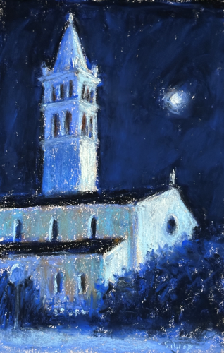
And then came the hardest part: knowing when to stop.
The temptation to “explain” everything is strong, but too much clarity can kill atmosphere. So I stepped back, squinted, and looked. Does the light feel believable? Does the structure hold? Does the night feel deep and quiet?
When the answer was yes, pastels were putdown.
The Palette: A Limited Set for Painting the Night
Here’s the small selection of Unison Colour sticks I used – darks at top, lights at the bottom. I used mostly cool colours. The warm dark (brown) was hardly used – only in the windows – but I then decided not to incorporate it into the piece. Nevertheless, I left it in the photo as it’s still part of the painting. The yellow ochre appears in the final piece, although I used it sparingly. That’s why both warm sticks are moved away from the grouping.
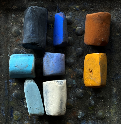
Working with a limited palette stops the painting from getting visually chaotic and keeps your colour relationships consistent.
It also helps you commit early to the mood of the painting. The only colour I added later on was the blue-green middle value (to the left of the more blue violet colour).
Final Thoughts on Painting the Night
A night scene is so different from painting a daylight scene. There’s a mystery already built in!
If you’re in IGNITE!, you’ll know how inspiring Clarence’s teaching was — and how energising it is when we paint through something together in a Co-Create session. I hope this little tour through my process encourages you to try your own nocturne. Give yourself permission to push the light and deepen the dark — that’s where the magic of painting the night truly happens.
Tell me — have you ever tried painting the night? What aspect of nocturnes intrigues you most? I’d love to hear from you!
Until next time,
~ Gail
PS. If you’re new to painting the night, you might also enjoy my earlier tutorial on painting the night. It goes deeper into design choices and practical tips on how to make a night painting feel like night.
PPS. Did anyone notice that the position of the moon changed between the thumbnail and final painting…??


4 thoughts on “Painting the Night – A Step-by-Step Pastel Nocturne”
i loved this post…and I love nocturnes. The mystery of the night, the mood it instills and the challenges of trying to keep it simple and real at the same time. Normally, darkness is perceived as the ‘lack of color’…but then, especially in cities or towns where there is an abundance of artificial light, there are different color temps for different kinds of light…and reflections. And the light coming through curtained windows, neon signs, etc all affect the mood of the finished painting…! Loved watching your progress on this one…thanks, Gail!
Thanks Curtis!! And YES, when there is light in the night, that’s when colour is revealed. As you say, shop windows with their varying light temperatures call out to be painted. That cool greenish artificial light in Edward Hopper’s “Nighthawks,” is such a great example!
What a fabulous blog/lesson/tutorial you just did on nocturnes. You gave me so much to think about in creating my own nocturne. I love how you moved the moon, such a subtle change but it made a huge difference. And I am always I spired by your limited palette. I have never done a nocturne but this motivates me to try. Thank you
That’s awesome to hear Christine! I think we can so easily get tied into and by what we are seeing when, in fact, we are the artist and have the power to change things up to try to make a stronger painting. Perhaps this blog post will interest you too.