So often when we work from photographs we are seduced by what’s there. We follow it with complete devotion and without deviation. In the end, all we have is a copy of the photo. Our painting doesn’t actually say much about us or why we chose to paint the picture. This is one of the reasons I really love creating thumbnails before I paint. This practice allows you to compose intentionally. One of the best things you can do as you’re composing is to rearrange elements in a photo for a better painting. That’s the aspect when working from photos that we’ll look at today.
You are the artist and you can eliminate, add, and move parts about as you see fit to create a stronger painting. This means you are no longer merely re-creating/copying the photograph.
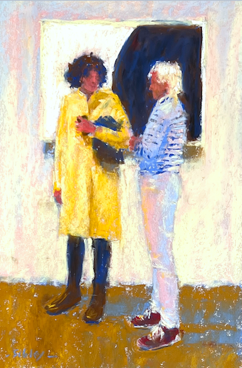
To illustrate this idea, I thought I’d show you one of my most recent paintings. It’s part of my ongoing gallery-goers series. In it, two figures converse in front of an Ellsworth Kelly painting.
Here’s the final piece:
Now let’s look at the photograph. You can see that the Ellsworth Kelly painting is off to the right and we see it on an angle. Two figures are off to the left. They aren’t directly connected to the painting.
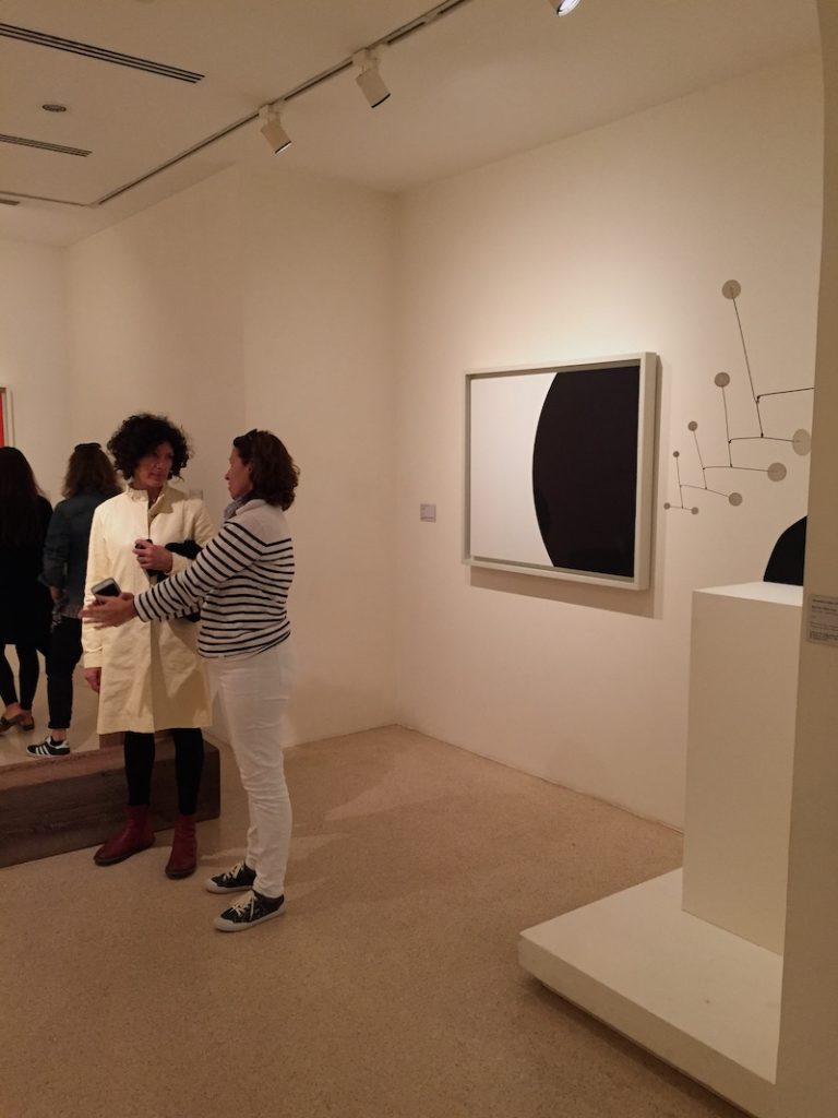
As I initially reviewed the photo as a possible inspiration for a painting, I recalled that while in the gallery (Guggenheim Venice) I noticed the visual relationship between the figures and the Ellsworth Kelly painting. (I’m always looking for these connections between people and paintings in my gallery travels!)
The figures are basically in white and black and so is the painting. That’s the primary connection. I love that the Kelly painting is divided in half. I thought it would be cool to have the figures in front of the painting, one in front of each half. They would ignore the painting but be part of it by the way they look and relate to each other.
So I started to rearrange elements in the photo by moving the figures in front of the painting. I also changed the painting to be squared on to us. That was the first two changes that I made.

You can see in the thumbnail that I also decided to change the colour and value of the hair of the person on the right from dark (in the photo) to light. That way their hair would be white against black and the other figure would have dark hair against the white background.
And finally, I considered the extended arm of the figure on the right and decided it added nothing to the story. So I rearranged the arms into a crossed position. That way the two figures are still in close proximity to each other, reflecting the two parts of the painting. I did, however, allow for some space between the figures rather than have the overlap you see in the photo.
In the end, I also chose to change the colour of the raincoat. I wanted to go beyond painting a purely black and white painting (not that it would ever be pure black and white if I’m painting it!).
The yellow is still a light value so it still fits into the light and dark pattern of the thumbnail. I knew that the floor would have some yellowish colour in it and I didn’t want the floor to be the only thing that had some colour.
With the figure on the right, I wanted to keep the black and white striped sweater and the white jeans. But to add some colour, I replaced the black shoes with red ones, thereby, still retaining the dark value.
Here’s the start of the painting – the underpainting.
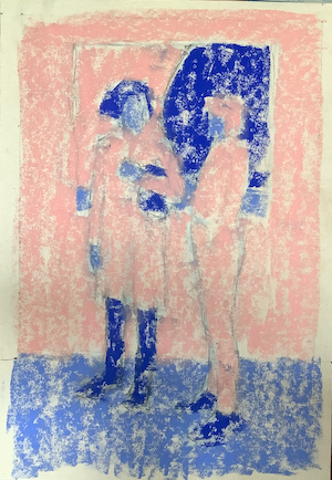
And as always, I used a limited palette. Here are the 12 Unison Colour pastels I used: Dark on the left moving to light on the right

And just because, here’s the painting in black and white beside the thumbnail. You can see some small changes but basically, the painting reflects the thumbnail. Remember, the thumbnail is really small – less than three inches tall while the painting is 12 inches high.
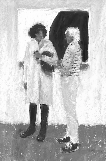

So can you see how you can take a photo that has some cool parts and rearrange the elements? By doing so, you’ll end up with a painting that’s more aligned with your intention AND your initial attraction to the scene, the attraction that triggered you to snap the photo in the first place!!
Now tell me, do you regularly rearrange elements in a photo before creating a painting? I’d love to know whether the answer is yes….or no. So please leave a comment!
Until next time,
~ Gail
PS. We are deep into thumbnail review in the IGNITE! Art-Making membership! Want in? Join the Waitlist HERE.
PPS. I’d have shared more of the progress of the piece if I’d remembered to take photos along the way!! Sigh. I do have a video recording however….











![Pastels on black aper: Gail Sibley, "Untitled [at this point], Mount Vision pastels on Sansfix pastel card, 5 1/2 x 7 3/4 in](https://www.howtopastel.com/wp-content/uploads/2016/04/IMG_9649-2-150x150.jpeg)



46 thoughts on “Rearrange Elements In A Photo For A Better Painting”
I LOVE this, Gail! What a fantastic piece, with many underlying nuances. Bravo!
Colleen, oh my goodness! Thank you for such a quick and enthusiastic response!!!
Very interesting!! Thanks for the walk through of your process !
So great to hear Naela!
Not so much rearranging as eliminating or simplifying or changing a horizontal landscape to a vertical or square. Sometimes I make a distance scene a close-up instead to be more intimate so the viewer isn’t just observing but is part of the scene.
YES YES Donna, there is sooooo much we can do to improve on what’s there to really express our vision and intent! Thank you for sharing these additional possibilities!
Gail, that is a cool idea to rearrange the objects in the photo, well proven by your story. Original photo was not very exciting, however you composed, and executed much more exciting composition, with contrasting elements, not to mention the excellent execution of colors. I do not view the pictures as a springboard to move elements around, but rather as an exciting piece in itself, because, most of the time, I only take a pictures of what I love, or of what mesmerizied me in the scene I observed. Than, when I use the photo as an inspiration for painting, I try to recreate what I remember about the particular scene, the reason I took a photo in a first place. That is why I do not favor using photos taken by others. I do not have emotional connection to photos taken by someone else.
But I agree, that sometimes a bit of rearranging might help. Will definitely remember your piece of advise.
Thanks Urszula! Thank you for your in-depth review of it and also sharing your own use of photos.
And yes, I think taking our own photos is crucial not just for the copyright issues but for exactly what you said – that when we take our own photo there’s a residual memory and emotion that accompanies it.
Look forward to seeing some rearranging lol!
I loved seeing how you worked from the original photo, but explained why you made the changes you did. I’m trying to do the same – i don’t want my works to just be copies of reference photos…..very helpful and a good challenge for me. Thanks!
Lori I’m glad to hear this was helpful. I wanted to recall the feeling I had when I saw these two women near the Kelly painting – their subtle reflection of it…and so I needed to bring them all together to show it successfully.
This is the best example I have seen, which shows, how important thumb nails can be!
It is definitely a keeper! Thank you Gail. 😁😁😁
Whoo hoo!! Ed that’s so awesome to hear!! 😁
Love your gallery series Gail! You’ve definitely influenced me to do thumbnails for every painting I do. An invaluable tool. Thanks for always reinforcing the importance of doing it. Really enjoyed how you played with this photo reference.
Thanks Ruth! And ohhhhh music to my ears about doing thumbnails for “every painting” you do! Yeah!! 👏 👏 👏
Definitely enjoyed this blog…..as I do all your other newsletters! Cheers from a fellow Canuck.
Yay!! and thank you 😁
Whereabouts are you Jill (and apologies if I should already know this!)?
As usual you blow my mind away with your creative process. I do have a picture that I will be working on of my grandson playing his violin. There are elements that I’ve wanted to change and you have just given me the courage to do so. So I’ll be doing many thumbnails before I dive into the painting. Thanks. By the way I’m going to the IAPS convention. My first! Hope to see you and say hello!
Ahhh that’s awesome Gisela: that I blew your mind; that it will help with the piece you want to do of your grandson, that you will be doing lots of thumbnails before actually painting, AND that you’ll be at IAPS. For sure I’ll see you there! Last IAPS, we had an HTP get-together. I’ve got to get organizing another!!
Wow, so so interesting and what beautiful piece at the end. Thanks and congrats
Oooo thank you Ghyl!!!
I’ve always admired the sometimes subtle changes artists make to photos to make them more interesting. Thank you for explaining the thought process behind rearranging this composition. Great post! Maybe it will help me overcome my “copy what I see” rut!
Hey Russ, I’m so glad you found this post of some value. I think it is a continuous struggle to overcome the pull to copy a photo. And the more we can detach ourselves from the photo by say using thumbnails, sketches, and even colour studies, the more we can bring “us” unto the painting!
Hi Gail,
I have moved a few trees and bushes but never a painting and people. How creative you are and I always marvel at your use of a limited palette! Thanks for all your ideas and tips.
Hey Sandi! Thanks for chiming in and your kind words. 🙃
Super that you work at making a better landscape painting by moving trees and bushes around, and yes! use that capacity as an artist to use that power with whatever you paint!
Love the way you re-arranged the elements within! I often have to change or adjust the shapes within my seascapes particularly – the actual scenes might not be creating the best compositions, but with a little help they can gain more focus and impact.
Thanks Lana! And yes, it’s easy to think that a beautiful painting we see of a landscape/seascape (like yours!) came ready made. But as a working artist, we know better. We know that the artist has taken time to create the best possible arrangement to create that powerful painting!
Do I regularly rearrange elements in a photo? NO! Do I want to do that? YES! Thanks for the good example and thought process.
Hah hah. Go Therese!!!
Thank you for this lesson. I struggle with photos, with what to leave out, or move to make a better composition.
Marian
You’re welcome Marian. I think we all struggle with that….which is why I LOVE sketches and thumbnails as they give us the opportunity to explore possibilities before committing to the painting!
This was right on Gail! Thank you for sharing your process in depth. Thank you for insight into the difficult process of using photos to produce a painting. It is inspiring to see how you work!
You are so welcome Noreen. I’m delighted to hear it was so helpful…and inspiring!
Excellent job of conveying two critical ideas: rearranging elements in a reference photo and using thumbnails for composition. And very concise too! Good job. You should submit this to pastel journal (or add it to the book you going to publish next year….)
For me, I think being a ‘slave’ to photos is a big issue. Oh, I take all my own photos, then actively crop, change colors, alter light/dark areas move bushes, people, etc with the incredible Photoshop tools so that I end up with a great photo to paint. Who needs a thumbnail when I have this masterpiece? Unfortunately, I tend to feel once I have this modified color laser printout that it’s now unchangeable and I have to go with it. This is not a conscious decision, really, but there’s a real pull here. And yet, so often and perhaps inevitably, I’m halfway through the painting and discover maybe this or that needs more modifying than in my ‘gold standard’ print from Pshop. Now what to do? “Boldly go where no one has gone…” or hold back?. The little voices say “don’t change anything, you’ll wreck it. Stop now. The print was good, why change it? You want to alter all that work on the computer….?”
You inspire me to go with my gut feeling and make the change anyway. That’s what creating is all about and is probably what holds me and many others from reaching that next plane. Time to leap. Time for good thumbnails. Time to understand that technology is still just a tool.
Keep up the good work!
Mike
Mike!!
Mike, thank you for being so honest about your own process!
It’s quite incredible the pull of that final image isn’t it?! As is the fear around “wrecking” what we have. But ..if we can see…okay, it’s not the best it can be so, and then say, then what the heck, let me try this ___. And yes, it may be a complete disataster. But oh my, what if it isn’t?? And you move into wowsa! territory.
And yup, those dang thumbnails can be such a help to push you to see other options, choose other alternatives than the ones that come ready-made or that just seem obvious or are the easy options.
Again, thank you for sharing your thoughts and process with such honesty. Many will relate I’m sure!
What a wonderful post! Thanks for the photos and your succinct explanation!
Ohhh so glad it struck a chord Wendy!
It is fantastic, your re-invented composition is bringing that emotion one feels in the original photo, but copying its original scene would loose it as the composition wasn’t attractive. I yearn to be able to do this myself and I often reflect on this but then stop unsecure before put anything into realization.
Oh Dragana, thank you so much for letting me know that that’s how the painting comes across in comparison to the original photo!! I encourage you to take a small step to changing things up from a photo. A small change can make a big difference!
Do sketches but not always. You just inspired me to constantly incorporate it as part of my painting.
Whoop whoop! That’s what I love to hear!! 💃🏻
Just returned from Gail’s show at the Peninsula Gallery. You need to see her work in person. You really miss all the nuances viewing the artwork on the computer. Her work has beautiful line work, texture and colour that cannot be seen in the photograph. Congratulations! Beautiful show.
Thank you so much Michele for such a lovely review of my work!
It was a real pleasure to meet you in person. We see each other on IGNITE! membership Zoom but meeting in 3-D is a whole different story! Thanks so much for taking time out of your day to come visit 😁
Learned lots by this example of working with photos…will tryand Thank You…God Keep.
Soooo good to hear Marty!!!
You gave me an entirely new way to look at a photo and thus create a thumbnail. Was like a “lightbulb” moment! There were so many different ideas to rearrange, remove and create from a simple photograph.
Thank you for sharing these ideas!
Oh my gosh, I LOVE hearing about lightbulb moments! I’m so glad this was helpful Jan! And yes, sooooo many ways.