
I love figurative work! And one figurative artist whose work I admire is Corey Pitkin. I’ve featured his work twice in my monthly roundups. The first time was with Summer Solstice in September 2016 and the second was with The Golden Apple in February 2019.
One of the things I love about Pitkin’s work is the mystery it evokes – there’s always a story waiting to be told. The artist brilliantly removes whatever doesn’t enhance his intention, focusing our eye on what’s important.
So you can understand why I was thrilled when Corey Pitkin said YES to guest blogging!
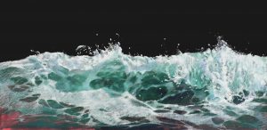
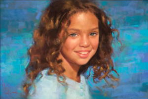
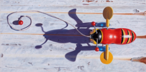
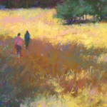
Don’t know his work? Here’s a teaser…

Before I hand the blog over to Corey, here’s a wee bit of info about him.
Corey Pitkin Bio
A predominantly self-taught artist, Corey Pitkin’s award-winning work has been featured in The Pastel Journal, Art Renewal Center, Portrait Society of America, Pratique des Arts Magazine, and International Artist Magazine, and is held in collections across the world. He is a Signature Member of the Pastel Society of America and has achieved Master Circle status with the International Association of Pastel Societies. Pitkin teaches frequently in his local art community and regularly travels for workshops. He currently resides in upstate New York with his wife Esther and children Anastasia and Xavier. You can find more info and work on his website.
And without further delay, here is Corey Pitkin!
~~~~~
I’ve been working as a portrait-slash-figurative artist for about 10 years now. My weeks followed a steady routine: working from a live model on Mondays, Tuesday evenings working with my apprentice, Wednesday either studio work or more life drawing, Thursday studio work, Friday gallery reception (there’s always someone’s to attend), teaching on Saturday, studio on Sunday. This would occasionally be peppered with photoshoots with models, out of town workshops, conventions – the life of a working artist. It was busy but it was predictable.

Then COVID-19 hit.
And everything went away.
I found myself without models, without routine. I’ll be honest with you: at first, it was great. Probably the first true vacation I’ve had in a decade. I didn’t have to worry about deadlines, curriculums, travel, producing new work…just stay at home, dabble here and there, spend time with my wife and kids (they’re actually pretty cool – who knew?), just hunker down and wait for the whole thing to blow over.
You’ll be shocked to know it didn’t blow over.
So now what? How does a figurative artist continue making work when the world locks down? I needed a new approach.


Luckily, I’m not averse to working from photographs. There are many figurative artists who are adamant about working from life and find working from photos repugnant, blasphemous even. They argue that photos distort reality: that even the best camera lens warps proportions, flattens colors, loses subtlety, and creates a too-high contrast image.
They’re not wrong – a camera lens at its most basic is a curved piece of glass that warps light to project an image onto film or a digital sensor. This curvature bends the light entering the camera so that the entire field of vision is compressed to fit the film or sensor in the back of the camera, typically a 35mm space. Distortion is going to happen.
Painting from photos has other pitfalls. Photos provide the artist with unlimited time to work on a piece. This is rarely to the artwork’s advantage. The pursuit of perfection can lead to overworked and lifeless pieces. Or the dreaded statement, “It looks just like a photo,” often meant as a compliment because culturally we’ve come to accept photography as equivalent to reality.

Wait, didn’t I say I wasn’t averse to using photographs?
Working from life has its issues too. The light changes over the course of a session unless you’re lucky enough to have a space with north-facing windows or skylights. Models move during the pose. Models have lives that often don’t coordinate with the times you have available to work. Models need to take breaks. Sometimes models don’t show up. Sometimes they’re never heard from again. I’ve seen it all in life drawing, from the model needing medical attention halfway through the pose to having their significant other show up to pick a fight halfway through the pose. When you’re working from life, you’re working with people and that always has the potential to get messy.

What’s the solution? Well, the real point of my digression is this: None of this really matters. If you’re looking for the model or the photo to provide you with completely accurate and trustworthy source material then you’re already in trouble. Because the point isn’t the source material, it’s what you do with it. The model or photo is the muse; the inspiration. The art is in what you do with that.
You can make a great painting from a terrible reference photo if you have a clear vision of what you want the painting to be, and the perfect model won’t save an uninspired painting. Know what you want to do before setting pigment to surface. Use the reference to enhance and add detail, but truth is found on the paper. Accuracy is great but in the end, who cares? When I visit the Metropolitan Museum of Art in New York City, literally holding back tears standing in front of Diego Velázquez’s Juan de Pareja, I’m not saying to myself “it looks just like him!”

Being willing to work from a photograph still poses an issue right now though. I can’t take a photo if I can’t coordinate with a model, and that can’t happen in the middle of a quarantine. So I need other solutions.
For multiple reasons I’m not a fan of working from photos that I did not take, at least for “real” paintings. Sketches are practice and I’ll take my inspiration wherever I find it, but for a painting, I don’t want someone else making my decisions for me. If you’re working from someone else’s photo you’ve let the photographer decide your pose and lighting, if not the entire mood of the piece. Good or bad, the decisions made have to be mine.

Solution 1: “Life” Drawing
In early June 2020, I started up a weekly “life” drawing session on Zoom. I’m putting “life” in quotes because, let’s be honest with ourselves, this ain’t working from life. All of the issues with working from a photograph that I mentioned previously are in play here, but now it also includes all the issues that working from life presents. Those are the cons.
The pros, however, outweigh them: first and foremost I’m keeping our local life drawing group, and therefore a part of our local art community, alive. I’m able to provide some work for our local models when all their work has dried up. There are less altruistic reasons too. I’m forced to make quick design decisions like in life drawing and then stick to them. No time to switch gears halfway through.


The Zoom platform is a double-edged sword: I have to compensate for often less-than-ideal reference (Zoom was not designed for fine art, and we’re at the mercy of whatever phone/tablet/laptop the model has at their disposal), but the poor video quality simplifies the image in much the same way that squinting does. I don’t have access to the detail that I would when working from life or a photo, but detail is often a painting killer. Better to focus on resolving the big shapes convincingly and attractive mark-making anyway.

Solution 2: Work With What You Have
I have a library of images from previous photoshoots that I can use. But I’ve already used all of the good ones. I’ll go through these pictures and occasionally find one that didn’t strike me before and make something decent with it, but inspiration doesn’t work the way that’s most convenient to you. Some ideas demand to be birthed. So I have to tweak the idea to fit what’s available to me now: myself, my wife, and my kids.

I did a self-portrait a couple of months ago. I don’t do many self-portraits. I’ve probably I’ve done less than six in my adult life.
Lighting can be a real challenge when doing a self-portrait because you need good light on your working surface but you also need interesting light on your face to make a good portrait. For some reason “interesting light” seems to always mean “pointed right into your eyes.” I found that a spare piece of mat board and some clamps can be used to block out any stray light that isn’t necessary for lighting your subject.

I made an effort to keep this pastel loose and emphasize the mark-making. The highest contrast is in the eyes, keeping the viewer locked in this highly analytical gaze that I apparently have when I’m working. I softened the edges separating the eyes from the face to further emphasize this contrast so that once I put in those hard edges on the catchlight, I had an instant center of interest.
I’ve been utilizing my wife and children as (mostly) eager models for years. I think these pieces have been some of my best work, and not just because of my relationship with the subjects. There’s something honest in these pieces that can’t be faked. Quiet, real-deal day-to-day love that comes from sharing the minutiae of your life with someone, not over the top and saccharine.

The concept has to come first. Sometimes it will come from a visual idea, like the pile of white papers on the dark table in Hodgepodge. Sometimes the title comes first, and the pose and costume are built up from that, like with Blackberry Winter. Occasionally you’ll get lucky and stumble across a fully-formed idea when looking through old photos, like The Golden Apple.


I’m not looking to just create portraits of my family. I want something with emotional heft, something relatable. Think of it like song lyrics – you want to take something specific from your life and state it in a non-specific way. This allows your audience to free-associate and apply it to their own experience. If you don’t have the specific idea or event in place in your head then the piece won’t have the emotional oomph that’s required to really connect with people. Because it won’t mean as much to you.
That might be the key to creating something that really reaches people – you have to love your painting when you’re painting it. Anything less and it is just work.
*****
WOW!
And did I hear you say WOW too? So much to be blown away by! So do let us know what strikes you. Go ahead and leave a comment or question for Corey. You know we’d loooooove to hear from you!
Thanks for joining us 😀
~ Gail
PS. You can see the video of Corey Pitkin creating his self-portrait here.
PPS. You can read my experience drawing from a model over Zoom
and also how I built up a pastel painting from one of those sketches.


48 thoughts on “Corey Pitkin – Portraiture In The Time Of COVID”
I so enjoyed reading this one! His paintings are so evocative and each one tells a story. I had the pleasure of taking his PSA virtual workshop this summer and now this wonderful blog! WIN-WIN!!! Thanks again, Gail!
Katy, so glad you enjoyed Corey’s blog.
And it’s soooooo funny/amazing that you should be the first to comment because I just this minute opened an email from PSA in which they featured student work from a couple of virtual workshops including Corey’s. And there was your lovely portrait. Well done!!!
Corey, you use many different types of paper and pastels. What are your favorites?
Great question Carol! We will wait and see what the answer is!
Carol, my prefered papers are Sennelier La Carte for more traditionally-styled work and UArt 400 dark for sketches and work that focuses a bit more on mark-making. For example, Eventide is on La Carte and Hodgepodge is on UArt.
I thrilled you enjoyed them both Katy! It was great meeting you at the PSA workshop.
I go ‘wow’ every time read these newsletters, so here is another big WOW. Good insights about working with photos. (Photos provide the artist with unlimited time to work on a piece. This is rarely to the artwork’s advantage). I always love Hodgepodge because of the little boy in the too big chair. These are special works.
Thanks Marsha!!!
And such a good point about using photographs.
Hodgepodge is definitely a favourite of mine. Along with what you mention, I love the daring to have aaaaaalllll that table in the foreground. Fabulous!!
Thank you Marsha! Hodgepodge is a special piece to me as well since the model was my youngest who just turned 5 a couple weeks ago.
Hi Gail,
Corey just had a big feature article and loads of photos in Pratique des Arts (France). It’s fun to see this blog, thanks for bringing it to us. WOW is the word.
Thanks for the update Nancy – I missed that article in Practique des Arts. (My blog has been featured in that super magazine!)
Glad Wow works for you too 😀
Absolutely loved this, the colours, highlights and sense of drama. Each one evokes an emotion and a fleeting, almost mysterious sense of the person. I love doing portraits and life drawing myself, and creating works with a story and emotion, not just a simple likeness, is what I’m aiming at (though certainly wouldn’t say I’m there yet.) But Corey’s work has inspired me. Thank you Gail and Corey.
I agree Judi – there’s emotion simmering on the surface of all of Corey’s pieces just waiting to be experienced by the viewer. And yes, a fleeting sense of the person. I am so glad this has inspired you Judi and I can’t wait to see to see how it will affect and influence your own work. Hope we see some in IGNITE!
Thrilled to read that I inspired you Judi! There is so much more to a person that just their likeness and I feel it is the job – no, duty – of an artist to convey that complexity to the best of their ability.
I love the way he creates a mysterious and intimate atmosphere as well as the softness and vibrant colors.
Yes, that’s it exactly Marie-Claude!!! It’s such an interesting combination of colour and effect!
Thank you Marie-Claude! A little bit of mystery really helps to engage the viewer’s imagination.
Hi Gail
Your blog is artistic ‘food’ – very nourishing!
I hadn’t come across Corey’s work before and it was fascinating to see his self-portrait video and read about his work, I really warmed to him.
On-line learning has been a revelation to me as a direct result of COVID restrictions, although I had been so looking forward to your course ar Muthill which was cancelled. You’ll need to come up to the Highlands when all this is behind us – weather, water, shores and mountains and if that doesn’t get you the midges will 😨😬😀
All the best
Morag
Thank thank you, Morag!! And I’m delighted to have introduced you to the work of this fabulous artist!
I was sooooo disappointed not to be able to come and teach in Scotland. I had been looking forward to teaching, meeting many HowToPastel followers, and generally reacquainting myself with the UK, seeing olf friends and meeting new social media friends in person. Sigh. It will STILL HAPPEN! Just not for now.
In the meantime, perhaps you’ll consider joining us in the IGNITE! art-making membership. It’s closed at the moment but get on the Waitlist and you’ll be the first to know when it reopens in the Fall!
I’m happy that Gail was able to introduce you to my work Morag! Her blog is a wonderful service to the pastel community.
Thanks for sharing this, Gail, and to Corey for writing it! Flexibility and adjustments during Covid. We’ve all come through so much .. and there’s so much more to go. Corey’s work is wonderful and inspirational .. (as I move back more toward portraiture – something I love so much). Acquiring a more relaxed attitude in my painting and mark-making is reignited in this blog! Thanks again!
Whoo hoo!! I love that a more relaxed attitude to your painting and mark-making has been the effect of this blog Terrilynn!
And yes, still more to come in these COVID-19 times. Even so, we grow and change and adapt to the circumstances as we can.
Thrilled to hear that Terrilynn! We all have so much stress simmering just under the surface these days that the last thing we need is to be stressed about our paintings too.
I remember seeing his “Marie Antoinette Wig” in, I think, Pastel Journal and being just entranced by everything about it! And you know what? He’s funny! Great blog post and a real treat to watch his self portrait video.
It’s quite a wonderful painting isn’t it??
And yes, when I got Corey’s draft, I was delighted at his humour and smiled my way through the reading of it!!
Thank you Tamara! I’d honestly forgotten how much I enjoy writing and I’m thrilled that you had as much fun reading the post as I did writing it.
Corey is the best pastel artist in our area and possibly anywhere. Many of his paintings have an old world feel. I was proud to be in a show with him years ago.
Whoo hoo – congratulations Sandi! I can well imagine how it must have felt being in the same show. Lucky you to have Corey in your neck of the woods 😀
Good to hear from you in the virtual world Sandi! Thank you so much for your kind words and hopefully we’ll see each other in person again soon.
Beautiful work! I love the balance between the areas that are more tightly rendered and those that have looser, bolder marks. Definitely captures the multiple ways that pastels can be used effectively to achieve different results. I recognized “Suburbia” because it was given the Award of Excellence by the Pastel Painters Society of Cape Cod last month—via a zoom reception of course. Congratulations on the award and for figuring out ways to adapt to the new normal created by the pandemic.
Love that you picked out Corey’s varied use of mark-making and brought it to our attention Mary!
I LOVE the mystery of Suburbia and can certainly see why it won an award.
Thank you Mary! The different mark-making comes from my love for both classical art and more modern work – I’m always trying to find a way to sneak some Franz Kline into a Rembrandt. 🙂
Yes, WOW! wonderful work to ponder and so entertaining to read! I remember being struck by Hodgepodge in the online IAPS show which was critiqued. Every one of Corey’s paintings tells a story. I was particularly struck by his last line- “you have to love your painting when you’re painting it…” Thank you for this!
Whoo hoo… I was wondering if anyone would pick up that last line Helen 🙂
And yes, a wonderful read – entertaining and instructive.
Thank you Helen! I’m thrilled the last line struck a chord with you. Any time I’ve attempted work that I thought “this will sell” or “I need some less-personal work for this show” the paintings have always fallen flat.
OK. This is astounding. There’s so much in this blog including the pitfalls of working with photos, being a slave to detail and losing what’s important. I’ve watched the video of his self-portrait also and think, well maybe portrait drawing is more appealing than I thought. He did indeed Find the Drawing. He demonstrates what he says above, that if you get lost in the detail you’ve lost the painting. Almost from the beginning the eyes are the focal point, even when they are hardly there at all. I had to keep reminding myself to watch what else he was doing with the rest of the drawing because the eyes demanded my attention. I can see that using pastel pencils and charcoal to start the painting helped a lot to keep the painting focused within the paper plain. The mouth, well it just appeared out of the rest of the marks, finally. This is wonderful. Thanks so much, Gail and Cory. And lest I forget, yes, Hodgepodge is also amazing as well as the fabulous nude Zoom Figure Sketch.
Oooooo Jean…thank you for taking us on your journey through Corey’s self-portrait creation. Loved hearing your experience!
And thanks for sharing all you’ve learned from the blog. Hmmmmm does that mean we’ll see a portrait, even a self-portrait, from you one of these days??
You just may see a self-portrait one of these days. And this blog and demo changed my mind about that answer on the IGNITE! membership survey.
Whoop whoop!!
Thank you Jean! I love that you took what I wrote and applied it to the demonstration video!
I want to give a HUGE thanks to Gail for inviting me to write for How to Pastel. I thoroughly enjoyed writing this and I loved reading everyone’s thoughtful responses. Thank you all!
Such an honour to have you as part of the HowToPastel blog Corey. And thank you so much for taking the time to respond so wonderfully to all the comments!!
Thank you so much Gail, for sharing Corey’s blog with us! I have had a love affair with pastels over the last 5 years, that really gained depth and new perspective when I started learning from a local artist, as a student! Most of my work tends to be very detail oriented and I have the biggest self sabotage skill of being too critical of my own work. Because of my OCD tendencies, I have a very difficult time looking at a subject and not focusing on the details! Still being fairly new to pastels, I have a hard time transitioning from more linear work I’ve become accustomed to, such as pen and ink. My teacher, Susan Glendenning, taught me that there is a difference between drawing and painting. She has tried to get me to use different strokes and techniques, and get away from line drawing. I love your paintings, Corey, that either try to blend the subject into the background, or leave a lot to the imagination as far as the rest of the subject is concerned, like in your painting, Marie Antoinette Wig! I noticed that you use a lot of Blue Earth’s pastels. Some time back I purchased their portraiture sample pack, but it has mostly remained in its box because of my intimidation of actually making a portrait or figurative work and being satisfied with it! I’m sorry for going on so long. Can you offer some advice in regards to my fear of lack of perfection in my work, so I don’t even attempt something that I am not comfortable with? I really want to excel in my skills but don’t know where to start. Thank you so much!
Hi Andrea, thank you for your very exuberant response!!!
As to your question regarding perfectionism stopping you from even starting, I’ll give my thoughts first 🙂
What you might try is working small and setting a timer so you are restricted by time. If you usually take two hours to do a piece, set the timer for one hour. And then get gradually less. And actually STOP when the timer goes off and move on to another piece or walk away. Don’t be tempted to fiddle fade with it!! Try and it and see what happens 🙂
Gail, Thank you so much for introducing Corey to us. Such accomplished artwork and so painterly. Neil
Oh you are so welcome Neil!! What a treat it is to introduce you to such an accomplished artist!
Catching up!
Corey, thanks so much for sharing your work and process.
I’ve just recently been working on a painting that I felt ‘meh’ about from the start. It was started with my plein aire group, and I wasn’t feeling the site or my subject. I never got it up on plane.
Today I started a painting that I loved from the start – a quiet sitting place in an overgrown garden. The 2nd layer is kind of wild with color and structure, but I’m really liking it’s looseness and movement. I often get lost in the detail. Do I dare allow myself to let the untamed go unleashed? Could it be finished – or not? How do I know? Do I get down to the detail? Is this abstract realism, or is it just unfinished? So difficult to know.
Liz, so happy to know you are excited about this new piece you are working on! To answer your question, I’d say put it aside as is and put it somewhere you can’t see it (face it to the wall for instance). Then in awe or so, come back to it and see how you feel in that instance of seeing it again.
I’ll look forward to hearing Corey’s thoughts!