Have you ever found yourself staring at your box of pastels, desperately searching for that one “right” colour? If you have, welcome to the club. It’s a dilemma that has plagued many of us, and today, I’m here to tell you that it’s time to break free from the shackles of convention and embrace the wild and wacky world of unconventional colours. We dug into this idea of using unexpected colours in the IGNITE! Membership this month.
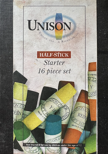
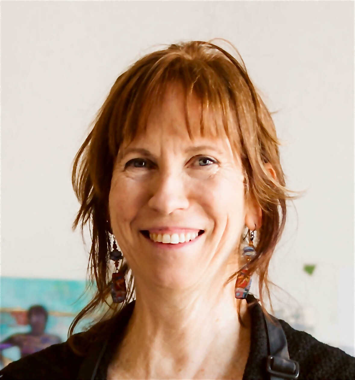
Prepare to embark on a colourful adventure as I illustrate this post with the progression of my self-portrait, which ended up sporting some rather peculiar hues. This was all down to a twist of fate – the limited palette of pastel sticks I was exploring at the time. Now, I must say, with just 16 colours to play with a limited value range, it was like trying to create a rainbow with a teaspoon of paint lol! But oh, the creative restriction was nothing short of magical.

The Allure of Unconventional Colours
Picture this: I’m in a workshop, and a student calls me over and with a perplexed expression, asks, “I don’t have the right colour for this tree. What should I do?” I reply with a question of my own: “What IS the ‘right’ colour?” The student’s response? Usually a vague gesture towards some green in the distance.
Now, here’s the kicker. How many shades of green do you think exist in this world? Take a wild guess! (I have no idea by the way!) The truth is, there are so many greens that even a palette stacked with pastel sticks won’t have them all. That’s when I drop my favourite line – “Just use any colour!” Of course, I say it with a wink and a smile, but the reality is, you truly can use any colour. Why not add some fun and go wild with a crazy, unexpected hue?


The Role of Values
Now, let’s get down to the nitty-gritty of why this works. It’s all about values. You’ve probably heard the phrase, “Values do the work, colour gets the glory.” I’ve got my own spin on it – “Know your values, be free with colour!”
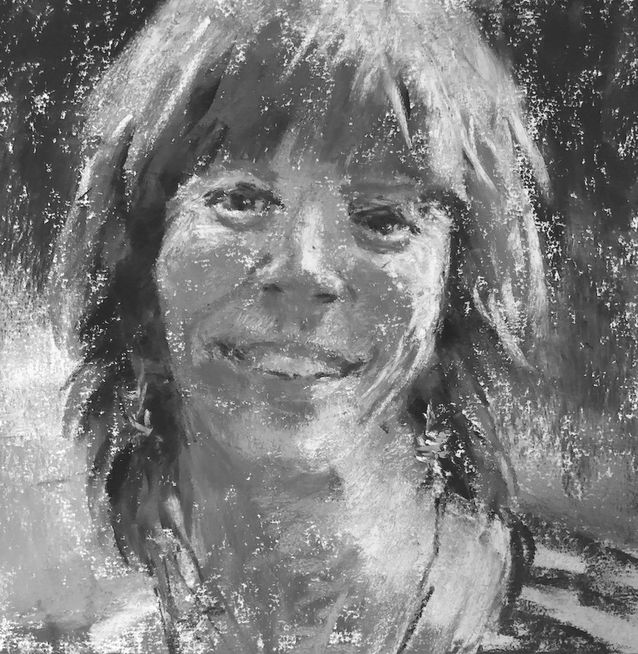
Values continue to be the underrated heroes of art. They’re the backbone of your piece. They provide the foundation and structure. Once you’ve got those values nailed down, you can go all Derain on your colour choices and still create something spectacular.


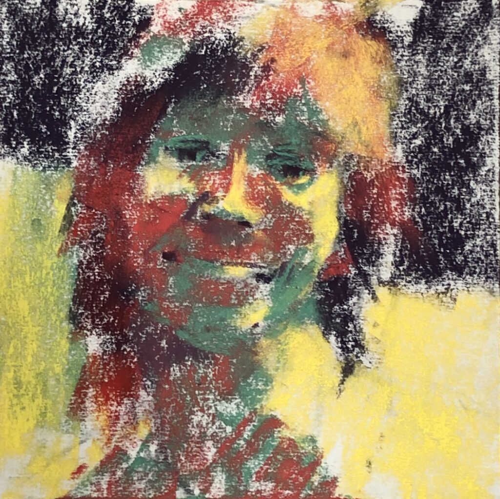
Reasons to Use Unexpected Colours
So, why on earth would you want to use colours that defy the colours of nature? Well, here are a few good reasons:
- For Fun: Because art should be a blast, right?
- For Expression: To convey your innermost thoughts and emotions.
- For Mood: To set the tone and atmosphere of your work.
- For Whimsy: Because sometimes, whimsy is just what the doctor ordered.
- For Boldness: To make a statement that screams, “I’m an artist, and I play by my own rules!”
- As a Spiritual Expression: When words fail, colours can speak.
- A Restricted Palette: Embrace the challenge of limited colours and discover new possibilities.


An Artistic Statement
Here’s the thing: Your painting can be more about the colours you choose than the subject matter itself. That’s right! It’s like wearing a vibrant outfit that steals the show. You’re making a statement, not just with what you’re painting, but with the unconventional colours you’re using.

The Path to Success with Wild Colours
But, I hear you asking, “How do I successfully go wild with colour?” The answer is still….drumroll…values! Values. Values. Values. Understand values, and then, my friend, you can unleash your inner artistic maverick with a palette that’s crazier than a bag of Skittles (or Smarties if you prefer).
In a world of endless colour possibilities, it’s time to liberate yourself from the notion of the “right” colour. Get your values figured out and you can go anywhere with colour! Remember, practice makes perfect, and experimentation is the name of the game. So, go forth and paint the town… in all the colours of the rainbow!

If you’re hungry for more artistic adventures, don’t forget to check out the IGNITE! Membership which is now open until 25th September!! You’ll find this painting as a full-length demo with voiceover!

Thanks for joining me on this colourful journey! I’d love to hear your thoughts and stories about using unconventional colours in your art.
Until next time!
~ Gail
PS. This is different from the idea of “pushing colour” which I wrote about HERE.






![Gail Sibley, [Not yet titled], Unison Colour pastels and a Sennelier pink on UART 400 mounted on board, 15 1/4 x 11 1/2 in -close up of face](https://www.howtopastel.com/wp-content/uploads/2025/07/11.-Gail-Sibley-Not-yet-titled-Unison-Colour-pastels-and-a-SEnnelier-pink-on-UART-400-mounted-on-board-15-14-x-11-15-in-close-up-of-face-Feature-image-150x150.jpg)




6 thoughts on “Unconventional Colours: My Self-Portrait in Quirky Hues”
Love the unexpected colors portrait. Looks like you had a lot of FUN!! You’ve certainly captured YOU!
Glad you are recovering from the second bout of Covid and feeling much better!!
Best regards and Happy painting!
Mike
Hey thanks Mike!!
And I did have fun! Well sort of hah hah. Always some anxiety midway!
Hi Gail,
I always look forward to your Blog entries. They inspire and energize my own painting forages. Your self portrait is as ‘out of the ordinary’ as your zingy personality. No blandness, resounding with enthusiastic enquiry by using the unexpected and reflective of your generous nature. Just love it. Also love your freshening up haircut.
Always thankful for you Blog lessons, Carmel
That’s sooooo great to hear Carmel! Makes it worth the effort for sure!
And thank you for your oh so lovely comments about ME 🥰
Oh what fun…..
This post has us hungry for colour… and smarties….and play.
Hah hah!! That’s lovely to hear Melanie. I sure smiled about the smarties part!