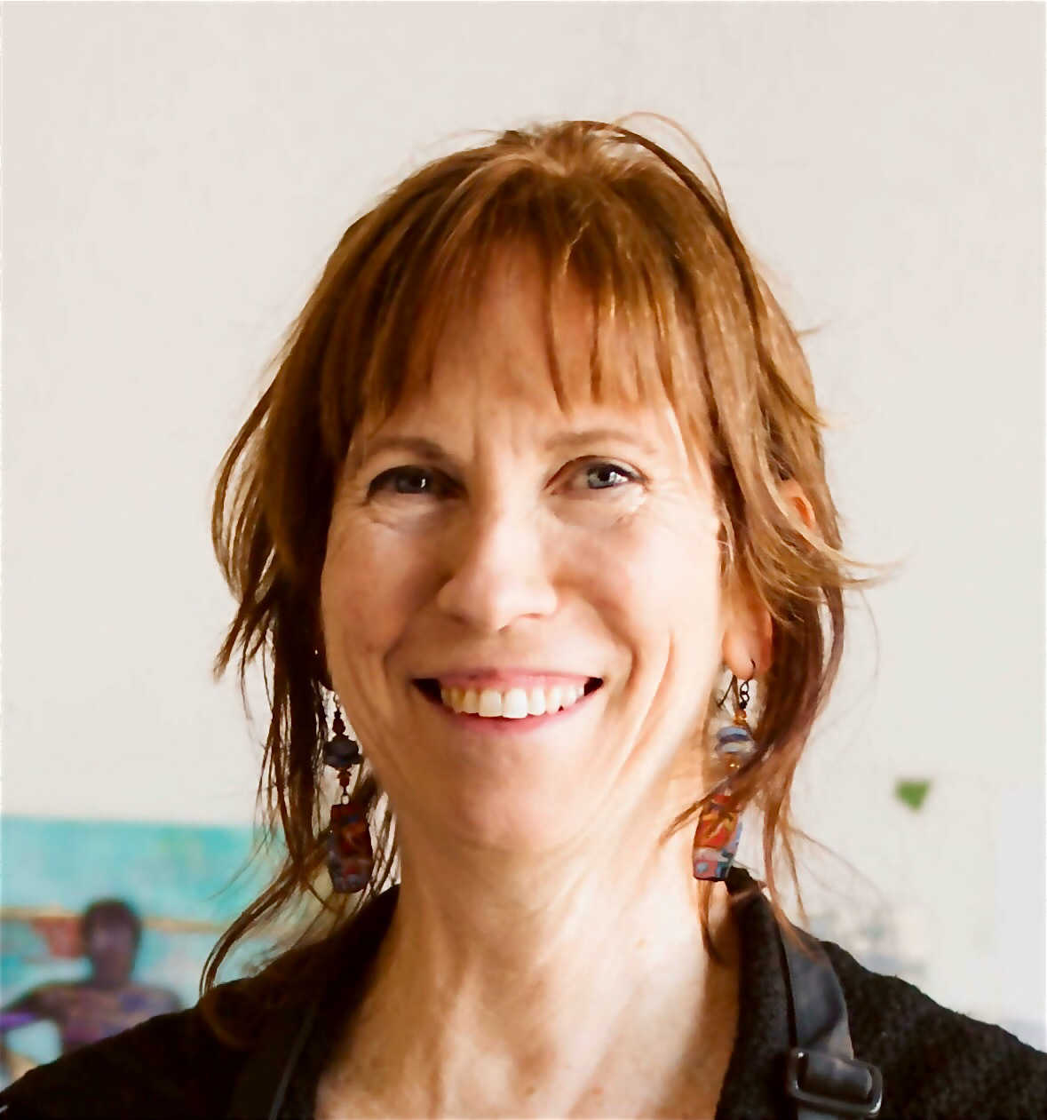
People are fascinating! And they are one of my favourite subjects to paint. So when I find an artist who seems to dig in and express a person’s essence, I pay attention! One such artist is Judith Leeds.
I came across Judy’s work a number of years ago and wrote about two pieces of hers when I was producing my Monthly Roundups. You can read what I wrote about The Poet and He’ll Make Me Beautiful (a painting that’s featured below).
When I approached Judith Leeds to write a guest blog, I had no idea about her previous life as a graphic designer, typographer, and illustrator of book covers! Wait until you discover one of the covers she created!!
I should note that Judy wasn’t sure whether she should include info on her life as a book cover illustrator. I encouraged her to do so as everything feeds into our art-making and that’s certainly true here. Judy shared a lot about various cover designs but because I wanted to get to her other art more quickly, I edited some of this history out. Since it’s fascinating, I still wanted to include it so you’ll find this part of Judy’s life in the PS. section.
Before we go on, here’s a sampling of Judy’s work:

Before I hand you over to Judith Leeds, here’s a short bio.
Bio for Judith Leeds
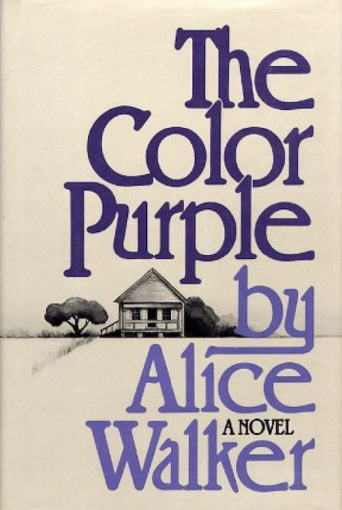
Judith Kazdym Leeds is an internationally recognized award-winning artist/graphic designer who created over 3,000 book jackets. One of these, The Color Purple, was included among “the 25 Most Iconic Book Covers in History.” She now paints portraits, still lifes, and landscapes in both pastels and oils garnering numerous honours. These include awards from the Portrait Society of America, Pastel Journal’s PASTEL 100, attaining PSA Signature Status and IAPS Master Circle status. Judith teaches throughout the USA, conducting demonstrations and workshops. In June 2024, at the IAPS Convention, she’ll be painting a portrait for their “Dueling Demo” presentation. For more information go to her website.
And now, here’s Judy. Enjoy!!
*****
Looking back on my artistic history I realized there was a definite connection in the way I approached creating book covers and how I now do my fine art. What I did then and do now is try to reflect the underlying message/personality of my subject.
In my early twenties, I got my first big break in publishing when I was promoted to Senior Art Director at G.P. Putnam’s Sons Publishers and Coward McCann and Geoghegan. At the time, the president of the company told me that not only was I the first woman Art Director for Putnam’s but also the first female art director in Major Publishing. I must say I was too young and perhaps too naive to realize the importance of such an accomplishment.
Of course, being a woman, I was paid half of what the former male art directors had been paid. After a year, I was told I did a better job than the previous male art directors yet I only got a small raise, not equal to the previous art directors’ pay. That was the way it was at the time – women did not get equal pay. This inequality exists today but it’s less overt.
Eventually, I went freelance and created covers for most of the major publishers in the US and throughout the world. The books I worked on ran the gamut from novels to non-fiction.
Even now, as a fine artist, I also like to work on a wide range of subjects and generally work on a number of different paintings at once. After I reach a certain point with one painting, I like to take a break and move to another one. Distance and time help me see the flaws in my work and it also helps me get back to my initial enthusiasm for a painting. I did the same with my book covers.
My most famous book cover, The Color Purple, was recently selected by Literary Hub as one of the 25 Most Iconic Book Covers in History. That blew me away. Though it was not, for me, a breakthrough in design, it did capture the stark feeling of the novel. I did the illustration and most of the typography by hand as was usual for most of my covers.
The Transition
After creating so many covers (over 3000), I was totally burnt out. I had hit a wall with my work and finally decided to take a break. Getting Lyme disease gave me that extra push. I found out and really believe, that sometimes, when bad things happen to you, it’s really meant to push you in a different direction in your life and it turns out to be for the best.

That transition was very hard for me. When you do a cover, you are given a specific book to work from which of course limits what you can do. There are parameters and rules.
When you begin a painting, you have a whole world from which to choose, with no parameters, rules, or limits. Finding what grabs you and what is your own personal vision is, in my opinion, at the centre of being a true artist. It makes your work unique, just as you are.
My personal vision took me a number of years to find and it’s still evolving.
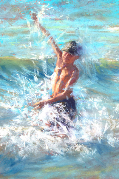
I started off doing landscapes – running around in tick-infested grasses dressed like the Pillsbury dough boy to protect myself – feeling itchy, sweaty and miserable. Then I’d go out at night with lights attached to my head or go out in freezing weather having my feet feel like they would fall off from the cold. I finally decided that this was not where I belonged BUT I had a lot more respect for those hearty souls who venture outside to paint and create such wonderful paintings. I’m in awe of them.
I eventually discovered that when I took portrait classes or just sat at a coffee shop and sketched people, I felt at home. I realised I’d found my happy place and my path.


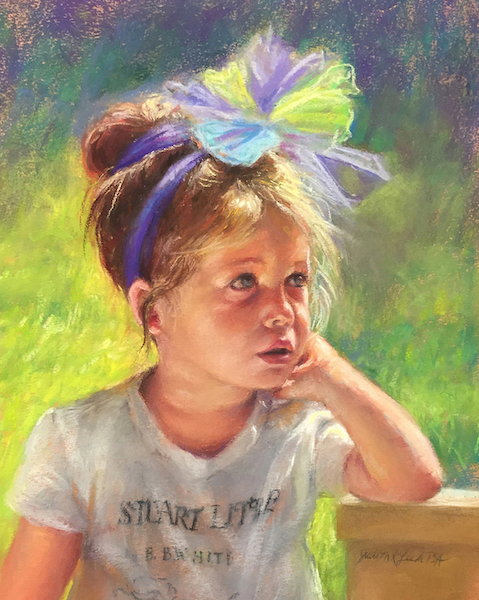
Some artists, like Picasso, stylize their people, reflecting the artist’s ideal image or attitude towards “women” or “men.” What I love is the individuality of everyone. We are all like snowflakes, everyone is different. Those differences attract and excite me.
Photorealism is not my aim as I generally want the viewer to see the hand of the artist in my work. My approach is more intuitive rather than precisely planned out in advance. That being said, I sometimes do wind up creating a more photorealistic painting.
My paintings evolve and change as I work on them. Often when I’m doing a portrait commission or just have a model sitting for me, my initial plan goes out the window: Something about the subject takes over my painting.
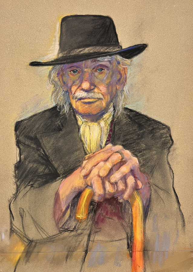
You can see this change in my initial sketch for Man of the Streets and the finished piece.


For me, technique is only a tool to communicate my message. It’s not an end but only a beginning. I am constantly experimenting and learning so I can have better ways to communicate and connect with the viewer.
Although Canson Mi-Teintes paper was, for a long time, my go-to paper, I now often use La Carte and other sanded and gessoed papers. I absolutely love, love, love the scratching sounds the pastel makes on these sanded papers. Then I also add scratches, smears, textures, and even fingerprints to my pictures. I use my hands and fingernails to create edges and make lines. It’s whatever comes to me at the moment. As you can imagine I’m not my manicurist’s favourite client!!!

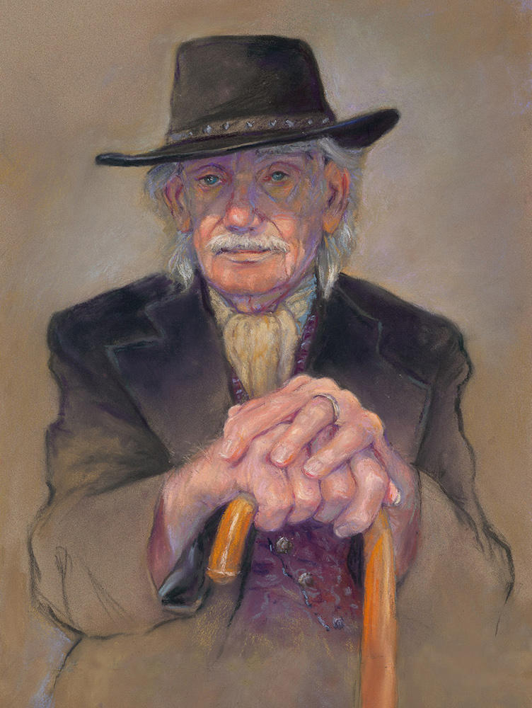
With portraits/commissions, my aim is to capture the personality and mood of my subject. I not only closely observe them when they pose but also during their breaks. That’s when I see their real personality and their mood. I talk to them and even feed them while taking many, many pictures of my subject in their relaxed, happy, unhappy, meditative mode. Then you see that little spark in their faces – that smile or frown reflecting what they are feeling/thinking. It’s who they are. Later, after the model is gone, I can add that little smile or meditative look that could only be caught by the photograph because a person can’t hold that pose for long.

In my opinion, there are 5 important steps to a successful painting
1. Your Subject/Message
What do you want to say or focus on? What first drew you to this subject? Was it the emotion of a person’s face, the play of light on the beard, or even the movement of the body?

2. Composition
What is the focal point of your painting? To best work this out, do thumbnails to create an interesting breakup of space. Use diagonals, curves etc. to bring the viewer’s eye around the picture so they are directed to the main point of interest in your painting. Don’t let the viewer’s eye get stuck in one place.
Here’s a perfect example of how I dealt with Points #1 and #2

When I started this picture I struggled with finding my focus and intent. At first I wanted to focus on the hair stylist. I loved his hands and their movement. But as often happens with me, something else took over the picture – the woman’s face and her expression. I had to make her the central point. The stylist’s great hands were still visible in the foreground but the rest of him was reflected in the mirror.
For the composition, I repeated warm and cool colours throughout to guide your eye around the picture. Other directional elements such as the circular movement of rollers, the diagonal of his arm leading into her face, vertical and horizontal lines leading up and around her head, all made this a picture that kept the viewer’s eye moving around.
3. Values
Values do the real work and colour gets the glory – an old saying. Do simple thumbnail sketches broken down into three value shapes of dark, medium, and light. Squint to see the values.
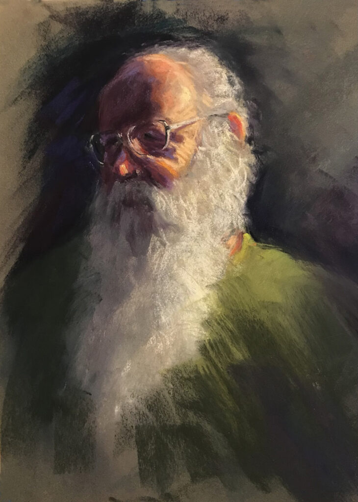
The picture is made up of very simple shapes and values and contrasting areas of bright lights and dark darks. Also, there are simple midtone values and shapes. All of these value areas are composed of a lot of different colours, lightly layered over one another so you can see each colour but all the colours are the same value. The bold strokes add interest and movement. I graded the dark side of his face into the background to create depth.
4. A Strong Drawing
I urge those who want to become better portrait painters to improve their drawing abilities. Take anatomy and drawing classes. Then you’ll know what is going on in the face and body. From this knowledge you can train your eye to understand what is happening beneath the skin. Forget about names like nose, mouth, eyes. Look at the shapes created by the shadows and lights, both positive and negative, inside and outside the head and figure. The relationship between the shapes you see is of utmost importance.
It’s very obvious when I see a portrait, even when an artist is stylizing it, whether the artist understands what is going on with the anatomy of the person. Matisse stylized his figures but was a very competent draftsman. Work from knowledge not ignorance. “Knowledge is power,” said Sir Francis Bacon.

This is of a friend of mine who has a debilitating disease. His mind is so sharp and his hands still produce beautiful paintings but his body is weakening. I tried to convey this with the colours in his face and hands = life. In his body, the neutral greys = fading but still there. Not only his face but the way he sat reflected his feeling and condition. He not only was coping but overcoming. As he posed, I sketched him and took many pictures of him moving all around.
Carry a sketchbook with you and draw, draw, draw. I’m constantly doodling wherever I go. Once my husband dragged me to a lecture by a financial guy. UGH!!!! Afterwards he said he was so happy I took all those notes. But when he looked at my pad, he saw all I had been doing was drawing the lecturer.
5. Colour
One colour scheme usually dominates a picture playing off against its complementary sub-scheme. Layer your colours, one over the other to get excitement. I echo my colours throughout the picture to create continuity and interest.

Every painting I do now has in it some touch of a human being. For instance, my still lifes are about people’s quirks, especially in relation to food.
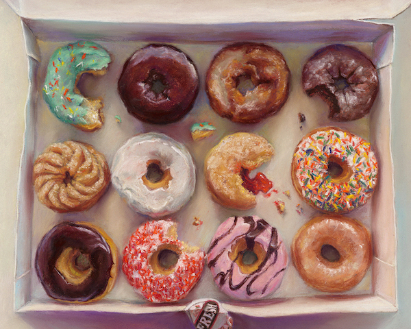
Or someone’s quiet morning ritual.
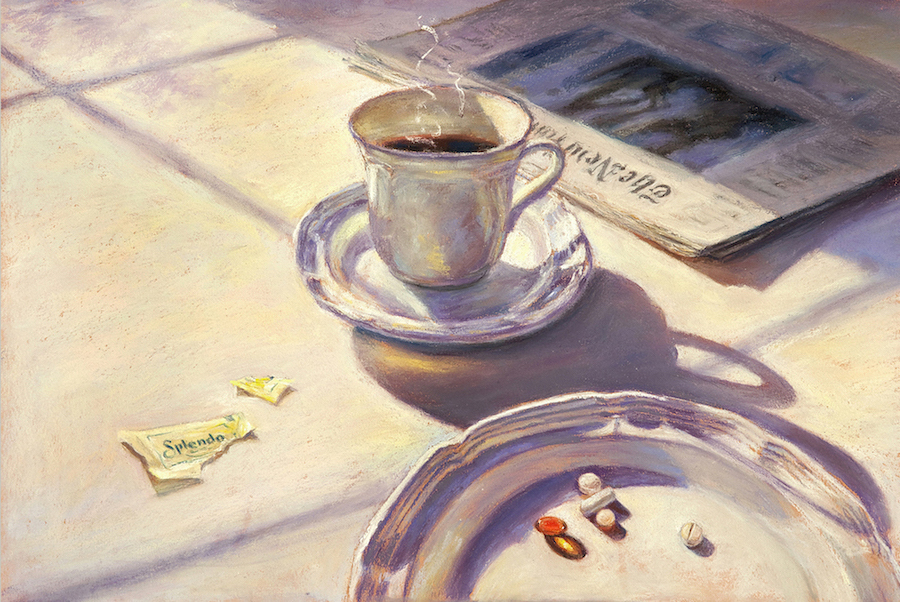
Or someone’s (my) preference to eat my calories rather than drink them.
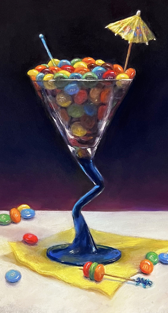
Have a look at this progression which shows how my paintings evolve and change as I work on them.

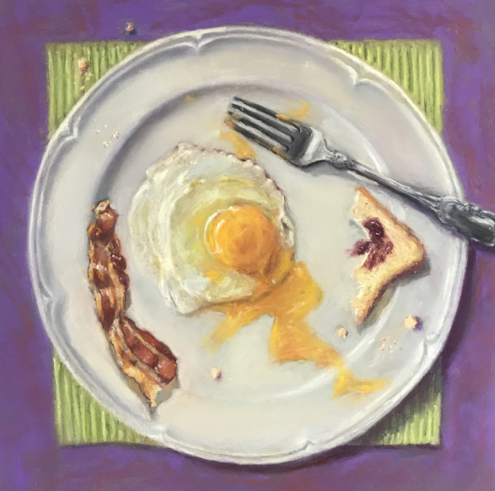
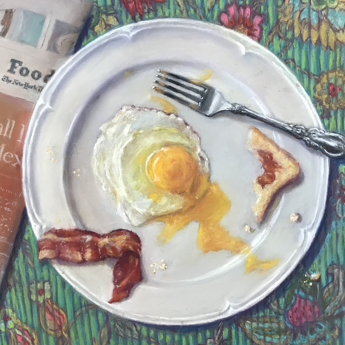
Looking back on your artistic journey is a wonderful exercise. You see where you were, where you are now, and it gives you a glimpse of where you want to go.
~~~~~
Wow!! I hope you are as blown away as I am!! (And make sure to check the book cover samples below with Judy’s explanations about their development!). One of the things I noticed about Judy’s work is that many of the pieces are done on Canson Mi-Teintes paper which I find pretty darn amazing!
If you have questions or would like to share your thoughts with Judy, please do leave them as a comment.
Until next time,
~ Gail
PS. Here’s the amazing book cover life that Judith Leeds had before she turned to creating her own art!
My cover for Eerie Weird And Wicked was my breakthrough as a book cover illustrator because I really experimented with the typography. I was honoured to have it chosen to be included in Print Magazine’s The Graphic Revolution in America – Forty Years of Innovative Typography 1940-1980. I consider this cover to be my most memorable. It was, at that time, a unique approach to twist the type in space and to put a tone/illustration within the type. Note that this was before computer art programmes like Photoshop. In subsequent covers, I used this approach and even expanded on it as for The Bog.


Another example of making my type design reflect the meaning of the title is the bestselling book, My Mother Myself. This design speaks to the reader saying, “You as a woman, are really a reflection of your mother.”

People thought I had a crew of artists working for me because my style for every cover changed according to what I felt was appropriate for the book.
As an example, I used a bolder, graphic design for a mystery like Headcase and a softer approach for a love story like The Summer of ’42. Both were my illustrations. The latter was among the first covers I ever created. I made sure to have the type readable and eye-catching on the spines as that was, and still is, often the first thing a buyer sees. Authors would write or call to thank me, exclaiming how their books “set themselves apart from the others on the shelf.”


When I received a manuscript for a novel, I always read it from beginning to end. For nonfiction books, I’d read sections of them just to get the gist of the author’s point of view.
My aim was to have each cover reflect either what the author was trying to say or the feeling of the book. I designed the typography to be an integral part of the image thus creating one organic unit. An example was Stuffed Spuds. This is one cover I had fun doing. If the publisher allowed it, I had the image bleed onto the spine, the back cover and even the flaps. Then the whole cover worked as one unit.

Family Linen is an example of how I made the whole cover into one unit visually. It won a number of big awards and is one of my favourites. I drew the title by hand, transferred it in pencil onto the tablecloth, and had someone embroider it right onto the material. Then I had the whole set-up photographed. Unfortunately, in the final run of the cover, the printer lost all the details of the tablecloth including coffee stains and little crumbs.

Even now with my paintings, I try to make my signature an integral part of the overall design. I once shipped a portrait to Houston and the buyer called me up and said, “You didn’t sign it!!!!” I told her to look on the shoulder of the man. She laughed and was happy.
Missing Persons and Improvising and Arranging on the Keyboardhttps://amzn.to/3P2EYAN were two covers that enabled me to become a member (I was told, the first woman) of the elite Type Directors Club.








![Gail Sibley, [Not yet titled], Unison Colour pastels and a Sennelier pink on UART 400 mounted on board, 15 1/4 x 11 1/2 in -close up of face](https://www.howtopastel.com/wp-content/uploads/2025/07/11.-Gail-Sibley-Not-yet-titled-Unison-Colour-pastels-and-a-SEnnelier-pink-on-UART-400-mounted-on-board-15-14-x-11-15-in-close-up-of-face-Feature-image-150x150.jpg)




35 thoughts on “Judith Leeds – Capturing The Person Behind The Pose”
Blog post by Judy Leeds was wonderful. Interesting, instructive, and inspiring.
Sooooo good to hear Hyrum!!!
Thank you so much Hyrum.
Great blog!! Such an interesting and successful career. Judith’s work is totally fascinating to see and linger over. Each portrait is fabulous, and the still lifes and food paintings, are wonderful. Not enough superlatives to describe my appreciation of her work. Thanks for featuring Judith this week.
Yay Ruth!!! And I know what you mean about not having enough superlatives 😁
Thank you Ruth. I really appreciate your kind comments and support.
What a wonderful reaction to my article. I really appreciate it. Thank you Ruth.
Wow! Great article! Lots of yummy gems of wisdom!
Love hearing that Dan!! Any gems you can share with us?
Thank you Daniel!!!
Wonderful article. Beautiful work. Judith is truly a communicator. All that amazing design experience and expertise comes through so strongly in the paintings. I was so interested to read about the book jacket designs and how they set out to convey the content of the books – with stunning results. I have always felt that good typography and information design is too much taken for granted – often not so well done, but when it’s done well we often barely notice that we got the message!
Thanks so much Gillie for delving into the book cover design side of Judith’s work and how iit feeds into her own non-commercial work. The cover is so important to getting someone to pick up a book. That, along with the title is like a headline – it will grab your attention….or not!
Gillie thank you. Thrilled that you also appreciate “commercial” art.
Gail thanks for featuring such a talented portrait artist. I love doing portraits, so I learned a lot from this blog. Love her color layering and her mark making that makes her work so beautiful. Also love that none are “formal” portraits but rather tell a story of the sitter. You can write a whole story from each of her paintings.
Thanks again
Gisela
Thanks Gisela for digging into the way Judy creates her portraits and noting the emphasis on story. And love that you say (and I agree!)”you can write a whole story from each of her paintings.”
Gisela thank you !!!!
What a treat to read Judith Leed’s story. Her sensitivity and careful observation is evident in everything shared here. Her touch with a pastel stick must be as light as a feather floating to the ground, her transitions are seamless. Such beautiful work! Then the surprise of her graphic design, particularly her amazing lettering all done by hand and not computer driven. I’m in awe of her focus, adaptability and creative energy.
Yes yes yes!! Incredible to think of creating some of those covers without the help of a computer graphic programme!
And..in awe indeed!!
Thank you so much Gailen for your comments!!!!
I have NEVER commented on ANY blog before (and I’ve been moved by many). But, I just had to for Judith’s guest post. Her pastel works and subject matter are ENTIRELY my cup of tea. Her technique as well as the empathy and compassion found within each piece are everything I aspire to achieve. SO inspiring.
Gail, thanks for deciding to include the bit on Judith’s book cover illustrations: there’s real gold there! I recognize quite a few of these books! There was a ‘flavour’ in book covers that just doesn’t exist anymore – maybe I subconsciously miss the human touch and creativity in book cover design. But, whatever it is, thanks for the memories, Judith! All your cover work is amazing, but for me, Missing Persons design and layout = BRILLIANT (as was ‘Improvising….’) – it’s no small wonder that these were the ‘tickets’ that allowed you to pass through those ‘gilded doors’!!!
Hah hah!! Well I’m DELIGHTED that Judith’s post got you to clicking the Comment button Pam!! Thank you!!!
I couldn’t NOT include Judith’s aaaaamazing graphic work on the book covers. They are quite incredible and it’s pretty special when we actually recognize some of those covers and know it was this very artist who created the designs!!! Thank you for commenting on them specifically.
And Pam, I hope now that you’ve taken this first commenting step that you will be moved again to do so in the future. It warms my heart to see responses to the art and artists who appear on these “pages.”
Hi Gail,
Just had to say thank you for all your supportive comments.
Aww thanks. Easy to be supportive of such fab work!!
Pam thank you for all your kind words. So glad you enjoyed and learned somethings from my article. And Missing Persons was always a favorite of mine. When I was given the manuscript I knew immediately what I would do!
Judith is so talented, beautiful works of art.
Thank you Penelope!
Judy’s work is beautiful. I love her palette. I feel a connection to her choice of subjects and their poses. I find these pieces not only illuminated, but illuminating – translating the personality/moment of her subject through her marks and color choices.
I loved typography in my graphic design days and find Judy’s book covers to be fantastic – a bit of a lost art in communication. To me, the vast majority of today’s book covers rarely give me a good indication of what I’ll find inside.
Thank you Jeni for your comments. Really appreciate them.
What a wonderful instructive article by JUdith Leeds. I really enjoyed and learned from the process by seeing her steps in underpainting and continuing to finished product. Thanks so much.
Thanks so much Kitty for your positive comments.
I was a fan of your typography /Book designs before I ever met you at the Pastel Society of New Jersey many years ago. Sharing our artistic paths (from graphic work to pastel painting) makes it even more special today. Showing your process is so important. The postings from beginning to completion helps far more than words can explain. Your technique in drawing your hands are divine and you create moods that feel special…(and at times tasty🌷) Love all your art!!!
Thanks you so much Bernadette for your supportive and uplifting comments. I do adore painting people if all kinds and am especially drawn to their faces, hands and even their feet. So much fun to paint. As an added bonus I love getting to know different people.
Judy’s work captures the heart and soul of anyone lucky enough to be chosen as one of her subjects in one of the most difficult mediums to use. In addition to her extraordinary skills, she captures the most incredible light that draws viewers in. It’s clear from her work that a deep part of herself is part of every portrait.
Agreed Jaime! Thanks for expressing your appreciation.
Thank you Jaime. I really appreciate your comments. Yes I do especially love doing faces as I feel the humanity and emotion in everyone’s face and I empathize with their emotions. Light defines everything we see so how could I not make it an integral part of my paintings.