
Louise Abbéma (30 October 1853 – 10 July 1927) was a French artist. She isn’t an artist I’d heard of prior to discovering this pastel painting by her in the National Museum of Women in the Arts in Washington DC. We’ll have a close look at it and I know this examination will be helpful for anyone painting portraits of young children!
Louise Abbéma was born to a wealthy family with connections to the art community. Abbéma started painting early and eventually studied under various artists such as Carolus-Duran who also taught the painter John Singer Sargent. According to Wikipedia (where you can read more about her), she “first received recognition for her work at age 23 when she painted a portrait of Sarah Bernhardt, her lifelong friend, and possibly lover.” A regular contributor at the Paris Salon, Abbéma specialized in painting genre scenes, allegories, and portraits in oils and watercolours.
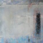
So let’s look at the painting, “Portrait of a Young Girl with a Blue Ribbon.” It’s 18 x 15 inches and done in pastel on canvas. You can certainly see her skill with this medium! Parts of the painting appear more blended while in others, the pastel strokes are visible and parts of the canvas are left untouched. These latter qualities reveal the influence of Impressionism on the artist.

Rather than creating an overly sweet and sentimental portrayal, Abbéma instead gives us something of the nature of this child. You can almost sense the quiet resignation at having to sit for this portrait. The eyes are slightly downcast, lips gently pursed. Is she as well behaved as she appears??
Now I want to take you through a series of close-ups, pointing out some of the aspects I think are worthy of your attention.
Let’s begin at the top right, where the artist signs her name. In this position, it doesn’t detract from the portrait but is still confidently apparent. The background is a neutral colour and if you look closely, you can see some dabs and “scratches.” The canvas tooth has been saturated, with no sign of the light colour coming through.

Let’s look at the ribbon on top of the girl’s head. It has an almost graphic abstracted design with areas of value clearly demarcated. Yet that doesn’t mean it’s all hard edges. Look at the way it disappears into the hair or background in some places.
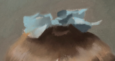
Moving down to her hair and fringe (bangs), you can see how Abbéma again changes up the quality of edges, as well as the values, to create a sense of three-dimensionality. Notice that the subject lighting is pretty even and comes from the front and overhead so there’s little shadow change from either side of the face making it harder to show volume. The artist’s attention to the fringe helps with that.
On the right side, the hair looks darker and stands out against the side of the head (but still with a soft edge between skin and hair) whereas, on the left side, the hair and skin are similar in value. Notice too that the hair is blocked in areas of light, middle, and dark and you see almost nary an individual hair! I love those few dark lines dividing some of those shapes.

Moving down, let’s have a look at the difference in ear treatment. The left one picks up more of the light yet much of the ear stays in a middle-value range, disappearing into the side of the face as well as the background. The ear on the right has almost no highlights and although it stays in a middle value, it shows up because of the darker hair around it.
Also have a look at how the girl’s hair – the hair that would be behind her head – disappears into the background both because of value (hair and background are almost one and the same) and the soft edge between them. There’s also very little rendering of what we’d imagine hair to look like in these shapes.


Next, let’s look at the ruffles over her top. I “read” it as ruffles yet there’s very little detail to tell me that. What’s there, does the trick! There’s a beige colour in two values/tones with what looks like a bit of pastel pencil (?) linear work but very little of it.
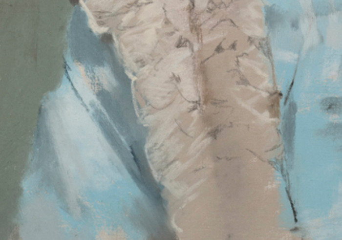
Moving across the portrait, have a look at the texture and pattern of the clothing. Gatherings and pleats are revealed by a loosely applied mid-value blue/grey that shows shadows, and flat blocks of colour in light blue and a wee bit of light violet to describe the main part of the outfit. Look how the pastel is so loosely applied in the bottom half. You can see small areas of untouched canvas.

Moving up the right side of the portrait, have a quick look at the sleeve. Here it’s very obvious where the canvas is left blank. Also, Abbéma has added some darker grey-blue marks that don’t appear in many other areas of the portrait.

Moving up, I love the way the shoulder on the right combines hard and soft edges – a hard edge on the right side, a softer edge at the top where the ruff moves over the shoulder to the back. The artist gives a softness to the edge that divides clothing and background so they blend into each other visually.

Before we get to the face (I’m leaving the “dessert” for last!), have a look at the neck collar/scarf and see how so much is said with so little. Notice too the areas that seem to disappear – into the blue clothing, into the background. And examine the quality of edge that separates the chin from the clothing.

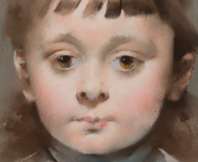
Right! Let’s get to the face. First, a quick reminder of the whole face before we break it down. Ahhh the smoothness of a child’s face – no sign of life-experience wrinkles yet!
Starting at the bottom, the lips. Detail and yet hardly any! I love the touch of more saturated red on the right: it suggests the sense of rosebud innocence. Notice too how little of the mouth is outlined, and also, how little shadowing there is.

And next up, the wee nose. Children don’t have the vertical structure that appears as they develop into adults. This image is a bit blurry but you can still see the difference in colour temperature between the tip of the nose (cool – probably partly as a result of some reflected light from the blue outfit) and the cast shadow (warm).

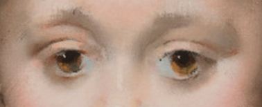
And finally, we come to the eyes! There’s so much to discover: the colour in the eyes themselves where light reveals that colour, the way the whites of the eyes (not white at all!) slip into the surrounding skin, the darkness in the eyes not just from pupils but also cast shadow from the lids, the emphasis on subtle temperature change (rather than value) to suggest volume in the eyelids, the scantness of eyebrow and brow structure.
And that’s it!! Let’s have a look at the whole portrait again so you can see all the parts together again. And perhaps you’ll view the portrait a bit differently now. I’ve also included a black and white version for comparison. You can see in the value design that the attention is all on the head!

What I also found interesting about this piece is the mix in style between the loose rendering and application of the Impressionists and the more finished look of academic work.
And now, I’d LOVE to hear from you!
Had you heard of Louise Abbéma before?
And what do you think of this portrait?
Also, was this close-up post helpful?
Let me know by leaving a comment. Let’s get a conversation going!
Until next time,
~ Gail
PS. There was something about the attitude of the sitter by Louise Abbéma, if we imagine it more exaggerated and rebellious, that reminded me of Augustus John’s portrait of his son Robin.

PPS. A look at a photograph of Louise Abbéma shows a fringe of similar style to the sitter… 😁

UPDATE after hearing back from the National Museum of Women in the Arts!!
Dear Gail,
Thank you for your interest in Louise Abbéma’s Portrait of a Young Girl with a Blue Ribbon. We forwarded your questions to one of our colleagues in Paris who is an expert in pastels. I’ve copied his answers to your questions below:
Q. Can you tell us how she managed to use canvas? How pastel can stick to it?
A. To my knowledge, there has not been any study of how Abbéma used canvas specifically. The use of canvas with pastel remained relatively rare among 19th century artists (compared to paper), but it certainly was done. Manet is well known in this regard. Ditto with de Nittis, Puvis de Chavannes, etc. I tend t othink that the use of canvas is round more among artists who see themselves as painters above all (as opposed to pastelists). In any case, the textured surface of canvas (as long as it is not too thick) lends itself well to the use of pastels, as the pigment clings to the texture.
Q. How much does the use of canvas, as opposed to sanded paper, effect the type of strokes and blending used?
A. I do not think that there is a large difference between the effects one can achieve using canvas over sanded paper. I would recommend reaching out to contemporary pastellists to gauge their opinion on the matter. But judging by the pastels I have seen, I do not see a large difference.
Q. Could you comment on the preparation for pastel on canvas surface?
A. I have never heard of preparation of pastel being any different for canvas than on paper.
Q. Was this framed under glass..or sealed in some way?
A. I am not certain about this work specifically, but pastels are almost always protected by glass. The medium is too fragile to not protect it in this way.
*[NOTE FROM NMWA’S REGISTRAR: the work is framed under Optium museum glass]
Q. I’m curious if the canvas was raw or primed with something before the pastel was applied.
A. This is a difficult question! I am not sure what preparation the canvas received before the artist applied the pastel.
I hope this helps!
Best,
Hannah
Hannah Shambroom, Exhibition Coordinator
MY REPLY:
Dear Hannah,
This is marvellous! I have written museums and public galleries in the past and never had a response so I very much appreciate the follow-through on this!
I will be sure to share all this info on my blog post. I do wish though there was more actual info on the use of pastels and the prep of the canvas by this artist. Nevertheless, we have responses! Yay!!
Again, thank you!!
Gail


62 thoughts on “Louise Abbéma – “Portrait of a Young Girl with a Blue Ribbon” – A Close Look”
Love to see you analyze the painting! You show us so many things that I would not have noticed otherwise!
Something to do again I would say.
So thanks for that. But can you tell us how she managed to use canvas ? How pastel can stick to it? I’m curious because I have old canvas I would like tu reuse…
So happy to hear it was an eye opener Denyse! I will do more of these in the future (as I really enjoy taking a deep look).
I don’t have a definitive answer to your question but now have an email sent in to the museum to see if I can gather some information for us! I’ll post something on the blog when I know more.
I myself have done charcoal on canvas (and really enjoyed doing it!) then fixed the dickens out of it!
Gail,
Thank u for introducing me to another “unknown female artist” of great skill. I remember how I looked forward to your blog years ago when you regularly analyzed 10 paintings of contemporary artists you found compelling.. Your analyses were always so interesting and instructive, just like this one.
I miss those!
Re the use of canvas, I wonder if Anbema used a pastel ground. Marble dust and pumice are natural ingredients most likely available at the time.
So glad to hear you enjoyed it Joyce!
Yes, those monthly roundups….I loved doing them but they took a full three days of work to produce. And nowadays, I want/need to put that time into supporting my IGNITE! members (which I LOVE doing!). To everything there is a season. AND there were a LOT of them so you can always go back and reacquaint yourself with them. Just click on the Monthly Pastel Picks category.
As to the canvas and ground, I’m still hoping to hear from the museum. Time for another email I think….
Your in-depth analysis with close-ups was extremely helpful in both examining Abbema’s techniques by application in my own portrait attempts. Too often, I find it difficult to accurately discern colors and brush strokes when looking at artwork on-line.
One question: how much does the use of canvas, as opposed to sanded paper, effect the type of strokes and blending used?
So glad you enjoyed it and found it helpful Janet.
As to your question, I don’t have an answer for you. I would suggest though that blending would be easier on a primed canvas. I have written to the museum to see if I can get more info on the use of pastel on canvas.
Thank you Gail. I really enjoyed that trip through the painting. I would read these any time! It’s interesting, I think it’s almost more successful in black & white. I don’t know why, curious if others have that reaction.
Thanks for the encouragement to do more of these Amy!
And an interesting observation. It certainly is powerful in black and white. It will be interesting to see if others feel the same way. I think the colours can diminish the visual power of the value pattern and that may be what’s happening here. I’d love to hear what others think!
This is a really helpful post for amateurs like me! Love and appreciate your blog posts always.
Jill, thank you thank you for your kind and supportive words!! And I’m delighted to hear it was so helpful!!
Thank you for this break down of the painting.
Without the close-ups and critique, I’d have thought it ‘ho-hum! Well done.
I notice that I am frequently invited to sign up .
How is it that I regularly already get your “Howtopastel.com” if I haven’t already signed up?
Hah hah Karen – I love your honesty! And glad I could help you see more in this piece.
The pop-up that asks you to sign up doesn’t “know” that you are already a subscriber. I am sure there are ways to improve this experience and one of these days, I will surely look into it!!
I appreciated seeing all the specific areas pointed out – and done on Canvas! Makes me think of branching out from sanded surfaces…..at least as a test. Thanks For Sharing!
Hey Lori, how fun that you are inspired to have a go on canvas. I myself have only used charcoal on this surface. Do let us know what happens with your test!
I really enjoyed your analysis. Children are too easy to overwork. I have not heard of this artist, like a lot of women painters. What intrigued me ( especially in the black and white version ) is the asymmetry of her face. Often when I’ve ( almost) finished a portrait, the jump up ‘mistake’ is this asymmetry , or the difference between the set of the eyes – and I feel compelled to change, even though I was initially happy with it. But is it’s someone else’s painting, I accept it .?.?
Thanks Robyn. And yes! That’s why I decided to focus on this piece because of the overworking, and ‘darkening,’ and adultifying, and sweetening that I sometimes see.
So interesting your comment about asymmetry and how we often feel the need to “correct” our own work when we see it. And yet pretty much all faces have some sort of asymmetry. And when you look more closely at front-facing portraits from the past, done from life, you’ll begin to see a lot of it visible. So subtle, yet it’s there. A great example is the eyes on Sargent’s Lady Agnew That I noticed a number of years ago!
Thank you for this discovery and for this very effective technical analysis. I will come back to it as I find it relevant.
Ohhhhh that’s so great to hear Gine – that it’s helpful and that you’ll be referencing it in the future!!
Thank you Gail! Beautiful portrait and analysis! Loved that nose with the cool reflected light and warm shadow, that’s just awesome work!
I’m not that much of an art historian, so saying I didn’t know her doesn’t really mean anything. 😅
Glad you enjoyed it Herbert. I almost missed the nose and then I had a closer look and…well, wow!
And sadly, even art historians I’m sure don’t know of her unless their specialty relates to her somehow!
This was a real lesson of observation. Thank you so much.
Taking time to observe, that’s the key.
Taking TIME to look deeply and see what’s there really is the key as you say Marguerite!
Very interesting!! You did a great job of breaking that down. Could you comment on the preparation for pastel on canvas surface?
Glad you enjoyed it Sharon! As you your question, I’ve only used charcoal on canvas so can’t speak to the use of pastels on that support. I have written the museum and hope for more info!!
Glad you broke this down into parts. There is SO much more to see than what I would have noticed by myself. I learned much more about the mark making she used and that I could use in my own art. Thank you for your insight into a way of using pastels that I would never thought of myself.
This is so great to hear Marie, that looking closely and seeing will help you in your own work and mark-making. Awesome!!!
Thank you for bringing these pastel artists to our attention. Inspiring!
You are soooooo welcome Bonnie!!! And I’m happy to know you’ve been inspired 😃
Gail, I cant tell you how much I look forward to these blogs! I love how and how much you see. Your insightful critiques always leave me feeling enriched.
Melisa, your comment totally warms my heart – thank you!!! I’ll do these more frequently in the future!
Was this framed under glass..or sealed in some way? Smooth canvas texture? Thanks for all your interesting discoveries and your blog where you share!
Ohhhh good questions Gerry and I added them to my email to the Museum. Hopefully we will get some answers!!
Love, love, love how you broke down the painting with close up – detail photos. This was very helpful to better understand the artist’s mark making you were describing. I’m curious if the canvas was raw or primed with something before the pastel was applied.
So good to hear that it was helpful Gin! As to your question, I haven’t a clue but hopefully we will get some answers from the museum!
What a beautiful portrait! And I love the breakdown comments. As usual, when I read your comments I realize that you catch things I hadn’t noticed. I guess 2 brains are better than one.
I did notice this: “disappearing into the sin on the side of the face ” – (in section about ear) I think you meant “sun” but Mr. Spellcheck thought he had a better idea. Am I right?
I’m glad the post and images revealed more than you saw initially Kathy!
And damn and blast those typos! I can read a post a dozen times and still miss them 😵💫 Thanks for pointing it out and all corrected now! (I have no idea what I was trying to say so just deleted!)
I’ve never heard of her either. Very interesting post Gail…although I wouldn’t want to meet her in dark alley…yikes.
Hah hah…I know what you mean Jill!!!
Glad you found it interesting 😁
Yes, Gail, very helpful to break down the portrait as you did. I love it!
So good to hear Sally and it encourages me to do more!
I loved this portrait, thanks for breaking it down for us. Such skill in handling the pastel to create a life-like but charming portrait that also conveys something of the personality of the young girl.
How did she manage to capture the smoothness and delicacy of the young girls skin!
I’m glad you are so enamoured with this portrait Laura!
As to the smoothness of skin, I’m guessing it’s somewhere between a kind of blinding and the smooth ground of the canvas! I await infor from the musuem…..
Thank you , Gail, for bringing this to us! Abbéma is totally unknown to the the public at large, beginning with me! Your dissection of the portrait is so helpful. As a sidenote, I think the little girl looks like Maggie Smith at the age of 3.
It was my pleasure to do so Nancy!
And on your sidenote…do you have a link where we can go and see the young Maggie??!
HI Gail , you can enter Maggie Smith in Google, and scroll around and click on Maggie Smith young.
No shots of her at age 3, but maybe around 15-ish.
Yes, I did that but couldn’t find a very young Maggie. Thought you might have secret knowledge you could share 😬
Gail your analysis was fabulous. So enjoyed reading this blog and see this wonderful painting on canvas. Looking forward to hearing what the museum has to say. I have tried using pastel on canvas and it has always been a dismal failure so I am very curious. I am still experimenting on it though.
If you saw this in person, was it framed behind glass?
Great to hear you found it valuable Gisela!! I do hope I hear something back from the museum regarding her use of canvas as a support for pastels. I sent my request to a number of their available email addresses! How cool that you’ve been experimenting with pastels on canvas. Hopefully we will learn something.
I haven’t seen it in the real thing but imagine it is framed under archival glass.
Gail, thanks for breaking this down into little bites! It helped me to appreciate the painting even more. Quite frankly I don’t think I would have spent much time looking at this painting if I saw it in a gallery. It truly is a remarkable work and thanks for highlighting it for us.
I’ve been wondering if I can do a painting of my grandkids. Maybe I can!
Nancy, I think this painting may have come at a perfect time for you! Now that you’ve had a detailed look at it, see how you can carry your learnings into a portrait of your grandchildren!!
Answer to your questions: No. Lovely. Immensly.
Excellent article (I too love the close-up indepth)! Especially the mouth, nose, and eye closeups were so revealing. Especially the eyes, as they have no corners! You’ve showed us how powerful suggestion is, thank you!
Hah hah Charlotte! I had to go back and check my questions 😜
I know, those eyes right?! And yes, so much can be said with a bit of suggestion. We don’t have to say everything.
Thank you for that introduction to Louise Abbema’s work, especially this lovely portrait. Your close-up photos with the description below makes me feel I am right there in a group class in front of the pastel.
That’s so great to hear Angie! What I wouldn’t give to be able to take a class around a gallery for close examination of particular pieces. Of course, online, we can really get a close look!!
Love the “play by play” you gave us. Very helpful in re-enforcing habits to look carefully at value changes, edges, getting volume without shadow (that was the best thing to me). You are a treasure, Gail.
Anita Beaty
That’s so grand to hear Anita! Thanks for sharing the things that were specifically reinforced for you. I love the analogy of play-by-play 😁
And thank you for your lovely compliment 😊
Love this Gail!
Thanks for breaking it down for us! I too am very interested in learning how to paint on canvas. I have tried it before but I’m puzzled as to how to preserve it!
I had a few observations. First it’s interesting that she studied under someone who taught John Singer Sargent. I can sort of see a similarity in style. Second I love the looseness in the garment compared to the more refined treatment of face. And third looking at photos of the artist I wonder if this is a painting of her as a child? She sure has the same set of bangs and eyes! And attitude😉
Thanks again very interesting!
Maureen Gerrity
Thank you for your keen observations Maureen! I wonder about all three too. The confidence and looseness of stroke in the garment both seem to point to Sargent’s influence. And certainly those bangs and a bit of the attitude relate to the artist herself 😬
Your comment has prompted me to follow up on my 1st November email to the museum. I do hope we will find out more about her use of canvas as a support.
This is a wonderful in depth breakdown of looking at art. Love it.
I’m astounded that this was done on canvas – it must have been of a very fine weave, unlike canvases that we buy prestretched and gessoed from the shops today.
Your in depth analysis of the work is excellent- I’d like more of this as I need to learn how to look at/analyze paintings. I have zero art criticism training.
And, no, I’ve not heard of this artist before, but that’s no surprise as I’ve had zero art history training either.
More please!
Thanks so much Liz for your comment of appreciation and for your encouragement to do more like this. Perhaps we can bring this in-depth analysis to IGNITE!?
It is curious about this artist using canvas. I did write the Museum and have some info back which I will add as an addendum to the blog post.
What a thorough and insightful analysis! Thank you for teaching about this great artist that I haven’t heard of before. Your article is like a lesson in every sense.
Cheers
Dragana
Dragana, thank you so much for your appreciative comment! I love doing these close-looks and so when I get positive reinforcement (like yours!), I’m motivated to do more 😁