
A couple of months ago, I published a post where framer Mitchell Jones and I chatted about a number of topics around the protective aspects of framing. As pastel artists, we need to protect our artwork from the elements (and curious fingers!). In our chat, among other things, we talked about glass choices and the question of fixative. We also touched on the framer/client relationship. Click HERE to watch that video. The one thing we didn’t touch on was the aesthetics of framing as it’s a HUGE subject! So in our second video, we go deep into how to choose the right frame for your art.
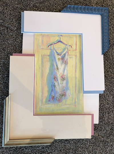
We cover a number of topics before getting into specifics using my pastel painting “Party Frock” as an example to play with.

Some of the topics we cover in this video are:
- Framing for a show and the idea of repurposing frames
- Trends in frames today
- Initial thoughts about possible framing ideas for “Party Frock” and then getting into the nitty gritty of choices of mats and frames
- Context – where will the painting hang and are there considerations to make regarding the framing being consistent with or different from whatever is already on the walls?
- The ins and outs of choosing mat colours for the inside and outside mats
- Choosing a frame to go with a couple of mat combinations
- Looking at using a frame-alone choice (ie without a mat)
- Tips on how to visualize your piece with the mat and frame all around the piece
So much of what Mitchell shared was eye-opening for me. AND it started to make the whole process of choosing the right frame less daunting and something I could actually start looking forward to!
So grab a beverage of choice and settle in for some fabulous info that will help you whether you have a framer doing the work for you or you’re a do-it-yourselfer!
I hope that you gained much from this interview with Mitchell Jones on how to choose the right frame for your art. We’d love to hear what you think. Feel free to ask about anything obvious that we missed. Your questions may lead to follow-up videos. To respect Mitchell’s time, I may ask him to answer any questions in a bulk response rather than answering each question or comment individually.
AND I have a question for YOU….which framing option did you like best? How do you think I should frame this piece?
Here’s the piece with the two options we looked at:
Leave a comment choosing one of these options:
- A – The pink inside mat version
- B – The blue inside mat version
- C – Hey you never finished up trying just a white mat combo with a frame. I’m curious about that version
- D – I have a totally different idea for you!
The main outcome I want you to have from this post is to have an aesthetic understanding of how to choose the right frame for your art. You will be armed with knowledge, permission, and courage to ply your framer with questions. We want you to end up with a framer who understands your needs and listens well AND at the same time can guide you to options you may never have thought about or even imagined!
I consider myself very lucky to have found the knowledgeable, interested, design-conscious, and generous-with-his-time Mitchell Jones. (And of course, if you’re in the Victoria or Saanich areas here in BC, Canada, be sure to drop in and have a conversation with Mitchell at the Peninsula Gallery. You may just want him as your framer too!)
If you’re a do-it-yourselfer, then I hope you have a whole heap more knowledge on how to choose the perfect frame for your work.
I look forward to hearing what you think of all these ideas and tips so please leave your thoughts below.
Until next time,
~ Gail
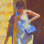
PS. Interested in the creation of “Party Frock”? Click here to get a sped-up version! (The real-time version with voiceover is in IGNITE! My kick-ass art-making membership. You can join the Waitlist by clicking HERE. We open soon!)
PPS. Are you interested in purchasing “Party Frock” (unframed)? It’s available so let me know!


18 thoughts on “How to Choose The Right Frame For Your Art”
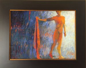
Great video and really informative! Thank you! While version B with the Blue is nice, the frame itself seems too busy for the artwork; takes away from and competes with it. Version D, another idea perhaps: a wide white frame maybe with a thin gold line closer to the artwork to break up the white; the frame is not flat but is gently molded and with a profile that scoops down to the inside. The viewer is then looking into, rather than at, the image and not at something flat against the wall. The absence of any real colour in the frame keeps it quiet, allowing the artwork to sing, and the molding of the frame guides the eye inward. Do you need a mat at all? If you want space from the glass you could use hidden spacers, or right against the glass with a Passé Partout sandwich. Too much flat visible mat seems to dwarf the artwork. Your lovely dress and pale yellow surround would seem to be weighted down with a dark frame, even though dark brown or black would make yellow sing generally. The aesthetics of framing and having a good relationship with a framer are so important. Great video, thank you again so much Gail!
Thanks Jennifer for your detailed answer!! And glad you enjoyed the video 😁
There’s soooooo much to think about when framing isn’t there? I like your idea about the wide white frame (but currently unavailable through Mitchell presently).
For me, there’s something classic about the mat. I would be tempted to go with one 8-ply off-white mat (which I’ve used on other pieces).
If using just a frame, I’d always use spacers. My framer and also museum archivists I know are completely against the passe-partout arrangement of pastel against glass. Quelle horror!! (We talk a bit about this in the previous video)
Hi Gail, very useful follow up video, many thanks! My preference is for B which I find interesting because I tend to gravitate toward warm colours – but the blue makes the pastel sing best in my opinion!
Judy thanks for your input. And I know exactly what you mean about being pulled to warm colours and, also as you say, the blue does make the dress sing!
I like the pink version. The party frock has less pink, so the mat and frame coloring help pop the white and emphasize the pinks in the frock.
Thanks Sonny! I like how you’ve pointed out that the painting has less pink so the mat/frame brings these colours out.
Thank you so much for this video. It is an area I have wanted to know more about.
My reference was a variation on the “C” option, above. While I liked both the the pink and blue double mattes, I thought they distracted from the work. I though the approach with the slightly dimmed white worked the best, as was said, to bright out the brighter white highlights.
All of this, by the way, made me appreciate your work even more.
Kyle, thanks so much for your comment and opinion! I love that you shared how the double mats shown affected how you viewed the work and that you would prefer the soft white mat on its own.
And thank you for your sweet compliment 😊
Hi Gail,
Although I love a softer look and the warm colours I think the blue option really made the pastel sing.
Great videos. I got some things framed recently and found Mitchell’s tips very helpful.
Thanks so much for your take on the framing options Lydia!
And I’m really glad Mitchell’s tips were helpful for your own framer connection. 😁
I prefer option B, with the blue frame.
I think because the yellow of the door has a green tinge (at least it looks like that in video), and the pink competes with that a bit, whereas the blue does not. Blue also brings out the shadows.
Blue frame has that lovely detailing which has an old- fashiony quality to it that somehow goes with the dress.
Thanks Laura for your choice and most importantly, why! I agree with all you’ve said. And yes to the old-fashiony quality of the frame 😊
Hi Gail,
Thank you, thank you, thank you! This was so helpful! It was nice to see “Party Frock” again! Like running unexpectedly into an old friend. I prefer Option B, although I really wanted to see the combination that had the more turquoise undermat with another frame (maybe white?).
I found myself saying, “Wait a minute! What about mat width? Do you frame larger paintings without a mat? In other words, how do you know when to use a mat and when not to?
Again thank you and Mitchell for the very informative video.
Ahhh Shirley, such good questions.
And after recording the video, I too thought, argh…why didn’t we try this or that combo?!
As to your question regarding whether to use a mat or not, a big part of that is aethetics. Another part is cutting down the amount of glass used. And another part is budget (mat plus a narrow frame can be less expensive than a wide frame on its own).
Gail & Mitchell,
The video is very helpful.
I like A, pink version, the best. For some reason B, blue version, made me think of a little girl’s room. Maybe it’s the shine of the frame? And, I know, pink = girl, blah, blah, but that’s just the way it hits me.
Another video idea might be framing in the black on black and white on white style, and any options that might be available within that concept.
– Liz
Thanks for sharing your vote and why Liz.
It’s funny, afterwards, I thought, we really should have tried a white on white especially since that’s the way I’ve been framing many of my current pieces! 🤦♀️
I’ve framed professionally, for 45 years. I was so pleased with this video! Your framer speaks very well and gives your followers all the right info! Bravo!!
Kris that is AWESOME to hear! Thank you!