

Recently in my IGNITE! membership, I created a mini-course on this question: How should one deal with the foreground in a painting? It’s a common question.
I’m going to give you a number of pointers and take you step-by-step through one of my paintings to illustrate what I’m talking about.
(If you want to read about backgrounds, on the other hand, click here.)
What do we mean by “the foreground”?
The foreground is the area in the painting closest to the viewer. This idea relates, of course, to Western painting where the picture space is divided up into foreground, middle ground, and background. By using linear and aerial perspective, particularly in landscapes, a painting can suggest the illusion of depth and receding space.
Why can creating the foreground be so troublesome?
The foreground is the entry into your painting. It invites the viewer into the picture space. And when the foreground is a large area with nothing much in it, this can pose a problem. Often we just don’t know what to do with all that space! We’re afraid of it being boring so we throw everything at it which can instead prevent the viewer from moving through the painting which is the very thing we want them to do!
Some of the things we do may do in the foreground that will work against us is to have:
- too much detail
- too much texture
- too much strong value contrast
- too much colour contrast particularly with saturated colours
- too many hard edges
These can all set up a tension between the foreground and the middle and backgrounds. We may be able to move into the space but we keep getting pulled back to the foreground, namely, we aren’t permitted to take a leisurely stroll around the painting. Or this tension discourages us from moving into the picture space at all!
Other problems can be:
- blocking the eye by a fence across the foreground (this could also be tall grasses) – we need a way in
- copying too much of what’s there (in life or a photograph) without thinking about what the picture needs
- fussing and fiddling
So how do we deal with the foreground?
So what to do? What colour should we make it? Or what intensity or temperature? How dark or light?
How do we make sure the foreground doesn’t block us from moving into the picture?
We’re often given formulas – paint foregrounds warmer, darker, brighter, with hard edges, with detail. But what about when the foreground needs to be cool or light? Or of low intensity? Or filled with soft edges?
Remember that the viewer’s eye will usually go to the area of greatest contrast in a painting. This is where the focal point is often located. Contrast in value is the most noticeable, but contrast in colours, shapes, colour temperature, details, edge, or textures can also be the thing that attracts the viewer’s eye. This means we don’t want this kind of contrast to happen in the foreground (unless that’s where the focal point is).
So how do we make sure a viewer easily enters the painting?
Usually keeping things simplified in the foreground is the best idea. Think “big shapes” for instance.
Another good idea is to keep the value the same (whatever the value decision is) while making it interesting by changing the hue or temperature of the colours.
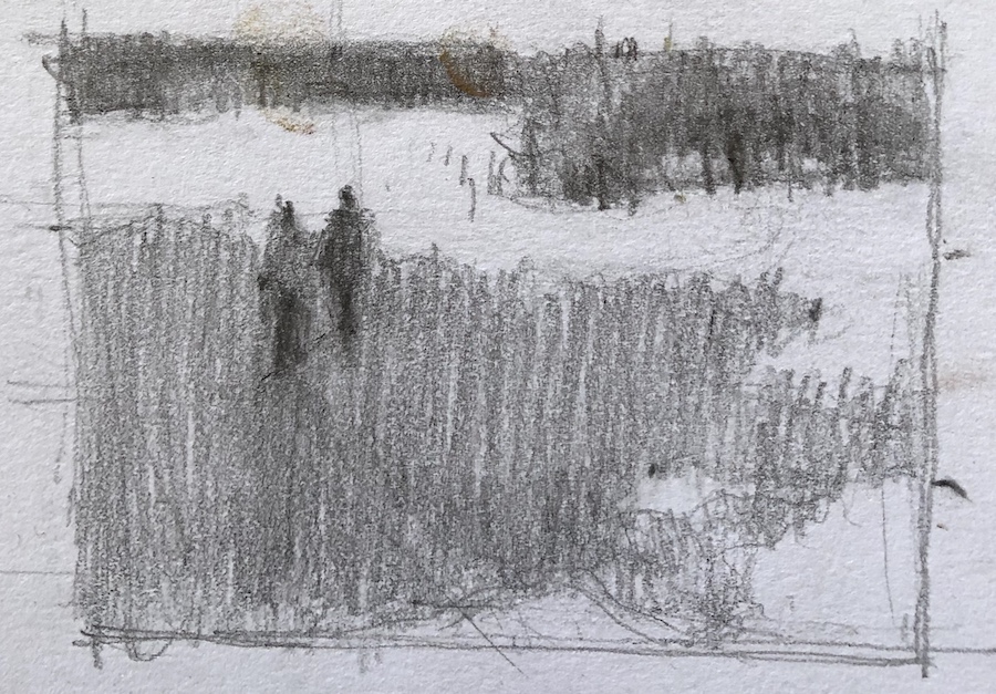
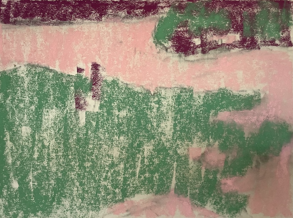
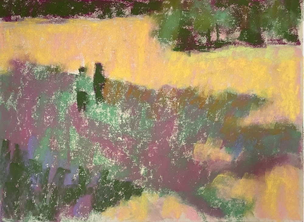
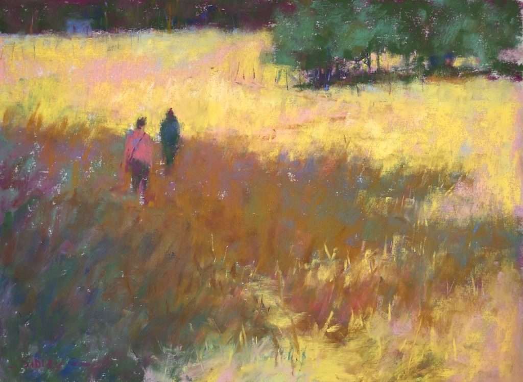
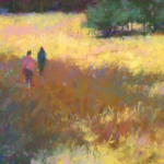
Let’s have a look at the piece I did that illustrates how I deal with the foreground.
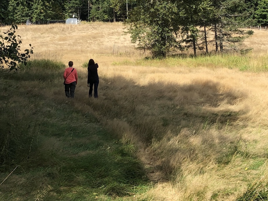
First the reference photo from a walkabout on Salt Spring Island. I was exploring location possibilities for Richard McKinley’s workshop (you can read my experience here) with Michele and Christine. I love the colour of the September grasses!


And that’s that!! I hope that was helpful for figuring out how to deal with the foreground. Please let me know by leaving a comment! And also, feel free to drop in any questions you may have.
Until next time!
~ Gail
PS. If you’re interested in going deeper into this topic of how to deal with the foreground and/or want to see this painting done in realtime with voiceover, then do join us in the IGNITE! art-making membership. Just click here to join the waitlist. We reopen in November!! I’ll give you all the details then 😀


16 thoughts on “How To Deal With The Foreground In A Painting”
Another good post! Thank you, Gail. I always enjoy reading these posts because you thoroughly dive into one topic. So much to think about in a single painting, sometimes it’s better to pick just one thing and really focus on that.
Can you provide more details about the IGNITE membership? Specifically, how much does it cost, how long does the membership last? Is there a monthly fee, yearly fee, etc. Are there structured meeting times via software such as zoom where everyone meets at the same time or is it something that can be done on your own time? Do you give demos and then assignments related to the demo? I see that there is a waitlist at the moment and I read the general description. I’m interested but still a little unclear about how it works. Thank you!
Glad you found it helpful Mary!!
And about IGNITE!…All will be revealed when I reopen early November 🙂 There is a fee that can be paid monthly or annually. Things are structured but may be changing up a bit. I’ll have a Page up that will explain all! Thank you for your interest in the membership 🙂
Love your demo on how to deal with foreground painting. So simply explained. The photograph was unremarkable but yet your finished painting is just stunning! Love it. So inspiring.
Thanks Gail.
Patricia, delighted you found it useful…and that you liked my painting too 😀
Hi Gail,
Pippa and I benefited from your walk about for selecting sites for the Richard McKinley workshop and I think we painted in that exact field . I wish I had seen this blog of yours prior to that workshop ; my paintings would have been less bad! SSI was delightful as well. Thank you for all that.
Now we are looking forward to Tasmania if there is still space for two on that trip.
India is under heavy lockdown and one is getting cabin fever .
Affectionately,
Siddharth Shriram
Hi Siddharth, I’m glad you enjoyed the blog even if it came after Richard McKinley’s workshop 🙂
How wonderful that you and Pippa will be coming to Tasmania! I haven’t been in touch with Gillian (the organizer) for some time so will check-in with her soon. I DO hope that we all feel less vulnerable to COVID-19 by next October and that travel becomes a reality again.
India certainly has had a hard time of it and I hope you both stay safe!! I can imagine your cabin fever ….
Love the reminder. I used thumb nails and got away from it for a while and really struggled with my compositions. Amazing how a few moments doing various Thumbnails really solidifies your work. I try NOT to skip this anymore.
Yay Donnaleee!! I do love hearing that you have come back to doing thumbnails. Truly, taking a few minutes at the beginning to get clarity on composition and value structure can be HUGELY beneficial to your painting!!
I followed your steps and did a pastel from your landscape. It came out really good. I liked your presentation and explanation of the foreground. Now I have to do one on my own! Thank you! It was very helpful!
That is so great to hear!!
Copying can be such a learning expereince. As you say though, now go and try one of your own 😀
Wow thank you so much Gail, it was so well explained and the result so beautiful. As always!
I LOVE hearing that Ghyl!! Thank you 😀
Good info; thanks. You make it seem so simple and easy; maybe it is!!
Marsha, it’s easy in some ways but it’s always a new painting. Every. Single. Time. And that means facing the unknown each time around!
You make it look so easy!
Thanks!!
And really, it’s always a search for how to express the intention clearly and effectively…and sometimes, that isn’t as easy as it looks!