
Have you ever yearned to move your realistic work towards a more abstracted, looser look? Well, this month’s guest is going to show you a surefire way to get there! Debora Stewart shares her story about how she moved towards creating more abstract florals and in doing so, shows you how you can do the same.
I wrote about one of Debora’s glorious pieces in a monthly round-up. You can read that here.
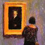
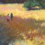
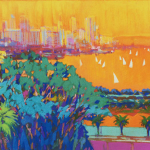
Don’t know Debora’s work? Have a look!
Before handing the blog over to Debora, here’s a wee bit about her!
Debora Stewart Bio
Debora Stewart is a Master Pastelist with PSA (Pastel Society of America) and in the Master’s Circle of IAPS (International Association of Pastel Societies). She is author of Abstract Art Painting: Expressions in Mixed Media and a series of videos on abstract painting by Northlight. She has taught many workshops throughout the US for artists.
You can find out more about Debora Stewart by visiting her website.
And now, I’m delighted to let Debora take it from here!
*****
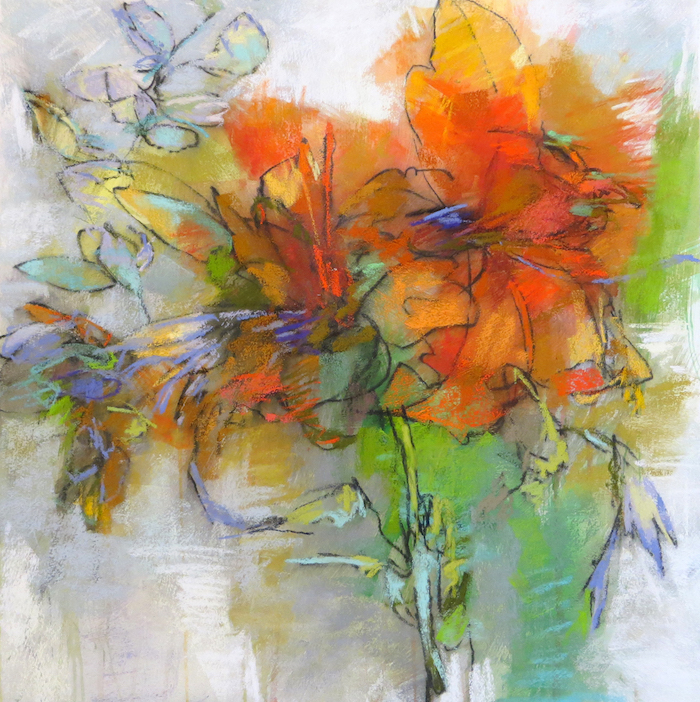
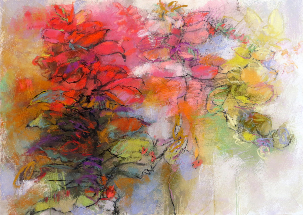
Beginnings of floral abstractions
Floral abstractions are not a new theme for me. I’ve been incorporating flowers and nature into my work since the early ’70s.
I’ve always had the tendency to look for abstract shapes in something more realistic. Even though I drew very realistically when younger and was able to render an accurate portrayal of the subject, I was always attracted to bold abstracts works like those by Franz Kline. It took me many years to become frustrated and brave enough to create my own abstracts.
After my years in college, I no longer had a model so I turned to plants and flowers. I tried to draw and paint them, but I was never satisfied. I started looking for artists who incorporated flowers in contemporary art. I purchased a book by New York artist Pat Steir and enjoyed her large experimental works of flowers. In the book, she also took a classical painting and divided it into different areas and painted each in a different style. Each section appeared as if an abstract painting. This fascinated me. I did a lot of searching and experimentation.


Developing Abstractions
At this time, I was drawing from black-and-white photos of plants and flowers. I created large charcoal and graphite drawings of flowers. I also painted grids, in watercolors, of flowers. I became very frustrated and cut up the photos I was using as a reference. This act of frustration resulted in my finding a different way. I had one of those “ah-ha” moments.
I realized that I did not have to focus on an entire photo of drawing of a flower. Instead, I could use a small section. And this began my explorations into abstraction based on nature. I created many small charcoal drawings of small sections of black and white photos. I also realized that what felt good and what came natural to me was making marks on paper with charcoal. This felt great. I began to incorporate pastels in limited colors into the charcoal drawings. I realized this had to be my direction and I needed to leave other mediums alone and focus on one.
Progress and finding a style was not an overnight process. It has come with a lot of experimentation and small changes over time.

Finding my way with papers and techniques in pastel
I didn’t have a “style” and had no idea what would develop. I look at it as peeling away the layers of an onion to find deeper and deeper layers. I’m still in the process. In the beginning, I used Wallis paper almost exclusively. I covered and washed off a lot of Wallis paper!
I discovered the technique of underpainting and using pastel ground through reading blogs by other artists. Painting paper and applying ground was a game-changer for me. I began to incorporate drawing with charcoal into the mix. That has led me to my current way of working with pastels. It’s so important to try different surfaces and techniques of applying pastel to find what feels right for you.

Exploring Gardens and Flowers in Pastel
In warmer months I draw directly from nature. When I travel, I take a sketchbook with me and draw. I collect drawings of plants and flowers to use later in my pastels. I seldom work from photographs. I say that I am not a plein air artist, but I do draw outside quite often. I take a sketchbook and graphite or charcoal outside to a garden or setting in nature and use a blind contour approach to draw what I am looking at.
Drawing is the beginning of everything for me. Just the act of drawing settles and calms me. It is a type of meditation. I am feeling the need for this in our current state of the coronavirus. I think I will spend much more time drawing this spring and summer!

Working in Two Mediums
I now work almost equally in pastel and acrylic painting. I don’t have enough space to work on both at the same time so I will work on acrylic paintings for awhile and then put those away and work on pastels. Many of my pastels are completed in spring, summer and fall. I am outdoors more and am inspired by what I see and experience and this is translated into pastel. The pastels later inform the acrylic paintings.
One medium influences the other. My mark-making with pastel teaches me a variety of ways I can move my brush to achieve the same feel with acrylics. That doesn’t mean I am attempting to make my acrylic paintings look like my pastels.
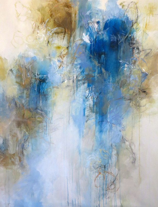
Colors of my pastel paintings often inspire an abstract acrylic painting that follows. I can take a section of a pastel painting to inspire a new acrylic painting. I learn about color and value through pastel.
Mixing paint has taught me more about neutrals and this has resulted in my realizing how important neutrals are in my pastel paintings. Each is its own separate medium with different characteristics. One is a reflection of the other. Many of my pastels are obviously inspired by nature. This reference may not be as obvious in my large acrylic paintings but it is there.

I enjoy working on large acrylic paintings. I draw with charcoal and other mark-making tools on canvas. I can create a stain and underpainting on canvas with pastel and mat medium, inks, and fluid acrylics. I put my body into a large painting in order to create movement.
When a painting is large, I have a feeling of being inside of the painting. Moving from one side to the other, working with large brushes and long handles, dripping, scraping, washing, and other methods have allowed me to be experimental. Does this carry over to pastel? I would love to be able to do five-foot pastel paintings! Maybe someday I will!
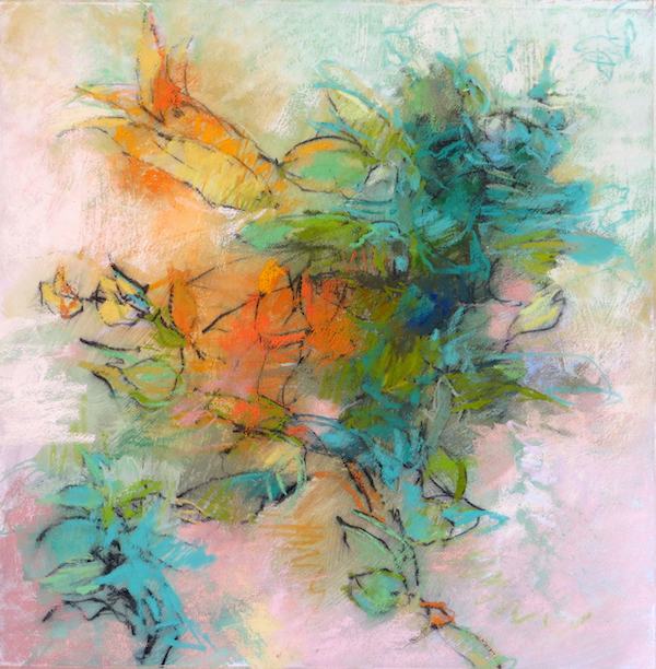
My process in creating abstract florals in pastel step-by-step
1. I draw from nature and use a blind contour approach. This allows me to focus on the subject and not my paper. I am only concerned with looking carefully. I put my graphite pencil on the sketchbook and as my eye moves so does my hand. I follow the curves and folds of the flower and allow lines to overlap as I go. I slow down. It is very meditative.

2. When I get ready to create an abstract floral, I ask myself what color of painting I want to create. I don’t think about realism. This is where the abstract comes into play.
I create a bold and expressive underpainting with fluid acrylics, inks, or gesso on a sheet of Rives BFK paper. I tape it all around since it will buckle when it gets wet. I use wide brushes and apply very quickly, and I leave open areas and drips. These areas will be incorporated into the final pastel.
I dry this with a hairdryer. It will also flatten as it air dries.

3. I recreate my drawing on the underpainting. I may use portions of various drawings in one pastel. I move portions around in different compositions. I usually put this drawing on the underpainting using compressed charcoal.

4. I use a wide bristle brush and apply Liquitex clear gesso over the drawing. I apply in various directions and give it a liberal coat of gesso. It does smear the gesso as I don’t apply fixative. I like this effect as it blurs the edges and helps to loosen the drawing. I dry again with a hairdryer until it is flat.

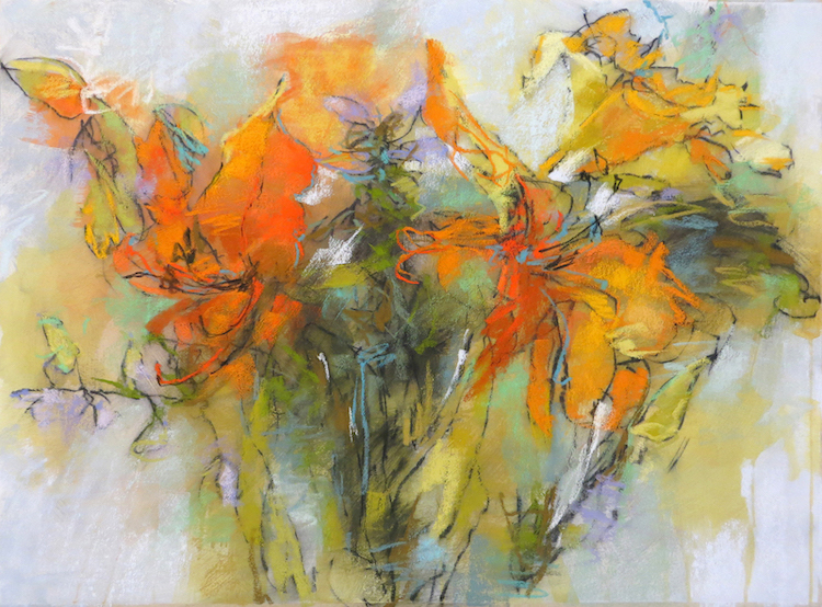
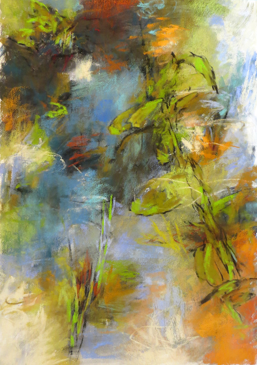
5. The final step is to apply my soft pastels in a color range. I usually choose colors based on a complementary color scheme with additional neutrals. The pastels I like to use are Unison Colour, Mount Vision, Diane Townsend, and Girault. I do have a wide assortment, but these are the typical choices with an emphasis on Unison Colour pastels.

This process works for me and has allowed me to bring back some more realistic images into the abstracts that I have painted. I realized that I missed drawing from observation. Flowers give me the opportunity to draw from life.

Here are some of my thoughts on abstracting flowers or other subject matter.
How to Abstract Flowers or Any Realistic Subject
- Experiment with underpainting. Try creating a very expressive underpainting in one or two colors with large brushes. Allow paint to drip and don’t try to overthink it. An expressive underpainting is the foundation on which the subject will rest. This will allow you to abstract the subject further.
- Don’t think realistic colors. Flowers, figures, faces, and landscapes can be any color you want them to be. Don’t get stuck on the actual color of the subject. Choose the opposite color or something totally out of the ordinary.
- Draw the subject first. I like working from my drawings and rarely use photos. The drawing loosens up the subject and eliminates detail. I love a “blind contour” approach to drawing. This is the type of drawing where you hardly look at your paper and use one continuous line. I love this because it’s like meditating. I focus and do not concern myself with accuracy only with looking. You can also draw the gesture of a subject. Draw the mass of the subject. Anyway, create a drawing and use the drawing as your guide instead of a photo. It will result in a much more unique work.
- Simplify. Simplify your color choices. Simplify the shapes. Keep it loose and don’t focus on details.
- Think of any subject as shapes, line, and value. Don’t think “I have to make this look like a flower.” If you do happen to be using a photo, turn it upside down. For me, creating a non-objective painting and an abstract flower are much the same. I may create a blue abstract pastel garden that has references to flowers. I ask myself what color of painting do I want to create? I get my drawings out and use several for one painting. I take bits and pieces from various drawings and move them around. I never think of creating a realistic depiction of a garden or flower. Only a reflection.
- Draw and paint from memory. Look at a flower or garden and then look away. Try to draw or paint what you remember seeing.
Create with no end in mind
Right now, we are in a very uncertain time. I don’t know what the future holds. It can be difficult to stay motivated and inspired some days. I am used to always looking ahead and having goals to strive towards. I have been very fortunate and blessed to do what I have been able to do. It’s been a blessing to be part of a wonderful group of pastel artists. I’ve had the pleasure to get to know so many wonderful artists and feel a real sense of comradery. I will continue to create because I must. My teaching will probably be on hold for a while. I may resume teaching in 2021. I will spend the spring and summer drawing, painting pastels and acrylic paintings with no end in mind. Sometimes the best work is created without thought of a future show, competition, or sale. It’s created from pure inspiration and desire.
~~~~~~~
Gorgeous or what?? And doesn’t Debora make her technique look easy? So, are you going to try it out? Let us know in the comments! And please do share your thoughts and questions too. We want to hear from you!!
Until next time,
~ Gail
PS. Check out my short interview with Debora Stewart at the last IAPS convention by clicking here. (Just scroll down to find Debora’s interview.)


53 thoughts on “Debora Stewart – Floral Abstractions”
Wow! Really love the color energy and verve of your work. Just looking at it would eliminate the need for a cup of coffee for me (well, maybe just one cup :-). the charcoal under painting gives just enough direction and structure.
I usually paint in a realist way, which is a laudable goal, but sometimes confining. Honestly, I never felt “creative enough” to consider something abstract, but your work seems to be more of a bridge between the worlds of realism and total abstraction.
Anyway, consider me inspired! Loved this:-)
Hi Nancy, I LOVE hearing that you are inspired, and maybe enough to give a bit of abstracting a whirl! And I like the way you describe Debora’s work as a bridge between two worlds.
(and yes, maybe one cuppa joe 🙂 )
Oh my I want to be in a workshop of hers. Dreamy work here! So much great info here Gail! Thanks and be well all my fellow HTPers!
I hear ya!!! I am so honoured that Debora shared her work and process with us. So much generosity in the world..starting her with my guests!
You be well too Brenda. Thank you for your work on the front lines!!!
A wonderful article, thank you!
It’s noted that Debora uses Rives BFK paper for her pastel pieces. It comes in several different weights/thicknesses. I’d like to try it myself. Would love to know which she likes to use?
So glad you liked it Karen! And great question…which I will leave for Deboar to answer 🙂
Absolutely love your artist interviews like this. So interesting to see their various processes.
Thanks Kathy. Glad you enjoy them. I love the surprise factor of who I will bring to you each month!!
I have long been energised and inspired by Debora Stewart’s work. Her book Abstract Art Painting was the springboard for me to leap from the world of perfect realism to the inner joy and chaos of abstraction. Thank you Gail for featuring this remarkable artist, and to Debora for her inspiration.
Oh yes – inner joy and chaos of abstraction – LOVE that description.
And YES! to Debora’s book – highly recommended for anyone wanting to try stepping down the abstraction path!Love that it helped you leap Lyn!
Wow that was really informative and inspiring! I took a workshop with Deborah in Naples Florida a few years ago and she was a lovely person and very intuitive.
Beautiful work and I learned a lot from this. Thank you!
Costa Rica: I’m interested keep me posted!
Oh how lucky for you Maureen!!! And I’m so glad Debora’s post enhanced what you learnt in person.
Good to know of your interest in Costa Rica. We shall see what happens as the year progresses….
Fantastic info. I hope it was okay to share this with my pastel society. It’s too good not to share.
So glad you think so Christine!
And yes, totally fine to share as long as it links back to the HowToPastel blog! 😀
So inspiring! I am already a loose interpretive artist, but love to draw,so this is a way to combine both. The techniques used with acrylic and underpainting are useful and I plan to try them now as I have the materials.
Gail this is wonderful to hear, that you are adding the aspect of drawing to your painting AND also trying out the wet underpainting. Have fun experimenting!!
So excited to give this a try!! Very lively with such vibrant colors! Thanks so much for sharing your process Debora!! Do you ever do other subjects besides plants and flowers? I’m thinking of doing a cat with your style in mind. Thank you Gail for featuring Debora and her beautiful works!
And I’m so excited to see what happens when you give it a try Ruth!
And thanks for your question which I will leave for Debora to answer 🙂
I learn so much from artists of all types, and here is another great lesson. I don’t do enough (any?!!) drawing, bought the tools to do so but never used them. Now I will start. Thanks.
Fantastic Marsha! I’m a HUGE believer in the power and usefulness of drawing so I’m glad to hear you already have the tools to start (so no excuses!!). 😀
Breathtaking! Inspiring! Debora Stewart would have a field day at Giverny (alas closed because of the virus!!! GGGRRRHHHH!)
Thank you for bringing her to us.
All the best
Nancy Malard (another Nancy)
Nancy I love that you can imagine the work Debora would do visiting Giverny. (One of these days I’ll make it there too….I can’t believe I haven’t!). Thanks so much for sharing that thought with us. And I was delighted that Debora agreed to share her work with us here!!
AND we WILL get through this pandemic. Although it is bringing disquiet and pain and stress and anxiety to sooooo many, and has upset, seriously!, the status quo, it’s also an amazing opportunity to see things differently, to grow, and for positive change. It will be interesting to look back at this time in a few years don’t you think?
Oh yes, Gail I agree. This crisis is a major shake down,acting like a fine-meshed sieve; one can hope that the needless stuff we usually think is so vital to our well-being and happiness, will slip through the mesh and be gone, while the sieve will retain only what really counts. Such as Beauty. Then we shall really feel the full impact of this timeless verse: “Sweet are the uses of adversity.” The angel entertained unawares…
Take care
Nancy
Oh that’s beautiful Nancy.
And here’s to the sieve retaining only what counts. May this pandemic shift us and hoping we can all see the growth opportunity. Sweet and silver linings…
I love Deborah’s work! I first saw pictures of it at a pastel class I was taking in Sedona. I love the abstraction of her paintings along with the fact that you can actually tell that the subject is flowers. I needed some inspiration and maybe these paintings are it.
We all need some inspiration from time to time and I’m chuffed that it’s Debora’s work that’s offering it you when you need it Kathy! Let us know what happens!
Wow! I totally love this art and article. the information couldn’t have been more relevant for me. I struggle with breaking away from realism and trusting myself to abstract more. Thank you so much!
Faaaantastic Nancy. Now go experiment and let yourself go!
Greetings from an imprisoned Britain and one very aggravated pastel painter. I must say I have looked at Deborah’s work for a few years now and am amazed that (seemingly) so few artists realise the huge potential of pastel for the abstract genre. It’s so direct, so full of gesture. I tend to be rather detailed and appreciate reading about how Deborah sets her work up at the beginning….the blind contour drawing. I’ve never tried it, but I see how it can make great sense for an abstracted approach. Thanks so much for your article, Deborah, and Gail for having you as a guest. I’m so glad to have my painting as a “comfort” during these times.
Greetings oh imprisoned Brit! Thanks Chris, for your comment on Debora’s work AND your statement about pastels as a fabulous medium for abstract work. Have you seen the work of Pirkko Mäkelä-Haapalinna or Arlene Richman? Or what about Bernadette deCesare or Marcia Holmes or Judy Tate?
I LOVE blind contour drawing as they release you from the need to be accurate (how can you be after all?!). And yes, our art-making IS a comfort at this time!
Since pastel seems to be the top layer, can you share how these are framed? They are beautiful, lively, and joyful! Thank you!
Fabulous question Connie!! I’ll pass that on to Deb!
They are all framed under glass as other pastels. Even though the underpainting is fluid acrylic or ink they are pastel paintings. I only give a light spray of fixative before framing.
I took a workshop from Deborah in Dunedin, Fl quite awhile ago. Actually sold the piece I did as a result of that workshop. Love her work and I am so glad you had this blog. It refreshed my memory of the process. I too may try it on something other than flowers and plants as there is not much growing up here in northern NY yet. Actually had some snow flakes this morning. Thanks again. I have learned to lot from this site.
Hi Anne, how lucky of you to have had the chance to take a workshop from Debora!! And whoo hoo! A sold piece is ALWAYS awesome! Love that this post was a refresher for you. Look forward to hearing what subject you take on. Snowflakes??
It makes my heart sing to know you’ve learnt a lot at HowToPastel!!
Hi, I love this interview with Deborah Stewart. I have her book on abstract art, but this is even better. I would like to know about spray. Do people spray and if so what do they use. Someone even says he used hair spray! Also, I studied with Gregory D’alessio, at the art students league. We did blind contours intensively. It was wonderful.
Thank you, from Jerusalem, Israel. Trying to make sense of this virus. I’ve actually taken advantage of the limitations and been working hours, daily, til my eyes hurt!
Hi Sarah Lynn! I know what you mean about Debora’s post being even better than her book. I think it’s because we feel she is here speaking directly to us, that’s she’s right here!
Love that you have done blind contours so extensively. They are wonderful for sure. Wondering where you went with them?
I’m glad you, like many, have taken the crazy and unusual time around this pandemic as an opportunity to go deep into learning and painting 😀
I would never use hair spray. I use Lascaux fixative before framing or I store pastels in a flat file with Glassine.
I particularly enjoyed this post. Her process is fascinating to me and very timely. I am playing with underpainting and different surfaces and love the way she combines media to create her beautiful effects. She presents an irresistible invitation to play and experiment! Thank you.
Hi Katy! Lovely to hear from you! Glad this post from Debora was so timely for you.Yes!! PLAY and EXPERIMENT!!!!
So fantastic! Discovering Deborah’s work is a horizon broadening experience for me. It reminds me of travel to a different culture and coming home forever changed in perspective. Thank you for introducing her work.
I’m going to give her technique a try although I don’t have the same supplies. Do you think using pastel with an alcohol wash on UART paper would be an adequate start?
Shirley I’m so happy to hear your positive response to Debora’s post! I love the analogy to travel as I completely relate to it. (Can’t wait to be able to travel again!)
Love that you are going to give her method a try! I’ll pass your question over to Debora 😀
I think this would work very nicely.
Thank you both so much for this inspiring post! I’ve been painting a lot of local landscapes preparing for a show that was originally scheduled for September. Who know how or when that will work out! Now I think I need to try something less representational and, being a great flower lover, find these abstract bouquets very appealing. As soon as my framing is done I will give this a try! Many thanks.
I love serendipitous timing Wendy and this sure seems like this is one of those times! Can’t wait to see how Debora’s inspiration influences your new work! Have fun experimenting 🙂
Gail, thank you and Debora so much for the VERY INSPIRING work and demo! I totally needed that, a response to the springtime magic that is all around us now.
I did a piece in response to this generous gift!
Whoo hoo!! Joy, I LOVE hearing that you took action on Debora’s inspiration rather than just thinking about doing it. High Five girl!
Wonderful article Gail! The step by step was so informative. I never thought of using gesso on Rives paper. Would it work on Canson? I am also a flower lover so I’ll definitely be trying Deborah’s techniques. Just the thing to help me get away from my usual realistuc approach!
Can’t wait to see what comes out of your Debora-inspired explorations Irene! I don’t know the answer regarding the Canson Mi-Teintes paper. You may need to try it out or perhaps Debora will have an answer for you!
I don’t think the gesso would work on Canson as it’s too light of a paper. You need paper that can get wet like the Rives or even watercolor paper. Try mat board too.
Also I use Rives BFK 175 or 250 most of the time. The 250 is heavier than the 175. I use both.
Wow I love this ! I’m inspired to do what I’ve been longing to do . Abstract pastel paintings .
Faaaaantastic Joan!! Let us know how you get on.