I’m just home from Salt Lake City, Utah. Cam, my sweetie was taking a workshop there and I went along for the ride having never been there. One of my favourite things to do when visiting a new city is to check out the local art galleries, particularly the public institutions. I’m always inspired and artistically refreshed as I learn something new from the masters so I was keen to find out what this city had to offer!
I discovered two public galleries – the Utah Museum of Contemporary Art and the Utah Museum of Fine Arts (UMFA). Both were fabulous. In keeping with the idea of learning from the masters, I want to share a few pieces from UMFA and how they relate to ideas I often talk about. Although none are pastels, there is much to be learnt from them!
Let’s look at this beautiful Corot first. Jean-Baptist-Camille Corot (1796-1875) was admired by many artists including Claude Monet and Edgar Degas. This painting was done only a couple of years before his death.

Corot was not known for his colours. He preferred instead to focus on the tones (or values). You can see that clearly here, especially when we have a look at the painting in black and white. Clear big shapes of dark, middle, and light values comprise most of the painting. The figures are the only area broken down into smaller shapes with all three values present. They balance out and contrast with the large interesting dark shape created by the tree and bushes on the right and left, and the vast middle and light shapes of land and sky.
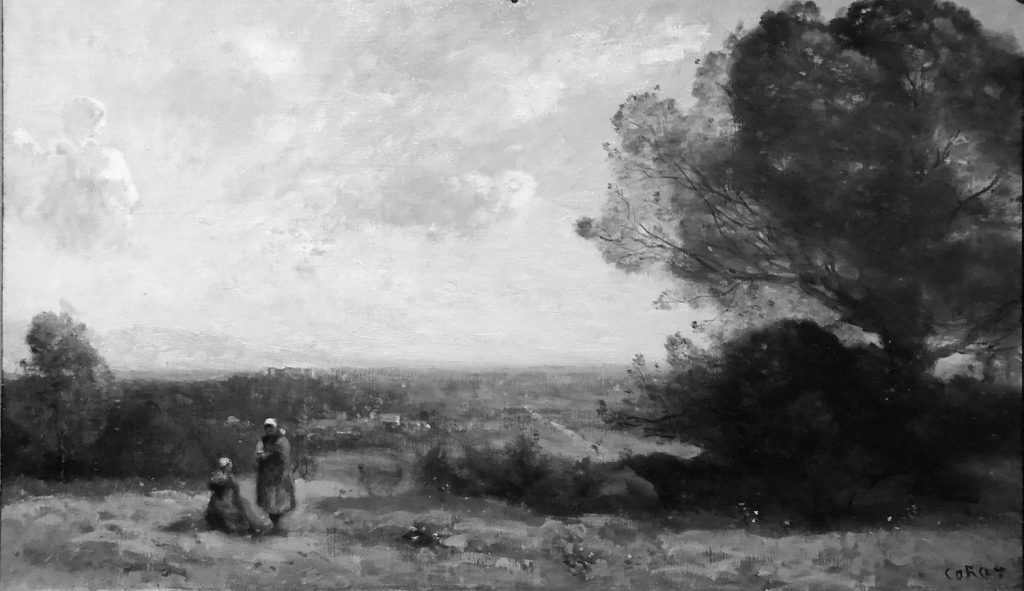
I love the atmospheric perspective in this piece. Look at the close-up below, how Corot, scumbled the horizon so there isn’t a hard edge. The distant atmosphere of violet-grey makes the foreground look positively green!

We know there are two figures in the painting, and they look like they are women. But when you look closely, you can see that Corot only gives the barest of indications, just enough to make our brains read: two figures, female with one seated. This goes to show that we don’t need to be as detailed as we think we need to be! And I love that small splash of red and a bit of yellow in the seated figure. Just enough to bring our attention to her.

I chose this next piece as a good example of the benefit of using low-intensity colours to support and even exaggerate the smallest amount of brighter colours. This is what happens after sunset – we no longer have a light source to illuminate objects to reflect colour to our eyes. Instead, we’re left with desaturated colours. The sky and clouds become the only light source and colour we can easily see and this is shown so beautifully in this small painting.
As an aside, I hadn’t heard of this artist – Gutzon Borglum (1867-1941) – but when I looked him up I found that he was primarily a sculptor (making this small painting even sweeter!) and indeed, he was the sculptor of the Mount Rushmore National Memorial!!
Have a look at the painting.
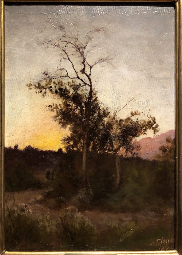
It’s interesting that there’s a feel of colourfulness since, on closer inspection, the only real colour comes from the yellow at the horizon and the red-violet on the distant hillside. All the rest is pretty dulled in colour – greyed down greens and browns and a rather greyed upper sky.
Take a look at this detail though. You can see the very darkened green and the browns in relation to the colour beyond. Can you see how even the red-violet that looks bright, when isolated, actually looks pretty greyed? Put your hands up and remove all the other parts and see what happens.

Just for fun (and yes, I realise this is oil, not pastel) let’s look at a detail of how he paints the bare tree branches. Seeing this, I think it’s possible to recreate the effect in pastel.

Now let’s go to two portraits. I want to show you how each artist has used lighting (values!) to reveal the most important things.
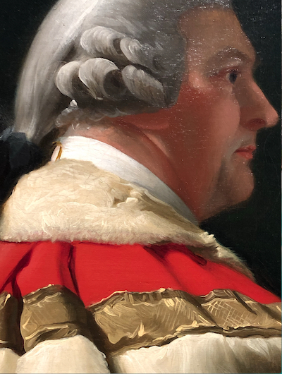
One would expect the face itself to be lit but in this first painting by John Singleton Copley (1738-1815), we find the subject turned away from the light, in profile. Instead, the robe with fur trim and gold decoration is illuminated, revealing no doubt his status as a Parliamentarian. I find this interesting, that more attention was paid to the sitter’s clothing than his face. Some digging revealed that this portrait was created on spec by Copley and so it seems this was a way of attempting to appeal to John Ward‘s vanity. And to show off his skill as a painter!
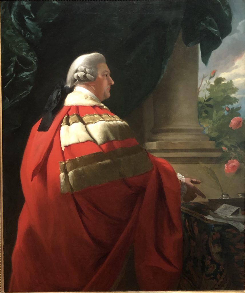
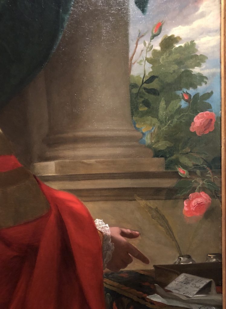
This dramatic painting is divided into four triangles created by two diagonal lines crossing the painting from corner to corner. The top and bottom triangles are primarily dark, they really ground the portrait. The other two triangles, on each side, are more light-filled. The one on the left shows the sitter’s head and robes while the triangle on the right contains a column and part of a garden with roses that lead our eye to a document to which Ward points. Notice too, the tiny splash of light hitting the lacey cuff on the pointing hand. It’s all very calculated to draw our eyes and attention, around the canvas!
Have a look at the painting in black and white…
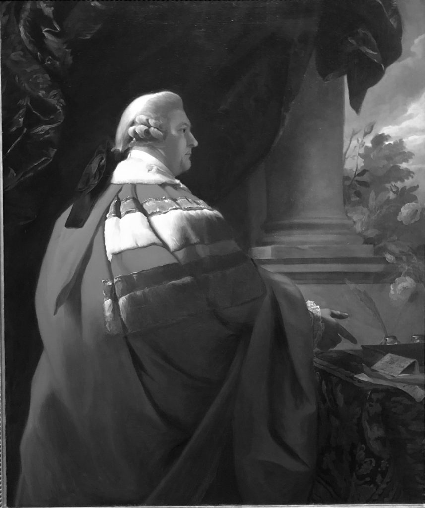
Let’s have a look at the head with the upper part of the robes. It’s always fascinating to me to see how an artist creates the effect of light, for example, on the gold trim, especially as it contrasts with the velvety smoothness of the red and the subtle textures of the fur trim.
And how about looking at how Copley painted the roses, the wildness of nature, encroaching on the manmade territory exemplified by the perfection of the columns. I love the way he brings subtle attention to the pointing finger by using contrast – the finger is darker than the background.
Let’s look at one more portrait. This one is by Henry Raeburn (1756-1823). Its simplicity is in stark contrast to the Copley piece. It is all about the face and the character behind it. Have a look.
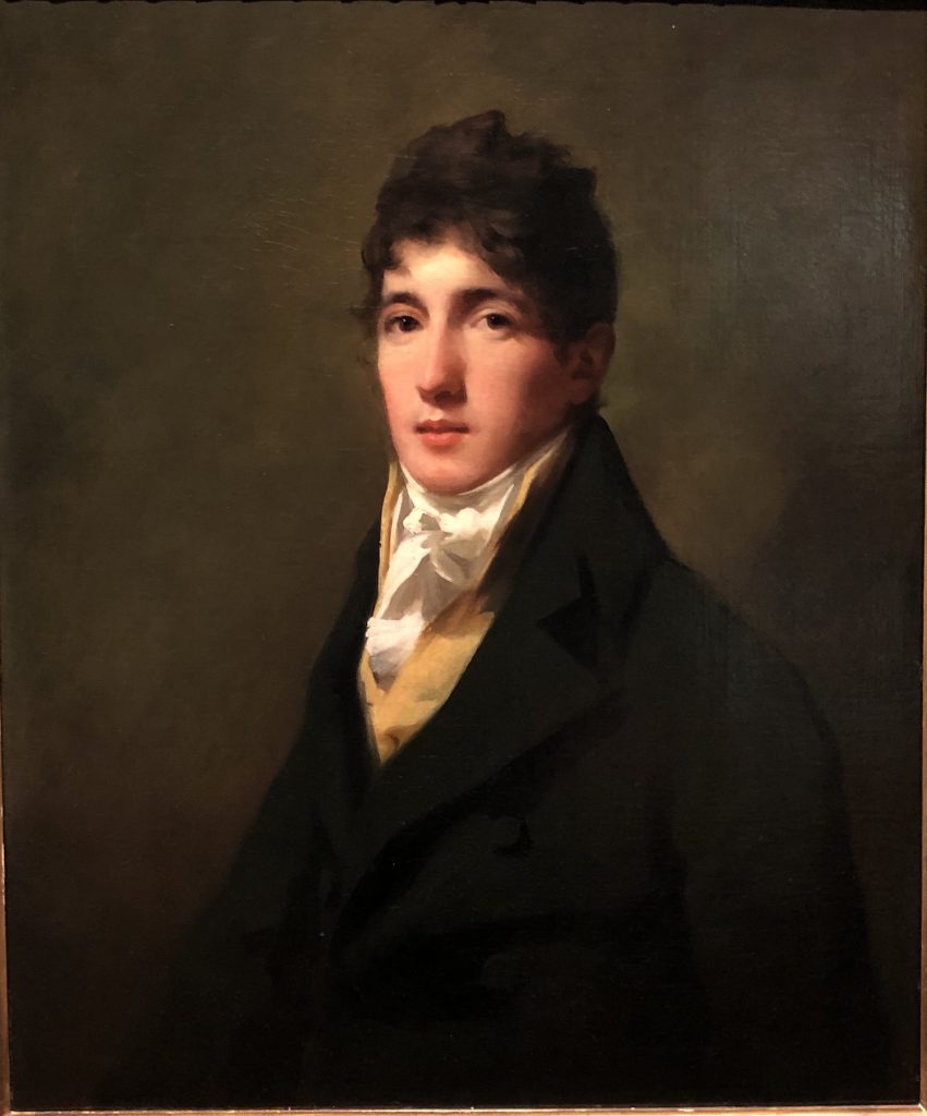
Although I’d been exposed to his work, this was the first time I was face to face with a real-live Raeburn. I was mesmerized by this portrait and kept returning to it. The face and cravat are ablaze in light with the rest of the canvas supporting these parts. The background is kept very simple with only minimal value shifts to create a glow behind the figure. There is some detail in the jacket as you’ll see in a close-up below but only just enough to give us a feeling about the clothing. I keep being drawn to those eyes. Who is the man behind them? What was he like as a person?
Have a look at the portrait in black and white. You can see how illuminated the cravat appears!

And now for a detailed look at the cravat. You can see how few brushstrokes Raeburn used to express, so perfectly, the sitter’s clothing. It has a very contemporary look don’t you think?
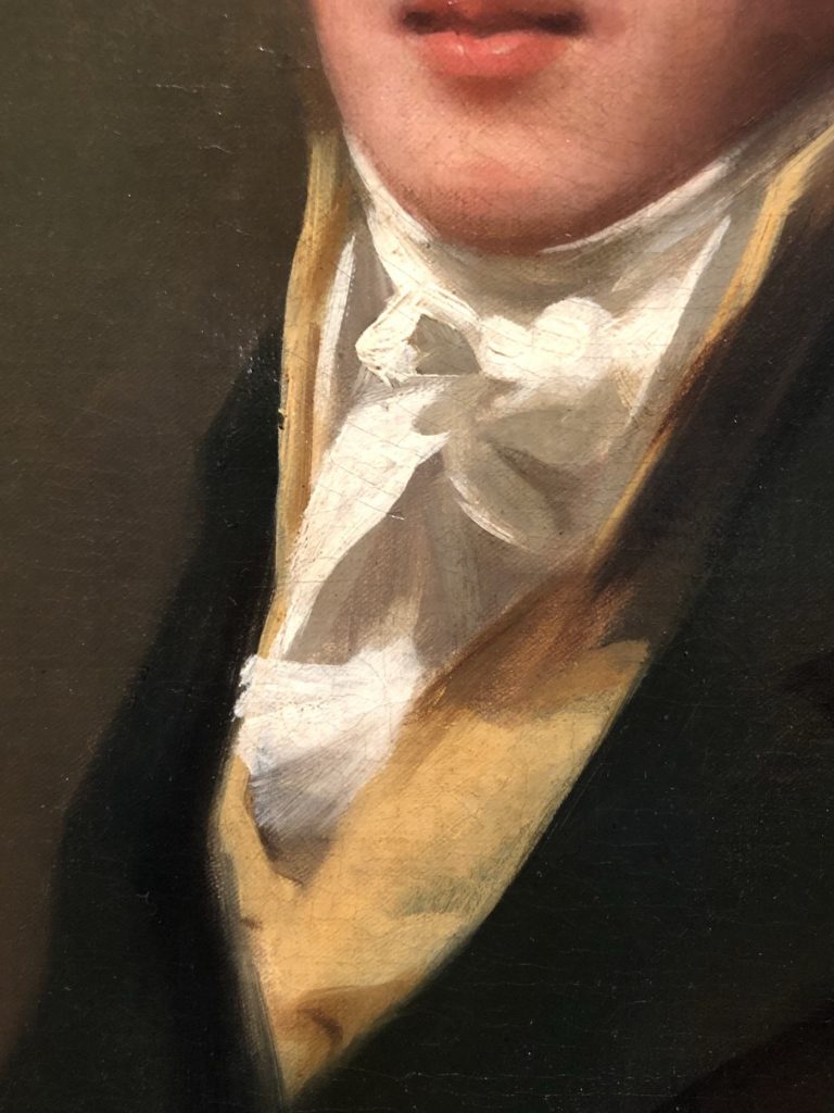
And then there’s the jacket…
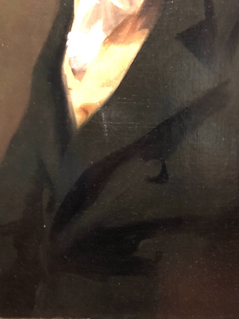
And I couldn’t leave this portrait without showing you a close-up of the face. Look at the way the left side of the nose slips into the cheek with the same value and temperature. See how unfussy the depiction is? Yet so powerful. And then there’s the tousled hair and it’s cast a shadow on the face, almost unnoticed.
Sigh.

There was a temporary exhibition of Japanese prints on while I was at the museum. Some wonderful pieces! I’m going to include one here. I’m using it to illustrate the clarity of three big shapes of the dark, middle, and light values and the dominance of one value – here, the dark. You’ll also see that using a contrast of size – the small shape of middle value within the dark – as well as the vertical lines of the trees, the artist draws our eye down to the small figure on the road.
Have a look at the print by Kawase Hasui (1883-1957) in colour and then in black and white.


I have one more for you. (I actually had about six more but time and space curtail….)
It’s a painting by Dutch painter Pieter Cosyn (1630 – 1667?) an artist I pretty much couldn’t find any info on hence no links out.
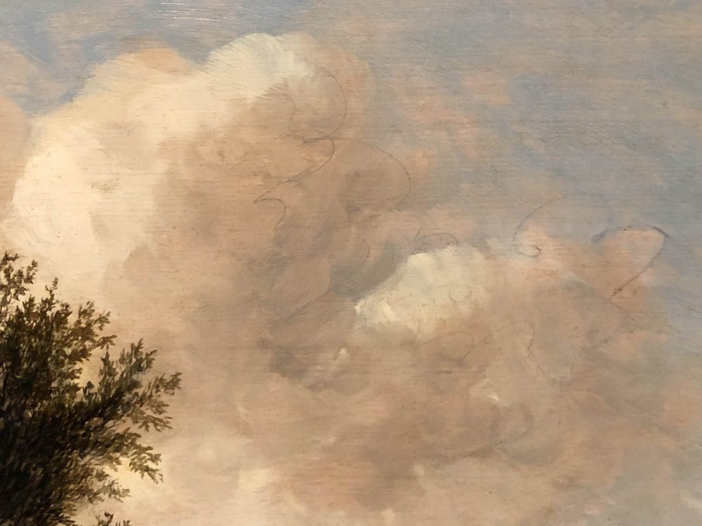
One of the things I loved about this painting was, on close inspection, the discovery of the original underdrawing to indicate the placement of the clouds. I often talk about how much I delight in being able to see some remaining indication of an artist’s process revealed in the finished painting. I don’t think it’s necessary to cover up all your process of creation.
There are also some faint lines that appear to indicate where a chimney may have been planned originally. These traces, ones that reveal an alteration, are referred to as pentimenti (plural of pentimento).
First, let’s have a look at the whole painting.

You can see how nature dominates the picture and yet there’s a keen sense of manmade structures having their place in the flat landscape – the churches and the windmills in the distance, and, on a closer look, the large residence tucked away in the left of the painting. Two figures have a chat in the foreground. We see a broken-down fence and then on the far right, what looks like a prone figure – someone resting perhaps?
The artist utilizes contrast of value to bring our attention to all these points – the tree is dark against the light sky as are the silhouettes of steeples and windmill blades. The figures are part of the light foreground and jut into the dark expanse beyond. Dark against light and light against dark, a kind of chiaroscuro. Have a look at the painting in black and white:

You can see how the diagonal line of the clouds directs our eyes down to the buildings rising above the horizon. The broken fence repeats the uprights of the steeples and leads our eye into the light and to the two figures. From there we connect with the house to the left from where we move to investigate the trees.
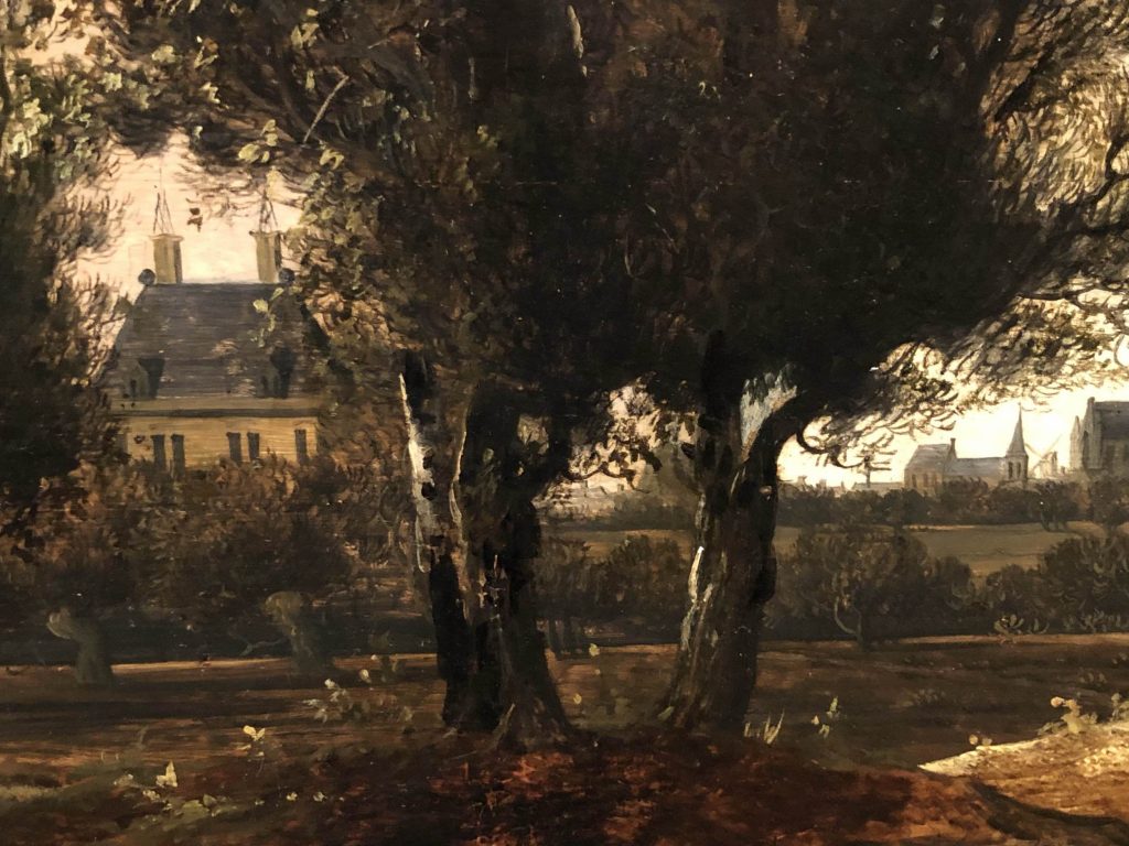
Now have a look at a close-up of the residence. Can you see where a chimney might have been planned? It’s a very faint drawing on the left side of the roof, to the left of the chimney.
And now for the clouds. Look for the dynamic line beneath the clouds!
And here is one more detail. It’s a close look at the simplicity of the figures, the birds rising in the sky, and the distant buildings. Curiously, it almost looks like the initials P C on the fence. Do you see it? What do you think?

So that’s six of the MANY paintings I saw at the Utah Museum of Fine Arts in Salt Lake City. I hope by sharing the points I have that you will learn from the masters!
Let me know what was the one thing that you learnt or that helped you have an aha moment. Also please share something you noticed in any of these paintings. I always love to have your voice add to the bigger art conversation!!
Until next time,
~ Gail















![Pastels on black aper: Gail Sibley, "Untitled [at this point], Mount Vision pastels on Sansfix pastel card, 5 1/2 x 7 3/4 in](https://www.howtopastel.com/wp-content/uploads/2016/04/IMG_9649-2-150x150.jpeg)


33 thoughts on “Learn From The Masters At The Utah Museum Of Fine Arts”
I “googled” Sir Henry Raeburn and found out that he did hundreds of portraits, and “Boy With a Rabbit” that I had to learn in the 5th grade back in the “old days” when teachers thought that learning art and music history was a necessary part of education. Thank you for your analysis of these paintings, Gail.
I’m glad you googled this artist Cathy and yes, LOTS of portraits. Thanks for sharing your own connection to the artist through a childhood story. It made me smile!
Interestingly one of Raeburn’s most well-known pieces, The Skating Minister (as it is more casually called) is unlike much of his other work.
Gail, this is like visiting the museum with you! What a treat. I especially like the way you point out the composition of the paintings. For example, the Copley — it wasn’t obvious to me that you could divide the painting with two diagonal lines. I had to really look at it again to see it. Thanks!
I’m so glad it came across like that Dotti!
The diagonal line composition is a tricky one to get just right (ie make work!) but I’d love you to experiment with it!! Have a closer look at the piece and see how it’s broken down into darks, middles and light shapes. Look at the shapes only, not the subject!
Hi Gail, thank you for showing us these Old paintings. I think Ward in his red cloak was shown from the side because the painter wanted to show what he did: being a speaker, politically engaged, his finger painting to the paper, and there is a feathered pen in the background also indicating he wrote stuff..
I found some details about Pieter Cosyn from a catalogue at Sothebys. He lived in Den Haag 1630-1667. And here is the text from the catalogue. Leiden is THE old university town in Holland by the way.
”CATALOGUE NOTE
Pieter Cosyn (also known as the Monogrammist PC) was active in Holland around 1660 and worked in the close following of Anthonie Jansz. van der Croos, whose style the present work closely resembles. A small group of works by the artist, signed PCOSIN or as in the case of the present work signed with the artist’s monogram P.C., have been identified by Beck (see H.U. Beck, Jan van Goyen, vol. IV, Doornspijk 1991, pp. 129 ff., with illustrations).
We are grateful to Dr. Hans Ulrich-Beck for tentatively confirming the attribution to Pieter Cosyn upon the basis of a colour transparency (written communication 11 May 2004).”
Kind regards
Susana
Susana, yes, I agree with you about the composition of the painting by Copley. And everything he included would, of course, make the sitter want to purchase the painting!
Thank you for the extra info on Pieter Cosyn. Everything helps! I love that I did pick out his P.C. before knowing how he signed his work!
I so enjoy your blogs and insights. I liked Gutzon Borglum, “Late Evening” because we forget how evocative neutrals can be.
Thank you so much Marsha!
And yes to what you said about Borglum – that’s exactly why I chose to include it. The painting is small but it certainly caught my eye. I loved seeing the variety of desaturated colours in the foreground, most of which are in the same value, and how the artist could make that area interesting as well. You have to be ‘with’ the painting to fully appreciate it (as is true of most paintings!).
All the museums in Cambridge/Boston, Massachusetts, (where I live) are now closed due to the corona virus “encroachment.” So it was wonderful to have visit a museum with you! I’ve now got a taste of a museum I’d never been to and a big dose of inspiration as well. It was a great idea to show pictures in black and white, it makes it easy to see the structure. I also found you takes on the compositional organization very astute. Thanks so much — do some more? 😃
Ahhh novel coronavirus COVID-19 how though art changing the world!
Yes, thank heavens that soooo many art museums now have their collections online. There’s NOTHING like seeing the real thing but it’s a good second best.
Susan, I’m so glad you enjoyed the post. I did hope that although there wasn’t a pastel to be seen, I could get away with it! And I will be delighted to do more! Thanks for the vote of encouragement. 🙂
Thank you Gail, I love it when you do an instructional on art by master painters. You truly excel when you critique and show how paintings are constructed by discussing shapes and values. It makes me slow down, really look and ultimately learn just how YOU look at masterworks. I admire your knowledge and enjoyed this mini art survey.
Ohhhh thank you so much Gailen!
And when you said it makes you slow down and really look, well, I let out a Yahhoo!! Slowing down seems to be so difficult in these days of rush rush, flip, swipe, click, tap, and move on. I felt incredibly lucky to have hours to meander and look deeply and at length at paintings that caught my eye. Definitely my happy place!
I always enjoy your commentary and analysis of other peoples art and this is no exception. Thanks.
Aww Cheryl, I am so glad you found it helpful and enjoyable!
I get so much out of your step by steps and your thinking as you work through the piece.—which I think is so beautifully colorful. Looks to me that you managed to salvage the dark area at the front of the painting!
I am always curious to see what you choose to paint. I get way too elaborate and want to do too much.
I have a question—I just recently started working on an easel and like it—I particularly like standing vs. sitting—I am amazed at the amount of pastel dust that collects in the tray. I wonder —am I using too much pastel? Or is there the same amount of dust when working on a table—just can’t see it as well.
Hi Julie and thank so much! I’m glad you enjoy the step-by-step posts!
And yay for working at an easel. Standing is way better than sitting because, for one thing, you can easily move away to check on your work.
To your question, there’s always going to be some pastel dust in the tray. It was there when working flat but you may have blown it away (heaven forbid!!) or worked through it somehow. Using lighter pressure can certainly help but dust in the tray comes with the territory I’m afraid.
I enjoyed reading the blog, really interesting. It has shown me that a close look with an expert eye reveals lessons for artists. I will look closer at pictures in future. Well done Gail.
Hi Dave, your comment made me smile!
Looking more closely at paintings and allowing yourself to take the time to really examine a painting that catches your eye is a habit I want everyone to cultivate!
Thanks for this informative blog post Gail. I especially like Corot’s painting, those wonderful greens and the juxtaposition of the green and the little bit of red.
Talking of art museums, I always find them so inspiring. Just recently I went to this incredible exhibition with paintings by Edward Hopper.
Regards, Gabriela
So glad you enjoyed it Gabriela! I know, that wee bit of red in the Corot painting! And you don’t see it at first. It only appears when you take the time to ponder and observe and absorb the painting.
And you are right about art museums being inspiring. Actually that was going to be the main theme of this post but it got slightly sidetracked!
I would LOVE to see a whole exhibition of Hopper paintings. Lucky you! Is that the one that is now at the Fondation Beyeler?
Such a treat to have you analyze the work of art. You make me go back and really see what I missed on first glance. Definitely do more of these reviews it is so very enlightening to me as a novice painter.
I am so glad to hear that my post made you look longer and more carefully Constance. That’s what these posts are all about!
And thank you so much for your encouragement to do more (especially since they are not of pastel paintings!).
Yes, that’s the one (Fondation Bayeler in Basel). I spent about 4 hours there with my brother, losing all sense of time…
Thank you for this tour! I really enjoy your in-depth look at each piece. It really shows how much composition is so important in each work. Nice also to see these lesser known artists!
So glad you enjoyed it and took something away Helen. And I was happy to show the work of a couple of painters I hadn’t heard of before!
Deine Bilderauswahl und die Analysen sind immer sehr lehrreich. Danke dir!
Jürgen thank you!!! It is a pleasure to do it.
For those who don’t speak german (such as myself!) here’s the google translation: “Your image selection and analysis are always very educational. Thank you!”
And my response, in german, using google translate (so who knows!): Jürgen danke !!! Es ist eine Freude, dies zu tun.
Thank you! I could spend hours looking at “Late Evening.” One thing I noticed about it is the many textures that are present.
It’s pretty mesmerizing isn’t it?! I am so glad, Liz, that you noticed the texture. There is much to see in the dark, muted foreground if one slows down to look.
Gail, thank you for sharing your insights about each painting. What I realized looking at each painting, each artist managed to paint a picture that looks relaxed and unforced. I don’t want to say spontaneous because I understand that each painting was probably carefully planned, but it captures a moment in time effortlessly.
Love that observation Cynthia! And you are so right. It’s as if the act of painting came with ease. Like a ballet dancer who makes balancing on one foot, en pointe, look easy and effortless. Ahhhh how looks can be deceiving 🙂
Oh my, finding your blog is just like a gift of joy out of the blue. Fifteen or so years ago I was a juried pastelist and so loved the support of the Society, shows and workshops, then became allergic and had switch to oil paints. Your blog fills my head with reminders and information that are much the same in both mediums. Thank you so much. Sheri Morris
I’m delighted you’ve found me Sheri. And thank you! I love hearing my blog is like a gift! I like to cover aspects of painting that are essential for any kind of medium so hopefully there will be a lot of help here, even with oil painting.