
We’re almost two weeks into the 31-pastels-in-31-days Challenge (our 4th Annual!) and the HowToPastel Facebook group has been lit up with amazing work and wonderful encouragement between members. One of my ideas for this challenge has been to take a subject and work with it in various ways. (I did this last year and wrote a post about it and why working with one subject is a good idea. This year, I’ve pushed the idea further as you’ll see!) My first week has been all about gerberas, fuchsia-coloured gerberas, and painting them in anything but fuchsia! Namely, I’ve been painting beyond the colours you see.
(My main project during this Challenge is to paint using only Unison Colour pastels so I can come up with a selection of colours I want to have in my very own Unison Colour set!! I’ll keep you posted as this project progresses.)
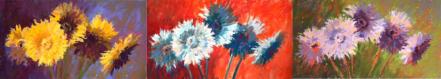
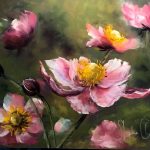
As part of this first week, I decided to really push the notion of painting beyond the colours you see by completely changing the colours in the painting from what I see in the real world. I thought: What if I make the gerberas yellow? What if I make them blue? What if I make them purple? I began thinking about colour as a mechanism to evoke an emotional response in the viewer rather than the viewer responding to a painting that looked more ‘realistic’. I did this in three paintings.
I began (of course!) with a three-value thumbnail which was the basis for all three pieces. This exercise was more about sticking to the thumbnail plan rather than capturing the realistic colours of the subject.
Let me take you through the three examples I painted.


Following the thumbnail, I took three similarly sized pieces of UART paper (6 x 11 in) and drew up the design quickly on each.
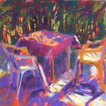
On the first day, I used a yellow/purple complementary colour scheme. The gerberas would be yellow while the background and dark areas would be in purples.


The next day, I decided to throw any sense of reality out the window. This time, I was going


The following day, I woke up with the idea of purples and greens with oranges, namely a secondary colour triad. So that’s what I went with. In this one, I had trouble with the purples – they began to appear rather grey. It wasn’t until I added some flecks of oranges that I felt the work begin to sparkle.


And so there they are! What do you think about painting beyond the colour you see? Are you willing or have you tried breaking out of the ‘real’ colour palette? I dare you to leave behind what you see in nature and push to create an effect or an emotional response with the colour you choose. How does each of my three paintings make you feel?
I’d LOVE to hear from you so please do leave a comment.
Until next time,
~ Gail


25 thoughts on “Painting Beyond The Colours You See”
I really enjoyed watching you play with these gerberas. Learned a lot, thank you very much!
Thanks Wendy! I was a bit surprised that the crazy colour combinations – from my head! – worked so well. Just goes to show how far you can push if the value pattern is strong!
Oh, how wonderful! Thank you Gail for this great blog post. I guess my favourite paintings are no. 2 and 3 because of the red colours. (I can’t pick just one favourite.)
I have just promised myself to try this kind of exercise. The timing is perfect as I am in the middle of studying Nita Leland’s “Exploring Color Workshop” book and trying to reach a new level of understanding colours…
Warm regards, Gabriela
You have to love the perfect timing don’t you?! I’m glad this blog works so well for you Gabriela.
And thank you for your choices (and I get the limitations of choosing just one favourite!).
Dear Gail, I love the sparkle in your work, I think the secret is not putting in a lot of detail and this is something I’m struggling with. My favorite gerbera pic is the orange background and blue flowers, it immediately grabbed my attention. Is it because the values are more distinct or the way the background is painted with two neighbouring colors rather complementary colors. Anyway thank you for sharing your expertise, very interesting article. Marianne
Thank you for your comment and question Marianne!
Part of the reason I think the “Gerberas in Blue” attract attention is the warm background. Warm colours tend to come forward and there’s a lot of background here! At the end of the blog, I’ve just attached a photo showing all three paintings together in black and white. You can see that I stick to the value pattern in all three pretty well with only a few variations. Also, in the “Gerberas in Yellow,” I used the same colours on top as I used in the underpainting (as I did with “Gerberas in Blue”). So the answer I think really lies in the way these two colour families vibrate against each other.
I love your crazy colours and use of complements for bold and vibrant paintings. It’s interesting to see how the paper showing through works with all the pictures, presumably because of the light, neutral colour.
Thanks Eddie!!
I think the lightness of the paper showing through in spots adds a lightness to the paintings. I do think, as I begin a piece, about whether to smoosh the underpainting colours to get rid of the light paper speckles but I think that doing that too early can be a detriment rather than a benefit. It’s easy to take a finger or a pastel to cover any distracting spots later and sometimes I’d rather do this than lose the light glow of paper showing through (which once gone cannot be retrieved!).
Great illustration of expressive color! Love it, thank you.
Thanks so much Priscilla!! They were soooo fun to do!
The disk-shaped flower heads, each with a different position and shadow, are perfect for illustrating how you used each color palette. Very nice and gives me some great ideas. I like #3, the secondary color triad, the best. Awesome Gail.
Thanks Pam!
I loved the different shape and quality of each flower head and how each offered a different shadow and value pattern. Love that you picked that up! And so happy it’s given you some ideas!!
And thanks for letting me know your fav 😀
Love how you so skillfully played with color.
Hope to try it myself.
Thanks Gail!
Thanks Theresa!
Maybe you can grab some similar coloured pastels and try copying one or two of these, just to get the feel.
Thank you for the suggestion. It will be a good to start for me. I will do that!
Theresa
The second is the most vibrant, the third the most thoughtful, but the one that calls to my soul is the first, perhaps because of the vibrant yellow of the gerbera on the left against the dark background.
I am trying to paint a picture of a house nearby that I caught with my camera last May. But, instead of the boring eucalyptus trees, next-door building, and lame road within the photo, I want to only paint the top attic floor and porch roof in the sideways light that caught my attention in the first place, and surround it with a woodland. That means painting outside the color scheme that existed in the first place. I have blues, reds, and greens swirling in my head. Let’s see when I have the time to finish it, and how it turns out. Not as well as your gerberas!
Ohhhhh Maria, I’m excited by your excitement. And yes, close-in on what it is that really caught your attention. We can easily get caught up in trying to capture everything instead of focusing intentionally on what makes our heart beat a little faster! I can’t wait to see it!!
And I LOVE the way you described my gerbera pieces and your reaction to them. Thank you!
I really enjoyed all your Gerberas. Each version sparkled! You are a master of color!
Aww Ruth – thank you!!!
I do LOVE colour 😀
Gail,
Thank you for this blog. At HTP31in31 I am experimenting with colours. And I always struggle with the question how I apply the colours from the colour scheme in my painting. Your blog provides a clear answer for me. Thank you
Mathy, I’m loving your colour experiments in the 31-in-31 challenge! Great to see them all in the HTP Facebook group. I’m glad this blog helps clear up some colour issues for you 🙂
Hi Gail,
I am most taken with the yellow version. I love the brilliance of the yellow against the dark purples/blues in the shadows and background. It is truly enlightening what one can do with a limited palette. An excellent challenge and one I just might have a go at!
Cheers, Val
Would love to hear more about a possible workshop in MEXICO!
Thanks Val! I am always quite surprised at how far I can push a limited palette. It all comes down to a strong plan of values! And yes, the 31-pastels-in-31-days is a fantastic challenge. I encourage you to do your own (but make yourself accountable with a person or group!) or join us next year.
And thanks for your interest in Mexico workshop. Keep an eye on email and website 😀
Can’t wait to experiment with color choices. I’m afraid I don’t stray too far from local color other than the underpainting. Thanks
Elaine, I suggest you work small so you can try different possibilities without worrying about what it will look like. This frees you up to experiment!! Have fun with it!! 😀