As you probably know, I’m a big believer in the power of thumbnails. I create three-value thumbnails in black, grey, and white, namely, I use the extreme ends and mid-point of the value scale. In this way, I produce a very clear, high-contrast map of what I’m going to paint.
Students, however, are often confused at the correlation between thumbnail and painting. They wonder since they have created a black and white in the thumbnail, should they then use such extremes of value in their painting. For example, should they use a very dark blue in the dark areas and almost white in the light areas even though they are painting a very brightly lit scene?
Just because your thumbnail includes both ends of the value scale doesn’t mean you have to paint a painting with those extremes of value i.e. from black to white. You can create a painting that’s very very light (for example a snow scene) or one that’s very very dark (a night scene for instance) or even one that sits somewhere in the middle (an overcast day might fit this) using your thumbnail.
In each of these instances, you would still follow a three-value system but would shift up or down the value scale as the subject dictated. In each case, you would still create an overall map showing what areas are darkest, what areas are lightest, and what areas fall between the two. (You can read another blog that touches on this topic here.)
To show you what I mean, let’s take a look at a thumbnail and painting I did at the Villa Nobile in Tuscany where I recently taught a 10-day workshop.

Very tiny thumbnail in three values 
Gail Sibley, “Fountain at Villa Nobile,” soft pastels on UART 600 paper, 12 x 9 in – in black and white
You can see how the thumbnail and the painting – as seen in black and white – correlate in value. Each has similar areas of dark, middle, and light values. The thing is that as you look at the painting, you’ll notice that my darkest darks aren’t that dark.
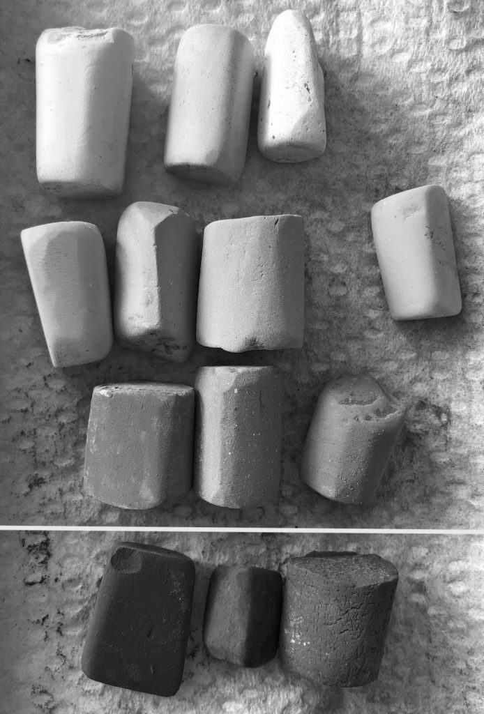
Have a look at the pastels I used. I’ve arranged them in dark, middle, and light colours. You can see that my dark pastels aren’t that dark. To see how not-dark they are, take a look at the image at the end of the blog post!

Let me take you through the progression of this plein air pastel.


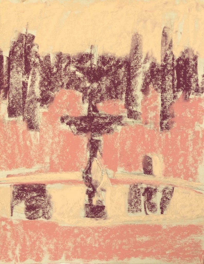


I showed the workshop students this painting to help them understand this concept of moving up and down the value scale. I think it helped.
Now have a look at the pastels I used PLUS three pastels from the dark value section of my box. A big difference huh?

Have a look at the pastels in black and white. This really shows you how far up the value scale I’m working.
And here’s the scene I painted. As you can see, the sun came and went!
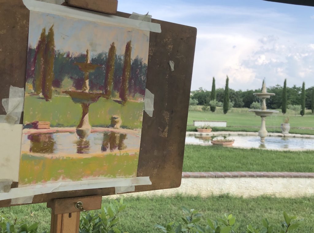
As an aside, the students asked me to critique my own painting (that’s always a toughie!). They then added their own thoughts. I plan on making a few changes to the painting but haven’t had a chance to do yet as I only arrived home from Italy a couple of days ago. And now I’m off to a workshop for a week. This one’s for me!
I’d love to know if this post was helpful so please do leave a comment. Also, please ask me any questions if it’s not clear. As always, I look forward to hearing from you.
Until next time,
Gail
PS. I had an AMAZING time with my students in Tuscany, Italy. Here’s a group photo of us at the end of our 10-day adventure together.

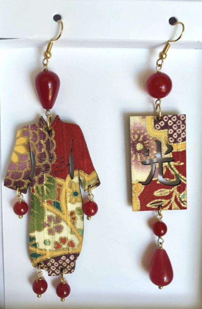
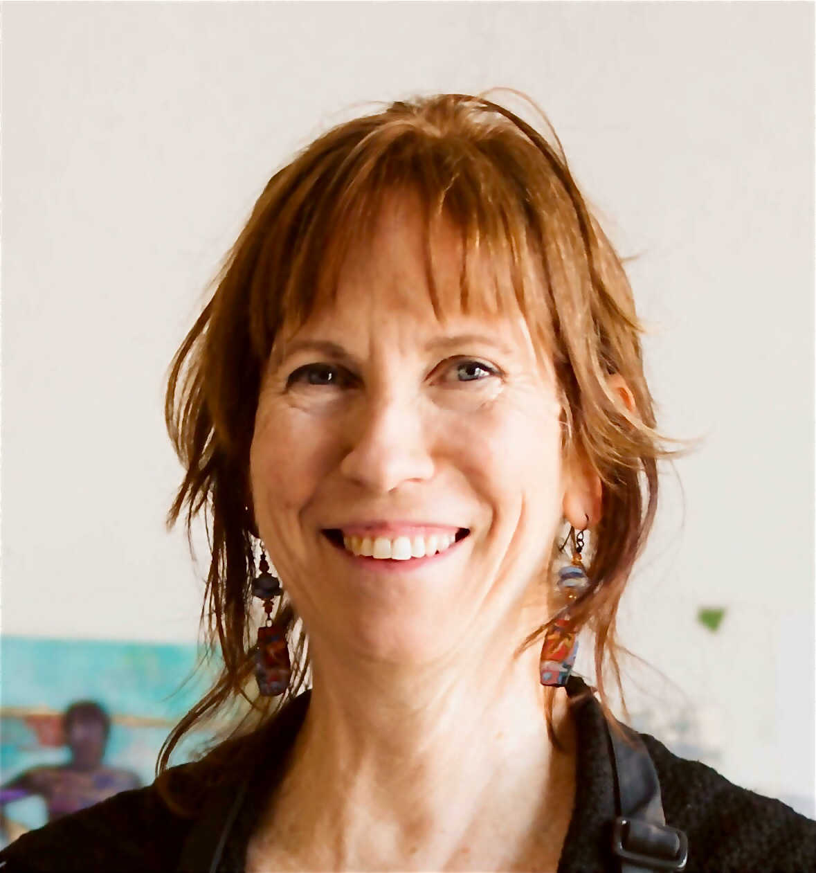
I was very moved when they gave me these beautiful Italian-made earrings as a thank-you gift!! (They also gave me some funky joke earrings but you’ll have to come to a workshop with me to see them!)














38 thoughts on “The Value Scale: How Thumbnail Values Relate To Your Painting”
That was a great plus for thumbnails, and chimes in with my challenge for this Friday! I bought a brush set from Faber Castelle just for the purpose of doing thumbnails.. The lighting in your painting is wonderful! Thanks Gail!
Love hearing you’ve got pens specifically for thumbnails Ruth! Super that this post jives with your Challenge. And thanks for the compliment 😁
Yes this was extremely helpful in the values concept between thumbnail and actual painting. Explains why do a thumbnail😊z
Thanks NJ. That’s great to hear! Yes!! So thumbnails 😬
Hi Gail
This was very helpful for me ….a simple explanation with your pallet always helps me …..a visual display of value! Thank you
Ohhhhh Leeanne I love hearing that!
This was really enlightening. The contrast between the color and black & white photo helped make your point brilliantly. Thanks!
That’s wonderful to hear Trish!!
Thank you once again Gail for showing us your process – it’s so helpful. Having to patiently and continually tell us about the importance and value of sketching a thumbnail first and using the three tonal values on it, re-emphasises to me that they are essential aspects of starting a work. I know I’m commenting on something that’s obvious… but will we do it !?! We so much want to just launch into the drawing part without the planning part, which often results in a disappointing outcome.
I just adore the ‘Fountain at Villa Nobile’ pastel work. It rocks my boat! What a great bunch of students at your Tuscany workshop, it looked like so much fun!
First Christine thanks so much for your kind words about my painting!!! And yes, what a fantastic group I had with me in Tuscany. Enormous fun!!!
I hear you about wanting to get right into the painting but taking a few minutes to do a thumbnail (and sticking with the composition and value pattern you decide on) really does set you up for success!!!
I so agree with Christine Barry’s comments. Your approach shows me how one can handle an intimidating subject like that beautiful water feature. I also need to rethink my own pastel selection because I end up with too many different pastels. I see what can be accomplished with just ‘a few’!
Thanks Marsha!
I think pushing oneself to stick with the early pastels used and layering further with them can a) cut down on the need for a lot of pastels, b) push you to explore colours that may not be exactly what you see and ones you may not normally choose, and c) bring a colour unity to the whole. And you know, even though it can be challenging, sometimes it’s easier to work with pastels you have in hand than to spend time searching for the perfect colour!
Are you reading my mind? This is exactly what I have been struggling with and you nailed the missing pieces to the puzzle. Thank you buckets. BTW I always look forward to your blog posts-so much zest, info and fun.
Hah hah!! So glad it was timely Carol!! And I appreciate your comments about the blog 😁
Cornwall sounds amazing for a workshop.
It does doesn’t it?!
Thanks Gail… great explanation! I get it now.
Whoo hoo Gisela!!
Great post Gail, and lovely photo of you and your students. On the thumbnails, do you obtain the middle value by cross-hatching or otherwise scribbling in with ink? Have you ever used Tombow markers? They make it super easy to get those middle values. Of course it’s another item to purchase and carry around – oy!
Thanks Pam. And thanks for the question. When I use a thin pen, I just hatch for the middle values. I do have Chartpak markers – on in black, one in grey – but sometimes, when it’s only for me I do this kind of quick thumbnail. It’s a shorthand I understand. Perhaps though, for a blog post, it would be good to redo it so it’s that much clearer. That’s what the mini version is for!
Thanks for the excellent reminder to use black and white photos (or red cellophane) screen for value clarification. Something I often overlook to my detriment.
It’s always good to have a reminder. Checking your painting as you progress can help you see if you’re on track. You did the work in the thumbnail so it’s a good way not to lose direction!
Hi Gail,
I find your blog very interesting and enjoying seeing each step as the piece progresses. The B/W photo of your chosen pastel colors was particularly fascinating. I have always wanted to paint in Tuscany and hope to attend one of your workshops there one day. It looks like a wonderful time!
Lori
Love hearing that you like seeing the progression of the piece Lori. It’s always a bit of a shock when I look back at where the piece comes from. It helps me understand the various states a piece of mine goes through.
I hope to teach in Tuscany again so look forward to seeing you there! We really had a ball!
Thanks for posting a blog even though you are so busy with workshops. I found this blog very useful and I especially like that you posted photos showing your working method step-by-step. I haven’t created value studies in the past. So, it’s helpful to see how you incorporate them into your painting and how they can be a guide for various types of lighting. I’ll try it out the next time I pastel. I hope you enjoy your next workshop!
Glad to hear you found this post useful Colleen! I hope it encourages you to try making small value studies in the future. Creating them can be a bit of a pain but they are oh so helpful!! And yes, very much enjoying the workshop so far!
Hi Gail, this painting of yours is absolutely gorgeous! Also how you explain it makes it look so simple, but I know better…
Thanks for sharing your knowledge, you help me a lot on my art journey! What pastels did you use here? (nice colour combination!) I always look forward to hearing from you, Gabriela
Thank you so much Gabriela!
As to the pastels, I didn’t list them because I’m not completely sure. I would say though that they are probably Unison Colour. In my travelling palette, the mixed area is a selection of mostly Unison, some Mount Vision, some Great American, and some Schmincke.
This is all very helpful, but what continues to amaze me is how you create this lovely piece with such a very limited palette! There’s my challenge!
Hah hah Helen! And you know what I’m going to say right? Values values values. AND, try to stick with using your initial pastels as long as possible.
Great post, Gail! I love seeing our process and beautiful results!
Many thanks Pam! Love that it was helpful AND that you like the end result 🙂
Such a well thought-out lesson plan. Your lucky students!
Casey, I appreciate that!!! 🙃
Gail…..you really know how to teach a class. This was just what I needed and really helped alot. For some reason I had the idea that I had to follow the darks and lights in my thumbnail with that dark of a value and that’s probably why I really didn’t do them because I really didn’t know how to apply the info. Thanks again,
Happy 4th to you and your family!!
Janet I looooove hearing that!!! I can’t wait for you to put this idea into action now that you further understand the concept.
You explain things so well! I thought I had the three-value idea but somehow never thought of shifting the value scale to agree with the overall key needed for the painting when adding colour (Doh!). I am greatly looking forward to meeting you at the workshop in Scotland next year and learning lots while having fun.
Hah hah Eddie. Glad the lightbulb clicked on. It’s so wonderful when that happens!
Fantastic you’ll be going to the workshop in Scotland. See you there for learning and FUN 😁