
It’s time for February’s fantastic pastels. Due to the DK project and the amount of time it takes me to create these ten-picks-of-the-month blogs, I postponed this round-up for a week. Better late than never! So let’s get started…

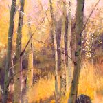
Vigorous marks of blacks, whites, and oranges all give the sensation of a freshly recorded scene in this pastel by Boris Rybinsky. The staccato marks, the wide swathes of colour in the sky, the purposeful smudging in a few areas, all reveal the self-assured hand of the artist. In their energy, they also contradict the seeming calm of the subject – a winding path through trees and meadows on which two figures make their way. There’s something about the two figures that suggest an earlier era. I think it’s because the figure on the left (a woman?) is dressed in what looks like a to-the-ground coat or dress. The orange mark to the right of this figure I read as a child – the two look as if they are slightly turned towards each other perhaps sharing their thoughts about the surroundings or maybe talking about life happenings. They cross a bridge made for walking over what looks like rushing water and make their way forward on the empty way ahead. There’s a winter bleakness about the scene and yet the energetic strokes and bright orange lift our spirits. See more of Rybinsky’s fantastic pastels and other work here.
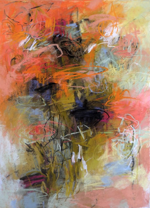
Speaking of the joy of orange, I was delighted by the whirling energy of this piece by Debora Stewart. There is a frantic feeling and perhaps a message behind the frenzied gestural marks. The title relates to the garden and as our days nudge towards spring, at least in the northern hemisphere, I’m reminded of the exuberant growth that takes place at this time of year, an almost chaotic show by nature of its energetic force. This pastel brings forth that same frenetic cycle of change. Both the colours and mark-making are wild and have a feeling of spontaneity and intuitive choice. Gardens can be the same, with plants emerging every which way – some expected and some not – that overwhelm the happily bewildered gardener. The black patches – what are they? Could they be the ground below being overtaken by the tangle of growth or spots that remind us of the possibilities offered by the fertile soil? Or are they instead dark holes of fear and desperation threatening to push upward through the joy and lightness of being? Are they a sinister reminder of a world out of balance with nature? I so enjoy this outburst of barely contained ebullience! See more of Stewart’s work on her website.
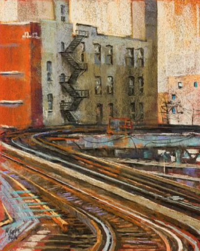
Nancie King Mertz is known for her paintings of urban architecture and infrastructure and this is a prime example. She takes what many would consider ugly or not even worthy of noting, and holds them up for us to see the beauty that’s hidden there. She makes the wasteland beautiful in her colour choices, her marks, and her design. This pastel might be a scene you’d pass everyday on your way to work in the Brown Line train. There’s only tracks and the backsides of plain and pretty unattractive buildings. Mertz sees the possibilities and opens our eyes to line and shape and colour. The painting is a contrast between the swooshing movement of the rails (can you hear the clatter of wheels on tracks?), and the rectangular solidity and flat shapes of the apartment buildings. Mertz moves our eyes quickly up the tracks and to the right, but the verticals hold us and call us back as does that bold and brave block of red on the far left. We become curious about who lives beyond the windows and all of a sudden the humanity of what we’re looking at takes hold. Even the title takes us beyond mere fact – we twist and dance and in the movement, laughter bubbles forth. Check out Mertz’s website for more fantastic pastels.
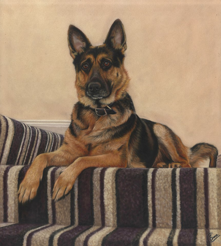
From the expanse of the city we visit one of those homes behind the windows and find this portrait of a dog, Yaya, who sits waiting on the stair landing. It seems like this is a good spot to watch the front door and any activity that might happen around the entry. Emma Colbert is a master at capturing pets – you can see a perfect example here. I love the way she contrasts the textures of the carpet, the dog’s coat, and the slightly uneven surface of the wall – can’t you just reach out blindly and know what you are feeling? The dog appears at ease with feet dangling off the edge of the stair, but all senses are on alert. A barely cocked head and raised eyebrows give this attentiveness away. Is it waiting for its beloved human to return or curiously watching some activity below? Colbert has used the blank wall to set off the dog’s head while the lower parts partially meld in colour with the carpet. Even so, there’s a nice tension set up between the straight lines of manmade carpet, and the eddies and whorls of nature in the form of swirls of colour on the dog’s fur. See more of Colbert’s work here.

On first glance, one sees a lovely painting of a pretty young girl in her pretty dancing costume. Beautiful you think. And look, even the title is pretty – Ribbons and Roses. But look more closely and you discover an undercurrent of unease. The prettiness of the piece is contradicted by the frowning look on the girl’s face. She appears deep in thought as she holds her toe shoe. (Has she just finished dancing and removed the shoe or is she in the midst of preparing to perform?) Underlying the painting and reinforcing the feeling of anxiety is the dark underpainting left untouched on the right. Compared to the bright and colourful clarity of the young woman and her clothing, this background suggests the murky unknown side of life. It leaves plenty of space for the future that we have no way of seeing. A dancer’s life is not all roses and ribbons. It takes a lot of hard work to attain that effortless look on stage. Is this young woman pondering a dancing career knowing the commitment involved? Has she been seduced by the seemingly enchanted life of a ballet dancer but now sees the reality? See more of Berry’s fantastic pastels here.

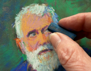
Natasha Kinnari has also captured a sense of disquiet in this portrait of Jamie. A lovely gentle portrait, it’s the lines at the bridge of the nose that give us further clues as to what’s going on. Kinnari could have softened them or even left them out. (Put your finger up to the portrait and cover them – changes things doesn’t it?) Instead they and the downward direction of the mouth, accentuated in turn by the mustache, have us questioning and looking beneath the surface of this man’s depiction. Why does he look so worried? Who is he? What does he do? What’s his relation to the artist? What is he pondering? He seems about to speak, perhaps to share his thoughts or questions. Kinnari is skilled with creating textures – the bristly hairs both long and short of the beard, the soft feel of the cotton T-shirt, the coarseness of the heavy overcoat. She confidently uses both the side and tip of the pastel to create the work. Nothing is overstated. We have enough information to understand the face of this man, yet from it emerges curiosity in the mind of the viewer. At this time, I couldn’t find a website to share more of Kinnari’s work.

In contrast to the quiet contemplative piece above, we have this loud and bold pastel by Linnea Doden. There’s no question that this is a feisty woman, completely confident in who she is and what she stands for in this world. Doden has chosen to tightly crop this piece making sure we focus all our attention on this face encircled by the red hat. The assignment of sharp features to the face heightens this perception of a no-nonsense spunky personality that frankly doesn’t give a damn about what you think of her flamboyant nature. Decked out as she is in sparkly earrings, flashy necklace, red lipstick, dyed hair (?) and of course the red hat, she can’t help but attract our attention. Her eyes dare us to say anything about the way she’s dressed, challenge us to make an ageist comment. She’s larger than life and exudes a life force! Unfortunately, I couldn’t find a website to see more of Doden’s work.
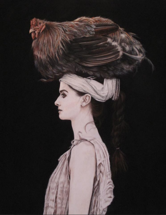
I was intrigued by this beautifully portrayed figurative painting by Melodie Cook. The woman in perfect profile appears statuesque and statue-like with none of the warmth of a blood-filled body. She appears otherworldly, even more so against the dense inkiness of the background. The one thing that makes her more lifelike – her hair braided into a thick plait – disappears into the darkness. Not so the chicken on her head. Although the pale figure is in stark contrast to the black background it’s the fowl that we notice, seated as it is on top of the woman’s head. It is exquisitely rendered, each feather silky, firm, downy, wispy as the case may be. The chicken’s head turns to us is if to say, “Yesssss? Is there a problem?” We can’t help but smile and be intrigued by the scene. How do we interpret what we see, this mysterious and still woman with the elegant name capped by a chicken that precariously balances itself on top of her head (notice how the feathers are in disarray). The chicken provides the life, emotion, and movement in the piece while the figure remains motionless, distant, and silent. See more of Cook’s work on her website.

Another superbly painted statuesque woman who although a life model of flesh-and-blood, appears like a statue. It’s as if the students are working from a cast rather than a real person. It’s the greyness of the figure that gives this impression as well as its position raised up on a pedestal. The colour of the figure echoes the neutrals of the ceiling and walls, all manmade and not of nature. This reinforces the perception of ‘statue’. One could also say that the frontal nudity so boldly exposed is easier to view if we don’t believe we are scrutinizing a human body. Holding onto this thought, see how the lighting tracks running diagonally seem to skewer the body in place as if a specimen to be examined with detachment and rational mind rather than emotion. The upper half of the painting is all cool greys and stillness but as we move down, colour starts to creep in as we see the artists, the easels, and the warm light reflected up onto the models legs. She towers above us in all her unabashed splendour. This painting reminds me of how comfortable life models are in their bodies. I’m also reminded that when we peer beneath clothing, culture, skin colour, and political and religious leanings, basically we all look the same with our commonalities more evident than our differences. See more about Scott Noel here.

Here we are gifted with another interpretation of a life model. This time the painting exudes the warmth of the body. It also reveals an undercurrent of emotions. Yes, the model took a pose but two things, she’s in her thoughts, and the artist brings his own experience and interpretation to the figure. So I would say there’s more going on than a mere record of a figure. Sakuma has filled the rectangular shape of the paper; the figure cannot be contained within. Unlike a specimen pinned to the centre of the paper, detached from the world, this glowing figure is part of our world where we exist just in front of her. Even though there is no contextual background (the untouched background attests to Sakuma’s mastery of the medium), we are so close that we place her in our world. Sakuma’s confident laying down of bravura colour quickens my heart – pale skin is enlivened with greens and yellows and pinks. (Love that splash of pink on the upper hand with merely a couple of pastel strokes in a darker colour to indicate fingers). Sakuma captures the small gestures – the curl of the toe, the relaxed open hand at the end of a severely bent wrist, the nonchalant hand under chin – that in their contradictions of tension and relaxation, evoke stories about what’s really going on. See more of Sakuma’s fantastic pastels here.
Soooooo that’s it for this month’s fantastic pastels picks! You know how much I love hearing from you so please do leave a comment.
Until next week when I can’t wait to introduce you to this month’s guest blogger!
~ Gail


![Pastels on black aper: Gail Sibley, "Untitled [at this point], Mount Vision pastels on Sansfix pastel card, 5 1/2 x 7 3/4 in](https://www.howtopastel.com/wp-content/uploads/2016/04/IMG_9649-2-150x150.jpeg)


28 thoughts on “February’s Fantastic Pastels”
Another interesting selection of paintings and as always, accompanied by beautifully written comments that heighten our ability to look at, see, and think about paintings.
Thank you so much Duane. It’s always such a pleasure to get a positive comment from you!!!
Hmm…dear Gail, has it occurred to you this month is March going on to April 🙂
Hah hah. Yes it is. But I always make a selection from the many pastels I’ve ‘collected’ the previous month so really, I’m only a week late 🙂
All I can think of to say is “WOW!” Great collection of pastels…..
Ruth, WOW works for me!
Terrific picks! Thanks
So glad you think so Jana!!
These are amazing. I love the range of artists you show us, and your commentary adds so much information. Thanks.
I’m glad you like them Marsha. Thanks so much for letting me know 🙂
I like the thread of unease that you’ve highlighted in these picks. So many worried faces. Maybe it’s just me projecting… Thank you for sharing your thoughts and comments. It helps me see and appreciate the works more deeply.
Marie, when I made my picks, I hadn’t consciously picked up on the unease. It was only when I came to asking myself Why I had chosen these ten that the answers arose. I may be projecting too! We perceive what’s in our own experience so quite likely. Glad you found my comments helpful 🙂
Your comments always take me further in to a better understanding – always the best part for me!
Thanks Gailen! I hope my comments stimulates your own ideas about the pieces.
Gail, Congratulations. A collection well worth waiting for. It’s amazing how your commentaries read so easily and are well considered knowing how busy you are. You become totally involved in each piece of art..S
Thanks Sandy! They do take time to do but they make me stop and analyze why I’m drawn to a painting and then express the answer.
Wowza Gail what a terrific selection of work plus beautiful words you use to help us really get inside each artists mind – love the way you write!!
Thanks Michele for your kind words. I’m glad the words help you get inside the paintings more deeply!
I really dived deeply into the Rybinski Gail. Thanks for picking that one and bringing this artist to light for me!
I know, amazing work isn’t it. I had the dickens of a time choosing which to include in the round up! Happy to introduce you to this artist Louise!
Thank you for sharing this excellent collection. Very inspired and I’ve discovered new artists to follow! Your insights make this post much more than a collection of fine art. Your post inspires thinking, feeling and connection, not least of all it draws us into our own creative minds to help make us work harder at our easels, to see differently … if that was your aim. mission accomplished & bravo! I’m a new follower and fan of your work. Thank you so much for not only this blog but the generous and informative tutorials on You Tube, where I discovered you.
Yes yes Tina, that’s exactly what I want. It’s not just about other people’s work but being able to look at your own work with a different eye.
Thanks so much for becoming a subscriber. Glad you found me on YouTube!
Gail, you do such a great job of curating interesting work we may not have seen, and then giving context, highlighting strengths, or just revealing how a particular piece evokes a personal reaction. So inspiring; Thank you.
Many thanks Jeanne for your beautiful words! Glad the pieces and commentary are inspiring 🙂
Perfect timing for your writing to arrive!
Now I’m off to the weekend drawing board!
Thanks for all this Inspiration!
Lyn
Lyn I’m delighted I’ve inspired you as you head off to be creative!
I am so grateful for the time you put into finding and sharing your inspirational selection of monthly painting and artists. They touch all of our desires to explore different possibilities for pushing the edges of line, composition, color, mark making and subject matter. And, your thoughtful reflections on each piece offers us a perspective that one might not have seen, without dictating that your vision is what the artist intended. Thank you!
Thank you so much for your appreciation Gill! I love thinking deeply about these pieces, and why I picked them.
I have done these roundups for a few years but sadly don’t write them anymore. They took me about three days to create (and that doesn’t include the collecting of art time) and nowadays, I have much to keep me busy, for instance my IGNITE! membership and creating content and connection there!