
Well I promised you a round-up for of January’s noteworthy pastels after missing the December edition due to the DK Project so here it is!
It’s interesting how sometimes in some of these monthly posts themes emerge and subjects repeat. That’s certainly the case this month. See if you can spot what I mean among January’s noteworthy pastels!
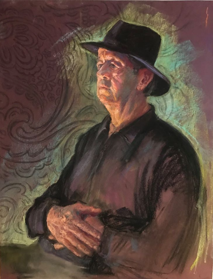
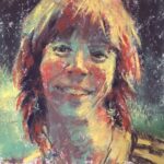
This dramatically lit figure can’t help but capture our attention! He sits quietly, as if comfortable on stage, while the world swirls around him. Is he composing poetry in his head? Judy Leeds manages to balance the vigorous marks that fashion the shirt with the more quiet and intentional marks that make up this man’s face and hands. The folds, wrinkles and veins of the hands as well as the forms of the face speak to the artist’s keen scrutiny of the model. The light green colour she applied around him works for the painting, showing up as it does the dark shape and contour of the subject and counterbalancing the overall dark reds and black. The aura also invites a more spiritual reading – almost like a glow emanating from this man’s soul. The paisley pattern in the background also suggests a metaphorical reading. Does it hint at who this man is? Will he come out of his meditative pose and recite some of his poems for us? I hope so. And may I point out that this piece is created on Canson Mi-Teintes paper. I’m in awe of artists who can make this paper work for them and Leeds certainly does! You can check out more of her work here.

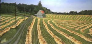
I’ve known and enjoyed Tom Bailey’s work for sometime now so was delighted to include this piece which made me stop, look, and listen. Yup I said listen. The movement in the piece (suggested by the whirls and squiggles of marks) speaks of the life within the plants themselves and also beyond in a hidden animal life. I’m sure there are birds in the bushes and trees, and flying overhead in the sky while mice and small creatures squeak and scurry in the grass verge at my feet. This painting reminds me of the wonder and beauty of nature. The inclusion of the barbed wire fence is also a reminder of the human equation and how we tend to separate ourselves from the environment and each other. On a purely design level, incorporating the fence provides us with a line for our eyes to follow. It also acts as a pointer to the countryside beyond. The whole painting records a rather green scene and Bailey breaks it up by using yellows, purples, oranges and blues both in side strokes and short bursts of the pastel tip. Take a deep breathe and inhale the glorious landscape! Check out more of Bailey’s work on his website.

From the breadth of a sweeping vista, we come to this intimate scene by Gill Truslow. A painting presented for a Friday Challenge in the HowToPastel Facebook group, I kept coming back to it among the selection I had collected over January and realized it needed to be one of the ten. I can hear the water trickling and gurgling as it flows to wherever it’s going. I love a quiet spot to ponder and to contemplate nature. This is just the place don’t you think? Truslow’s palette stays mainly in iterations of blue and muted oranges which keeps the piece harmonized and tranquil. Our eyes make their way along the upper edge and are led by the group of rocks found there to the other grouping in the stream itself. From there we follow the line of the shadow down to the bank where I stand and where we discover hints of greenery. Light captures our attention and we circle back to the top left. We can then go back to the centre arrangement where we are invited to linger. The mostly mid-value piece is interspersed with dark crevices and daubs of light. I’d like to remain in this peaceful haven but we’ve got more to see! You can find more of Truslow’s work here.

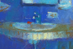
This is the third time Jeri Greenberg has appeared in my monthly round-up – a record! The other pieces were a landscape and hands and now we have this delightful interior. I just couldn’t resist it with its Degasesque compositional idea of putting an important feature close to the edge of the picture frame and making it work. Here a woman sits reading and is practically out of the picture; even her head is facing outward. We look at her eyes and as we glance down to see what she’s reading, we catch sight of the coffee cup which in turn leads us to the table edge which in turn drops us down to the chair. From there it’s natural for us to make contact with the other chair. This chair faces outward and so our eyes follow this direction and all of a sudden, we’re captured by a figure on the outside glancing in as he walks by. If we have time, we dawdle and explore what’s there – a tree, the other sidewalk, and of course the lettering on the window telling us where we are. We also glimpse the reflection of the reading woman which draws us back inside. There’s a lovely balance between cool and warm colours that echo the cool and warm of the outdoor and indoor temperatures. Here’s another place I’d like to tarry! Check out Greenberg’s website for more work.

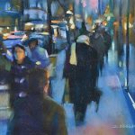
From reading in a cafe we come to the 21st century version of hanging out. Here Anne Strutz, with humour, describes a typical teenager scene. This gentle mocking of the new way of spending time with friends, captures a time and place. The vigorous and quickly applied strokes contradict the private and quiet intensity of the individuals. Yet those same strokes echo minds in constant motion, minds that have little time to stay too long in one digital place (while staying physically, for perhaps hours, in the same position!). The piece verges on the abstract with its bold shapes of black against light neutrals, accented with flashes of red that indicate the centre of these kids’s worlds. Such great poses that reveal much. The older teenager that really doesn’t want too much to do with a younger brother and friend, turns away slightly, to covertly absorb whatever’s on his screen. The younger boys are engaged watching something together, perhaps they are playing a game. In any case, I was taken with this statement about life today. You can see more of Strutz’s work by clicking here.
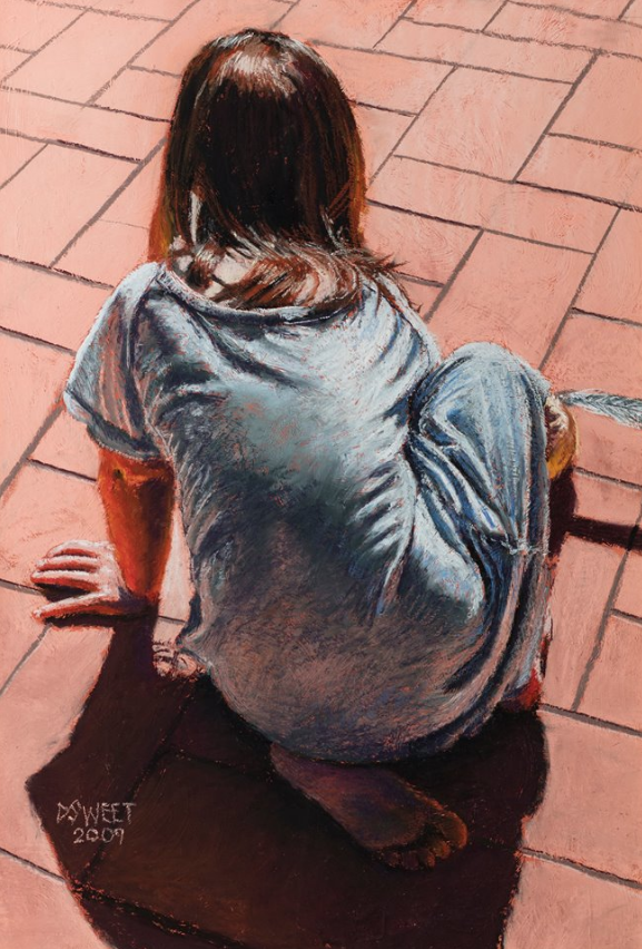
On the other hand, there are still some children that play off line. David Sweet’s pastel shows a young girl engrossed by whatever is in front of her. We can’t see what’s caught her attention and the few clues – the title, the feather, and what looks like may be the top of a doll’s head – don’t give us a definitive answer. It’s enough though to know this child is happily enthralled by whatever she’s playing. Sweet has limited his palette to oranges and reds complemented by blues but runs the full gamut of values from dark to light. He’s observed and incorporated some beautiful reflections – on her left arm, her right heel, and her left foot. These colour nuggets enhance the picture, glowing among the muted opaque pavement and the cool blues of her shirt (which also has some lovely pink reflections on it). The sharp lines of the tiles and manmade patio contrast nicely with the fluid curves of the human form and remind us of the difference between the two. I feel, I hope, the young girl will interrupt what she’s doing so as to share with me whatever it is that’s captivated her. By the way, note the large size of this piece. See more of Sweet’s work on his website.

Glen Maxion’s fantastic draughtsmanship comes through loud and clear in this delightful capturing of that no-way-in-the-world-are-you-going-to-wake-me sleep (love the painting’s title!). Just look at the face, the hand, the perspective. Another miracle worker with Canson Mi-Teintes paper, Maxion paints this as a high key painting with the only darks being the very small openings of nostrils and between lips and eyelids. Even if you don’t have children, I’m sure you have encountered this child’s dead-to-the-world sleep, the one you hope will continue as long as possible! The vigorous and confident mark-making belie the peacefulness of the piece. In their activity and energy, the marks negate the lean towards sweetness both in subject and colours. They also suggest tales of a youngster with abundant energy and all that’s required to keep up. So for the moment, let’s be silent and let this babe sleep! I was unable to locate a website but you can see more of Maxion’s work here.
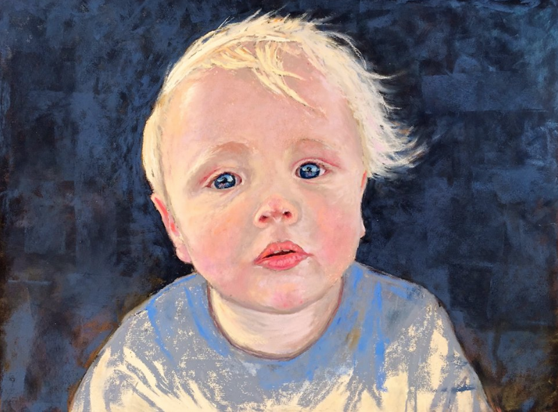
This young boy’s awake. Well, almost as there’s a look of just waking. I’m mesmerized by those eyes looking at me. And I can see myself reflected back and then I look again. The warmth of the face is beautifully balanced by the cool blues all around. Dark shapes in the background talk of the unknown, their fading in and out speak of the future. In the meantime, this luminous face looks out to the world full of innocence and yet with a burgeoning curiosity about what’s out there. We return the look with different sorts of questions and a deep wonder at the miracle of life. This portrait of the artist’s grandson is almost a cutout of light against dark but the eyes keep the face from free floating. They punch out in contrast to the lightness of the face and keep us grounded and looking. They nail us to this moment in time. What will the future bring for this child? See more of Howard’s work on her website.

Yes, yet another young child that I couldn’t resist this month! This time she looks off to the side and we don’t know whether the attraction is a person – child or adult (on their knees as this young girl’s head doesn’t crane upwards) – or an event or an object. What do we read on this child’s face? Hesitation, trust, fascination? It’s unusual to see a painting of a child’s face caught in shadow and looking away from the light. However this allows the artist, Máté Sandor, to play with the subtleties of transitions in value and colours on the face while the blazing light illuminates the blonde hair and back of the clothing. The hatching on the face is done with a deftness of touch that makes that cheek so smooth, so soft, that I want to reach out and touch it. He has also created believable textures in the child’s hair and sweater. Another example of a young being set against a dark background – warmth and colour bring hope and possibility in an unseeable future. And by the way, this is yet another artist who appears to be using Canson Mi-Teintes paper successfully and in this case, he uses the textured side! You can see more of Sandor’s work here.

And finally, we come to this piece by Susie Gotshall Quinlan. The tightly cropped painting of a dog’s face fills me with glee. Quinlan has placed the head off centre yet it works just fine. There’s a sense of balance as I circulate from the dog’s eyes to the ear on the right which leads me down to the collar. I move along, take a peek at the body but am soon at the dog’s mouth and nose. The movement of the ear on the left catches my attention before I’m pulled back to those glorious limpid eyes. Those eyes that adore, question, are alert to any word, any motion, ready to move at a simple gesture. Yet patiently waiting. Basically a black and white painting with sparkles of blue in the eyes, the smudge of colour top left, and the collar, Quinlan also introduces the accents of warm pink in the mouth, a smudge in the ear, and a hint beneath the skin below the collar. So much personality, so much love radiating from this painting. I move away slightly, to avoid being nudged by that damp nose yet wanting to draw close to look into those eyes and lay my hands on the dog’s coat. Wonderful. Sadly, I couldn’t find anywhere to refer you to see more of this artist’s work.
And that’s it for this blog post. What do you think of January’s noteworthy pastels? I ‘d love you to leave a comment letting me know what’s your fave and if any have inspired you.
Until next time,
~ Gail
PS. If you ever want a piece of your own work critiqued, I do offer that service. Click here to read the details!


28 thoughts on “January’s Noteworthy Pastels”
LOVE that Tom Bailey’s ”Peace in the valley” and Glen Maxion’s “I’m not tired”. Thank you so much Gail for posting all of the January’s Noteworthy pastels. I look forward to receiving your emails. I love the colours and textures that the pastel artists put together, not to mention the compositions.
All the best,
Chris
‘
Thanks so much Chris for sharing your favourite pastels from this month’s picks. It’s pretty amazing how many fantastic pastel paintings and artists there are out there!
I just discovered David Sweet’s work the other night and spent a half an hour looking at paintings on his FB page. I love his pastels of children and the wonderful lighting he captures! Glen Maxion also paints children beautifully…he’s a fellow member of our Pastel Society of San Diego. Thank you for your wonderful blog!
Anita, yes, Glen Maxion’s girls on the beach are wonderful and I included one of those pieces in an earlier round up. https://www.howtopastel.com/2015/07/junes-remarkable-pastels/
How lovely that you discovered David Sweet’s work just the other night – serendipity!!
Well thanks very much Anita… and of course Gail for this wonderful blog. It’s lovely to learn that people from a whole different part of the world have been browsing my wee website…
This was a delight to read and see. I love the theme of children and people at rest or contemplation. Really enchanting. Your critique was so insightful, drawing my attention in to each piece so precisely. Thank you so much.
Linda
Thanks Linda. It’s funny how there were so many young children this month. I usually try to include as many genres as possible but these pieces called to me this month! I’m glad what I write makes you look more closely – job done 🙂
All these selections are works of art. I also appreciate your reviews of them because they teach me a lot. There are no favorites, except The Poet. I like his aura. Thanks.
Thanks Marsha. I’m always hopeful that what I say will help others (you!) to see and really look at the work!
Hi Gail, I love this focus on portraits, something that I aspire to do more of, and appreciate seeing the diversity of figures and composition. I especially love the colors and mark-making in “I’m not tired”, but also love the title, remembering my son saying that so often when it was time for bed, and his head would droop, falling asleep in my lap.
Thank you for including my painting! I got such pleasure out of working on the surfaces of the rocks, as well as the play of light and shadows on them and the water, and am glad that you enjoy it too!
Gill I remember saying “I’m not tired” and then waking up the next morning. Definitely an emotional connection to this piece but also the man-making so appealing as you say.
Gill your piece is so lovely. Mind you, I was torn between this one and waiting until next month with your black cat which I love!
A lovely selection as ever, Gail. I particularly enjoy the works by Gill Truslow and Tom Bailey – the colours really sing.
Could you find some abstracts for another month? It’s always fascinating to see how others approach these.
Thanks for your efforts.
David W.
David thanks for your comment.
It’s always my hope to include a wide range of gear and styles e but sometimes, it just doesn’t happen. I look through what I’ve collected over the month (ranging from 60-80 pieces approximately) then I go through them and through them until I’m left with between 15 and 20, and then I start writing notes. The 10 that I choose are pieces that, in the end, I really feel I have something to talk about. So you (and I!) just never know!
Wonderful picks as usual! Always look forward to seeing these! 🙂 Thank you so much!
Glad you enjoyed them Marsha!!
A great selection Gail. Especially like the works by Judith Leeds, Tom Bailey and Jeri Greenberg. Wonderful mark making. Thank you.
Hi Penny, thanks for sharing your favs. Yes the mark-making of those three is an inspiration.
Wow, Gail – I felt like you were speaking directly to me this month! If I look at the collection of pastels I’ve done over the past three years, the majority of them are of children and dogs. My abilities don’t even come close to what’s presented here, but by reading your critiques, I’ve learned and I’m sure future children and dog paintings of mine will benefit (even if just a smidgeon!). Thank you!
P.S. I also loved the other four paintings, they just weren’t as personal to me.
Thanks Elaine.
The purpose of this monthly blog is to pick pieces that affect me in a technical but also emotional and visceral way. And I want to share my thoughts rather than just present the pastel pieces. It takes time and effort to determine what I feel and why but I’m hopeful that what I say will make everyone look more closely and ask, Why do I like/respond to this piece?
I’m glad you are picking up something. And yes, I can certainly see why this post in particular appeals to you!
Gail- Thank you for the HUGE honor of being included in your ‘Noteworthy’ collection for January. Each month, I have loved seeing your amazing spectrum of selected pastel works and your sensitive, almost poetic reviews of each piece. You make every painting come alive and provide a wonderful analysis on both emotional and technical levels. You help me see pastels — and pastelists — in new ways.
Tom, thank you so much for your warm and enthusiastic response to my blog particularly my monthly picks! All the effort then is worth it. And I meant what I said about liking your work and finally being ‘able’ to include one – Peace in the Valley. Keep painting your lovely work!!
Really wonderful pastels!
Yay!!! Thanks Casey. Always good to hear from you.
Gail I am truly honoured to get a mention here… First time I have seen your blog, but it was a wonderful experience to read your critique of all of the work, and a great learning experience for me to see how others might view mine from a technical perspective. Your style of writing really draws the reader to look so carefully at each piece being presented.
Looking forward to seeing more in future.
Best wishes,
David Sweet
Thanks so much David. Happy you’ve discovered my blog and enjoyed reading what I had to say.
I am always looking forward to your post , these are great portraits , I do some portraits , but these are exceptional , love them .
Thanks Rae. Yes, some exceptional portraits for sure!! Glad you think so too 🙂
Great Selection Gail!