
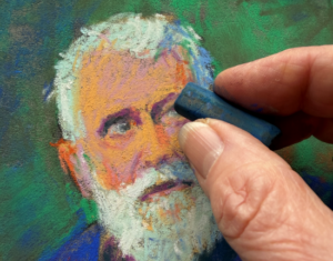
It’s Labour Day and on this grey, cool day in September, I’m writing about astonishing pastels chosen from the glorious many I saw in August. These are pastels that in some way moved me to share them with you be it their colour and design, their emotional resonance, their success with values. My ten pastel picks may not necessarily be award winners but there’s a certain something that calls to me. August’s astonishing pastels are personal and subjective choices for sure.
Let’s go have a look!
August’s Astonishing Pastels!

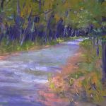
It’s damp and the fog is rolling in. There’s a chill in the air and yet it’s held off by the warm colours of the marsh grasses. Archer has used large shapes to describe the setting, only introducing the smallest amount of detail to help us read the scene. The composition is a simple one divided as it is into three unequal horizontal strips. (You can see the middle strip continues on the right with subtle changes in the cloud formations.) The palette too is simple: variations of warm yellow browns alongside neutral greys that are tickled with greens and purples. Note how Archer brings the greys down into the marsh grasses on the left and a bit on the right and in so doing, harmonizes the whole. Your eyes are immediately taken to the distant and dark trees, they follow the horizon to the right, drop down through the warm marsh and wind their way up the small path of water cutting through the marsh until once again, they arrive at the line of trees and shrubbery. All parts are painted with the subtlest of colour changes that remain within their respective value ranges. See more of Archer’s work here.

Parsons’s piece takes us away from grey fall days and fills us with the joys of springtime: clouds skidding across the sky, fruit trees in full bloom, the bright greens of new growth. All seems possible as we climb up the rising hill. Parsons has taken a corner of nature and captured a feeling only the freshness of spring can bring. This painting offers us a tangible experience – you can smell the blossoms, feel the breeze, and it makes you want to laugh with the newness of it all. Parsons pulls the pink from the trees and injects it into the foreground field suggesting flowers congregating among the grasses. This brings our eyes down from the trees and we circle around, following the clouds in their movement across the sky where we once again encounter the fruit trees. The intensity of the blue sky gradually diminishes as the clouds begin to veil it. The clouds are warmed with creamy yellow adding to the comfort of the scene. Parsons seems not to have a website so visit her on Facebook here.

In this vertical landscape by Dejanovic, I am fascinated by the rambling disarray of branches and scrub at the water’s edge. It’s a scene many of us wouldn’t see as a paint-worthy yet here is the proof that it is. The composition is based on an asymmetrical cruciform with the tree grouping (both the trees themselves and their reflections) creating the vertical, and the line of bush along the water as well as the distant trees and green in the water, the horizontal. The four uneven quadrants are filled with the blue of the sky in varying amounts and intensities. It’s a hot summer day and the water entices us for a swim or a paddle. The green growth partially covering the water echoes the green in the field beyond as well as the leaves on the trees. Dejanovic introduces mauves to dilute the effect of the green in parts, leaving other parts to make a more intense statement. This painting honours both the beauty and chaos of nature. You can see more of Dejanovic’s work on his website.

Speaking of summer, I was completely charmed by this painting of chickens dashing towards me, the viewer, no doubt eager to be fed! There’s such a raw response here to the behaviour of these birds and to life in the chicken coup. The movement of the chickens is enhanced by the diagonal lines of light leading to the coup (where one chicken glows against the darkness of wood behind), and also by some smudging of pastel in areas around and behind the chickens. The cool greys in the chicken yard are balanced by the warm light and colour in the surrounding garden. We see cars, and perhaps a building beyond this fowl life. The bold application of pastel amplifies the spirited vigour of life revealed here. A joyous piece indeed! Again, I found no website for the artist but you can connect with her on Facebook.

Again lines converging but this time they lead us to a place hidden and quiet rather than raucous and energetic. And so a mystery unfolds. Where is this place? Who lives here? Not a soul to be seen: the mystery invites us in. There’s an almost fairytale character to this painting with its compressed line of houses and varying tilted roof lines. Our eyes take in the buildings on the right and then we are lead back into the painting, all the way to the stairs, beyond which we can’t see veiled as it is by a shiver of snow falling or a bush delicately covered with frost. The sense of frost pervades and gives texture to the scene. It is silent indeed, warmly lit by an unseen streetlight. Using complements of orange and blue, the artist creates a wonderful balance between the orange-red brick of the houses and the cool blue shadows cast across the snow. I love that the painting is primarily warm despite it being winter and nighttime. You can see more of Isenhour’s work here.

Speaking of mystery, who is this woman? And what is the meaning of this painting? The title may give us a clue to work with. Summer Solstice, a time when the sun reaches its greatest height and gives us the longest day of the year. Often it is a time of celebration, often with religious rituals (one can’t help but notice the cross formed in the window). We could read much into this painting – a young woman at the window of bright sunlight, protecting herself from its power or is she about to open herself to it and passion? It’s an almost monochromatic work in tones of reds, with hints of the complement green. There’s a sharp contrast between dark and light in this backlit piece. The light is almost blinding and we avert our eyes and take refuge in the darker places where we find this young woman. Pitkin has beautifully rendered the figure but we need to spend time with it to savour all the nuances of skin and clothing. See more of Pitkin’s work on his website.

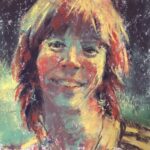
I think it’s the pink that keeps me coming back to this piece. Hancock has incorporated it perfectly, allowing it to glow beneath the green grey she’s applied over it. I also enjoy her bold, unfussy application of pastel. She’s given us just enough detail to read the face of this young man. What is he thinking? Perhaps we can get some ideas from his T-shirt that reads Trust. And then possibly ‘No’ which leads one to imagine the next word to be One as in, Trust No One. And isn’t this a sad statement about today? Does this painting tell us about the despair of youth, about what they face growing up in our ‘civilized’ worlds. The chin of this young man juts out in defiance, his lips are closed with tension creating a straight line, yet his eyes speak of tenderness. We can also sense a hesitation and insecurity that comes with the inexperience of youth. It gives us much to ponder. Check out more of Hancock’s work here.

Known for her fine and often complex tromp l’oeil paintings, this one by Hildebrandt is simpler but still gives much satisfaction. I was very taken with this piece and it’s play on painting. I love that it shows us crayons – so realistic you could pluck them out of the picture – that are being used to colour, in the exuberant and unencumbered way of a child, a drawing of a Vermeer masterpiece. It’s a painting of the process and joy of creating. The lady with the pearl earring seems to be saying, “oh” with surprise as if she’s just noticed she’s getting a rather wild makeover. I can feel the torn edges of the well used cardboard box with all its trial marks on it, delight in the paper that looks enthusiastically handled barely held in place by a strip of blue painter’s tape, relish the marks applied to the outline of the lady, revel in the luscious selection of colours with crayons nicely sharpened – all recalling childhood days filled with the time-passing enjoyment of colouring. See more of Hildebrant’s art on her website.

This painting makes me feel like moving in my chair, and keeping time with these birches that dance to the rhythm of music only they can hear. Fall is a time of withdrawal yet these trees seem energized by the backdrop of flaming leaves. The dark evergreens rise in the background foreshadowing the depth and darkness of winter yet the birches seem oblivious to what is to come and cavort in their sinuous way. These trees are reminders to live in the moment! Koch’s use of a warm analogous palette with only the additions of white and black, focus our attention on the dance of the trees and the joy of warm colours. The zigzag of added pastel marks over the large flat shapes of colour reinforces both the sway of the trees and the leaves as blazing fire, and enlivens the whole painting. View more of Koch’s paintings here.

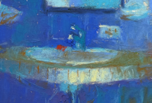
From the warm oranges above, we go to the primarily blue piece by Oosterhof. It’s a landscape and yet it goes beyond a mere record of what’s there. The abstracted quality comes from the creation of shapes, particularly in front, and the orange accent in the background. What are those forms in front? A dock, a fence into the water? Does it matter? Do we need to name everything in a painting to enjoy it? The same goes for the small rectangle of orange (such a ‘pow’ of a complementary colour) in the distance – is it a tower? a fire? Is it illuminated from without or within? Again, does it matter? I love the painting and its visceral nature. I like the way the painting itself, its colour and design, shapes and values, textures and marks, become more important and perhaps more enjoyable than any reading of a realistic narrative or scene. I revel in the varying pressures and application of pastel – the scumbling, the opposition of thick stroke (esp seen in the cream colour) and thin, the contrast of strokes made with the tip and side of the pastel, the vigorous application versus a more tentative layering. Check Oosterhof’s website to see more of her work.
Another month of astonishing pastels and I’d love for you to tell me which are your favourites and why. Are you inspired by any of these pieces? Do leave a comment!
If you create a piece directly inspired by any of these I’ve shown you here, do post it in the HowToPastel Facebook group and tell us about it, for example which piece inspired you and why.
So glad you’re here with me on this pastel journey 🙂
Until next time,
~ Gail


14 thoughts on “August’s Astonishing Pastels- Let Them Motivate You!”
Such a wonderful selection. I always go into the lists with the idea that I’ll have a favorite, but they’re all great! Such talent and hard work, thank you for sharing these.
LOL!! I know what you mean Matthew. It’s soooooo difficult for me to narrow down the choice to 10! Glad you enjoyed seeing them 🙂
Hi Gail,
THANK YOU so much for featuring “That’s the Pacific Ocean”, my painting, above. I am so shocked and honored to have been chosen.
I always love reading your top 10 picks, it is like a whole course in color, composition, form, light, meaning, mood, etc. You don’t miss ANYTHING!!! I urge all my serious students to read your blogs, newsletters, etc.
I met you across from where Marsha Savage was painting, at the last IAPS. I am one of those who mistook you for Rita Kirkman! Loved watching your demo there that day.
FYI, I do have a website, a new one, http://barbarsarts.com. Besides my pastels, I have my jewelry on there, and I try to do blogs of some of my processes…for my students, mostly. I teach pastels weekly, here in SW Florida.
Again, thank you so much for this honor.
Barbara
Barbara, thank you for such an effusive thank you!! And glad I could surprise you 🙂 And you are so welcome!
I’m also glad that you find the blog useful enough to spread the word about it to your students. Much appreciated.
Thanks for the reminder about meeting me at IAPS. Perhaps I’ll see you there next year?
Thanks for letting me know about your website. I’m sorry I don’t go very far in my search – one or two pages on google at the most. I always hope I will be corrected, as you have done.
Thanks again for your enthusiasm for my blog – when I hear words like yours I’m highly motivated to keep going!!
Fabulous images as always, but the atmosphere in Natasha Isenhour’s image is wonderful!
Thanks for commenting Kerry! And yes, isn’t it amazing? The more I looked at it, the more I became aware of a deepness to it.
Such an interesting selection this month! I always look forward to this section of your blog….and i was so struck by the variety here….particularly the Natasha Isenhour, “Streetlight and Silence” , Corey Pitkin, “Summer Solstice,” and Marie-france Oosterhof, “Not That Far”. all three are so intriguing…i must say i get a bit bored with all the trees, rivers, marsh landscapes….there seems to be such an abundance of them! there are certainly some in that category that are amazing…..but there just seems to too many of them! I love that you find some varied and different takes on painting! thanks again Gail…..cheers, Linda
Thanks for sharing your favs Linda! I know what you mean about there being many landscapes. I see many lovely ones but every now and again, one stops me and those go into my collection for the month. When I have them all collected, I go through them again and again, slowly making the tough decisions until I am left with ten about which I have things to say!! It’s very important to me that the selection is varied in style as well as genre so I am glad to hear you think it is varied 🙂
I love the different portraits and landscapes you post. The styles are so unique in each one. They are teachers all in themselves! I, too, do landscapes and portraits in pastel and am a member of the PleinAir Painters that gather once a year at different locations around the globe. It’s a great experience! Thanks for the inspiration.
So glad you enjoy them Terre and find that they all have something to teach you.
How wonderful for you to paint en plein air along with so many others at the Plein Air Painters annual event!
There is a quiet appreciation of nature in the work of artist Dalibor Dejanovic. I enjoyed reading his blog and the charming way he phrases his thoughts. Two paintings in the landscape category on his website highlighted his careful study of nature. They are studies of a riverbed and I thought his handling of this difficult subject was beautiful. He captures light exceptionally well in his work and his airy light touch defines his style. Very enjoyable time spent exploring this artist.
Thank you for another month of discovering new artists.
Gailen, thanks for sharing your discoveries about Dalibor Dejanovic through your exploration of his website. This is just what I hope will happen after reading my monthly curated collection blog, namely that readers dive more deeply into the oeuvre of any artist whose work intrigues them. Happy to know you encountered some new -to-you artists!
Thank you for your insightful descriptions. Looking at the selections through your sensitive vision, I am able to understand much more than my amateur eyes comprehend. I particularly enjoy seeing what paper artists use because I like to think that if I too worked on Acme Substrate V800, I could paint as convincingly. (Mention of the pastel manufacturer also thrills me; I bet my clouds would look so much more convincing if I also used Pete Townsend or Terry Gilliam buttery-softs!) In this month’s post, you noted that Barbara Archer’s beautiful rendition was painted on “reused UART 400.” Now, that I have in stock. What the pros refer to as an underpainting, I call a failure, and the best things I have pulled off have been done after knocking off pastel with a foam brush, sometimes as often as three or four times!
David, thank you for the laugh!!! I’ll be looking for those pastels by Pete Townsend. Do they come with music added?! Hope you’ll show us your creations over on the howtopastelfacebook group and tell us how they relate to these blog posts!! https://www.facebook.com/groups/howtopastel/