
Here I am, a week into September, and because I’m travelling (now in Budapest), I’m only now getting to August’s awesome pastels.
As always, sigh, a difficult decision. I had 57 pastel paintings to choose from, ones that I’d collected over the month of August, and after much humming and hawing, whittled the choices down to the self-imposed ten. As always, they’re very personal choices showing a range of technical experience. I just select what jumps out at me as I wander through the internet.
Let’s go!
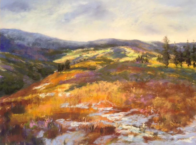
I love the vastness of landscape here and that moment when the sun pops out from behind the clouds and lights up the scene, spreading a warmth unseen in the cooler cloud-covered areas. We all know that experience – it lifts the soul and fills us with the wonder of nature. Our eyes circle from the sunlit distance to the trees on the right then to the foreground of snow and grasses and then on to the shadowed hills on the left. I love the full range of colours used from yellow and purples to greens and blues. See more of Kahne’s work here.
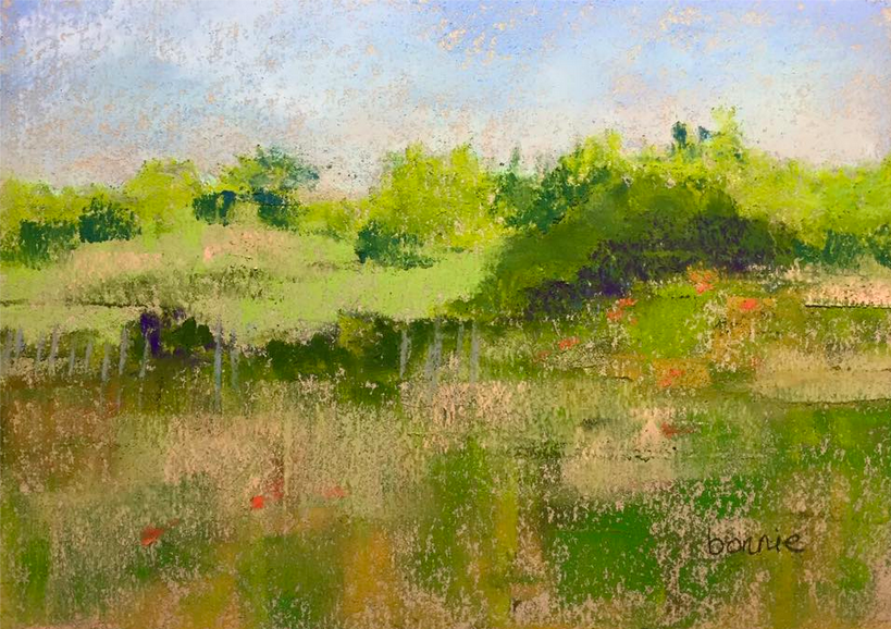
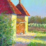
Don’t be fooled. This gem of a landscape is only 5 x 7 in! Bonnie uses the texture and the warmth of the paper to pull all these various greens together. The simplicity of this piece just goes to show that often there’s no need to be fussy and detailed to make a statement about the landscape, to capture an impression of a view. Half close your eyes and you see a field of colours and beyond that, trees with deep shadows below, and then more fields in the distance, all with a cool sky overhead. Check here for more of Bonnie’s work.

Here’s another tiny awesome pastel! You can’t help but think of J.M.W.Turner’s work when you look at this pastel, paintings like The Slave Ship or The Fighting Temeraire. But those are huge and this is small. This moody little piece, with full value range, contrasts warm and cool, with the light of the sun contrasting with the cool of the clouds. And what do we see (ships? buildings in the far distance?) and where are we? Venice perhaps? A story lies waiting here with only a hint indicated. I love the way the blue pastel dragged over the texture of the paper gives us the sense of the clouds. Check out more of Rob’s work here.
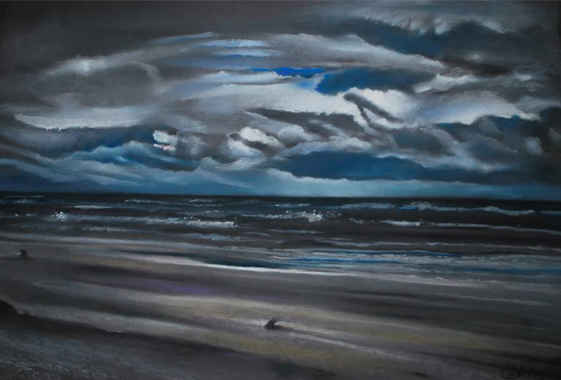
Speaking of moody, this dramatic painting by Andrzej Siewierski of roiling clouds and rolling waves certainly fits the bill. It’s called ‘Wind’ and you can feel the wind blowing wildly as well as feel the dampness of the water in the air. I like the way Andrzej has kept the colour choices limited – blues, blacks, whites, small hints of purple, and a wee bit of ochre warmth in the foreground. I also like the simplicity of the composition divided as it is between sky and water. The line of the cloud at the top swirls us around and down to the water on the right while the diagonal of the beach moves our eye back to the left side of the painting. There’s something about this piece that reminds me of the work of Lawren Harris. I couldn’t find a website for Andrzej but here’s a good article on him and his work.
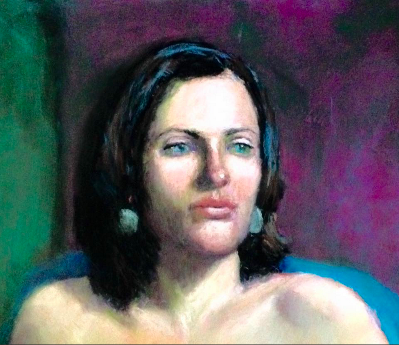
Continuing the moody theme, check out this painting by Jana Volkmer. I love the way she has repeated the blue colour in areas throughout the painting – eyes, hair, earrings, cloth-covered chair. This is a cool painting enhanced by the warmth of the voluptuous lips and other parts of the face. It’s not detailed and yet there is so much we can read into this painting. This woman looks as if she is about to speak, to give us her thoughts on something.There’s a tenseness in her shoulders. The surrounding colour seems to reinforce the feeling of unease. See more of Jana’s work on her website.
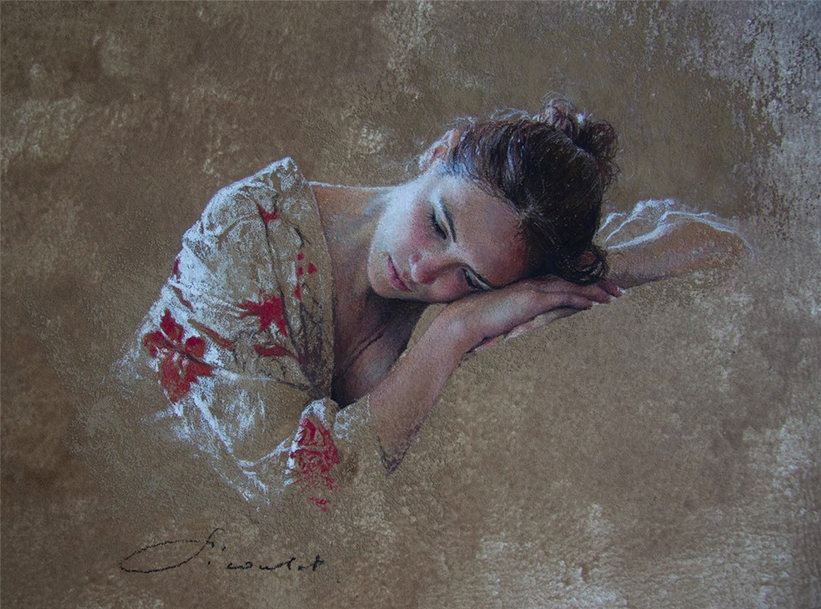
I recently discovered the work of Nathalie Picoulet. Her drawing skills are immediately evident as she renders the human figure so accurately and so sensitively. The way Nathalie vignettes her painting is unusual and distinctive as is her subdued colour palette. I like the way Nathalie hones in on what’s important – here it’s the girl’s face resting on her hands and also a part of the gown of orchid-printed material that inspired the title. Nothing else is required. We see this young woman and wonder what occupies her thoughts.
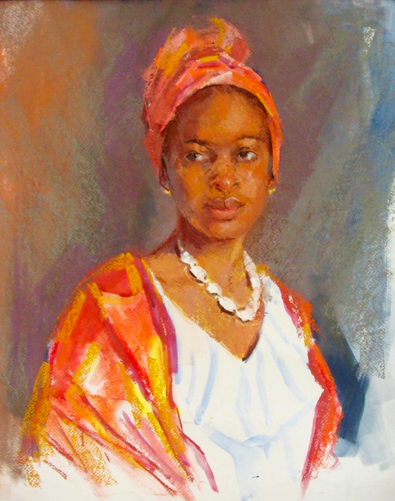
From the quiet of the last painting we move to one of warm colours and bold strokes. This is a direct and spontaneous capturing of the model yet done with a careful accuracy where it’s needed, particularly the face. I like the way Vishni has set off the pure and saturated colour on the model with a greyed yet still colourful background. Notice how the grey is repeated in the left and cooler side of the model’s face. Vishni leaves the white of the paper almost pure and repeats the white in the necklace and the eyes. Somehow the glaring white doesn’t overwhelm the painting as we keep coming back to the beautifully rendered face of the model. Lovely! Vishni doesn’t have a website but you can see more of her work here.
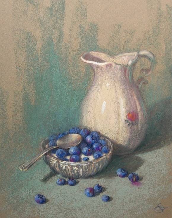
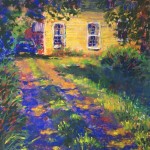
Moving from the warmth and vitality of the pastel above, we come next to Suzanne Godbout’s quiet contemplation of a pitcher with a bowl of blueberries floating in cream. There’s an elegance here that with detail and looseness, captures the solidity and sheen of ceramic, the lustre of metal, and the soft lushness of fruit. The painting has an old-fashioned sweetness that appeals to me – a reminder of the simplicity of childhood, a memory of being in my grandmother’s kitchen, a suggestion of abundance, a recollection of how good a bowl of fresh berries and cream taste. Yum! I love the way one of the blueberries has split open – you see the stain it’s produced on the cloth and the green colour inside. I could pick these blueberries up and eat them right off the paper! Read more about Suzanne and her work here.
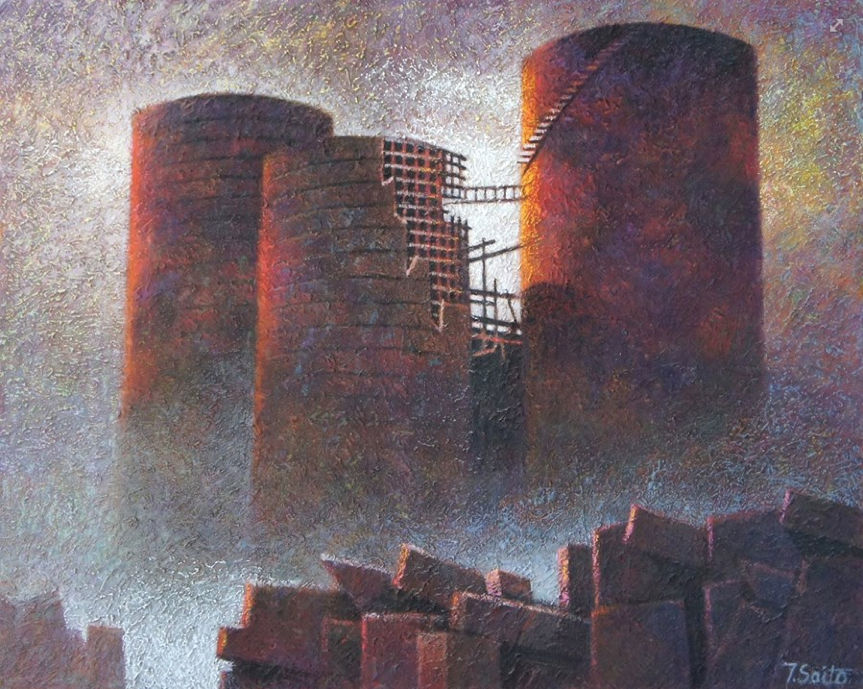
I was stopped in my tracks when I came across this unnerving, apocalyptic pastel with its heavy texture and its simple statement and uncluttered design. I was fascinated by the dichotomy of feeling I derived from the subject and from the style – one bringing a sense of doom and gloom, the other a delight in the colours and texture and light. There’s a story to be interpreted here. The low light source – the sun? – could reveal a metaphorical change – if it’s a setting sun then one of oncoming catastrophy, if rising, well then there’s hope after cataclysmic disaster. Are we to be disheartened by a chilling story or inspired by a hopeful one? Check here to see more of Tomonaga’s work.
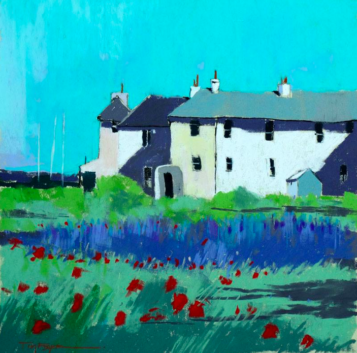
And finally, after the darkness and possible foreboding of the previous painting, I thought it would be desirable to end this blog of awesome pastels on a bright example. This one by Tim Fisher fits the bill with its cloudless turquoise sky, radiant white buildings, colourful summer grasses and flowers of greens, blues, and red. It’s so expressive of place. With it’s clean saturated colour, one can’t help but feel uplifted and joyous when looking at this pastel painting. I also like the abstract nature of its composition. See more of Tim’s work here.
And there we have it – another month of awesome pastels. I’d love to hear from you. Did any of these strike you to the core?
Until next time (when I have a nice surprise for you!),
~ Gail


6 thoughts on “August’s Awesome Pastels”
I can’t stop studying the application of pastel in the works by Gregoretti and Saito. Both paintings seem to be of catastrophic events – each equally powerful considering one is 5×7 the other
31 1/2 x 39 3/8. Curious about modeling paste on Canson paper in Saito’s piece. Interesting and varied choices, thanks as always.
Thanks Gailen. The size of a piece is so important to consider as you pointed out especially as we generally see art work the same size when viewed on screen or in books. And yes, both pieces are powerful irrespective of size! Yes, I was interested about Saito’s use of modelling paste on Canson and how the paper takes the weight.
Love this August’s pastels ! Thanks,Gail.
🙂 Thanks Sandi!
FYI, more great pieces by Andrzej Siewiersk
http://www.touchofart.eu/en/Andrzej-Siewierski/gallery/100/
Thanks for the link Laura!