
It’s time to share my pastel picks for July. As always, a difficult decision to choose just ten pastels but here they be. They’re chosen from the many delightful pastels I came across over the last month.

I was blown away when I came across this pastel by Elaine Despins. There’s so much I love about it – the figure’s expression, the colour of the background, the deceptive simplicity of the pose, the accuracy of the drawing, the subtle shifts in values and temperatures of the skin, the daring use of black clothing, the amazing depiction of the hands, the capturing of personality and pose. See more of Elaine’s work here.

Not only do I appreciate how Gail Piazza has captured the sense of this boy, I’m also delighted by the monochromatic colouring of this piece with the paper itself being used as an important element of the whole. I enjoy the simply yet so effectively shaded face with all the contours revealed in a minimal way. Also, look at the fine hatching in contrast to the more thickly applied stroke. And don’t you just love the red accents on the nose and lips? In the course of locating Gail’s website, I discovered that she is an illustrator of children’s books 🙂

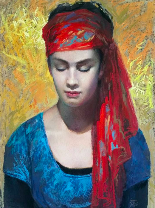
I like the close cropping of this pastel by Sylvia Laks. It, along with the contrast between the warmth of this woman’s skin and the cool colour of her clothing, make sure we focus on her face. We create a story based on what little we see, a story that is coloured by our own cultural background and bias. The painting compels us to ask questions, for instance: Is this woman upset? Or does she instead exhibit curiosity? What are her thoughts, her feelings? The subject is an individual and yet, almost iconically, she represents all women who are in the same situation. You can see more of Sylvia’s work here – you’ll be surprised when you get there 🙂
Drawn to the contemplative pose of this woman, I enjoy the way her smooth flawless pale face sits in contrast to the colourful and vigorous marks surrounding her. Leoni Duff’s skill at combining the perfectly rendered face with the more impressionistic interpretation of the clothing and background gives me great pleasure. Check out Leoni’s website for more of her work.
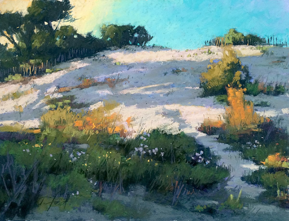
We now move to the landscape with this deceptively simple demo piece by Terri Ford. The subject is a fairly nondescript patch of land yet Terri, with her skill in composition, value, and colour, has created a pastel that excites and moves me. She effectively and masterfully moves our eyes easily around the whole. She’s unafraid to apply the pastel thickly and directly, with confidence and vigour yet with consideration. Click here to see more of Terri’s work.

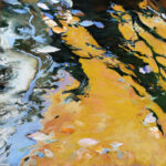
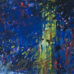
Look at this pastel by Jorge Gomez close-up and you’d be forgiven for thinking it’s an abstract. Step back and you see water that moves over hidden rocks and splashes against the outcropping. I’m fascinated by this dichotomy between what is evident from afar and what disappears and becomes much less representational at close quarters. Jorge manages to achieve an almost magical feeling with this piece. There is also that lovely feeling of imagining jumping into cool water on a hot day. Check out his facebook page for more.
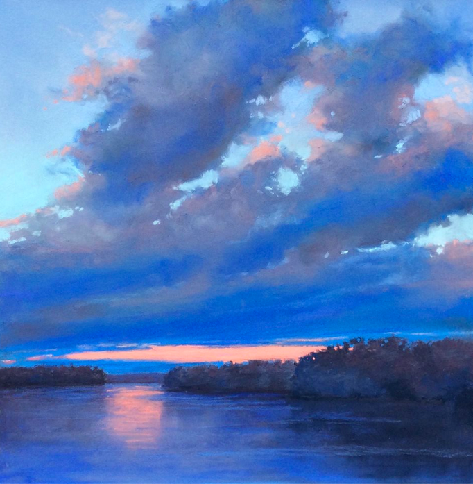
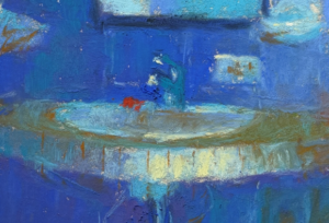
A mostly monochromatic painting in saturated blues, Michele Wells uses the pinkish accents judiciously, just enough to create that warmth that remains in the sky at the horizon and tinges the clouds after the sun has set. We are drawn deeply into the far distance only to be swept outwards, back to where we stand, as our eyes follow the clouds up and out. Such a beautiful impression of an elusive time of day. See more of Michele’s work here.

A similar time of day as Michele’s pastel yet Suzanne captures a totally different cloud effect. Rather than being swept into and then out of the painting, this time we stand still as we witness the majesty of the effects left by the setting sun and feel the peace settling in at the end of the day. There is a beautiful texturing of the water as the remaining light glints off it. I enjoy the quiet simplicity of this piece. Check out Suzanne’s website for more of her work.

I love that time of day when the sun has set but the sky is not yet fully dark and still, it’s dark enough for lights to be needed. This painting by Linee Baird certainly captures that time of day. The pastel balances out the blues of day end with the warmth of the glowing lights. The vibrancy of this southern French city at night is fully conveyed as is the dampness in the air found in a seaside metropolis. I love the expressive energy of this painting. See more of Linee’s work here.
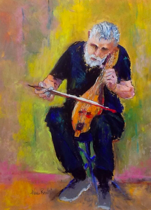
And for a complete change of pace, we have this piece by Neva Rossi. I was totally charmed by this painting – by its bright combination of colours, by the impressionistic rendering of this man engrossed in playing his stringed instrument, by the feeling it evoked in me. See more of Neva’s work by clicking here.
So what are your thoughts about this month’s pastel picks? I’d love you to leave a comment – please let me know what you think!
Thanks for being here with me on this pastel journey,
~ Gail


10 thoughts on “July’s Pastel Picks”
What an interesting assortment for July’s picks. Terrific choices for portraits each special for the very different handling of the medium. Sylvia Laks “Marriage Arranged” is very intriguing – there is certainly a story attached to that face. Studying these faces makes me want to go to the studio and try my hand at a portrait forcing me out of my comfort zone of landscape. Thanks as always for challenging by example.
This post almost was mostly portraits – there were so many splendid ones to choose from! Let me know if you do a portrait. It’s always a good thing to move out of one’s comfort zone once in awhile – it can take you places you never dreamed of!
Thank you Gail for including ‘Saint Raphael’ in your July picks! Your description is great. I’ve posted your link on my blog and facebook pages.
Thank you Linee for sharing my blog. Fabulous painting!
Gail, I am very flattered that you chose “Charles” to be one of your July pastel picks! I really enjoyed reading your comments about each one of the beautiful pieces! I will be sure to read your blog often! I also just shared it on my Facebook page!
Thanks so much Gail for sharing and reading and enjoying what I had to say. Love your piece!
I am thrilled at having my painting, Venice Violin, featured here! And in such great company, too. This is really a treat for me. Thank you for the lovely words about the painting. It is good to know that what I felt came through and was felt by someone else. Neva
As I said Neva, I was charmed by your pastel!
As usual I enjoyed this blog your choice of pictures and relative comments. You must review a good number of works prior to making a choice. Looking forward to the future. S.
Sandy I see hundreds of pastels through the month and select about 50 or so from which I make my final 10 choices. Crazy but satisfying to do. And of course I love hearing everyone’s comments!