
Oh my gosh, how did it become the end of the month so quickly? Perhaps having a couple less days has something to do with it 🙂
Right, here’s the line-up for February. I think you’ll agree there are some pastel wonders here.
Without further ado……

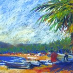
I love the simplicity of this piece. I feel as if I’m standing there among the rocks, looking out to sea, blown about by a fresh breeze. The horizon line is soft with the sea mist. I can smell the almost overpowering smell of the sea as it emanates from beached seaweed and the sand and rocks themselves. There’s so much said with a limited number of broad strokes and little fuss. Wonderful! Go see more of Jean-Yves’ work at his website.

I love the quality of light in this one. I also appreciate the simplicity of the evocative scene – a river (?) bank topped with shrubbery and an attractive clump of trees, with a backdrop of dreamy sky with the sun that’s trying to burn through the thin cloud. Haven’t you experienced just this time of day and the way the light is warm and cool all at once? You can see careful value study at work in the piece! See more of Linda’s work here.

Another painting about the quality of light. And here it’s exquisite as we move from the sun tipped-grasses back into the picture that’s mostly about snow untouched by the sun. Look at the beautiful display of grayed colours beyond the warmth of the sun. Go check out more of Kim’s beautiful descriptions of light on her website.

Like Jean-Yves above, Lorenzo uses broad strokes to achieve this sunlight wonder. Can’t you just sense that taking just a few steps more and the sun will be blazing in your eyes. This piece positively glows. And he does it so simply! Look closely at the few marks he makes to achieve this light wonder. Notice too the balance between the warm and cool sides of the painting. You can see more of Lorenzo’s work by clicking here.

Can’t you just reach out and stroke that fur? And those eyes, they’ll blink any minute. And can I hear purring or rather, is it a meow that’s about to be heard? I was completely taken by this painting. One of the things I appreciate is that although the cat looks real, Heather hasn’t gone into super-realism to do so – we can still see the hand of the artist in the pastel stroke. Heather is known for her cat portraits and I can see why! Go see more cats as well as dogs and more here.

I laughed when I saw Suzi’s charming portrait of a giraffe. I love that she has taken this quirky animal and captured the character of its munching head. it brings into focus what a giraffe head really looks like. The wall tempers the delight as this isn’t the wild but probably a zoo. The close proximity of the wall to the giraffe could be making a statement. The lines of bricks form a cage and yet, they also mimic, in a way, the spots of the giraffe. There is a play of the rigidity of man against the flexibility of nature. When I first saw this painting, I read none of this into it but the more I looked, the more I saw. Perhaps this is a case of a viewer bringing her own experience to the picture. Go see more of Suzi’s work at her website.

Canson paper? Really??? How does Robin create this kind of pastel on Canson and not on a sanded paper? I am rather in awe. I love how the line of mosaic echoes the embroidery on the young woman’s blouse. I also like the link between angelic girl and mosaic angel who seems about to whisper creative musings in the young woman’s ear. I was torn between this painting and the one on the front of Robin’s website but I think it was the juxtaposition of modern and Byzantine that captured my attention in this one.

I’ve been an admirer of Jody’s work ever since I saw it in Carole Katchen’s book, Creative Painting With Pastel many years ago. Things I appreciate: the thick impasto quality of the pastel – there’s a lusciousness to it; the balance between the narrative and the abstract design; the emphasis on shapes; the broadness of stroke – you can see the mark of the artist; the extreme value range; the way Jody leaves out so much, including instead, only what’s necessary to say what she has to say. Go see more of her work here.

From the abstracted design above to this one of a pile up of houses in the Ardeche. This is such a difficult subject, all the various perspectives, all identically constructed houses yet with different shapes. How to make the scene fascinating rather than a boring repetition of similar houses? Claude has done that beautifully and boldly. The warmth of colour, the pattern of light and shadow, Claude’s obvious love of the subject, lifts my spirit. See more of Claude’s work on his website.

How fun is this?? A tulip lover, I was drawn to this piece by the unexpected and unusual portrayal of this flower. There’s also a mystery – what is the red shape to the right that also hovers over the tulips? I am mesmorized by the combination of red and blue colours and the variation within. The pastel marks excite me. I also like the flow back and forth between positive and negative shapes and the dissolution in places between the two. Searching for a website, I came across a number of places to see Bernadette’s artwork but no personal website. Try this website to begin.
As always, it’s a pleasure to bring you this collection of pastels, some from artists more well known, others from artists I’d never come across before. Curiously, three of this month’s artists are from France!
Please let me know what you think about these pastel wonders. Did any surprise you? Delight you? Sadden you? Please leave a comment! 🙂
And if you like what you see, please share!
Until next time,
~ Gail


14 thoughts on “Be inspired!! February’s Pastel Wonders”
Love your choices as always. The Mutti and Calvin speak to me in particular. Can’t wait for your March picks!
Thanks Maggie! I look forward to seeing what March will bring too 🙂
My favourite is Claude Carvin’s landscape. There are diagonals in it pointing toward the centre (bottom left; also a subtler one above, left to right, across the roofs; two on the right through the trees) that point to nothing specific but give the painting a motion that would otherwise not be there among, essentially, squares and blobs. I just love all those angles, broken up by the trees and rocks.
I also like the impressionistic rocks in the painting at the top. I tend to try to put in too much detail in my own pastel work (I’m much more confident with graphite and charcoal), and can’t strike a happy medium in pastels between that and just staying loose and devil-may-care.
Thanks for commenting Stephen. And so interesting your analysis of Claude Carvin’s painting. It’s a pretty fabulous painting isn’t it? And I agree about the rocks in Jean-Yves Marrec’s painting. I keep looking at it and am amazed at so clearly I can ‘read’ rocks and yet how little is in the painting to give me that information. Much to learn from these paintings!
Thank you Gail for sending and sharing beautiful pastel paintings. Claude Carvin’s Balazuc en Ardeche made me catch my breath. So beautiful and he inspires me to keep trying to paint similar scenes. Wendy
You are most welcome. I know what you mean about Claude Carvin’s work! I think that’s why I left it for near the end 🙂 I am glad it’s inspiring you. Keep painting Wendy!
What a delicious selection of pastel paintings! They are all beautiful and the handling and colour in each of the landscapes quite wonderful! The portrait, Veni Creator Spiritus, is great and the background is so interesting and such a clever concept.
Thank you Gail for all your research and discussion on each pastel.
M.
It’s such fun to go through all the work I collect. Not so fun to have to choose only 10 but that’s my self-imposed limit. Glad you are enjoying them 🙂
My Red Tulips are honored by your comments………….Thank you!
My pleasure Bernadette 🙂
Thank you Gail for another month of thought provoking work from a wonderful line-up of artists. Jody dePew McLeane’s pastel sent me straight to her website, I had to see more. Her work transported me back to Paris in the 60’s. The little dress shops, the beautiful patisserie cakes, the waiters in black with white aprons… The faces of the models reminiscent of an Edith Piaf song. Thank you for introducing me to her work. She is a true original, a confident master and her work inspires me.
Gailen Lovett
I am so glad to have brought you an artist that was both new and has inspired you so deeply. You describe the effect of her work on you so beautifully. Thank you!!!
Excellent choice Gail.
Robin’s painting is quite amazing.
Kind regards
Colin
Glad you appreciated the choices Colin. Robin’s work is, as you say, pretty amazing. Thanks for writing.