
Here we are well into February! I’ve just finished launching my new online-course – Pastels 101- over the last week hence the delay in getting to March’s startling pastels. But here they are so let’s get right into it.

I was first mesmerized by the colours of this piece – the gradual drift diagonally from light greens to dark and saturated blue. These simple colour choices show how effective an analogous scheme can be.
We see one small section of a lake or pond as if seen through a viewfinder. The artist shows us a world that we may pass by without ever really seeing it. No flowers or bright zing of colour stand out to catch our eye. Yet there is such beauty here! And that’s what our job as artists is to do – to reveal the world as we perceive it so that something so ordinary can be looked at in awe and preserved for all to see. Such a simple scene of lily pads and water but it speaks to the glory of nature in every square inch. It’s a place for quiet contemplation, for dreaming and hoping and whispering our happiness to the world.
The work is realistically rendered yet there is an abstract structure seen in the diagonal division, the deliberate graduation of colour, and the way the big shapes (lily pads and water) are designed. Enter the painting more fully and then you can see the detail – the water droplets on the leaves, the insect life, the complex reflections of trees and sky revealing the world above us, and even hints of what lies below the surface of the water.
And I personally am amazed to see this done on Canson Mi-Teintes paper – what texture, vibrant colour and detail!
See more of Janet Johnson’s work here.

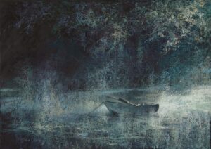
From that quiet place above, we arrive here, at this small place on the earth where water breaks over the edge of rock and falls downward, bumping crashing and discovering its relentless path onward. Nothing can stop it. It even appears to spill beyond the painting’s edge. I can hear the water, feel the escaping and bouncing droplets against my skin, smell that scent that only a place with fresh rapidly moving water has.
The rocks are rendered exquisitely – solid with cracks and crevasses, yet in an angled position set from geological upheavals and worn from the years of water rushing over them. And yet at the same time, the painting is truly an impression of nature. Look closely and all you see is pigment brushed over roughly textured paper. Pull back and all resolves into a recognizable scene. Go back and forth between the reality of the scene and the reality of the painting surface of texture and pigment and you’ll have a dizzying experience!
The blues and greens make room for the yellows and warm browns of stone, the deep blacks of spaces unseen. The painting is divided into two-thirds given over to the water and stone while the upper third contains the sensation of sky and vegetation.
Although there’s no sign of human life, we ourselves intrude as we gaze upon this powerful corner of nature. I want to stand on my toes or clamber up the rocks and see what lies beyond and yet too, I’m content to be hypnotized by this continuous flow of water dropping through the gash in the rock.
Regrettably, I could find no web presence for Stan Bloomfield. I hope I am incorrect about this.
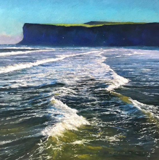
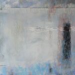
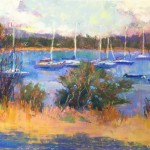
This is an unusual view of waves. More often we see them rolling towards us and onto shore, backlight illuminating the colour of their interior as the begin to roll. Instead, we are just above the water (or standing in it) looking along the line of surf that stretches away from us. The waves are perpendicular to the paper’s bottom edge rather than parallel with it. I feel as if I’m sitting in a boat – a sailboat or a rowboat? We aren’t close enough to the surface of the water to be sitting on a paddle board but we could be standing on one.
The different viewpoint certainly caught my attention. But it wasn’t only this that stopped me. I was pulled in by that olive green in the water, by the echoing strip of sunlit green atop the cliff, by the purples and deepest of blues on the cliff face itself (lighter at the bottom where the surf spray veils the land slightly), by the turquoise of the sky that takes your breath away, and by the pale mauve seen in the clouds sitting on the horizon and drifting across the water in the distance. And can you hear the call of the gulls in the far distance? Can you see their white specks breaking up the velvety background of the far-off cliffs? This is a place I want to linger!
Like the piece above, this one has been designed in thirds, with the top third all about the sky and land and the other two-thirds telling us the story of the water around us. The dark and dense horizontal block of cliff grounds the painting while the space in front is alive with the movement of the sea and all dressed in creamy frills and the laciness of foamy threads.
Check out more of Gareth Jones’s work on his website.
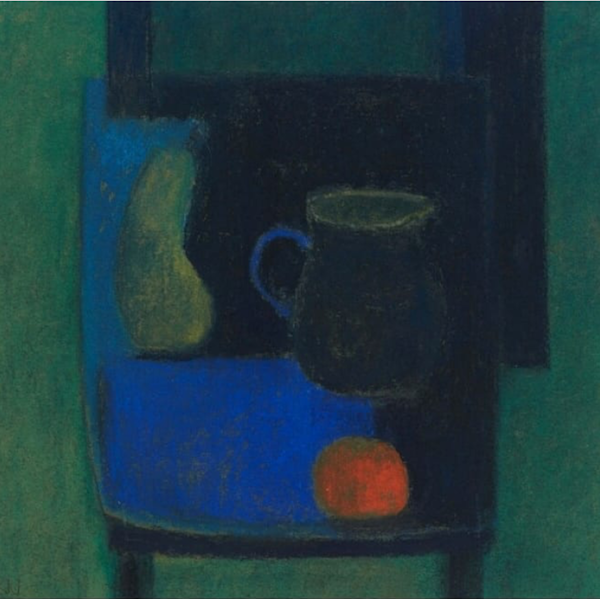
From the square of wind and waves and outdoors above we come to this quiet, low-key interior with a gentle yet strict arrangement of a still-life where each shape is considered as it relates to the next shape. It’s a simple arrangement of objects – pear, jug, and tangerine – on a blue chair. The perspective is skewed with the seat of the chair raised as if we are looking down at it while the objects sit as if we are looking at them almost at eye level. I love this play of things in space – confounding our expectation of how things should be and how we consider and perceive them in the real world. The piece is very much about how objects form shapes that relate to each other in our three-dimensional space on then on the two-dimensional surface. The design of colour and form, of value and edge, of receding and advancing shapes, becomes more important and relevant than a realistic depiction of the subject.
A dark and mostly low chroma painting, a split-complementary colour scheme of blues and greens with red/orange is balanced by a hearty dousing of black. The saturated blue and orange really pop and catch our eye against the sombre colouring of the piece. I’m intrigued that the artist can get away with placing the high chroma tangerine so close to the base of the painting. Look and you’ll find that there’s enough density and darkness above it to keep it attached to the rest of the objects and prevent it falling out of the painting. The lines of black framing it on the right and bottom also serve to contain this ball of fire popping off the surface of the painting.
The hardest edges in the painting come from the effect of the light source from the right – where the chair edges on the right (seat and legs) meet the negative space beside them, and where both fruits on the lit side encounter the darkness to their right. A compelling piece.
Check out more of Robin Warnes’ work here.

Who can help but be drawn to capture the glorious colour of daffodils – such harbingers of spring! Here we have an impressionistic and loose yet accurate depiction of the structure of these flower heads that are notoriously tricky to get just right. The front flower tells us what we need to know and then in our minds, we create the remaining flowers that aren’t as specifically painted.
What I found most appealing about this painting is its unexpected darkness. Most often, flowers such as these are painted in a buoyant light, often in a high key range, and made to look as pretty as they are. I don’t think you can apply the word “pretty “ to this dramatic painting. There’s a kind of eeriness about the dark and deliberate shadows. I find this refreshing and intriguing.
The low saturation of all the other colours in the painting show off the intense yellow of the daffodils. We can’t help but notice them. A greater proportion of the painting is in dark and middle values which again, supports and shows off the light colour of the flowers. Adding to the gutsiness of this painting are the vigorous slashes on pastel sideswiped across the paper. There’s no pussyfooting around here! The arrangement is held tight within the frame yet there’s a feeling of the flowers reaching outward to escape the constraint of the painting’s borders.
Click here to see more of Stephanie Cohen Mouw’s work.

With eyes wide open and lips slightly parted, this woman appears to have a startled expression. This begs the question: Why? Why is she startled? What or who has startled her? Her hair looks in slight disarray as if hurriedly scooped up and pinned. Her shirt also has a somewhat dishevelled look.
The paleness of her skin glows against the middle value, low-intensity background while her green eyes electrify us with their gaze as they sit in the centre of this mostly neutral-coloured painting. Although the striking contrast of black and white stripes in the shirt means that her clothing is the area of greatest contrast and so may fight for dominion over the face, the eyes prove that the strength of the painting is there. There is nothing else that dominates as they do. They pull us in as they look out at us. From the eyes, we are drawn down the nose to the mouth which appears to be about to utter some reaction to whatever has surprised this woman.
The paper looks like Canson Mi-Teintes and if it is, the artist has used it to best advantage. The smooth blended surface of the skin contrasts with the rougher texture of hair and stripes of the shirt where the paper is allowed to peek through.
The hair is expressed deftly with side strokes and a few lines, just enough for us to understand the way its pulled up behind with many escaping hairs. I love the softened edges on the right lower side pushing the hair back and keeping our attention on the face.
There’s a sense of warmth that comes through both from the model and in the artist’s response to the model. You can see more of Lesley Doyle’s work here.
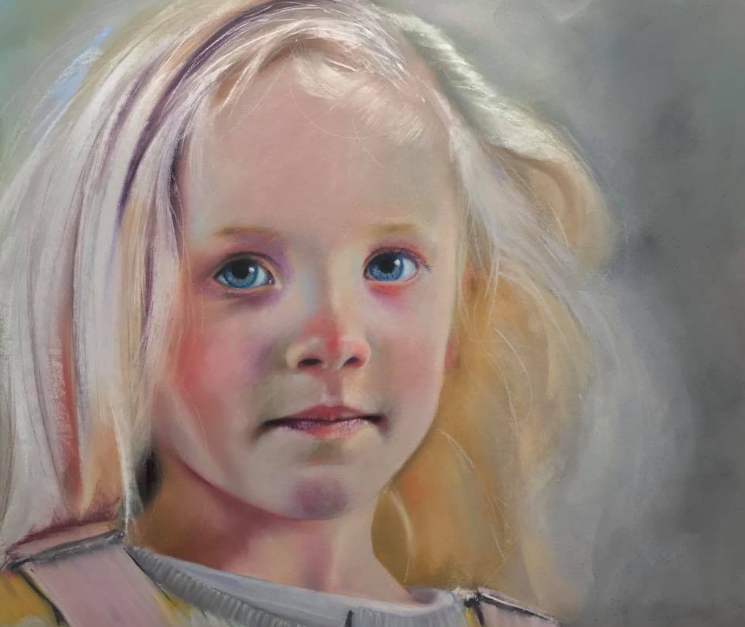
This portrait of a girl has an etherial, almost other worldly air. There’s an angelic quality of light around her head – light flits off threads of white gold. And isn’t this the way we think of children when they are still young enough to believe in the goodness of the world? There’s an overall impression of innocence yet we also sense the intensity and wisdom of an old soul deep within, one that gazes out at us through her eyes.
The painting uses light “pastel” colours yet avoids feeling pretty. The addition of greens in the skin helps counterbalance any sweetness. As do some of the purples, for example, the streak of shadow beneath her blonde hair gleaming white in the sun. The same goes for the greys around her, a colour that speaks of the storms and trials of real life to come as do the hard lines of her barely visible clothing. But for now, this child can be secure in her youth and guilelessness.
Her unblinking eyes look out at us. Do we read trust or wariness? Questions? A slight sadness? A recognition of life ahead? Her mouth purses slightly, creating dark shadows at either end. Is this from displeasure at being requested to pose as a model (whether for photo or painting)? Certainly in this moment, a story is revealed. What’s happening? What is she thinking (for certainly she is with thoughts)? What’s her relationship with the artist? What’s her relationship with us? Neil Condron captures a fleeting expression and leaves it to us, the viewer, to read what is conveyed there.
Check Condron’s website for more work.

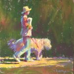
The quiet softness of the previous picture erupts here into the full-on energy of life! Again a child looks out at us directly but this time there’s confidence, pride, and a vibration of joy.
This child glistens with water as if he’s just emerged from the pool. We can see the drips and also the sparkle of light against the slick skin. He asks if we have seen him swim or do a backflip, or dive off the high board. His expression requests confirmation and affirmation that’s so typical and perfectly captured. I smile every time I look at this piece both because I recognize this characteristic behaviour and because of the execution. I know I can just reach out and feel the life flow, the cool wetness of skin, the hard plastic of the goggles. I just want to pinch (like a dreaded aunt!) those ginning cheeks.
The hard lines and flat shapes behind the realistically shown head add another dimension. Rather than paint a background of location, we have a simple framing of the head. The graphic shape suggests a manmade context of pavement and wall at a pool for example rather than the natural edges of nature (a pond for instance). The dark in the upper portion of the painting blends with the dark values of the hair and echoes the darks of the shirt in the lower part. Between these two bands live the centre portion of the light/middle values of skin and mauve background. Light shows on one side of the face, the straps of the goggles, and the circle of yellow around the boy’s shirt, all of which serve to circle and frame the face. The tight crop too puts all the attention on the facial features.
You can see more of Lynn Simon’s work here.

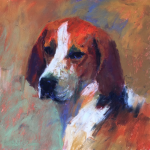
Bam, I was stopped in my tracks when I saw this painting! The bright orange colour and splash of pink were the prime reason but it was also the sparkle in the dog’s eye. On further consideration, I fell for the dog’s expression as it turns away from us, distracted by something off camera. If you’ve ever had a chance to encounter a Great Dane, you recognize that almost coy, self-conscious, or apologetic look!
The dog’s body is hardly there but that doesn’t matter. What is there gives us context and serves to keep our eye on the main attraction, namely, the face. Let’s explore shall we? There’s that scumble of blue grey over the muzzle to create and emphasize the box shape of the structure. The edge of the muzzle is the lightest part of the painting and is indeed exaggerated by the neighbouring dark shape (of the body) next to it. The end of that dark shape curves to the left (reinforced by the slash of pale blue grey below it) which encourages us to investigate these nether regions. We notice the spare yet varied depiction of the dog’s legs. From there we encounter that unexpected pop of pink and return to the dog’s head. And here we examine shape and edge and depth of forehead before once again returning to that intense shot of orange in the eye and that point of reflected light. Delicious!!
There’s a contemporary feel to this painting in colour and application of pastel. Also, let me bring your attention to the size of the piece!
Check out Jory Mason’s website for more paintings.
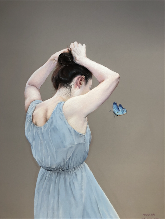
This is a favourite subject of mine to paint – a woman turned away from the viewer, hands working in her hair. She appears so caught up in her own actions and thoughts that she fails to notice the viewer. Although our contemplation of the figure is harmless, there enters a slight feeling of voyeurism.
The delicate cool colours of pale grey-blue and whites creating skin and dress are counteracted by the warm coloured background. The background itself appears untouched by pastel (but I am unsure of this as there appears to be a subtle gradation of light in the background – slightly darker at the top). Yet the faintest hints of pentimenti mar its perfection. Anyone who follows me, however, knows how much I revel in these marks of initial drawing! The hand and mind and heart of the artist is revealed in these few lines as the artist finds his way around, settling in on the placement and expression of what he is painting. You can see these lines (charcoal?) faintly along the sides of the dress. These, for me, are a visible reminder of the process of creation.
The dress is exquisitely rendered; ever crease, crinkle, and gathering is shown in the simple shift. The skin glows with life and even as light as it is, you can sense the blood, the muscle, the bone beneath the surface. So too is the hair painted with care and attention; a single dark mass with escaping hairs that stand out against the light skin and background. Notoriously difficult to render, the artist has successfully painted her hands in their awkward position.
The inclusion of the butterfly adds a strange mysteriousness to the piece. It calls into question the context (none of which is shown), the reality, the reasoning behind the painting. It brings up more questions than it offers to answer. A butterfly represents so many things one of which is the ephemeral nature of being, that we are always changing. It also reminds us of strength in something that appears (and is in some ways) fragile. Being blue, we can regard the exquisite creature as symbolizing the young woman.
Shockingly, I could locate no web presence for this artist. I hope I am proved wrong.
~~~~~
And that’s it for this month’s roundup of startling pastels! Do you have any favourites? If so, be sure to comment and tell us what they are and why you find them startling.
Until next time,
~ Gail


10 thoughts on “Startling Pastels From March”
Another round of amazing artists! I loved the canyon and beach paintings, as well as the children’s portraits. I especially liked Tying Hair. Impeccable posture for the action depicted, showing the strain of the body inside a beautiful delicate dress. She’s in perfect harmony with the butterfly. Just lovely.
So glad you liked them Ruth! Yes, the pull of the body beneath the dress and skin is something isn’t it?! And what to make of that butterfly?
I had to laugh. I just finished a dog portrait that I posted on How To Pastel. A few people said that the background was too bright and distracting. Then, I came across this painting with the brilliant orange and loved it right away. This dog also had a brilliant yellow/orange eye. I bow to the wonderful technique here, however. I love the looseness of the strokes. “Less is More” for dog portraits is an entirely new concept for me, but I’ll study it. Many thanks for picking this one.
Oh that IS good timing Andrea!
Less is more is always the most difficult thing to achieve. Looks easy when someone else does it, not so easy when we try to do it!
Thank you so much Gail for my inclusion amongst such an accomplished selection of work, I am truly delighted! Your observations are so insightful and thoughtful. The unusual angle was courtesy of a vantage point from a pier at Saltburn, N Yorks UK.
A pier! That possibility didn’t cross my mind. It’s such a beautiful piece Garath as so much of your work is. And anything to encourage you to get back to painting 🙂
Glad you enjoyed what I had to say – always a bit of a risk!
If a few of these artists have no web presence, where are you finding these pictures of their work? Instagram?
Yes Gretchen and Facebook groups. Many are posted by the individual but others are posted by pastel groups. Once I decide I want to write about a piece, I go looking for a website so I can direct readers to more of an artist’s work.
What an education I am getting here. You explain so well the richness of each piece. These are my favorites too. Thank you for taking the time to enlighten the audience and honor the artist. Another great job !
Thank you so much for your kind words Susan. It’s music to my ears to hear you’re getting an education. That’s one of my missions with this blog. I wish to highlight the work of others (there are so many amazing artists in pastels out there!) as well as educate by illustrating ideas with my own work. Educate and inspire are my mottos for HowToPastel!