
There’s a pastel painting I’ve always loved – it’s Édouard Manet’s “George Moore”.
I was reminded of it today when, searching my book shelf for something else, I came across a book, Édouard Manet Pastels by John Rewald published in 1947. This book is particularly special to me as it first belonged to my grandfather Newton Brett and was then passed on to my Mum, Joanne Sibley. The thing is, it also survived the devastation of sea and sand in Hurricane Ivan. My Mum’s note when she gave it to me for Christmas a number of years ago said, “Another ‘Ivan’ escapee – almost. I am sure Dad would love to know that you are now enjoying it.” Like I said, very special!
I’ve been wanting to do another ‘Close Look’ blog and as far as I was concerned, this was a sign to do it today! It was difficult to decide which of Édouard Manet’s pastels to choose – there are so many luscious ones of women! – but in the end, I chose this one of George Moore, executed in one sitting.

Don’t you just LOVE this?! Certainly a different reaction than when it was first exhibited in 1880. According to the Metropolitan of Museum of Art’s notes, critics ridiculed it, calling it “Le Noyé repêché” (the drowned man fished out of the water).
It seems that Édouard Manet (1832-1883) didn’t start using pastels until his forties. His first appears to have been “Madame Manet on a Sofa” done in 1874 and now at the Musée d’Orsay. Most of his pastels were done in the late 1870’s and early 1880’s until his death in 1883.
Edgar Degas was of course using pastels at this time but his pastels have more the feelings of drawings – you can tell he worked with the tip of the pastel in the hatching. Manet’s pastels on the other hand have the feeling of paintings, as if they were painted with a brush in oils. And look, this one is done on canvas, which makes it look even more painterly.
By the way, the Met Museum’s notes say that George Moore liked the pastel so much he used it as the frontispiece for his book Modern Painting (1893), noting that as “a fresh-complexioned, fair-haired young man, the type most suitable to Manet’s palette, [the artist] at once asked [him] to sit.”
Now let’s have a closer look at the painting of George Moore, Irish critic and novelist.

Let’s start at the top of the head. Now, don’t tell me you didn’t think you were looking at brushstrokes. Even when I know it’s pastel, I think oil paint! Manet makes his mark and then doesn’t fuss. He paints in shapes – not a single hair is individually shown yet we know what we are looking at are strands of hair. Manet sweeps the background slightly over the outline of the head in places – especially on the right – thereby softening the edge which makes it recede (see this in the detailed image below). He makes a few smudged dashes for the eyebrows using some of the colours of the hair.
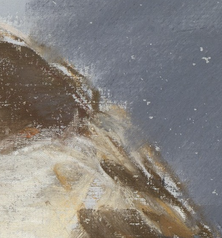

Oh. My. Gosh. The eyes!! You could write a whole blog post about just this! You can imagine Manet looking, seeing, and then making his strokes. Much of the canvas is left bare which acts as the cool area playing off the warm pastels of creams and yellows. The eyes are there but with so little to describe them. If I painted them like that, I’d be in there correcting, trying to make them as perfect as I could. But Manet doesn’t worry about that at all! What’s there is enough. Look at that reddish line for the eye on the left – that says something with so little about Moore’s state don’t you think?

Ahhh the nose. Noses can look flat or awkward but not here. With so little colour or value change and so few marks, Manet convinces us of the volume and structure of George Moore’s nose.

And now we come to the ear. When you first see the portrait you don’t notice that dashed-on red line. And then you look closely and there it is, plain as day. Manet uses the red as shadows but rather than use one of the brown pastels, he introduces this colour. It’s only seen here, possibly on the opposing side of the face, and in the shadowed part of the lips. I can see Manet spontaneously picking up the red to paint what he sees.

That mouth, pursed as if about to express some thought, some opinion, some off-hand remark. Manet uses three reds – light (the highlight), middle (the main part of the lips), and dark (the underside of the top lip and possibly part of the interior of the mouth as the lips begin to part). And look at that curved stroke that quickly defines the top of the lip. So little to say sooooo much! This so clearly shows Manet’s precise observation.

And now let’s look at the beard, that ragingly orange beard! Don’t those pastel marks look like dry oil brushstrokes?! And look at how much canvas is left bare. I’d be in a rush to cover all those light spots but they give the idea of skin or shirt below the beard and/or light glinting off it. Such bravado in capturing the scruffiness of this beard. So seemly effortless!

The cravat, a place to get lost in the details of stripes, and folds. But not Manet, oh no. He grasps the design and then slashes on the pastel in brush-like strokes of blues, greys and red. Such confidence! You can feel the silkiness of the fabric and sense the pattern.
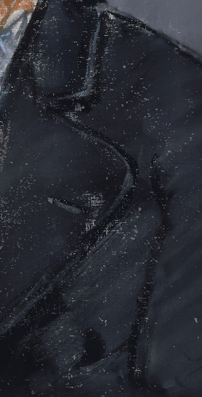
Speaking of fabric, look at how little Manet does to define George Moore’s jacket. He first applied the black and in a barely lighter colour, added a slight sheen to the right side as well as details like buttonhole and collar edging.

This image is just to point out the ways Manet deals with the shoulder edges – hard on the right (nearer and coming towards us), soft on the left (further away from us and receding).

And did you spot the signature? It’s there but not in your face. It appears as writing on what may be the spine of a book. Appropriate considering George Moore was an author and wrote many books!
Look at the painting again. What I find amazing is that the overall feeling is one of colour, dominated by orange. And yet when you look at the piece it’s mainly blacks and greys. This shows the power of contrast – the orange defies the dominance of the neutrals and shines brightly. So brightly that that’s what we remember about the colour of the painting.
Note too the way Manet changes the value of the background – darker on the right, lighter on the left. This not only affects the way the head shows up against it (sharp contrast on the left, less so on the right) but also adds to the sense of movement in this piece. Nothing is static, not the lips, not the hair, not the eyes, and not even the background.

A quick look at the pastel painting in black and white just because you know I’m big on values! You can see how monochromatic Manet’s work is when you compare this version with the colour version above. It’s really only the face and beard that show colour.
George Moore, who was painted in oil and pastels by Manet, was quoted in John Rewald’s book pp37-38 (without sources mentioned – they didn’t seem to think this was important years ago). George Moore reported on the way Manet executed his paintings, and as Rewald says, this could apply to his pastel paintings as well as his oils:
“Strictly speaking, he had no method, painting for him was a pure instinct…there was no trick; he merely painted. He did not prepare his palette; his colour did not exist on his palette before he put it on canvas, but working under immediate dictation of his eye, he snatched the tints instinctively, without premeditation. Ah! that marvellous hand, those thick fingers holding the brush so firmly – somewhat heavily; how malleable, how obedient that most rebellious material, oil-colour, was to his touch. He did with it what he liked…”
I think that’s it!
One thing I’d like to say before ending is that, for me, this painting and my reaction to it is a reminder that it is possible for a portrait to reach beyond time and place by virtue of its own energy, its own marks of colour, its own design. Here’s a portrait with a freshness and spontaneity of expression that goes beyond the mere representation of George Moore. It speaks more about an artist’s vision, and attracts us to it, decades later, despite knowing little about or having much interest in the subject.
I’d LOVE to hear from you. Did you learn anything from looking more closely at Manet’s portrait of George Moore?
Until next time,
~ Gail
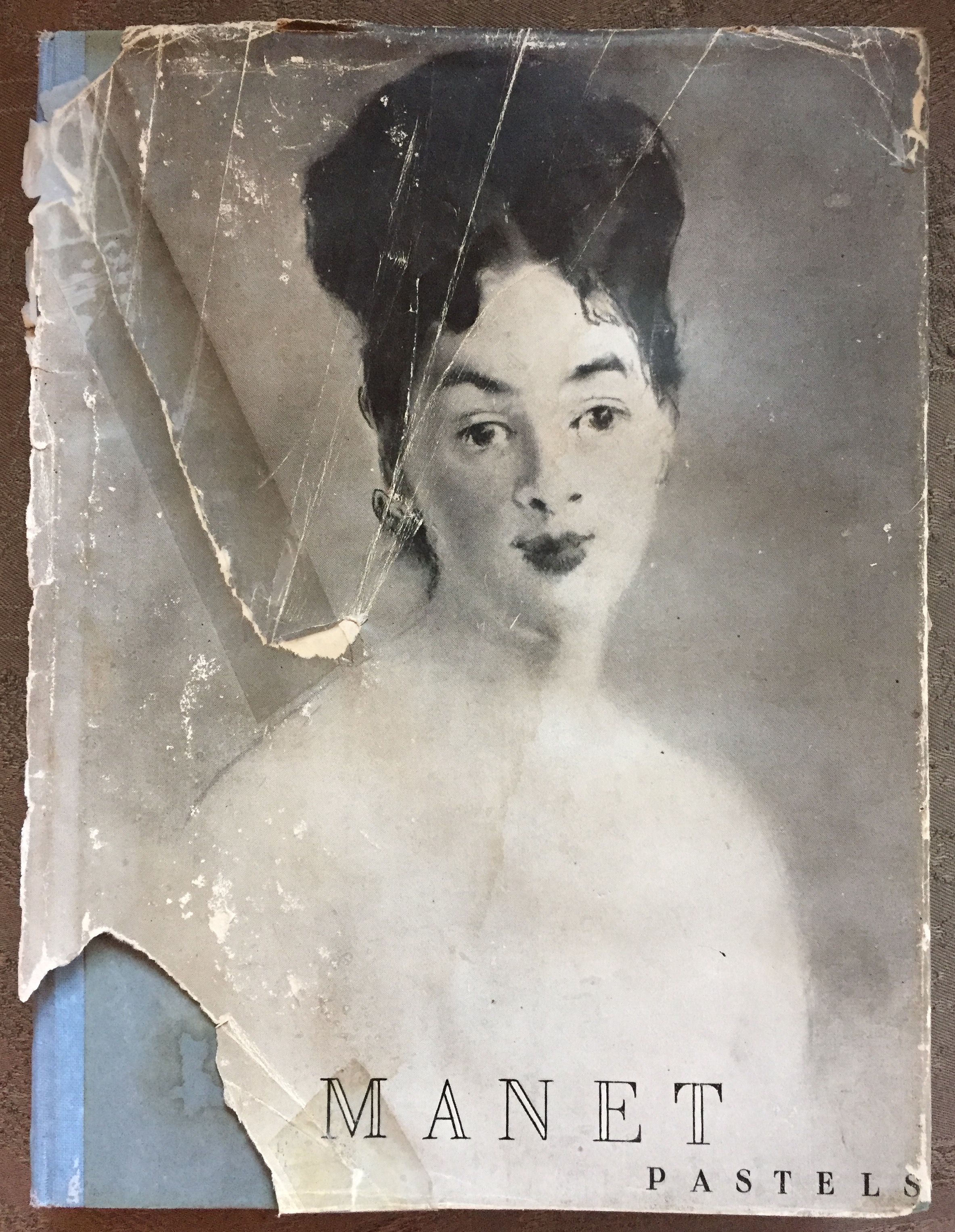
And in case you’re interested, it is available via Amazon. More a collectors item than anything because all images except first one (which happens to be “George Moore”) are in black and white. The text is interesting but some info may be dated.


46 thoughts on “Édouard Manet’s Pastel Painting – “George Moore” – Audacious And Enduring”
As always, I love to read your thoughts. This was a great Pastel piece to show so many aspects that we try to capture. Hard and soft edges,, values just right, and saying much with few strokes. What can I say? Gail Sibley is brilliant! Thanks so much for sharing your thoughts, skills and training to help us all reach higher.
Awwww Sally thank you. Such a reward after spending the time on it!!!
Hi Gail – thank you for sharing your thoughts on the Manet pastel, Learned so much from the close ups – lots of food for thought there!
Thanks Penny! I just love close-ups as there is sooooo much to learn when you look more closely!
A visual feast! Thank you sharing this incredible painting. I really enjoy reading your observations…this one could easily be studied for hours!!
So glad you enjoyed seeing it Lyn. And yes….hours! When I get to New York (one of these days!!) it’ll be one of the paintings I’ll be looking for at the Met!
Thanks for the opportunity to see this painting through your eyes. You see so much that otherwise would just go right by me. In school it never occurred to me that studying the masters could make me a better painter; it was only about knowing who painted what, in order to pass a test. In other words, that was poverty, while your blog is a source of great riches.
Ruth your words make me so happy. Thank you so much!!
Thank you, Gail. What a great breakdown of the painting and what makes it a painting.
You are so welcome Teri. I do love doing these close looks!
Gail, I really appreciate the close-ups and how you discuss the specific parts Manet masterfully rendered. Thank you so much.
Thanks Barbara 🙂 It’s amazing what we can learn from the masters if we take the time to slow down and examine!
I agree with the other comments that your discussion of this pastel pointed out a lot of useful information. But I think the most interesting part you included was the description by George Moore of Manet’s techniques – that being that he didn’t have any. Isn’t that intriguing? Imagine just picking up the pastels and going at it on instinct and by intuition – doesn’t that sound like so much fun? 🙂
I’m wondering if the back arm is thrown over the back of a chair and that’s where Manet’s signature is. Just a thought…
Thanks Gail – a wonderful pastel painting to explore.
I know, Debbie, I just loved that description which is why I had to include it! The thing is, the more we work, the more we just ‘know’ what pastel to pick up and with Manet’s experience, it became natural for him. Love hearing Moore’s non-visual artist’s view!
And yes, I think you are right about the chair. I had thought that but then couldn’t see it and then thought about books. But yes, looking at it now, that seems more plausible. Thanks!
Thank you. Your words painted a whole new picture of Manet for me. I would have never gotten so much out of it by looking at it myself. You’re so good with words. Thanks again!
Cindy thank you for your kind words. Seeing more deeply is what I want everyone to do so I’m glad this opened up Manet’s painting to you.
Ah, Gail, i am writing from moscow/Russia and i am sòoooooooooooo happy to have come along your site on the internet quite accidentaly. As Sally Ayers wrote – you are brilliant! U cannot imagine what a treat for me to read your intelligent and indepth pieces of artguides! I started pastel drawing quite unexpectedly after 2 big life trials and its what made me survive and continue enjoying life. And also knowing such brilliant professionals and experts as yourself is happiness. Thank you for your great work of educating peole and enlarging their horizons. Besides being a great pastelist, art critic and teacher you are also such a wonderful person! Thank u very much!
Marina thank you so much for your enthusiasm and very kind words – enough to make me blush! It’s so rewarding for me to know I’m reaching people like to over the world and helping in a positive and effective way. Truly makes me happy!!
Thanks Gail! Shame on me- when thinking “pastel”, it was Degas who came to mind, never Manet! And on canvas yet! I love your analysis, attracting our attention to aspects I certainly would have have skipped. I hope you will have time to do more of these, they are so instructive.
Again, thank you.
Nancy
Hah hah Nancy – I think that’s true of us all! Degas is kind of the king in the 19th century/early 20thcentury world of pastels!
Glad you enjoyed the post and want more – which is just what I like to hear since I so enjoy doing these close looks 🙂
Have you thought about publishing your critiques and analyses of different painting styles, because you are quite good. I learn a lot through your eye and words. I never would have understood this painting at all just by standing in front of it, although I want to, now!
Marsha, there’s a thought! I wonder how a book could happen and if there would be interest in it? Thanks for thinking it would be a good idea.
So happy to hear I opened your eyes to this pastel! Yes, to stand in font of it would be something special!
Love, love, love this post! I always look forward to the things you share but this one spoke to me at an even deeper level. Thank you so much for all you do. Keep up the good work. You, and what you do, are most appreciated!
Thanks Gaye!! Your words make the effort all worth it!
Thank you for this Gail (and all the time you put into it). Love reading your comments and looking at the painting in detail. The right eye does bother me a bit . I have to relook at it later
I know what you mean about the eye Jill. But what’s funny is I didn’t really notice it until I began to look closely!
What a cool story. I got excited to search for the book and found one! Apparently the author wrote about quite a few artists of the impressionist era. So much to learnfrom the past, Thank you for keeping the door open.D
Thanks Diane! Yes, John Rewald was a well-known art historian with a special interest in Impressionism and Post-Impressionism. The 1947 book is all in black and white except for one which just happens to be this one of George Moore!
Thank you, Gail! I especially liked seeing the values contrasted with the actual picture. And the examination of the details, too. You do good work!
Thanks so much Wendy. Glad you like the bow image. You know me and values!!
I enjoyed this. It was really helpful to see the approach. Makes me think that I am overthinking stuff. Also, imagine his work wasn’t accepted so much at first, based on what you said there. It really underscores that you need to just express yourself regardless.
I love how you put it Kimberly – yes, I think as an artist, we are here to share our vision of the world and to paint the way we uniquely paint. Let your creations come from your soul. Easy to say and more difficult to do!
This reminds me of a portrait painting(oil) of Stephane Mallarme that Manet did around 1870, where broad brush strokes are used to maximum effect. I see the same thing in the George pastel painting: the work of a true master. Same subject different medium, masterful execution. Ah, to reach that level of painting! As usual, thanks for sharing your observations in this blog.
Good call Cliff! That painting is wonderful!! Here’s a link to it in the Musée d’Orsay below. And yes, to reach that level of painting!!
Thanks Gail for such an insightful article. I recently came across a copy of this 1947 book as I was sorting art books for one of the massive charity book fairs we have here in Canberra (Australia). I was surprised to learn that Manet used pastels as much as he did. While disappointed that my little volume is all in black and white except for the George Moore work, you have certainly encouraged me to focus far more on that wonderful opening image.
What a fabulous find – a reward for your work for the charity book fair Tim! And yes, the book is all in black and white (except the one colour reproduction) but many of the paintings are in public collections (as listed in the back) and are available for viewing online. Of course, as I said, mine has huge sentimental value! Anyway, glad the post is making you look a bit more closely at the one of George Moore. I do love some of Manet’s pastel portraits of women even in black and white. I also like the sprinkling of simple sketches through the book.
A great read. Thanks
Glad you enjoyed it Carol!
Gail –
I’m often left speechless after reading your blogs. Maybe because I’m a newbie; who knows? Oftentimes, your analysis of a painting resonates in me through emotion rather than in thought. Thanks again for such a taken-aback experience. Looking forward to next week’s!
Elaine
LOVE that you are sometimes speechless after blog reading Elaine!! HUGE compliment 🙂
Thanks for this detailed walk through this portrait and your connection to it through your precious book. I remember seeing this at the Metropolitan. It drew me from across the room and when I got up close, my jaw dropped at the looseness and showing canvas. I was shocked it was pastel. All the things you mention make this potrait stand in such contrast to the fussy overly detailed ones in the room. And the lines of the shocks of hair, eyes, nose ,mouth and cravat give it a cruciform structure!
Ahhh Linda – lucky you! Thank you for so perfectly describing your encounter with this painting at the Met. I knew I wanted to see it before but now more than ever! Must get to New York!! Thank you too for adding another dimension to the painting.
Thanks, that’s a great help for me !!!!!
That’s GREAT Dora!!
WOW! What everybody said! Your critiques are priceless. I always learn something, and often feel validated by the choices I make. I learn from you, from the artists featured, and from your followers. Expressive, intuitive styling appeals to me most; but It’s not an easy one. There’s a fine line between amateurish and inspired! I was thrilled to read about Manet’s process. Thank you sharing, Gail!
Thanks Genie! It’s my reward to hear your words – that you’ve learnt something and see things a wee bit differently from before reading the post. Awesome!!