
May is here, by date anyway if not by weather conditions (I’m still bundled up in fleecy sweaters!). But the beginning of a new month heralds another blog of ten amazing pastels, pastel paintings that have grabbed me for some reason over the past month. Have a look.

Ah the imperiousness and certainty of youth is definitely on view here! The viewpoint from below enhances this characteristic as does the placement of the head high up on the paper. There is something about this young man’s teenage moodiness that reminds me of Russian portraits from the turn of the last century. The colours used in this portrait – primarily variations of browns – also engender this feeling of a time past.
The face is the main event, pulled out as it is from the looseness of the background. On the left, the profile is almost carved out with a hard edge while on the right side, the hair melds into the lighter brown of the background. The analagous palette of warm yellows, red, and browns unify the whole and serve to keep our attention on the face.
The seriousness of the model, partly seen in the downturn of the mouth and slight tension around the eyes, generate a curiosity in us – what does this youth ponder? Or is he just thinking, “I have better things to do than this!” I like the combination of painting and drawing in this piece. And as an art historian with a particular love of drawing, I ask you if you noticed the vestiges of a hand that suggests the original idea was to show the model with crossed arms? I love these small remains of the initial idea.
Check out more of Susan Putnam-Jenson’s work here.

From the gravity of the first portrait we come to this one, lit with a smile that radiates love. That smile, who is it for? For children? spouse? humanity? This is the face of a woman who has come this far through the ups and downs of life and still looks forward, demurely, with acceptance and hope. You can see this in the gentle tilt of her head, the lift of the lips into a half a smile that may break open any minute, the crinkle of smile lines around her eyes.
The artist has also captured the fleshiness of her nose, the softness of her cheek, the coarseness and wave of her hair, the details of eyelids and eyes. On the right, the face is in high contrast to the darkness of hair behind it whereas on the right, the hair is lightened and blends into the cool background.
The distinctness of the flower on her blouse makes sure we move around the painting rather than remain mesmerized by her eyes and smile, following her glance out of the picture. This detail also tells us more about this person – she’s unafraid to wear bold patterns despite her reserved disposition, and she’s also a nature-lover. The dominance of muted cool greens surround and set off the warm colours of the model’s face, colours that reinforce that feeling of kindness she emits. This piece celebrates and makes a star of this unassuming yet gently giving woman.
I couldn’t find a website for this artist but you can check out him out on Facebook.

With this portrait, I’m fascinated by the perfection and clarity of the face against the abstract and colourful background. Her mask-like face reminds me of Greek sculpture from the classical period where often the eyes were hollowed out or at least, shown without irises. Yet here we don’t have the glum and severe aspect of that sculpture. Instead we have the warmth of flesh and blood with a sweet tentative smile.
And yet still I feel the notion of a mask. The surfaces are so smooth and glow with a sheen one might find on polished wood. We all wear a mask of some sort at times. And this mask hides the turmoil of our hearts and minds. This turmoil is revealed here in the shapes, intense colour, and evident marks of pastel in the background. All this is in such contrast to the calm purity and finish of the face.
Along with the abstracted background, the underpainting too offers a sense of excavation. Like many Greek and Roman sculptures, this face and figure too have been excavated from the mess and chaos surrounding them. The underpainting also reminds us of the hand of the painter, that all the pastel marks that coalesce into a face, are merely illusion.
Check out more work by this artist here.
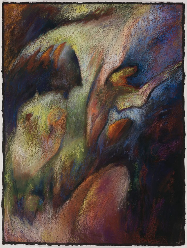
I was drawn to the mysterious push and pull of shapes in this painting. You look and as you look, the shapes begin to take on some specificity – a wing, an animal head, a thigh, a torso, raised arms, a lily, other world creatures. These forms emerge and then dissolve as the eye moves on. A shape moves forward but, as another is seen, the first retires. Hard and soft edges as well as the play of colours – the advancing of warm ones and the receding of cool – support this perception.
The diagonal movement upward is made steady by shapes that connect to the sides of the painting as well as by the hidden mysteries in the darkness on the lower right. And then we are back at the base of the work to start our ascent again. There’s a feeling of emergence..or is it a feeling of escape? You could also read a descending (falling) motion rather than an ascending (leaping) one.There is a sense of theatricality about the piece.
The warmth of colours banishes some of the disquiet related to the darkness. By leaving the edge of the black support visible, the artist brings us back to the paper surface, negating all illusion of depth.
You can see more of this artist’s work on her website.

Another mysterious piece that begs the question: what is this about? It’s not very large but it has the feeling of immensity. Three horizontal bands of varying widths – two dark, one light – make up this painting. It’s an abstracted landscape, where sky meets land at a distant red-marked horizon. The rising sun throws out rays that illuminate strange metallic-like plant forms. When you look beyond this perception, you can see that the artist has made marks in grey on black. Some of these grey strokes are flecked with a lighter pastel and this instantly returns the lustre of metal.
The sky above is full of curves and swaths of cool colours with soft transitions. This is in profound contrast to the earth below with its harshness and sensation of drought and death. The light ahead blinds us. The red line at the horizon unnerves us.
The whole thing is unsettling yet the stipples of light create a kind of route for us to follow toward the glow in the distance. But underneath some of the grey marks we also see strokes of red lining the path. What are we to make of these? The hardship of blood, sweat, and tears? This won’t be an easy passage. Do we step forward or stay static with no hope of change or growth? A difficult decision we all have to make at some point. Yet we are prompted and encouraged to take the step.
I was unable to locate a website for this Paul Holmes! Here’s his Facebook profile for now.
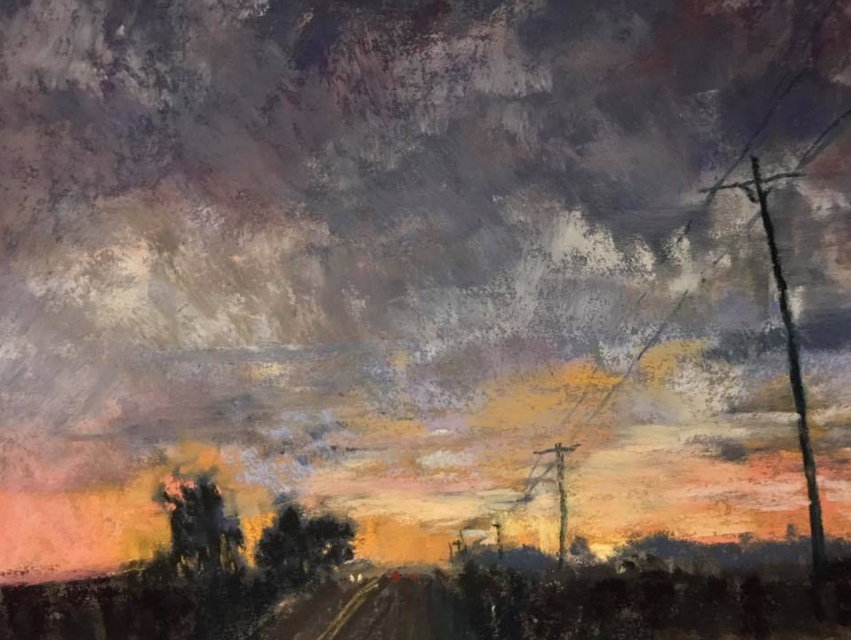
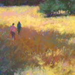
A much smaller piece than the one above, it too gives the impression of being much larger than it is. This landscape is also divided into three bands running across the painting. Here the horizon is low and dark but without the edginess of the previous painting. A storm is brewing but we head for safety drawn towards the warm colours of the setting sun.
The boldness of marks in the clouds creates their fullness and sets them roiling. So many variations of grey can be found there, all of which intensifies the band of pinks and yellows of the sunset. It is the clouds that are the focus of this painting with the small amount of land in silhouette grounding us and giving us a context for a narrative. With so little used to describe the scene, we see a road (double yellow line), cars coming and going (two dots of red, two dots of light), trees, bush, and telephone poles.
With the telephone cables, we see the power of the diagonal line to bring us into the picture. Without these, the picture remains static. The texture and variety of marks and colours in the clouds keeps me looking and coming back for more.
Sadly I was unable to locate a website for this artist and so I offer his Facebook profile.

Speaking of mark-making, here we initially see only the dibs and dabs of pastel in an abstract piece. And then, as we start to examine the work, it resolves itself into a landscape – we see grass, ferns, reflections in water, a tree, leafy cast shadows. If we relax our exploration, it all dissolves back into the purity of colour and mark. I’m intrigued by this momentary cohesion of shapes and colours into a subject. The more we look, the more the whole thing moves from abstract towards a traditional landscape which then separates into shapes and colours again. It seems this painting reveals how, as artists, we see the world – flipping back and forth between form and content.
Analagous colours of yellows, greens, and blues, run through the whole gamut of values from dark to light. Hard and soft edges, big and small shapes, the diagonal from upper left to lower right – all these are aspects of picture making and also, illusion-making. The artist has, with elegant simplicity, offered us the essence of nature.
See more of Amy Gamble’s work here.

Fearless is the word that comes to mind when I see Tony Allain’s work. He has the ability to take complex scenes and strip them down to their core essentials. He then takes these elements and offers them up to us with bold strokes and a full range of values – from the deepest black to the purest white.
Here you can see how values and dominance play the main role in his work with colour being the secondary actor. And with that limitation, the nuggets of pure colour pop out at us, drawing our attention without effort. These are enclosed with line and gestural marks. And all of it takes up only about a third of the painting’s square footage.
The painting has a high horizon line and most of the area below it is left in a state of simplicity. Bold wide swaths of colour give us the info we need to recognize the beach at low tide (which inhabits almost two thirds of the piece). Complete minimalism is seen in the sky where it looks like Allain has left the paper untouched. Even the pier itself is shown with the most minimal of indicators.
Movement is created by the lines from the boats as well as the angle of the pier. The two ropes from the boats create a roadway of exit for us as well as a place of entry. A skilled draughtsman, Allain doesn’t get caught up in the details yet manages to suggest the intricacies of masts and rigging. Minimal marks for maximum effect.
You can see more of Tony Allain’s work here.
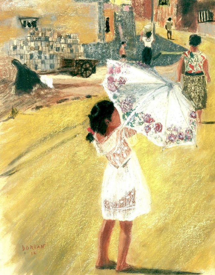
I am totally charmed by this piece. The little girl opening (or closing) the white umbrella kept bringing me back. The action gives movement to the picture and points our attention to the figures slowly making their way up the hill. We’re stopped by the sharp dark shadow that attests to the heat of the day. We follow the shape of the shade across the painting to the detailing of what looks like concrete blocks stacked and either loaded or just unloaded from the cart. A indistinct figure at the far left arouses our curiosity as to what he/she is doing but soon we again look at the young girl.
She stands, toes slightly turned in, concentrating on what she’s doing with the umbrella. The umbrella is decorated with a floral design which seems a perfect reflection of her pre-puberty innocence. She wears what looks like a lacy transparent dress over a white bathing suit or underclothes. Who is she? Is she related to the woman who strides forward ahead of her?
All the figures have their faces hidden which not only gives them anonymity but also a universality – of people going about their daily lives. Notice how the artist balances the simplicity of background directly behind the girl (which shows her up beautifully) with the details in the upper half of the picture.
I could find no website for this artist so put you in touch with him via Facebook.

I was drawn to the warmth and interesting shapes of this pastel by Rick Stevens. At first glance, you notice the big colourful shapes, rounded and piled up in a higgledy piggledy way. They’re partially held together by a backdrop of orange. And then you notice the dark vertical line near the bottom of the piece which seems to wind its way upward and sprout green shapes that could be leaves (or not). Two thin lines echo the dark one and create a frame for the whole, containing it. They reinforce the upward movement but also ground it.
I can’t help but sense landscape elements – tree, leaves, earth, sky, distant hills. It’s our natural world and yet not. An alternative view would be one looking down from the air at fields and villages or watching a computer game in action. The more you look, the more you see and the more you can create possibilities about what you are seeing.
I am enthralled by the textures and overlays, the lines and squiggles, the shapes – large and broad, small and intricate, the bright colours. In this painting, the form is as important or more so than the content.
For more of Rick Stevens’s work go to his website.
~~~~~
So there’s my choice of amazing pastels for this month. You know I want to hear what you think about them. Did any jump out at you? Were you surprised by any? Did you look more closely at any of these amazing pastels after your first glance? Do please leave a comment 🙂
Have a question regarding anything pastel? Why not set up a 15-min call with me – it’s FREE!
Until next time,
~ Gail


36 thoughts on “April’s Amazing Pastels”
I enjoyed the portraits, each supporting the gender of the subject – hard edges for masculinity (even though there’s a feminine quality to the face – delicate) and the softness of the woman’s portrait (although the strength in her face could easily be at home on a man). I was surprised to find I liked the Tony Allain painting, recognizing it as his before reading the name. I’m not usually comfortable with his work, but this was more serene than most of his paintings I’ve seen. I’m aware that my feeling about his work could change as I grow as a pastelist (at least I hope I grow, lol)
The peek a boo nature of the Crystal River Glen by Amy Gable was wonderful – kind of like a Bev Dolittle work, only in a landscape without an animal. It’s an interactive work, as you move into representation and out into abstract shapes and colors.
I wondered if the Paul Holmes painting showed the wake of a boat in a sunrise in “First Light”. Rick Steven’s painting “Distinct form Logic” immediately reminded me of pizza, so it seems well named. Perhaps I’m just hungry. :-}
Interesting range of subject and technique, approach and mark making for this beginner.
Thank you.
Wow Debbie, thanks for taking the time and thought to give such an in-depth response! I appreciate your ideas and insights. Great comparison between what happens in Bev Doolittle’s work and Gamble’s. Nice interpretation of Holmes’s painting and love you idea of pizza with Stevens’s! (Now I’m hungry!). Isn’t it wonderful how we all come to an abstract painting with our own experience and perceptions. Good stuff!!
Fascinating picks, and so well narrated. I am delighted and I am sure many others will be as well!
Cam
Many thanks Cam – that’s so great to hear!!
Gail, thank you for this wonderful blog. As a landscape pastelist I am branching into abstract works and finding it a bit daunting. I, for one, would appreciate an instruction on abstract pastel painting. The work of Shoenfeld was amazing. I spent many minute gazing at her work and her website. Her Ghost Ranch work intriques me. I am including a photo of a plain air piece I did at Ghost Ranch. I would like to be able to translate this into an abstract piece. Any help would be appreciated. Thanks for this week’s blog. /Users/davidattwood/Pictures/Photos Library.photoslibrary/resources/proxies/derivatives/4c/00/4c89/NMrmiPGKQJiUbJuop2vlMQ_thumb_4c89.jpg
Hi David,
It is a big thing to stretch ourselves from realism into abstract work but it sure is interesting how we can be called to it! I think removing yourself from any photographic source and concentrating on shape, colour, value, edges, and line in what you have may help. Do another piece with that in mind then do another, each time moving away from the tie of our world. Have a look at this Rick Stevens video. It talks about this process of moving towards a more abstracted landscape. https://youtu.be/sexe2RJd964
Sadly the link you provided doesn’t work. Can you send it to me in an email and I will try to attach it.
Thank you so much Gail for your wonderfully insightful comments about my pastel “Nothing Stays Forever Buried” I particularly was pleased with the following words of yours….”I was drawn to the mysterious push and pull of shapes in this painting. You look and as you look, the shapes begin to take on some specificity – a wing, an animal head, a thigh, a torso, raised arms, a lily, other world creatures. These forms emerge and then dissolve as the eye moves on. A shape moves forward but, as another is seen, the first retires. Hard and soft edges as well as the play of colours – the advancing of warm ones and the receding of cool – support this perception.” I’m so happy that could see all this and also put it into words. Great appreciation and also honored to be with some other terrific pastel artists, particularly Rick Stevens, fellow New Mexican, who references our natural world in his own mysterious and beautifully colorful way.
Hi Jane, I’m delighted that what I saw and said made you so happy! I had no idea you were from New Mexico. Will I see you at IAPS?
Thanks, Gail! I am so happy you made me discover Rick Stevens. Mesmerezing work. On the video I realised how big some his works are. Truly beautiful.
Made me curious about his mixed media techniques, as well as pastel of course.
Thanks Barbara! So glad to have introduced you to the work of Rick Stevens. I know, I was surprised when I watched his videos to see the scale of some of his work!
Very surprised by the Paul Holmes piece; a real puzzler, but then, maybe that was the idea. It might be a wheatfield or grassfield at dawn, when colours are more muted; but certainly a fascinating subject for pastel. I like Greg Stone’s piece “Storm Brewing”, because it is small and shows that you don’t have to work big to make a good painting.
I’m not a great portrait fan but I’m probably attracted to the third one Girl in Yukata”, for that beautiful placement of blue colour. And Tony Allain……always intrigued with his work… as you say, fearless, stripping something right down to its basics. Brilliant. Wish I could do it!
Hi Chris, Love that you chewed over Paul Holmes’s work and came up with other interpretations. And I’m with you on Greg Stone’s pastel – I really was surprised at how small it is! Wish I could get to those Allain-type basics too. Thanks so much for commenting!
Thank you Gail! I love the works you published ! So inspiring! I’m new to pastels and now think it is by far my favourite medium. So tactile and when I open a new box of pastels it’s like opening a box of delicious sweeties. My favourite pastels are Sennelier however I will be trying Shminke shortly as they’re on my birthday list. Can’t wait! I’m very excited about my pastel journey ! Thanks again for sharing.
I can feel your excitement about pastels Audrey! I know exactly what you mean about opening a new box of pastels – YUM! I love Sennelier too and also Schminke which are delectably soft. Look forward to hearing how you like them. Glad I can help inspire you along the way 🙂
I found myself really enjoying Rick Stevens cheerful, colourful path up through his abstract painting, and like you Gail, I felt as if I was surrounded by nature – leaves, flowers and a warm wind.
I always loved José Garcia Pepegarcia’s “Isabel” and wondered how he managed to have the light coming from both left and right so successfully. Would you comment on that please?
What a diverse and interesting collection, thank you.
Hi Mary-Anne, thanks for adding to the feeling of Rick Steven’s painting!
And as to your question, I think the reason the light is coming from two directions is that is what was seen by the artist. In our kitchen, we have two windows at a 90 degree angle from each other. Anyone sitting in the chair opposite me is lit by two sources. It looks to me as if the same thing is happening here with ‘Isobel’. And then it’s all about observation, seeing the colour of each light, seeing the strength of each light, seeing how each light affects the subject. Does that answer your question?
That explains it, thank you Gail. I always use a light box or photos with a clear, single light direction. I was intrigued to see how his use of two light sources works so well in this portrait.
Glad that cleared things up. It’s really lovely to paint a model with two uneven, and perhaps different temperature, light sources!
I’m new to receiving your blog and this is the second one I’ve read. First, I want to thank you for the time you spend to create and share your expertise, knowledge and research. I enjoy viewing and learning of the the various subject matters and styles. It’s like going to a museum without leaving the house!
I appreciate the community that you have created for us to share as well. Being a portraitist myself, I was excited to see portrait art in this posting. Your interpretations of Troy, Isabel and Girl in Yucata are eye-opening and reveal a world of pastel usage that I mostly see in works of other mediums.
Also revealing is how beautiful landscapes done in pastels can be! I’m so used to seeing the subject matter done in oils.
Thank you again. I look forward to reading many more of your blogs!
So lovely to have you with us Berdine and thanks for jumping in and commenting! I love you going-to-a-museum analogy – quite the compliment 🙂
Love that you began to see new possibilities for pastels through my interpretations of the pieces here.
And I look forward to hearing your reaction to my posts!
Interesting mix this month! I’ve followed and like Rick Stevens’ work but for me it’s Tony Allain. The economy and boldness of his work draw me in every time. I think you summed it up for me when you said fearless – perfect one word explanation of his work. Thanks Gail, enjoyed your picks as usual.
Thanks Gailen! Rick Stevens was a delightful new discovery for me and here you are following him. Ah yes, Allain’s work is quite extraordinary in it’s spunk and dash!
I was really drawn to Greg Stone’s “Storm Brewing”. It is so simple, yet a powerful image.
I totally agree with you Susan!
Every month I am left breathless by the stunning art you select, Gail, and also your good commentary from which I learn so much. I think, ohhh I love this one and then read about the next one. Amazing, thanks.
Aww Marsha, thank you so much! Those are words that keep me on this blogging track!
A treat as ever!
I saw and loved the Tony Allain pastel at the Mall Galleries, London in the Pastel Society exhibition in February.
I have a photograph of it! It’s inspirational.
Oh oh lucky you to see the real thing Lindsey!!
Gail, thank you so much for commenting on my painting. What great encouragement it is to keep on painting! Your work is stunning, by the way. I enjoy seeing it online and hope someday to have the pleasure of visiting a gallery that features it. Take care!
Greg you are so welcome. As you can see from the comments, you have other admirers of this piece! And thank you for your very kind compliment – that’s my encouragement for the day 🙂
Thank you Gail for choosing one of my paintings.
And for the wonderful interpretation.
When I completed this piece I was recovering from an illness, at the time for me, it represented the moment when you realise that you are starting to get better, a moment of awakening, “a new dawn”.
The foreground is painted using Sennellier metalics
I used the experience of my illness to create a series of 8 painting which have been submitted for a Medical Humanities exhibition in June of this year.
If anyone is interested in seeing the full set they can be seen in the Medical Humanities album on my facebook page https://www.facebook.com/art.sandalwood/
Once again thank you.
You are so welcome Paul. I hope you enjoy the other interpretations in the comments!
And now we have your moving story to accompany it. Thank you! I am glad to hear you are recovered from your illness. I am sure others will enjoy seeing your other paintings related to your experience.
And good to know the foreground is metalic pastel – it sure looks metallic!
Love your descriptions, interpretations, critique. You put in to words what I see but cannot verbalize. Although the portraits are all fantastic, they are not up my alley (at least at this point). I love the half way point between realism and abstraction. That is what I am trying to achieve. Interpreting a scene the way I see it, with whatever attracted me to it, and emphasizing that aspect. Thus, I am attracted to Amy Gamble’s and Tony Allain’s paintings. Also, Robert Dorian’s painting is very cool because it is not just about the subject but more about the areas of color, light and patterns. They are suggestive only, not photographic realism. Love your monthly round-ups!
Thanks Amy! It’s a challenge for me to put into words how I feel. I really have to slow down and ponder and understand Why I feel the way I do about a piece and that gives me the What. I can see why you are attracted to the work by Gamble and Allain. And thank you for your comments on Robert’s Dorian’s piece and saying what I didn’t say 🙂
Thanks Gail for another great review! I found myself really studying the last one by Rick Stevens. His title, “Distinct from Logic” made me look closer. I see what could be the rents of three crosses. The one on the upper right more distinct. It appears to have hearts fluttering down or perhaps drops of blood or both in symbolism. The seedling represents new growth and the cloud like layers appear to be assending into the clouds. I don’t always see this much symbolism but it struck me this time. I’m wondering if you can see what I’m seeing? It’s a truly captivating piece! Thank you as always for your excellent insight!
Denise LOVE your interpretation! Thanks for contributing to the ideas on this painting. I think that’s what comes of slowing down and really seeing. Thank you!