
I know how tempting it is to get right in there and paint when you’re excited about a subject. But hold on, did you do a thumbnail?! And what about creating colour studies, have you drawn up a couple of those?
I know I know, I hear you – it all takes so much time!! But you know what? A bit of time spent in preparation can save you frustration and disappointment in the long run, and also help you produce an exceptional painting!
So what are colour studies?
Colour studies are the next step after a thumbnail. In a thumbnail, you’ve broken down the subject into three (or four) main value areas of light and darks. The colour study takes that thumbnail and recreates it in colour using the same value scheme established in the thumbnail.
You know I’m a big proponent of thumbnails. Creating colour studies takes the next step. They’re especially helpful if you layer colours as I do. This is a time to explore all sorts of colour variations.
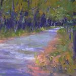
The topic for this blog post came up as I was working on the DK Project (and I think I have at least a couple more weeks of intense work to go!). Let’s take a look at the colour study I made as part of a technique for the book.
Creating Colour Studies

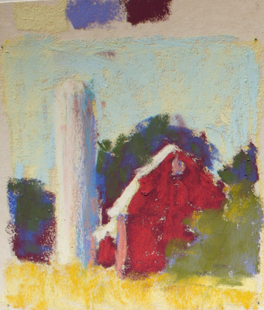
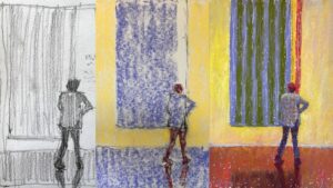
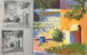
Here’s the reference photo and then the thumbnail I sketched up.


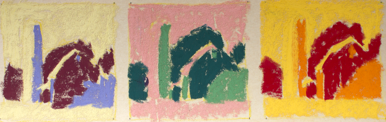
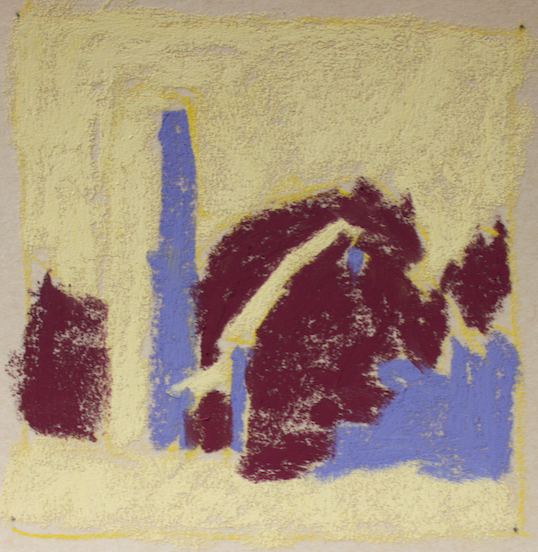
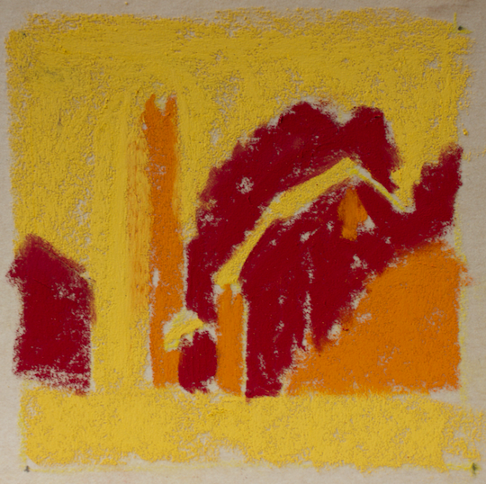
Let’s have a look at the three colour studies I created today. Each has its own set of first layer colours. To keep things simple, I used the same colours for the second layer on all four studies. All the studies are made with Unison pastels on UART 500 grade paper.
I’ll show each with its first layer followed by a photo with the second layer added. I chose colours randomly, just making sure I selected colours from each of the three value areas. As it turns out, I created two with complementary colours and one with warm analogous colours.


Some things to think about when creating colour studies
1. Stay small
When I say small, I mean no larger than 4 x 4 in or say 4 x 6 in. These are all 3 1/2 x 3 1/2 in. Staying small means you can get them done quickly!
2. Simplify
Follow the three-value thumbnail you created. Don’t look at the subject when creating colour studies or you’ll be tempted to put in details, follow the colour you see, etc..
3. Work fast
You’re not trying to generate a perfect artwork here. This is down and dirty so move that pastel quickly across the paper.
4. Don’t fuss and fiddle
It’s easy to get caught up in wanting to capture details and nuances. Don’t. This is not what creating colour studies is about! And anyway, you want to leave some surprises and options for the big piece. These are only studies to get the visual juices flowing.
3. Experiment with Colour
This is your moment to go wild. Don’t hold back! And don’t think about the ‘real’ colours. You can always turn your piece towards a more ‘real’ look but for now experiment. Just grab a colour from the correct value range and try it. You may be surprised with the lovely options you come up with!
By doing colour studies, you not only solve colour decisions and issues that may arise before you start on your main piece, you also learn a lot about colour and colour relationships along the way.
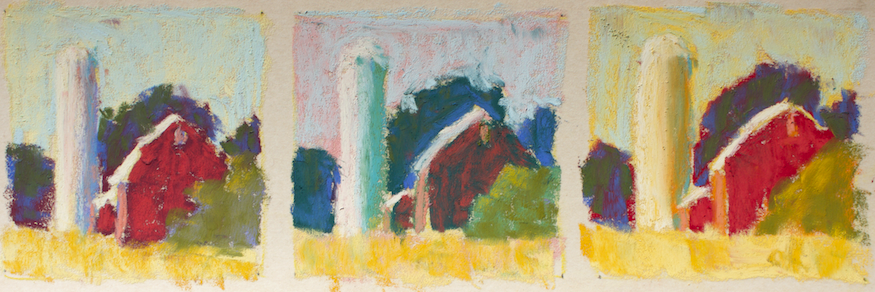
You can see how different these three colour studies look!
By creating these studies, I have more colour options available and get a real feel for what my final piece might convey.
So tell me, was this helpful? Are you in the habit of creating colour studies? And just for fun, which of the four above would you now take to make into a larger piece – 1, 2, 3, or 4?
Next week, we have a guest blogger and it’s all about glorious trees! Can’t wait!!
Until then,
~ Gail
PS. Hope your day is filled with love on this Valentine’s Day!


![Pastels on black aper: Gail Sibley, "Untitled [at this point], Mount Vision pastels on Sansfix pastel card, 5 1/2 x 7 3/4 in](https://www.howtopastel.com/wp-content/uploads/2016/04/IMG_9649-2-150x150.jpeg)


47 thoughts on “How Creating Colour Studies Can Improve Your Paintings”
This is great! This is a good way to stretch one’s color skills. One of the best things about pastels is the way the colors enhance each other, and you showed this so well. Thanks!
Thanks Jennie! This is a really fun wayto try out different colours and see how they work together.
I think I’d choose #4. Those sunny colors are what spring is all about~!~ But what I like the most is that with the next pass, there are good representations of normal color. It makes this place seem much more believable!
I’ve had to resort to WATERCOLOR PAINTING~!~ for the last 6 weeks or so, due to some lung problems. Really enjoying this medium. Finally understand why some pastelists leave their support open instead of painting it all in. Less dust!!! But seriously, the watercolor genie has been tickling my ear each night. I get up, go through my old photos, new still life pieces and hopefully, something fit to be shared soon!
The sunny one is very appealing isn’t it?! And Betty you are so right – it’s amazing how that second layer makes everything look more ‘normal’. And that’s why I want to bring this to everyone’s attention – magic can happen in these colour studies!!
Sorry to hear about your lung problems and that you are back to watercolour painting. Yet still you are doing pastels – yay!!
Valuable information, Gail
I have been practicing using notans, and it has made such a difference in my work. Coming up with color combinations can be a struggle at times, so I’ll give this a try. Thank you again, for all you give us.
Great to hear Maureen. Yes thumbnails are a huge help as you say. I’ll be curious to hear if you play with this idea and how it changes anything for you. And thank you 🙂
Forgot , I like the 4th study.
Ah yes, the warm one!
Gail,
OK, I’ll admit that I just don’t take the time to do color studies, but after reading what you have to say, and seeing the different examples…I have to say that it’s fascinating! Thank you for your encouragement, and for making all of this look so easy. I may have to branch out and try my hand at various color choices that I normally wouldn’t think of. By the way, I love all of your sketches here…But if I had to choose just one? #1
Hey Jackie, they do take time but they can be soooooo fun too. It’s a nice way to loosen up especially in the study (but also on location) Try creating colour studies once in awhile and see what happens. Don’t hold back on the colour. Just be sure to choose colours of the correct value. Glad you liked the sketches and thanks for sharing your fav 🙂
As a beginner, I find this post extremely helpful so thank you! Of the three studies, I find number 1 the best for the subject. I think number 3 is too bright for the subject, would be better suited for a seaside scene, and number 2 is too dark as if the sun had suddenly disappeared. Number 1 is just right. This is my completely nonprofessional opinion. 🙂 Looking forward to the guest blogger and trees! 🙂
Hi Noemi, thanks for sharing your thoughts and fav. It will be interesting to see what others choose as their favourite sketch. Thanks for telling us why you chose #1.
I’m looking forward to next week’s guest blogger too!
Hey Gail
Thank you for How to Pastel, you are a real inspiration. I am a fairly new pasteller and I have learnt so much from you.
I don’t do colour studies but will have a go after seeing this post.
I like no 3 best.
Cheers
Laurel
Laurel thanks for your kind words. It makes my heart all warm when I hear that I have been helpful!
Try the colour studies. Do them fast and don’t get hung up on trying to “get them right”.
And thanks for sharing your favourite!
What a great blog post! I have never done a colour study, but this certainly inspires me to do them in future.
Definitely number 4 colour study in a large size: a warmth and glow to the painting that makes it look natural, artistic and professional.
Yay Kerry!!Glad this has inspired you to try some colour studies. Look forward to hearing how they go.
And thanks for sharing your favourite. Something about that warm glow isn’t there?
I find this very helpful, thanks! I do thumbnails, but have not been doing colour studies this way. I will now.
I would go with colour study two.
Lynn
Lynn, I’m so glad you have found this useful and willing to have a go at colour studies. Have fun with them!
And thanks for sharing your fav 🙂
Thanks for this Gail, this is a step up from my usual practice of a small sheet next to my painting to test colors. You’ve made it look like fun, so I’m off to the studio to play! I like the first one on the left with bits of yellow peeking through the sky.
Gailen I also have a test sheet, mostly for trying out layers of colours but this IS fun and oh so satisfying!! Let me know how the playtime goes!
For me, creating colour studies is like practicing musical scales(classical guitar); challenging,time consuming, but necessary. Ah, the “pain” and joy of creating art!
p.s. #3 should look great. Cheers.
Cliff, I hear ya!! Thanks 🙂
Love the analogous colours, number 1 I think.
I found this very interesting thank you.
Thanks Valerie! And glad to hear you found it interesting!!
I like the 1st study.
I like pastels, but I do not like the dust. I also like blending which produces lots of dust. I have not done studies. It is always a challenge for me to choose colors. I do believe that working out a color study might be helpful for me. Again, with me, it seems like it takes a lot of time, on the other hand I waste more time and pastel sticks trying to balance my paintings. Thanks
Thanks Nancy. Love hearing your thoughts as they emerge, balancing each other off. Colour studies do take time but if you keep them simple, follow your thumbnail rather than the original source material, do them fast, and keep it fun, I think you’ll find doing them enjoyable. Try it and let me know how it goes!
Yes, very helpful. In theory, I know the value of doing the thumbnails, but I haven’t been doing the color studies. I will start. I like #1. And YAY on next topic of ‘trees’. Thanks.
Good for you Marsha. Let me know how it goes. Hmmm….maybe this should be a Friday challenge in the Facebook group….
Thought you’d like that trees are coming up 🙂
Hi Gail,
Thanks for a really interesting and thought-provoking article. Colour studies seem a very sensible discipline and, although they may be time consuming, perhaps eventually save time. And anyway, isn’t painting what we’re supposed to enjoy…?!
How would you take the chosen study (no. 3 in my case)? Would you mimic the study process with the same underlay and second layer, then refining detail?
Thanks as always,
David.
Thanks David. And yes, even the struggle of painting is a joy 🙂
Great question and I’m sorry I didn’t say in the post. So yes, I would then take the two layers and get my piece going that way, with a light hand. I’d then build from there – defining, balancing, detailing, tweaking. I don’t want everything figured out in the colour study. I want to be able to move with the painting as it develops but this a great way to start.
Thanks Gail.
I think I am too lazy and want to do things fast.But I will try this too one day.
I like the 1st one.
It needs so much discipline to do all this.
But I must try as I often don’t like what I’ve done and this is helpful to be clear oneself…. like writing a first draft of an essay. I am an English teacher !
Iris
YES! It is like writing a first draft and maybe like writing that revision that you so don’t want to do but after all, it does produce an improved outcome. Think of these as pleasurable warm-ups to your painting rather than something that ‘should’ be done. Make them colourful and fun!!
Great article, Gail! Thank you for the wonderful examples! Particularly love the top one and the first one of the 3 below. My own color studies too often turn into finished mini paintings, I get carried away. I do love the idea of simplifying them further down to the very basics, will try that next time. By the way, the students in my class just did small color studies before painting a larger painting and all agreed how useful that was 🙂
Thanks Lana! I find that if I work small and fast, the temptation to work to a finish is removed. Also, because I work fast and furious, I can produce more and then end up with a number of colourful options, some of which are delicious, others, not so much! Glad to hear your students found creating colour studies useful 🙂
Thanks! This was very helpful. I’ve never done the color studies, but on a 4×4, they seem like a lot of fun to do as well as great planning for the larger piece. I like #1 the best.
Glad to hear this was useful Ruth. They are fun to do! Just keep in mind their purpose and work quickly.
Thank you Gail. I have always loved pastels because of its textural look. It’s s quite expensive here in Nigeria and one very distinct medium not really used except for portraiture. Opedun remains my inspiration in Nigeria. I love the color studies techniques but can this be applied to other mediums knowing that painting will take more time?
Hi Bangish, it’s always frustrating reading about materials not readily available in one’s own location. And yes, Opedun is an inspiration! Have you read my interview of him?
I think this could be applied to other media. as long as there is a sense of the underlayer coming through I think it could work. What medium are you think about in particular?
Oh yes! I read your interview of him and i was inspired. Speaking of the mediums i was talking about ; oil color or acrylic.
Thank you Gail for this demo! I’ve tried to get my students to at least make color notes on the side of the paper but they always want to jump right in…they don’t want to even do a preliminary sketch.
I will definitely try a few more color studies in my own work. And I will show your examples to my students to try and motivate them.
After reading this blog I’m itching to take out my pastels right now..maybe for few minutes before work!
Yes, yes, get those pastels out!!! How wonderful to know the blog engendered this desire!
I know as a student how difficult it is to do preliminary work – you don’t want to waste precious time and energy doing what seems like a waste of effort. Yet usually putting in the time ahead of painting does actually payoff.
Good luck with your examples and hope they help to motivate your students 🙂
Reading this late, but so glad I did! Very helpful!! I really like how you used different first layer colors, but then showed how using the same second layer colors still creates a very different mood. I always do a notan study, but have never done color studies. I plan to try this!
Glad you found this helpful Susan and look forward to hearing how it goes for you! It’s pretty amazing how one change in the top layer can make such a difference!
Hi Gail, loved this article. I’ve never done these colour studies, just dove right in, but always had collisions on the way, or crashes, that disrupt the painting. This experimenting and selecting the base layers looks fun(damental!). I will start doing these.
Thank you so much!
And I love hearing that Herbert!! And they really ARE fun as well as fundamental!! These studies are a great way to be doing something in the studio when you don’t really feel like doing anything. And doing them often gets the juices flowing and the desire to paint becomes overwhelming. Yay!!
This was very helpful, thank you. I use a color study but never understood fully what exactly I was doing with it, but I think now I think I do! I am going with the first study, I see the values clearly. Perhaps as I grow more confident, the others hopefully will come into play
Carole I LOVE hearing this!! All the colour studies work off your chosen thumbnail. It’s all about playing with colour combos! Have fun and experiment. Remember, keep them small and fast so they don’t become laborious. Let’s keep the fun in there!