
Ahhhhh yes…it’s time for another monthly roundup of ten superb pastels. I’m always hopeful that one of these months it’ll be a breeze to select the 10 from the many I collect over the month….and then to wrote about them. Hasn’t happened yet. So after much time struggling to choose this month’s choices, here they are, October’s superb pastels!

A rather battered industrial building is the subject of this glorious painting. Erin Gill takes the ordinary and mundane and makes it extraordinary. The painting glows with a complementary colour palette of blues balanced by warm reds and oranges.
From top left we leap down to the right over large blocks of colour on the right, then follow the line of the railing to the left where we are whisked upward to the windows full of light radiating through panes of glass, almost like a stained glass window. The building’s vertical lines direct us skyward where we can marvel at the complexity of the roof. Slip down the bold and simple negative shape of sky between the buildings and we encounter the countryside and barely described buildings beyond. The more you look, the more you see so spend some time with this painting!
Check out more of Erin Gill’s work here.
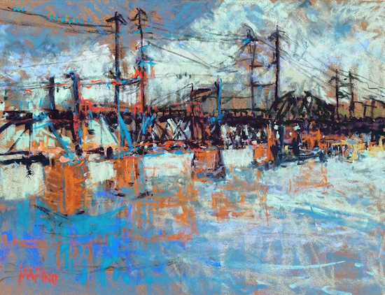
Here’s another subject most people wouldn’t think of immortalizing in art. In fact some would call it downright ugly! The job of the artist is to make the rest of the world take another look, to see what they cannot see at first glance. Maria Marina has taken an industrial-looking metal bridge with communication poles and abstracted them into a series of vigorous and colourful marks in the same complementary palette of orange and blue used by Erin Gill above. But how different the outcome!
The dark heaviness of the bridge is enlivened and lightened by bold strokes and colourful overlay. We travel the bridge left to right. Above we are aware of the lines and below, a glorious chaos of crisscrossing lines portraying water and refections of the bridge. We circle back and start the process again. This time we move more slowly and perhaps detect what gives the painting its name – the birds on a wire [see my PS below]. Since we may not have seen them initially, their discovery makes for a satisfying encounter.
See more of Maria Marino’s work on her website.

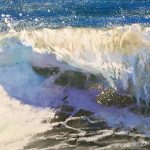
Here find the power and beauty of nature. I feel the moment, wind lifting my hair, shivery with some apprehension yet in awe of the dark and raging beauty. It’s a simple subject of sky and sea, each reflecting the other in movement and bolts of colour. Chroma is found where it’s unexpected – the dark sea is filled with colour; the grey clouds are filled with colour. Yet where you might expect to see the greatest intensity of colour – the sky in sunset mode – there’s only pale yellow with hints of pinks and pale blues. I like this reversal of expectation.
The energetic strokes enhance nature’s own dynamism of pounding waves and fast-moving clouds. It’s a blustery day where the clouds scoot us deep into the picture, to the horizon, and the small triangle of beach runs us back out to the picture plane where we encounter the waves. The lines of surf return us to the distant headland where we are swooshed back out by the clouds, in a reversal of our entry. Movement fills the picture! Although the palette is a mostly cool one, there’s a feeling of warmth. The painting is commanded by dark values with a sprinkling of small areas of light and those surprising nubs of colour, all of which echo the tense balance between disquiet and seduction.
Check out more of Marshall’s work here.
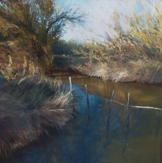
An ordinary and almost missable scene, a forgettable place made memorable by the hand of the artist. Marjorie Martin-Sisteron offers us a corner of nature, not only what’s visible but the painting also hints at the life that’s unseen in the water, in the grasses, in the shrubbery, and in trees. The sun rises, its rays catching the tips of vegetation as it makes its way upward and all awakens. The palette is subdued as it would be without the light and yet there’s a feeling of colour, of blues and yellows, and the merest hints of green. The painting exudes the joy of light that’s enhanced by lots of shade and shadow.
Human presence is indicated in the fence that adds both interest and compositional balance as well as tension. We can feel through this device, our impact on the land and the way we might affect the lives of the plants and animals we share the earth with. It also serves as a metaphor for the barriers we erect between ourselves and the natural world.
You can see more of Marjorie Martin-Sisteron’s work on her website.

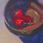
Another celebration of nature – this time we have lovingly and meticulously recreated peppers. I’m mesmerized by these peppers – their scars, their slight deflation due to age, their minor wrinkling, their slightly worn stems. I feel as if I could reach out and pick one up or scoop them all out of the basket! Careful observation by the artist means all the highlights are not created equally – they have different lightnesses, different colours, different shapes. When we sit with the painting for awhile, we then notice the extraordinary depiction of the basket in which they sit – I can feel the smooth surface of the material, and the in-and-out texture of the weave.
The painting is low-key but feels lighter because of the dominance of red, a colour intensified by the complimentary green accents of the pepper stems. The design is such that we weave our way through the picture from top left to right then we’re pointed to the bottom left where the curve of the basket returns us to our starting point. Nature’s bounty indeed.
Check out more of Mullett’s work on her website.

When selecting my ten superb pastels for this post, the contrast between the dark and the blazing colour of the flowers kept me coming back to this one by Senthil Kumar. This painting offers a story about those who sell flowers in a certain place and time. The darkness, with only a hint of light coming through what may be a skylight, suggests all this trade is taking place in the early hours of the morning. We are attracted to the work by the intense colours. After our initial introduction, we circle the painting, led upward by the lit figure on the left, over to the hanging light, and down to the woman leaning forward toward a customer you may not have given much attention to on first glance. If we spend time with the painting and as our eyes adjust to the light, the shadowy background figures begin to reveal themselves. We want to explore and discover more of what is going on in the darkness, just out of sight.
Kumar has captured a daily activity and elevated it to the status of art. Rather than sensations of sound, smell, touch, I experience the silence of art, not the hustle and bustle of life. In the same way Hopper’s paintings capture a single moment forever, this one has stillness.
I’m sorry but I wasn’t able to find a reliable place for you to see more of Kumar’s work.

From the extreme dark and light values in the painting above, we come to this generally high key painting by H Marie Dolchan. It’s almost monochromatic, divided into a large light grey rectangle supported by a much smaller and almost black shape at the bottom. Overtop of these rectangles is placed a still life. Let’s look first at the flowers: there are white ones, the lightest value in the painting, and there are flowers warmly coloured with yellows and oranges that punctuate and bring to life the monochromatic stage. The subtle and ethereal shadings of the shadows cast by the flowers balance beautifully with the dense dark shadow under the shelf and also the deep greens of the flower leaves. Dolchan has taken the excuse of flowers and created a selection of bottle shapes and sizes (or is it the other way around and the bottles that are the excuse for the flowers?). We can see how observant she is of the effects glass and water have on stems and colour pattern. The flowers are what pulls us in, the bottles are what holds us enthralled!
Sadly, I was unable to locate a website for Dolchan.

We leave the monochromatic above to arrive at bold brash colour! I could drown happily in those luscious red and pinks. This large pastel was done as a demo (!) and reveals a master confident in his craft. The dominant and vigorously applied saturated colour of the background somehow manages not to outweigh the delicate and careful rendering of the face. Note how many colours Picard uses to describe the skin of the model’s face yet they sit so close in value that when you squint, they become pretty much one uniform surface. The dark hair and jacket/sweater helps the figure to hold its own against the exuberant colour that surrounds it as does the slash of the white blouse. Somehow Picard balances both bold and nuanced pastel strokes: they seem to fit together here. So much information is expressed quickly – the short time of a demo – and confidently while under the scrutiny of hopeful students. The demo shows off Picard’s technique, his draughtsmanship, his ease with colour, his knowledge of values, his experience with mark-making.
You can see more of Alain Picard’s work here.

Another demo (!) and still pretty large, this portrait by Carol Peebles has a completely different feeling from the one by Picard. Although the model takes a similar pose, the colour is gentler and subdued, and the hatched strokes of pastel are deliberate and sensitively applied and almost invisible. There’s a lovely play of light against dark (face against the background) and vice versa (the dark hair and chair against a light background).
Every part of the painting has been considered and all have an equal part to play. No element eclipses another. Each part of this painting has its own exquisiteness – the hair, the eye, the scarf, the earring – all parts where we can linger and savour the fine detail. I can catch one of those curls between by fingers and feel the silkiness of her hair, caress the soft scarf, sense the cool metal edge of the earring, touch the smoothness of her skin. This woman is real to me and as she looks off into the distance, head tilted upward, I want to know her thoughts. Will she turn and speak to me?
Check out Carol Peeble’s website to see more of her work.

And finally we come to Bill Cone’s landscape. It’s a mesmerizing combination of reflection, translucency, and transparency. It’s also an exploration of contrasts: the hard sharp-edged rock above water compared to the rounded forms of the rocks below the surface; the warm palette contrasted with the cool; small areas of saturated colour versus large areas of greyed colour; solid reality contrasted with a feeling of the intangible.
The whole composition is one of landscape details superimposed onto an abstracted underpinning. You can see this if you squint and find the major shapes of warm and cool, mostly in the water area. The middle value is dominant: it’s bracketed by the lights on the rocks and the dark crevices and water line, most of which is found in the upper third of the painting. Cone has managed a perfect balance between crisp edges and softer ones, between bold strokes and careful marks, between extreme value contrasts and subtle shifts in values.
It’s a painting of such subtlety that you may not realize what has been achieved prior to deeper and more thoughtful examination. You can find Bill Cone’s work on his blog.
~~~~~
And that’s it for this month. It’s been a struggle to stay focused this week through the American election and the result. And so my apologies for the delay in getting this blog out. I have been distracted, depressed and depleted after this week’s events.
I would LOVE to hear what you think of my choices for this month’s superb pastels!! Let me know in the comments which is your favourite and why.
I’d also like to remind you that if you’re struggling with a piece of work and you’d like some detailed feedback, why not consider my critique service. You can learn more by clicking here. I’d love to help!
And that’s it for this week. Thank you for your continued support and encouragement. It wouldn’t be the same without you!!
Until next time,
~ Gail
PS. As I finish writing this post on October’s superb pastels, I hear of the passing of poet/singer Leonard Cohen. I came to his work only this past decade (through my dear Cam) but his music and words have worked their way into my soul. Because of the title of Maria Marino’s work above, I give you this:


20 thoughts on “October’s Superb Pastels”
Superb collection ! thanks Gail!
Glad you enjoyed them Alvin!!
I really like Birds on a Wire and Demo Portrait!
Thanks Nolan for sharing your favs!
Great selections, as always, Gail! I really appreciate the time you spend on your selections and your excellent commentary on each piece.
Thank you Jane. All the effort pays off when I receive comments like yours 🙂
I want to thank you for all the work you do to promote and support pastel artists. I look forward very much to your monthly collections and learn so much from your website. Our internet is so terribly limited where I live, I cannot watch videos or use anything that actually streams , but I can certainly look and study stills and read everything! Again, thanks for your work. It is appreciated.
Cate, I am delighted that you find so much help on the HowToPastel website. And I appreciate your kind comments too 🙂
It’s quite something to hear that you cannot live stream etc over the internet. Those of us who have fast and reliable internet service easily take it all for granted. Thanks for the reminder that everyone in the world isn’t so lucky!
Awesome as always. Keep the faith. Stay strong.
Thanks Lisa!!
Just WOW, such beautiful art. Heidi Marshall’s American impressionism speaks to me, although Bill Cone’s Sierra Nevada, sun washed high mountain scenes makes me very happy. Thanks so much. Marsha
Marsha thanks for sharing your favs, two paintings that cover a similar subject but so very differently! Pleased you enjoyed the post 🙂
Thanks for another really interesting variety of paintings, Gail. Your critiques help me analyze my own paintings and, hopefully, help me improve!
I’m glad Helen that my words and analysis of other work helps you look at your own work with a more discerning eye. I think ‘seeing’ our own work in a detached way is one of the most difficult things for an artist to do!
Wonderful, carefully chosen choices this month as usual. You have made choosing a favorite very difficult but for me, it’s about water. I keep bouncing between the SHOUT of Heidi Amenda Marshall’s Lake Michigan and the QUIET of Bill Cone’s masterful work Iceberg Shore. Thank you Gail for ending with Leonard Cohen’s “Bird on the Wire”. One of my all time favorites covered by many artists especially Rita Coolidge in the 70’s and Joe Bonnamassa who is popular now. Cohen will live on through his art.
Love that it’s a difficult choice for you Gailen! I love your comparison between the energy of Marshall’s work and the serenity of Cone’s painting – perfectly chosen words with ‘SHOUT’ and ‘QUIET’.
I have grown to love many of Leonard Cohen’s songs, and as you say, he lives on through his musical legacy.
A wonderful selection, Gail, especially with the 2 contrasting portraits.
Thanks Carolyn. I’m glad you picked up on the two portraits (which with your portrait work makes sense!). I was delighted to see that the two I picked were so similar yet so different.
Marie Dolchan, a retiree whose background
is in ceramics education, wanted to develop her
potential in painting and drawing. After attending
a beginning painting workshop taught by Gene
Snowden at the Murray Art Guild, she began to
joyfully explore the use of pastels and paint to
create still-life compositions. From Snowden,
Dolchan acquired a variety of valuable information
ranging from basic matters such as a realistic place
to start when purchasing materials, to formal issues
such as use of space, lighting and color. Dolchan
found the condensed information presented in
the workshop appealing, and appreciated the
individualized attention she received.
Hi Robert, thank you for the background info on Marie Dolchan. I am curious though why you are presenting it and not the artist. Am I missing something?